30 Oct 12 Clever Hidden Messages in Logos You Should Know
12 Clever Hidden Messages in Logos You Should Know with their Meanings
When brands invest in their custom logo design, they don’t invest for the sake of having a professional representation of their business.
Sometimes they behave a little mischievous and add some hidden messages in logos that keeps their customers thinking the correlation between the logo, their business nature, or maybe, the city where the company was born.
We know you love finding such small details that hold significant importance.
So, we jotted down a list of famous logos with hidden meanings that brands tend to add in their logos.
Come, let’s have a closer look at what they have in mind with famous logo examples.
Harmony & Happiness
If we talk about nonprofits, we’ll find a certain quality in their logos, i.e. they promote a positive characteristic of humans.
For example, if we talk about the famous Goodwill, a nonprofit organisation, their logo includes a smiling face.
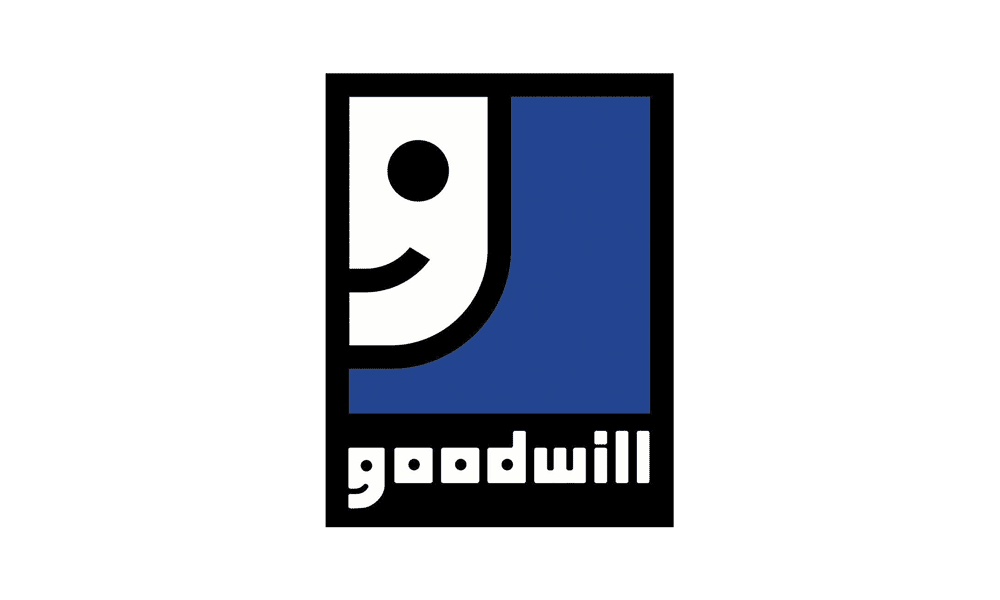
But that’s not an evil smile!
By adding a smiling face in their logo, and again in the word ‘G’, they represent the feeling of someone who donated something.
Similarly, they can also point at those beings who receive the donation from their platform and now feeling gracious for being in their contact.
This is a smart option to add positive hidden messages in logos and to promote a cause right from the logo they use for public representation.
Product Versatility
Sometimes, the brands intend to brag about their vast offering and wide range of product catalogue, and they do it right with their logo.
In our list of logos with hidden meanings, we chose Amazon that uses an orange arrow in its typographic logo.
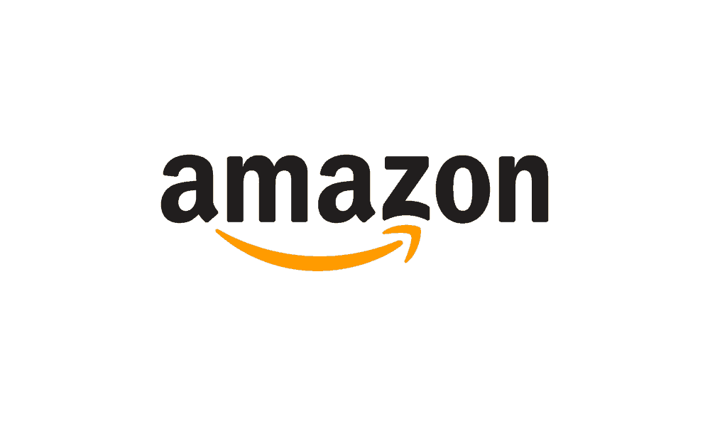
Have you ever noticed why the arrow doesn’t cover letters ‘A’ and ‘N’ but point letter ‘Z’ instead?
Nope, they didn’t do it by mistake; in fact, the letter’s length is kept short on purpose.
By doing so, they give out a message that Amazon offers every product in alphabetical order (from A to Z).
And they broadcast a message that they’re the prime source of online shopping worldwide, too.
Which is why we added the famous Amazon logo design in our list of logos with hidden meanings.
Typographic Expressions
Sometimes, the prime objective is to make the customer memorise brand name.
So, brands turn to typographic expressions to achieve this purpose.
They infuse the alphabets very creatively in the logo that everyone, who’d see the logo, will recognise them instantly.
Example? We’ve got two most relevant examples of one of the famous brands!
Let’s talk about LG’s logo that might look like a winking face, but it includes the letters ‘L’ and ‘G’ in their logo.
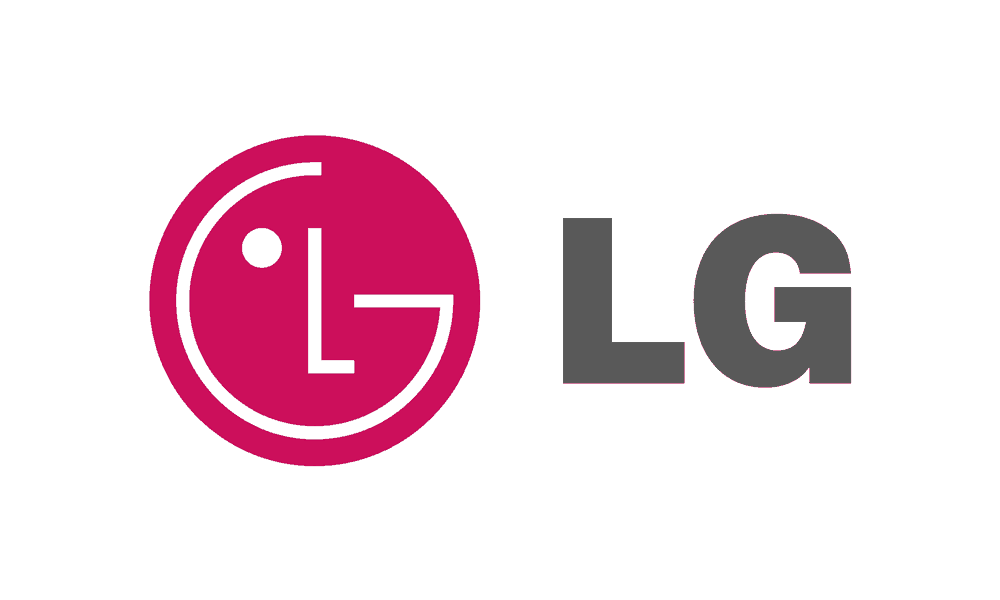

LG is one relevant example to suggest how brands use hidden messages in logos.
At one hand, they create a memorable impression with a winking face and at the other hand, they include their name’s initials.
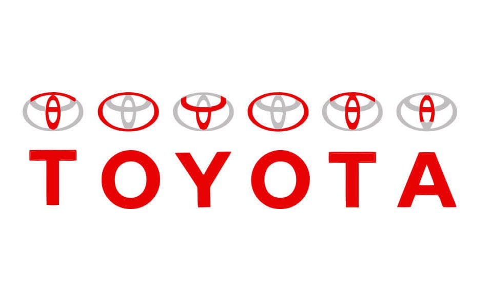
Another famous brand that used its logo as a medium to promote its name is Toyota.
You might think they use a globe in their logo design for company representation, but that’s not a case.
They, very smartly, included their whole name T-O-Y-O-T-A which is why included them in this list of logos with hidden meanings.
Product Representation
Some famous brands tend to focus on their products that including a social message as Goodwill did with its logo.
They, very creatively, relate their logo with the number of products they offer.
In the list of logos with hidden meanings, a good example is of Baskin Robbins that has a very funky logo that includes its initials, i.e. ‘B’ and ‘R’.
We scanned through their logo and found something exciting.
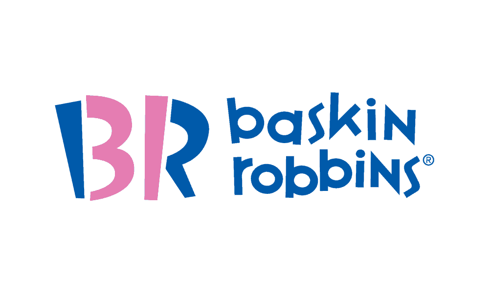
Just tell us how many flavours do they offer of their trademark ice-creams and smoothies?
If you calculated it right, the answer is number 31.
What if we tell you that they are conscious about their products and they want to brag about their famous number 31 so much that they included it in their logo design?
Yes, if you look closely at the Baskin Robbins logo and divert your focus in the centre, you’ll be able to identify the number 31 in their logo.
According to Baskin-Robbins, they chose 31 so customers could try a different flavour every day of the month. – Considerable
Creative Delusion
We talked about LG and Baskin Robbins, who very smartly added a specific number or alphabet in their logos.
The trend of hidden messages in logos is used to create a buzz, too.
Sometimes, companies hire a creative genius who can infuse almost anything, such as the Toblerone logo design.
The trend to use hidden messages in logos is not limited to reveal product lines but can be used to relate the brand with a famous place.
One such example is of Toblerone that we added in our list of logos with hidden meanings.
The company was started in Bern, Switzerland, that is famous for bears.
What they did to their logo is they kept a significant shape in it that relates with the city.
Look closely and see if you can spot a bear very creatively added into the mountain of the logos?
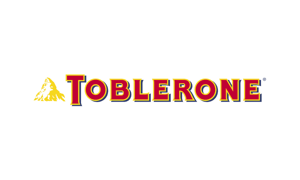
This was the strategic step that the company took for relating it with the city of their origin, Bern.
Where, at one hand, they relate their logo with the colour of chocolate, they also develop a connection with their roots that is in Bern, Switzerland.
Business Values
Speaking of hidden messages in logos, businesses also tend to include a business value or a promise that they made to their consumers.
For any company, it is crucial to stick with specific values that differentiate it from the competition.

To have a positive image of the company or its motto, some brands use their logo for the depiction of what they feel or how they operate.
We all know Hyundai, a renowned automobile company, that has an exciting logo. But very few of us ever pondered why the initial ‘H’ is in italic?
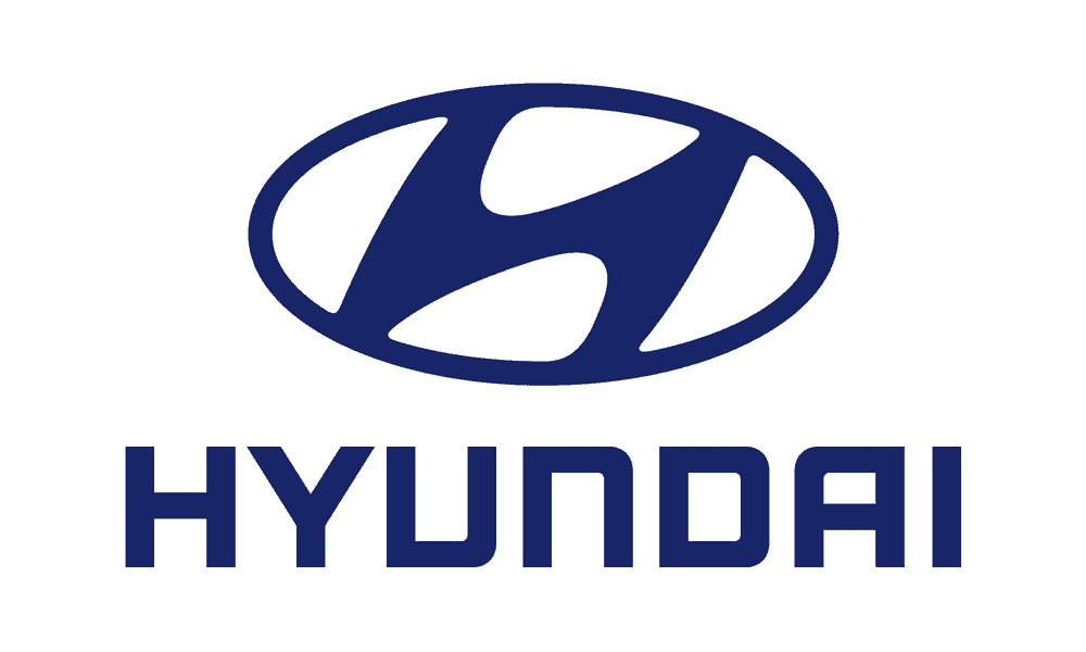
This is not an ‘H’ but a creative depiction of two men shaking hands which denotes to the quality of trust.
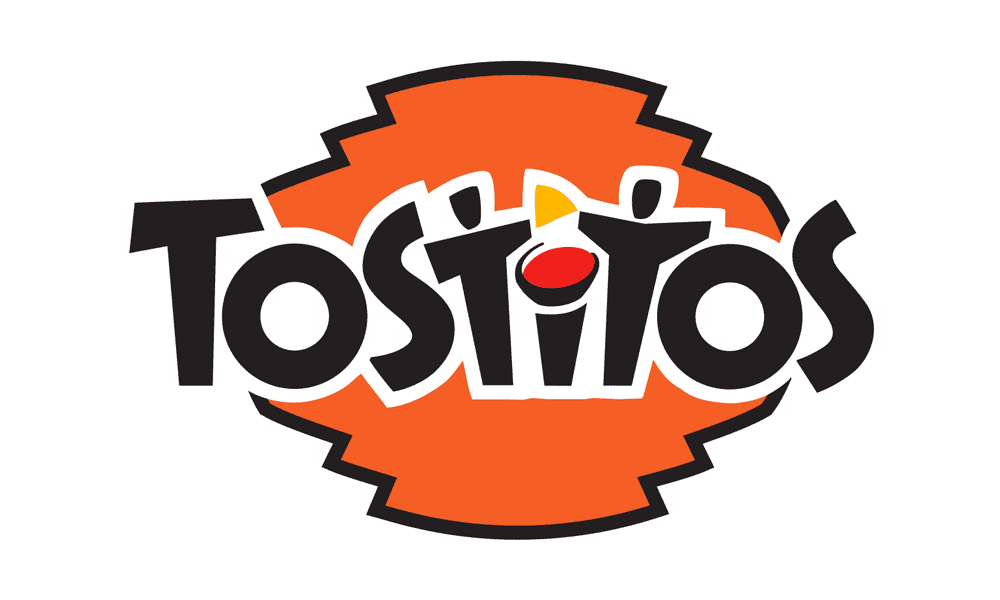
Another example is of Tostitos that has a typographic logo.
This delicious snack also used its logo to display one of its business values, or we should say a positive habit?
Look closely, and you’ll note two people standing in the middle and exchanging the snack (most probably the Tostitos).
They displayed their snacks as well as promoted this habit of sharing good food with others, too.
Routine Objects
Sometimes, these brands tend to play more careful by incorporating the hidden messages in logos.
They not just have a marvellous logo for their business representation but also connect it with something related to their business.
You’ve seen the BMW logo design.
What’s the white and blue space in its logo?
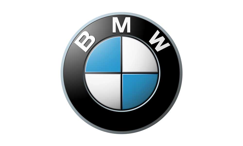
Don’t you think that it is a propeller that is mostly used in aeroplanes? It’s exactly that!
If you read about BMW, you’ll discover that they started as an aviation company and gradually moved to automobiles as this industry grew popular.
Though they stopped manufacturing aviation parts, they still carry something relatable from that industry in their BMW logo.
Languages
Do you know a company that is in love with complex languages? We do!
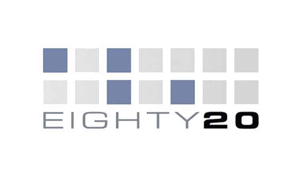
We all know the famous management consultant agency, Eighty20.
This Cape Town-based agency has a bizarre but interesting logo.
Can you see the grey and blue dots in its logo and tell what exactly they are?
They’re the binary language that denotes the values 1010000 and 0010100.
Don’t ponder too much as these 0-1 values are Eighty20 in binary language.
Sometimes brands use convoluted language, too, for incorporating hidden messages in logos.
Targeting Competitors
We’ve seen brands fighting and humiliating their competitors via TVCs but have you heard about their being witty with their logo by adding hidden messages in logos? Let us tell you about one brand that does!
It is not too long ago when Facebook launched its Facebook Places.

What’s interesting about its logo is that it has a map with a pin location, right?
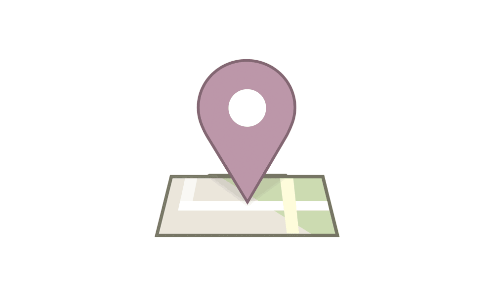
What if you look closely and see something even more impressive that pokes at its competitor, Foursquare?
The brand’s logo has a hidden four very smartly infused in the pavements that can be a way to tease its competitor, Foursquare.
Service Qualities
Next, in our list of logos with hidden meanings is FedEx which is very competitive about its business qualities.
They are hellbent on setting themselves as a company that offers quality services in FedEx is one of them.
The company is famous for its global shipping capacity and minimum delivery time.
What’s more interesting is that it displays its commitment for fast delivery via the negative space in its logo.
How?
Look closely, and you’ll see an arrow between Fed and Ex that denotes the company’s quality of continually working.
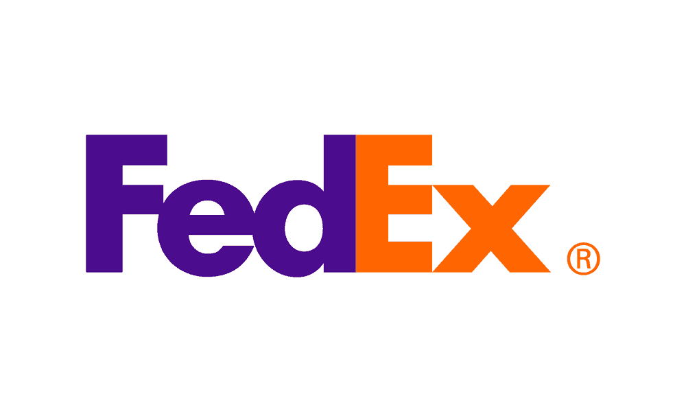
As Matthew May said in The Laws of Subtraction, “Nearly every design school professor and graphic designer with a blog has at some point focused on the FedEx logo to discuss the use of negative space.” I recently pointed out the arrow to my five-year-old daughter and blew her mind. – Mental Floss
Maps And Geographical Locations
Sometimes, the inspiration can come straight from the city of origin for big brands.
The same is the case with the Museum of London and Hope of African Children Initiative.
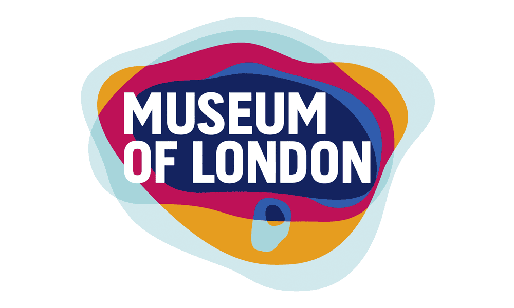
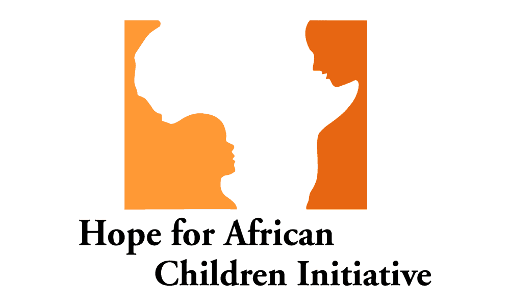
Though both the brands work on a different objective, there is one similarity when we talk about their logos.
Both the famous brand logos include a map of the city or the country, respectively.
Upon looking closely at Museum of London’s logo, you’ll discover that it includes the city’s map.
And HACI’s logo has an abstractive shape of Africa’s map, too.
Gadgets
To use hidden messages in logos, brands use gadgets, too, in their logo design.
We selected Northwest Airlines to prove our point!
Its logo has both the initials ‘N’ and ‘W’, but when you look closely in the logo, you’ll discover both the alphabets are pointing in their respective direction.
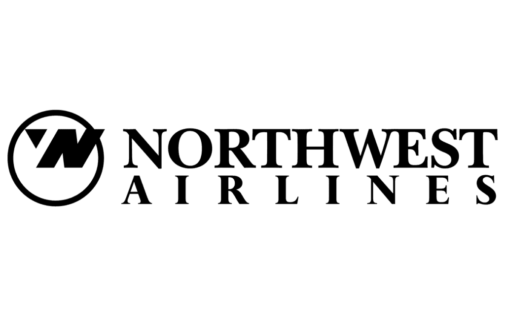
And the circle of their logo forms a shape of compass pointing in the northwest side.
This, frankly, is a smart act that they used for adding into their business logo.
We hope that you’ll find this list inspiring and ideas-oriented when having a new logo for your business.
Comment below and let us know if we missed an exciting brand with creative logo design story.

Author Bio: A creative designer and writer par excellence, James Warner is amidst the finest creative designer and writer at FullStop – a logo design company based in New York, USA. Possessing immense talent in both his fortes .i.e. designing and writing. If you truly want to enlighten yourself with industry insights and useful graphic design content, do subscribe to his blog.