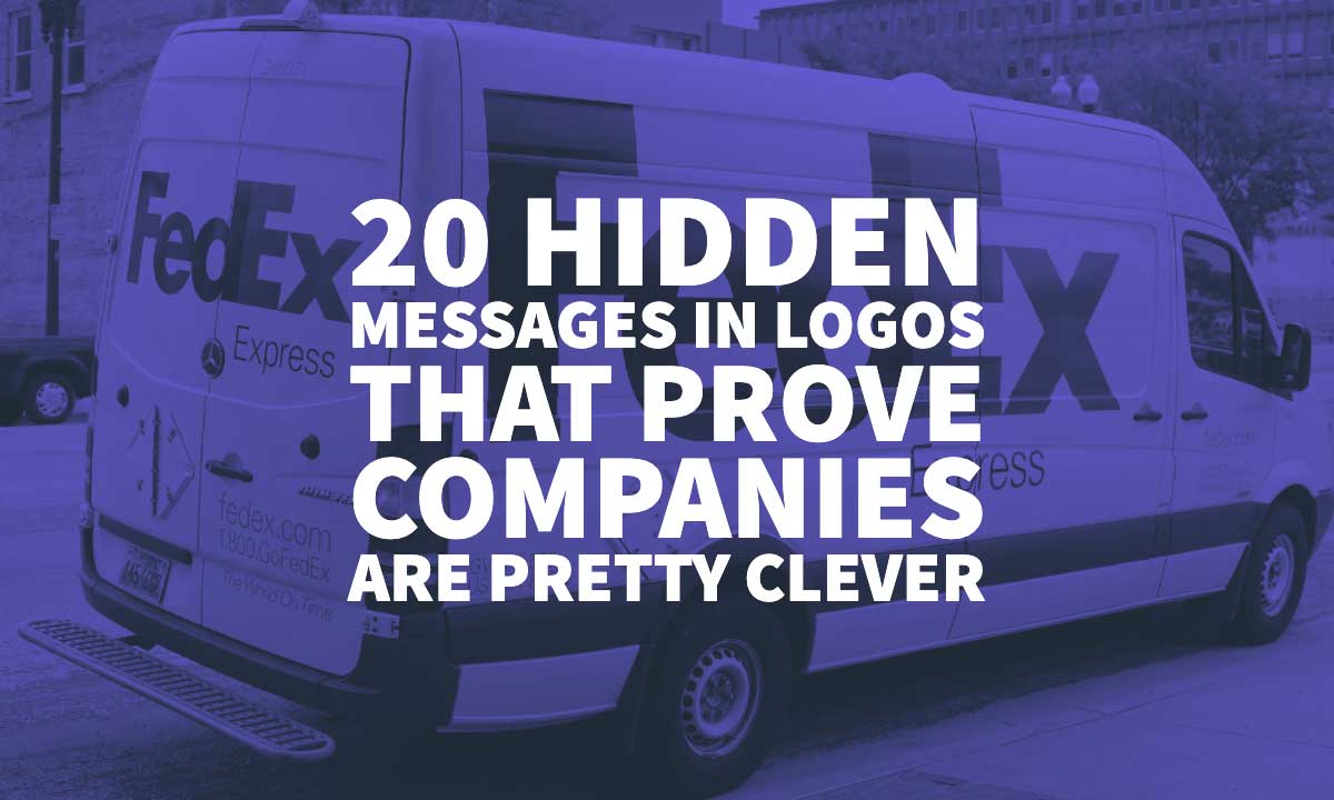
27 Jun 20 Hidden Messages in Logos That Prove Companies Are Pretty Clever
20 Hidden Messages in Logos That Prove Companies Are Pretty Clever
Logo Design is always considered a talent and a piece of art.
Good logos are essential in marketing to create brand awareness.
Logos represent the brand identity and are the most critical part of corporate branding.
The effects of a good logo reflects directly on your brand perception.
It is a graphic representation summarising your brand idea in a manner so that people can remember your brand.
Logos can be in figurative, graphical or in a text form.
It is often used as a synonym to trademark or brand.
The contemporary logos are the combination of symbols, icon and text.
The combination and ideography is a crucial part when it comes to website designing and the creation of logos for different companies.
The nature of the business also plays a vital role while designing logos for brands.
Colours are a critical element because of human visual perception and brand differentiation.
Different colours association and combination must be according to the brand, also keeping the social and cultural norms in mind.
Many big companies use logos with subliminal messages in it.
They pay a significant amount of money to the advertisers, creative designers and psychologists to envision their brand into a hidden message that can make their logo more than an image.
We had made a list of some 20 brands that use some hidden messages in logos that can leave you enchanted.
Need help with Logo Design
Get a FREE quote from a Professional Today
FedEx


The logo of FedEx is one of the best-known logos in the world.
If you look closely, there is an arrow between E and X.
Since FedEx belongs to the logistics industry, this arrow depicts the speed and precision.
Interestingly, FedEx had managed to keep their creativity and meaning alive even when the logo is translated in Arabic.
The Arabic logo is designed in a manner that the arrow is moving backwards.
This is because Arabic manuscript is read from right to left while English is read left to right.
Amazon

Amazon is the highest ranked company in the world, and their logo has also managed to grab their customer’s attention.
The Amazon logo has a logo starting from A and ending at Z.
It does not only represents the smiling face or happy customers at Amazon, but also represents the brand that Amazon has everything starting from A to Z.
It shows they sell everything at Amazon; you will buy everything here even if you do not need, so spend enough and you can qualify for free shipping.
Baskin Robbins

The famous ice-cream chain that is loved by every ice cream lover.
So here your favourite scoop chain logo says a lot.
The B and R of the Baskin Robbins are in a manner that depicts the 31 flavours available in their parlour.
Their famous three flavours have a concept that the customer can try each day a new flavour. Isn’t that sweet?
Tostitos

While eating your preferred tortilla chips, you haven’t noticed that the logo of Tostitos has something crazy.
If you look at Tostitos Logo carefully, you will notice that “TiT” is designed in a manner that two people are partying and sharing chips; you.
Also, the dot of I is a sauce in which you can dip your chips and have fun. After this, I want to party enjoying my Tostitos with the dips.
Le Tour de France

Le Tour De France’s logo is designed in such creativity that “O”, “U” and “R” of the logo represents the cyclist coming towards a yellow dot.
The yellow dot represents the Sun forming the world.
The O is designed as a vehicle of the cycle, U depicts the seat and R is the depiction of a person.
Hershey’s Kisses

Do you want an extra kiss? Well, you cannot have that in reality, but at least you can have one virtually.
The famous chocolate brand Hershey’s kisses logo is designed in such a manner.
If you look at the name, the space between “K” and “I” makes the packaging of the Hershey’s chocolate. A treat for the chocolate lovers.
SONY VAIO

VAIO which means the Visual Audio Intelligence Organizer and is known best for its technology.
No doubt, its logo also has a hidden meaning that perfectly depicts its brand.
It is the integration of both the digital and analogue technology that brand is comprised of.
The letters “V and “A”, are created as a wave which shows the analogue nature of products and the letters “I” and “O” represents the binary digits 1 and 0.
This shows the digital nature of the products that the company is selling.
Picasa

The world’s most prominent photo editor and organizer by Google’s logo at first glance looks like a camera shutter, but it has much more subliminal message in it.
If you see the negative spaces carefully, it makes an image of a home.
This is because of the word “CASA” in Spanish means home and also Picasa significant as the home of all your pictures at one place.
This has definitely a deep meaning.
MyFonts

MyFonts is the Font House of many of the stylish font resources that the customers can access.
However, if you look at the My Font logo, it has some more than simple text in it.
The “MY’ of the My Fonts is styled as a hand, which has a meaning that the customers can get their hands on any kind of font they want.
LG

LG is one of the most recognisable brands in the world.
Most of the people recognise this brand with the letters L and G.
However, what people do not notice is that the brand had created a human face in their logo using these two letters.
The “L” depicts the nose of a human and the G makes the rest of human face shape.
It makes the brand more customer friendly and inviting giving it a human element touch.
Carrefour

The literal meaning of the Carrefour in French is “crossroads”.
The logo of Carrefour has two arrows one on the left and one on the right.
Using the white spaces effectively, the logo shows the initial of the company which is “C”.
Audi

Audi is one of the biggest automobile manufacturers in the world.
The logo is created in a manner that depicts the company history.
The four rings in the Audi logo specify that four companies were integrated to make a single company which is “Audi”.
It also shows the union between the automotive industries.

There is so many time in a day when the Google logo appears in front of our eyes.
Because these days Google is everywhere.
One of the largest tech companies in the world has a hidden message in their logo for you.
Instead of having complicated symbols, the Google logo can simply rely on colours.
All the colours used in the logo are primary, but one green secondary colour, which shows that the company believes in things unique but straightforward as well.
Also, this shows that the company do not believe in playing with rules instead of having fun in the working environment.

The social media app that allows users to pin images and information on the wall has designed their logo also depicting the same.
The “P” of the Pinterest shows a thumb pin that you use to pin things at billboards.
It means that you can also pin things virtually like you do on the billboards.
Adidas

Adidas is one of the world most vast shoes and Apparel Companies for sports people.
The stripes in their logo have always been given attention that what does it mean.
The stripes in the Adidas logo are stylised as mountains which shows the obstacles and challenges that athletes face and come over it.
Hope for African Children Initiative

Hope for African Children Initiative is a program that is focused on children’s care, migration and health-related issues on HIV disease.
Providing them primary health care to children who have HIV and providing them with legal support throughout Africa.
The logo of Hope for African Children Initiative has a strong emotional appeal that will melt your heart.
Looking the logo at first glance shows the white space which is effectively used as the map of Africa continent depicting geographical boundary.
However, if you look at the coloured part of the logo, it shows a child and mother relationship looking at each other.
This bond is enough appealing to melt your heart and donate for the funds!
Unilever

One of the biggest companies in the world Is Unilever, selling numerous brands under one tree.
The logo of Unilever is a big “U” created that it consists of the symbols of all the products that it sells.
It includes some icons that show different product categories like ice cream brands, clothes representing laundry products, hands representing the soaps and many more.
In total there are 25 icons in the collage in which some shows product categories and some of their core values.
Wendy’s

Wendy’s is a fast food restaurant company, and their core value is serving food that is fresh and like home-made.
Wendy is depicting a young girl, but if you look closer to the girl’s collar, it is written “MOM” on it.
It means that it gives you a feel of food made by your mother and home-like feeling.
Nintendo GameCube

The GameCube has an exciting logo.
At first sight, it just looks like that it is a cube but if you have a closer view you will see that the cube is created in a way that it makes the letter “G” and the negative spaces make the letter “C” which are the initials of both words.
Beats

The Beats logo is simple yet attractive.
The “B” is enclosed in a circle, which shows the human mind and the B shows the headphones.
It gives the personal attachment from the brand to the consumers imagining themselves in headphones.
What other hidden messages in logos have we missed? Leave a comment below to let us know.