16 Mar 20 Innovative Signage Ideas for Small Businesses

20 Innovative Signage Ideas For Small Businesses
Signage techniques have been used by designers and marketers alike, thanks to their impact on your signs’ performance.
But to make your signs work, it’s worth looking at these innovative signage ideas for small businesses and how to apply them to your signs better.
What Is Signage?
Signage is a concept used in visual design and marketing.
To put it simply, when a sign is created – especially one to be used offline – it can stand out or look plain depending on the designer’s approach.
In the first case, when it stands out, it will most likely be using different signage techniques to make the sign the best it can be.
The essential principles of good signage are pretty simple.
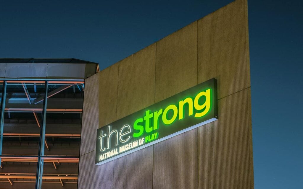
Your sign must be readable even from a distance, it needs to be placed in a visible place, and it should stand out both during the day and at night which likely means it has to be lit.
But to make your signs even more impactful, you need to take a more creative approach and use these signage ideas:
#1 Visibility

First of all, you need to think about the visibility of your sign. How visible is your sign to your target audience?
Suppose you want to have passersby visiting your café immediately as they see the sign hanging right by your café entrance.
In that case, you should make your sign visible specifically for them to see.
Remember your target audience when working with signage because these people are the ones you want to get to, precisely why it is crucial to reach them rather than anyone else who actually won’t be interested in your business.
#2 Readability
Readability is also an essential aspect of signage.
How much your sign is readable will influence how easy it will be read and remembered by your target audience.
If the words you use are too complicated or rarely used, you might find that many of your potential customers don’t understand what your sign means.
Likewise, readability can also depend a lot on how you place the text on your sign.
However, it’s still important to remember that readability is primarily dependent on the terminology and jargon you use to communicate your message.

#3 Clarity
Clarity is an aspect that is often overlooked by marketers in favour of the sign’s attractiveness.
Of course, having something bright can help your sign get noticed easier and attract more attention to it, but once the person starts reading the sign, they might find that the text isn’t clear at all because of all the brightness.
That’s why clarity is so important.
Your target audience must be able to see clearly what your sign says – otherwise, you may end with a reduced number of customers just because your signs aren’t clear enough.
#4 Identity

Your brand’s identity already plays a significant role in your marketing campaign, but it should also be front and centre for designing your signs.
After all, the way you use signage should align with your brand’s identity, even if you own a small business.
The best way you can go about the whole thing is by remembering your brand’s values and its main characteristics.
Then, you can implement these into the signs you create for your small business.
#5 Colour
When it comes to design, it’s important to remember that colours are more than just a technical element.
Colours can evoke emotions and feelings in your target audience on a subconscious level allowing you to influence your potential customers even before reading your sign.
But before you jump right in and start choosing every other colour that goes through your mind, it’s worth taking a step back and remembering what your brand’s identity is.
This will help you choose colours for your sign with more precision.
#6 Contrast
Even as you choose the right colours for your sign, you need to remember such a thing as a contrast.
Contrast is what makes the correct elements in your sign’s design stand out, while others can stay slightly hidden.
Using contrast correctly, you will attract your audience’s attention and then focus it on what matters the most.
Such focused attention will help your target audience also remember the information from your sign easier.
#7 Font
While colours and contrast are essential for your sign’s design, the font you use is essential for it, but it is particularly essential for your sign’s text.
Much like all of the elements discussed previously in this article, the font you choose needs to correspond to what your branding is like already.
For example, if your small business uses a classic look in its design (e.g. you are using Times New Roman or a similar-looking font), you should stick to the same font for your sign – or, at least, a font that is similar in its look.
#8 Boldness
Once you have chosen the font you will be using, you should also think about its boldness.
To an extent, this is particularly important for the contrast you create in your sign, but it is also crucial to look at boldness as a particular characteristic of your sign.
What this means is that boldness can only improve your design if it is already good.
Simultaneously, some fonts don’t look good bold, so you need to experiment and see what works and what doesn’t before you stick with boldness.
#9 Wording
As mentioned earlier, the words and phrases you use will significantly impact the clarity of your sign.
However, there is another thing to consider when choosing the correct words for your text – and that is, precisely, the wording.
You should worry about the complexity of the words you use just as much as about their undertones.
Certain words can have different meanings, while others can have negative connotations to them.
All of this should be kept in mind when creating your sign.
#10 Clutter

Directly related to clarity, the amount of clutter in your sign can significantly undermine the impact it could potentially have on your target audience.
It’s always essential to choose the best of the best from your design and text – and then cancel out everything else.
As Catherine O’Connell from the paper writing website reviews site puts it, “clutter is something every marketer and designer is constantly fighting with. If there is clutter, it usually means that it should be eliminated right away, as swiftly as possible.”
#11 Balance
It’s kind of difficult to explain precisely what balance means.
The whole concept of balance is about making your sign look good by ensuring that its different elements create a well-balanced picture when put together.
Balancing your sign may take a while if you want to include much information on it, but it’s worth remembering that the simpler you make the design and the text, the easier it will be to balance the sign in the end.
#12 Angle
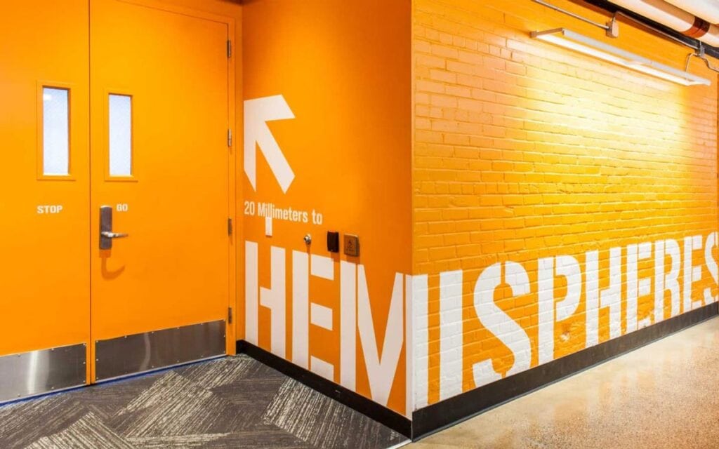
Something many marketers seem to overlook or underestimate is the angle of the sign they are creating.
To put it simply, the angle of your sign is just what it sounds like – it’s the way the sign looks in its static form.
Most signs are placed straightforwardly with no particular angle, but if you want to make your sign stand out, you should consider changing its angle a bit because that might help your sign get more attention.
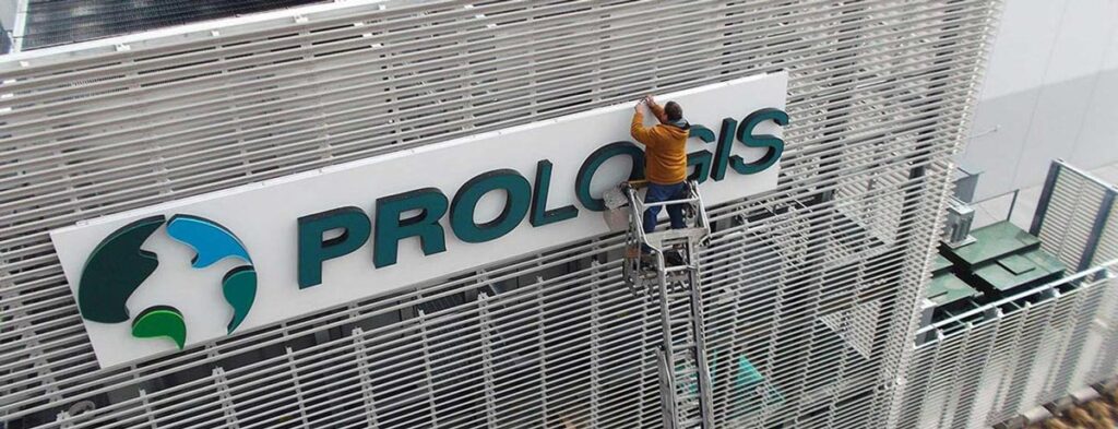
#13 Visuals
For some signs, you might decide to use visuals, i.e. images or graphics.
Logically, not all signs require these, but visuals are still important, particularly for more considerable signs or signs with more information.
The visuals you use can range from simple pie charts to beautiful photography, but they should always correspond to the sign, its message, and your brand.
If you happen to use something that doesn’t fit, your sign won’t work the way you want it.
#14 ‘IT’ Factor
Much like balance, clearly explaining the ‘IT’ factor is difficult.
More often than not, the ‘IT’ factor is what makes your potential customers stop, read the sign, get interested, and do exactly what you want them to do – enter your café, visit your website, and so on.
In this regard, the ‘IT’ factor makes your sign unique and makes it work (because your sign can be unique, but it may still be unable to do what it should do).
Having an ‘IT’ factor for your sign is similar to having a selling point for your products.
#15 Purpose
The purpose of your sign might not be apparent to your target audience right away, but it should always be clear to you.
After all, this is the only way for you to know for sure that the message you want to be sent to your target audience through your sign gets through.
The purpose of your sign can be anything from getting more exposure or visibility to your small business to attracting more customers to your café.
Whatever the purpose is, all of your sign elements should work together to serve that purpose.
#16 Scale
Your sign’s scale refers to its size and the size of the different elements on your sign.
When it comes to the scale of the elements, it’s worth remembering that balance comes first and foremost in this sense.
But when it comes to your sign scale, you need to keep in mind where you will place the sign and what purpose it serves.
Of course, if you are already designing a sign with a particular format in mind (e.g. a billboard), then the scale will be much easier to choose – it will correspond to the format.
#17 Location
Speaking of where you will be placing your sign, its location is something you will probably think about after you have finished designing the sign – but you should think about location much earlier.
If you know where precisely you will place your sign, you might interact with your sign’s surrounding elements, i.e. its environment.
Arrows can point in a specific direction, while things around the same could make a bigger picture when combined with your sign’s visuals.
#18 Materials
The materials you use for your sign will impact how long your sign can stay up.
For example, if you want to sign up for a year or more, you will need to use materials that can last this long. Moreover, some materials may look brighter than others allowing you to attract more attention.
For simple signs and are meant to be used primarily in the dark, you can consider using neon, especially if it fits your brand image.
#19 Cost
Depending on the materials you use for your sign, your sign’s cost can go up or down.
Always keep in mind your budget so that you don’t accidentally end up spending more than you can afford to.
If you want to make several absolutely the same signs, you will save some money (as opposed to making several different signs).
#20 Updates
Last but not least, you should never underestimate the power of updates.
Updating your sign can help you give it a fresh look and attract local audiences used to the old sign and ignore it regularly.
This fresh look might also end up being better and more effectively for achieving your marketing goals.
Final Thoughts
To sum up, using signage ideas from this article to create your signs can significantly increase your small business’s visibility and promote it more effectively to your chosen target audience and beyond.