09 Oct 5 Packaging Design Tips for Better Branding
5 Packaging Design Tips for Better Branding
No matter how slick you think your company’s product packaging looks, there’s always room for improvement.
Considering how much hype the unboxing experience carries these days–over 90,000 people search for unboxing videos on YouTube every month–there’s reason to iterate on how you brand yourself on the boxes and labels that cover your product.
While building a brand involves a lot of different elements, nailing your packaging is a crucial part of it.
Here are six packaging design tips to improve your branding.
1 – Keep Your Online and Offline Branding Consistent
Tinkering with your aesthetic is all well and good – that is, until your social media doesn’t match up with your website at all.
Keeping everything consistent and updated is an integral part of maintaining your brand, and that includes your website, social media, and packaging designs.
When you audit your packaging design, the best place to start is arguably not with your packaging, but with your website.
Is your branding consistent there? For customers that place their orders from you online will expect your packaging to be consistent with the branding of your website.
If you’ve tweaked your logo recently, check to make sure it still fits in with the rest of your designs, both online and offline.
Go through all the design elements of your website: colour palette, motifs, fonts, watermarks, any visual branding cues connected to your business.
When you start redesigning your packaging, having an up-to-date rundown of all the various design elements of your website will prevent inconsistencies from arising.
2 – Add Branding to Generic Components
The more you add your own brand’s flair to components of your packaging, the more cohesive it will look and high-value it will feel.
Consider doing some light assembly or kitting and adding your branding to unbranded materials.
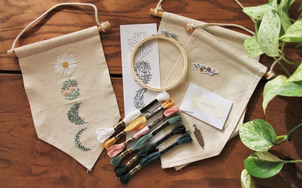
For example, Etcetera Embroidery sells embroidery kits on Etsy, where the pattern design is proprietary, but all elements of the kits are acquired from elsewhere.
The thread is already branded, but needles come loose and unbranded from the factory.
This is a branding opportunity: Each needle is sealed in a small envelope with a label (“needle inside”) that matches the font in the logo.
Little touches like that can make a kit, which is essentially just a pile of raw materials, feel more unified and on-brand.
3 – Let Your Logo Breathe With Negative Space
While it does depend on your brand’s niche to a certain extent, a good modern logo is not overcomplicated with design elements.
An excellent simple logo will be instantly recognisable and utilise negative space to make more of an impact.
On a branded package, a simple and straightforward logo will stand out more than a visually cluttered one.
Think about the Chanel logo. It’s simple, instantly recognisable, and easy to incorporate into all of their branding and products.
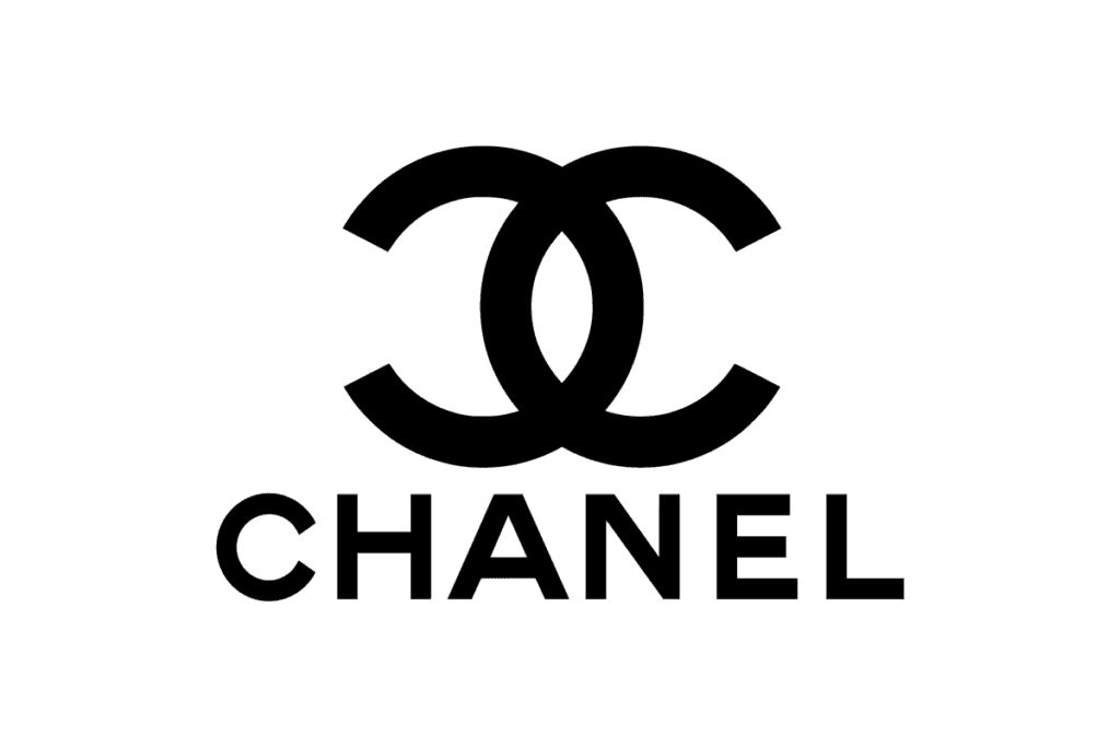
Logos like that serve so many different purposes and can become an iconic design element in their own right.
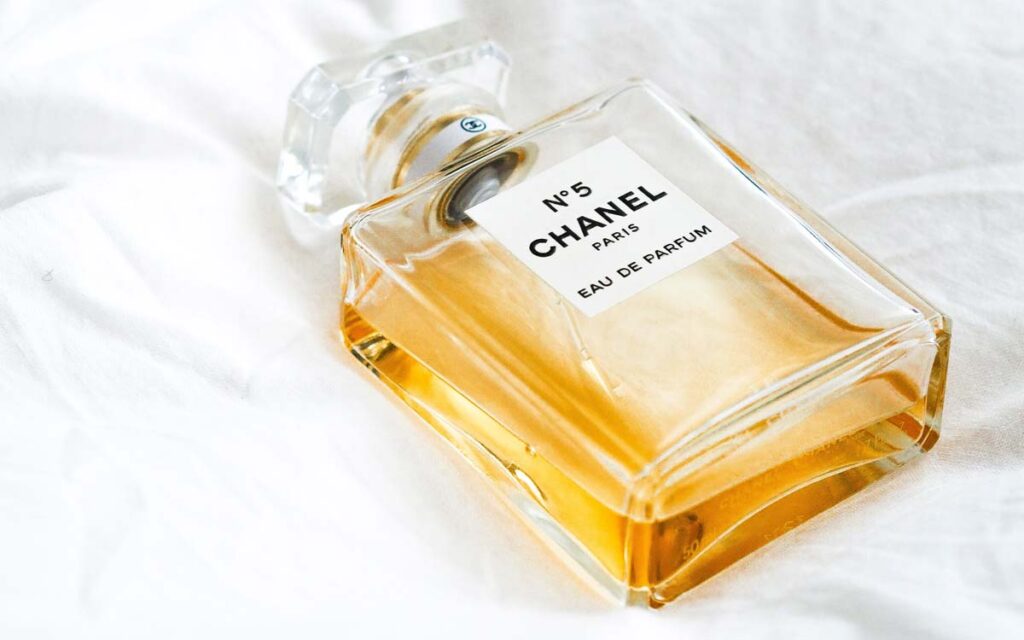
Chanel’s legendary No.5 perfume is a classic example of branding going further merely by doing less, not more.
Both the design of the crystal bottle and the labelling of this perfume, in existence since 1921, have hardly changed.
It’s a testament to the timelessness of understated design when it is executed to perfection.
4 – Use Compostable, Recyclable, and Reusable Materials
Here’s a hot take: eco-friendly packaging can no longer be viewed as a trend.
Trends rise and fall in popularity while being eco-friendly is going to be an ever-important feature of just about every business’s future.
More people than ever care about the materials that are used to make product packages and are more likely to refrain from buying from companies that utilise single-use packaging.
Customers are searching for brands whose identity aligns with their own beliefs, and a brand that makes being eco-friendly part of their mission statement will draw in like-minded consumers.
For example, by using materials that can be recycled or that are made from recycled materials, you can support the recycling programs that already exist.
All of this messaging comes across in your packaging with minimal effort.
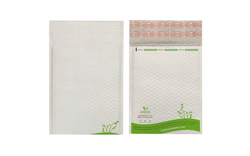
Kraft brown packaging already signals that the package is recyclable.
If you buy mailers from a company like EcoEnclose, they already include messaging about being made from recycled materials.
In the end, you can easily create a feel-good moment for your customer in the buying process, and provide a place for your packaging to be put besides the landfill.
5 – Distinctive Shapes and Colours Can Be Part of Your Packaging Identity
The colour of your packaging can be iconic in its own right.
Tiffany & Co has created a strong brand association with their distinctive turquoise-coloured boxes and shopping bags.
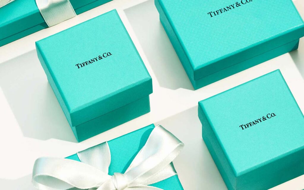
The colour is so well-known that their packages require little to no adornment (a bow being about the most you see when it comes to embellishment).
The colour of a package plays a role in branding, but so does the shape.
Protein shake company Soylent has done an outstanding job of documenting their numerous formulations in search of the perfect plant-based meal substitute in beverage form.
Their relentless iterative process manifests itself not just in the ingredients of their product, but in the design of the bottle itself.
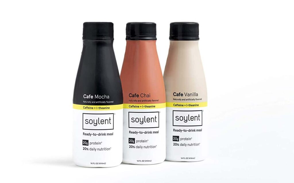
Admittedly, colour does play a part in the company’s distinctive labelling, but the shape of the bottle is arguably just as recognisable.
Either way, what you don’t want to have is packaging that is impractical, or has nothing to do with your brand.
You want the packaging to communicate on your behalf, and you want it to tell the customer what your company stands for.
Connect it to the story of your brand or the contents inside, and you’re well on your way to instantly recognisable packaging.
6 – Try Nesting Packages Together
People are really into the Russian doll effect, or nesting, when it comes to packaging.
There’s a practical reason for doing this: The extra stability, cushioning, and protection provided by an inner box offer more stability for exceptionally fragile items.
But it certainly adds a degree of excitement, something akin to that feeling you had on Christmas morning or your birthday as a child, when you open first one box and then another, the excitement building all the time.
There are many ways you can achieve this effect.
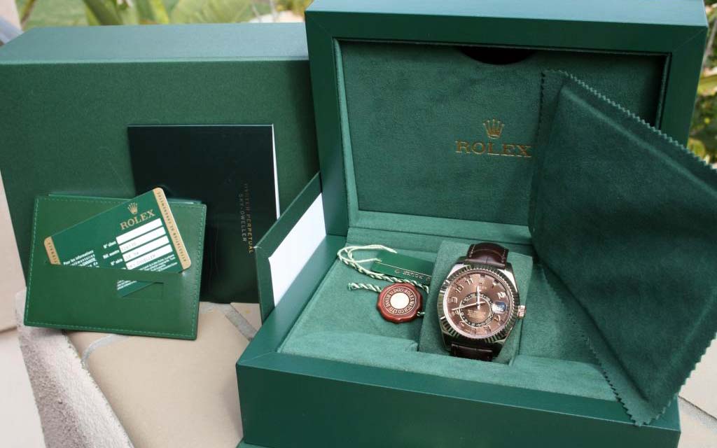
The first is to nest your product box into another box like Rolex does with many of their watches.
Another creative way to do this is to include a reusable bag, which is what luxury shoe brand Spier & Mackay do with all of their shoes.
While it may be less effective at protecting fragile items from bumping around inside the box, it still adds a fun “wow” factor and value to the unboxing experience.
More affordable than either nesting boxes or bags inside the external packaging but still capable of producing a bit of excitement is wrapping products in branded tissue paper.
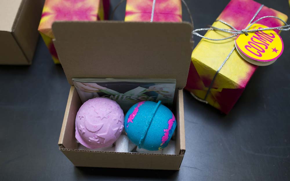
LUSH Cosmetics feature an incredibly eye-catching and exciting motif that give every single one of their products that Christmas morning/birthday/anniversary feeling of and joy and anticipation.
Either way, you can use nesting to create a memorable unboxing experience for your customer.
What Has Your Company Done to Improve Product Packaging Design?
There are so many ways to upgrade your product packaging so that customers feel a strengthened connection between the product itself and the brand appeal you’re creating.
Has your company experimented with these packaging design tips – or maybe tried something else?
If so, what kind of impact did it make?
Tips for Making People Look Inside The Box (With Examples)
Packaging design is a vital part of product placement and endorsement, as well as of a Branding process.
If you want your product to be sold well, producing goods of the highest quality is not enough anymore.
You need to intrigue your customers, get them interested in your product and be eager to buy it.
Due to the competition existing on the market, this task becomes three times harder to fulfil.
That is why you do not only compete regarding manufacturing or selling your services.
You also need to do all your best as for presenting these goods on the market.
The most significant help you may get in this case comes from sustainable packaging design.
Therefore, meet eight successful examples of excellent package design, along with some packaging design tips that will make you want to look inside the box.
1. Chocolates with attitude

Those who designed this packaging must be nothing less than real geniuses, and here’s why.
Not only did they create cute, creative enrober papers (which was half-way towards their success), they also made their design personal (which was a total win-win).
The first rule of every great business is its personalisation.
When you want people to buy your product, you need to create a secure connection in their mind between your product and themselves.
Because of this connection that consists of a wide range of bright associations along with things these people love and enjoy, you will gain loyal customers that prefer your product to anything else.
This very connection took place in this chocolate packaging creation.
Funny names of these chocolates appeal to people firmly and successfully.
So, the first of the successful packaging design tips is to “Make it personal!”.
2. Pizza Hut

A smart package design for Pizza Hut performed by Reed Collins deserves our admiration.
Pizza that turns into a projector.
It is a brilliant solution for a prosperous advertising campaign.
It makes you want to look inside the box.
Except for having a built-in projector, the box also has an artistic design
Captivating comics gain their second life on such packagings.
The pizza box becomes twice as attractive for curious people, especially if they are a few comic fans or just enjoy beautiful designs.
Thus, Reed Collins proves another truth in these packaging design tips: “Be as different and creative as you can”.
3. Aurora

In the Roman mythology, Aurora was the Goddess of the dawn.
She was the youngest and the most beautiful among the whole Roman Pantheon.
What’s more, one of the most beautiful phenomena in nature, polar lights, is also called Aurora, which emphasises its charm.
Thus, Aurora always stands for something unique, dazzling and elegant.
No wonder that the project launched by designer Ken Lo and called Aurora has managed to achieve such a superb success.
The packaging design looks quite simple at first sight.
No one can be surprised by a black box with sophisticated white lettering and astonishing logo design.
However, the real magic happens when you open the box.
It starts playing with all the colours of the rainbow, reminding you both of the polar lights and the Roman Goddess herself.
Though the initial plan was quite simple, its execution is ingenious.
Which brings us to the third of our packaging design tips: “Reveal the real zest at the end and impress.”
4. Touche Coffee

Packaging is a significant part of graphic design, and yet it is somehow different.
To make it even more distinctive, people try out different ways to attract clients’ attention.
The most efficient way is in making the product packaging as smooth as it can be.
Sometimes, the only thing you lack is the correct colour choice.
When in doubt, choose the colour that always wins: black.
Black packaging designs are proven to bring the most substantial profits.
They always look sophisticated and luxurious.
What is more, they do not need lots of graphic design elements to amaze others.
Touche Coffee packaging design proves this theory just right.
It looks great everywhere, starting with a banner or billboard advertisements and finishing with supermarket shelves, where such coffee packaging catches people’s eyes.
That is why the next of the vital packaging design tips would be “Make your design look sophisticated”.
Remember, people love perfection, especially if it comes to marketing.
5. Friends Forever

Many companies make the competition in your marketing sphere rather severe.
Packaging design is that integral part of the business strategy that can help you to cope with the struggle.
The label design created for the Russian Wine House, called “Friends Forever” is an example of the ways you can overcome your competitors.
The best thing about this packaging design is that it has an idea that connects all the marketing steps in one single unit.
Just think about it: the name itself (“Friends Forever”).
The tagline placed behind in Russian which can be translated as “Happiness is when you are surrounded by your closest people”.
The pictures of people who are lovers or friends on the label design, and the way it is all combined.
You will want to buy at least one bottle of this magnificent wine to share it with people you love.
You will want to give it to your closest friends because it includes messages like “I love you”, “I care about you”, “I need you”, “Thank you for being in my life”.
You will want to buy this wine the moment you see it.
Which is already a win-win situation for the company owners.
As you see, the next rule would be “Put a great idea behind your packaging design”, and it is critical not to break it.
6. Koronaki

People start caring about our Mother Nature more than ever.
That is why packaging design that does not harm nature has become more than relevant.
Lots of prominent companies have turned to eco-friendly packaging designs which got reflected in people’s perception.
For example, a world-famous cosmetics brand Yves Rocher has begun to notify people with the help of their packaging design, that it contains much less plastic.
That is why people who care about nature have changed their perception of this brand, as well.
The same happens everywhere.
Eco-friendly packaging designs become more and more popular.
That is why, if you want to show that you do care about people, use eco-friendly packaging design solutions.
You may do it in either ordinary or creative way.
Koronaki chose a more difficult path.
Instead of using just grey eco-friendly packaging, they decided to go with a half-wooden packaging.
No wonder, that with such attitude they managed not only to win more clients but also to increase their profit.
That is why another of our packaging design tips would be “If you can, think of going green”.
7. Meltz Chocolate

Do you know the feeling when your unconscious strains after something on the supermarket shelf?
You recognise you do not really need it, but you feel the desire to buy it.
There seems nothing you can do about it.
So you satisfy this desire.
This is what a great packaging design can do to people.
That is why it is so important.
That is why it cannot be omitted.
When it comes to the brand called Meltz Chocolate, it becomes clear that this company has fully grasped the concept of the packaging design and the way it should look.
They use a very unusual shape for their chocolate packaging.
The texture gets distinguished at once, and you might feel the need to touch this packaging design and feel this texture on your own.
Thus, the next of our packaging design tips is “Experiment with the texture and shape”.
The result might surprise you.
8. Warew

Every packaging design should contain one detail that attracts people and makes everything different.
It can be a strip of colour or a small visual.
No matter which detail you choose.
The main thing is what impact it has on your potential clients.
A clean and smooth design seems to be quite easy to create.
This, however, is only at first sight.
In fact, in this case, everything matters.
Not only the shape and the colour of this detail but also where it is placed and how this packaging opens.
Take a look at the design collection made for Warew.
Every single item of this set is a logical continuation of the previous one, which makes the brand so unique.
That is why our last but not least, a bit of advice is “Be special and consistent in your attempts to create a perfect package design”.
Concluding our Packaging Design Tips
As you see, the importance of packaging design cannot be exaggerated, primarily if we speak about its successful implementation.
If you think the idea you came up with is too daring, it will indeed work regarding design, for it was made to impress people and lure them into the world of marketing and advertising.
Looking for a creative packaging designer?
Get in touch today to learn more about our packaging design services in Belfast.