21 Oct 7 Different Types of Logos: Which Style is Right for You?
7 Different Types of Logos: Which Style is Right for You?
Logos are an essential aspect of branding.
They represent a business and are often one of the first things people remember when the brand name is mentioned.
Some logos have gone on to become iconic and develop their own value.
Some of the most successful logos include Nike ‘Swoosh,’ Apple’s half-bitten Apple, or Google’s multicoloured ‘Google/G.’
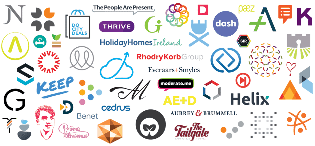
Many people admire and appreciate logos, but few really understand the underlying science behind them.
Business owners and marketers know how vital logos can be for their brand identity, but few take the time to understand the options available to them entirely.
In this article, we take a look at the seven different types of logos available and what you should know about them.
This will help you make the right decisions.
The 7 Types of Logos Explained
1 – Abstract Logo Design
Abstract types of logos don’t really make much sense when you first look at them, but they are connected to the brand.
They may have no clear recognisable shape and provide no literal interpretation of the brand.
One of the most recognisable abstract mark logos is the Nike ‘Swoosh.’
The swoosh is just a tick mark and can be interpreted in different ways.
It doesn’t blatantly tell people what it means but invokes certain feelings in people who look at it.
The Nike Swoosh is an affirmation symbol.
It conveys a message of strength, action, and possibility.
It represents movement and power, which is precisely what the brand wants.
Abstract types of logos styles can be challenging, but they can be rewarding if you don’t want to be constrained by one message.

It is crucial for such marks to be meaningful and impactful.
The message can’t be frivolous or random, it should be firm and conveyed clearly through the mark.
It is easier to find the best abstract mark for your company if you have a powerful sense of the brand identity.
For example, a fashion house with a logo that is monochrome, sleek, and has clean geometric lines will present an image of restraint, sophistication, and class.
The image conveys a theme and sentiment, which makes abstract mark logos very powerful.
2 – Wordmark Logo Design
This is on the opposite side of the spectrum of logos from abstract marks.
Wordmark logos contain only the company name in the logo.
This might seem like a simple choice, but it can have a significant impact and make your brand name really prominent.
The best example of the wordmark logo is Google.
The company’s logo has a clean and straightforward font that’s prominent and easy to read.
There’s nothing fancy about the placement or the font style.
The letters have different, bright colours that immediately attract attention.
The Google logo represents diversity and versatility while celebrating simplicity.
That’s exactly what the company wants to convey to its audience in it’s various types of logos.
It provides a wide range of services and applications but ensures everything is simple, clean, and easy to use.
You get the impression of Google’s overall casual but efficient vibe from the colourful logo.
When you use the wordmark logo, it is easy to get lost in the crowd.
Most people choose the wrong font and the wrong combinations to get the results they want.
This logo is ideal for self-employed professionals and companies that want to get their brand name out there.
It isn’t a good idea for companies with long names.
3 – Emblem Logo Design
Emblems have been around for a long time.
People have used these types of logos to represent different families, clans, dynasties, businesses, departments, and several other such establishments.
An emblem gives your logo a formal vibe and makes it look a little more professional.
They often include words, symbols, crests, and other such images.
The Starbucks logo is an excellent example of the emblem logo.
It features a picture and the company name in the company colours.
The logo is immediately recognisable, despite being upgraded several times over the years.
The Harley Davidson and NFL logos are also emblems with a strong brand presence.
They are intimately associated with the brand and appear very formal.
Details and intricate design are some of the signatures of emblem logos.
Experienced logo designers always lean towards clean fonts and precise designs, but emblems can be a little more complicated than that.
Emblems always have small details that are only noticeable when a person studies it carefully.
They’re similar to signatures and need to be as unique as possible.
Emblems are great for businesses who want to convey a sense of tradition and timelessness.
They look and feel serious, lending a sense of grandeur and luxury to your brand.
However, these types of logos aren’t easily scalable.
All their intricate details will become lost if they’re too small.
4 – Lettermark Logo Design
Lettermark logos are ideal for companies who have long names but want to shorten it for the logo.
They are also known as monograms, and they’re very memorable.
Some of the most prominent lettermark logos include HBO, which stands for Home Box Office.
BBC – British Broadcasting Corporation is also another example of monograms.
Monograms are also quite popular in the fashion industry and used commonly in their products.
Lettermarks are great for modern businesses because we live in times where people have limited attention spans and are easily distracted.
These logos also help you form a strong visual connection between the brand name and the customer.

Lettermark logos aren’t very effective if your brand isn’t well established.
It is a good idea to start with your company name mentioned in full below or above the lettermark.
You can slowly remove the company name when you upgrade the logo several years down the line.
5 – Mascot Logo Design
Mascot logos are some of the most effective logo designs because they are so memorable.
They add a great deal of personality and a human aspect to the logo, which makes them very appealing.
Mascots humanise logos, even if the actual picture includes a bear, fish, or even a peanut.
These logos can be expressive and flexible.
You can animate them, adapt them to suit different marketing campaigns, while still maintaining a strong brand presence.
One of the most well-known mascot logos is the KFC logo, which showcases the Colonel.
Cheetos has the Chester Cheetah, and Pringles has Julio Pringles.
Teams from different sports also have mascots in their logos.
Creating a mascot logo requires a little more thought and planning than regular logos.
You need to make sure the personality shines through and ensure the character design fits in with your brand.
The mascot logo is an excellent choice if you want to appeal to children, want to create a fun and casual brand presence, or want something that can work on several different platforms.
This isn’t the best choice for brands who want to present a serious and professional image.
6 – Pictorial Logo Design
A pictorial logo is often the literal visual description of your brand name.
These logos need to have a substantial brand presence and be iconic to be recognisable.
Pictorial logos often evolve instead of emerging from the get-go.
The Target, Adidas or Starbucks logo is an excellent example of this process.
It started with the circle, mermaid figure, and the company name surrounding it.
Not it only has the circle and the figure in a distinctive Starbucks colour.
Other examples of pictorial logos are often found in social media apps like Twitter and Instagram.
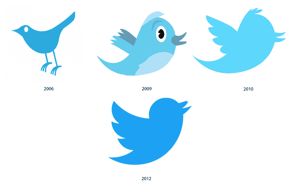
Both of them have a strong brand presence and showcase the identity well.
The Apple logo is perhaps the clearest and well-known example of a pictorial logo design.
It is just a bitten apple in a clean design.
Pictorial logos are great because they use the visual medium.
People respond well to pictures and remember them easily.
They are also very adaptable so that they can be used on different platforms easily.
It would help if you made sure the picture is a good representation of your brand and your brand name.
It should represent the personality of your brand well.
This logo isn’t the best option if you want to present a very formal and serious image.
7 – Combination Mark Logo Design
A combination mark is, as the name states, a combination of any of the above different types of logos.
You can combine different styles, like the mascot with a lettermark, or a pictorial logo with a wordmark logo.
There’s no hard and fast rule.
Just make sure your logo isn’t too cluttered, and people can see all aspects of it clearly.
A great example of a combination mark is the Dove logo.
It has the ‘Dove’ wordmark along with the Dove picture underneath or above it.
The Amazon logo has also evolved to become a combination mark with its distinctive orange arrow that connects the A to the Z.
This mark is very flexible because you can remove different elements of it and still maintain a distinctive brand presence.
For example, if Amazon removes the word ‘Amazon’ and still keeps the orange arrow, the logo still has a strong brand presence.
Similarly, if Dove removes the word and keeps the dove picture, the logo has a strong brand presence.
This might not be the best option for brands that focus on simplicity, but it is a good option for brands who want the best of both worlds when it comes to logo design.
An in-depth understanding of logos will you design one that fits your business perfectly.
This is an essential step in the branding process and can have a significant impact on your future visibility.
It makes sense to choose the right logo design from the get-go.
Wondering what types of logos you need?
Get in touch with a Professional Graphic Design Agency today!
Author Bio: Ayushi Choudhary is a Jr. Content writer working with Ethane Technologies. In her corporate life, she writes many blogs and articles on Web design and development, SEO, SMO and many more.
