12 Dec 8 Rebranding Examples Showing Superb Rebranding Strategy
8 Rebranding Examples Showing Superb Rebranding Strategy
Rebranding usually occurs when a business decides to change a significant element of its identity.
This change can include something as obvious as a new brand name or logo design, or something more in-depth like a shift in communication or new company values.
Whatever the reason for that change might be, a rebranding strategy is crucial for success.
A successful rebranding strategy can solve various problems and challenges such as stagnating business growth, change in target markets or expansion to new ones, unaligned management, confused or alienated clients, loss of competitive advantages, and so on.
With the right and complete implementation of a rebranding strategy, it surely will make a significant difference for a business.
We bring you eight rebranding examples of successful strategies that could inspire you to make these beneficial changes to your business.
1 – Made in Bhutan

Bhutan’s Department of Trade and the United Nations Development Program created a strategy called ‘Made in Bhutan‘ to define how to promote the country’s goods and services.
As Bhutan is not among the most popular tourist destinations due to developing economy and lack of infrastructure, this stunning Himalayan treasure is deprived of a status its neighbouring countries are enjoying for years now.
They created a unique philosophy called the Gross National Happiness Index.

The goal was to highlight the country’s spiritual values, authentic beliefs and stunning tradition.
With the unification of the country’s brand, all sectors have implemented this strategy to support Bhutan’s efforts in positioning the country on the map along with its neighbours.
To promote a country which was not successful when talking about tourism, highlighting its strengths and unifying them under a unique idea was the right strategy.
Bhutan is now known as a country of happiness and high-quality tourism.
2 – Coty Inc.
Coty has been present on the competitive fragrance market for over a hundred years.
When it acquired Specialty Beauty Business in 2016, it became the third-largest global beauty company.
To become the leader in the beauty industry, the company had to restructure and reshuffle 20,000 of employees under one, a new entity.
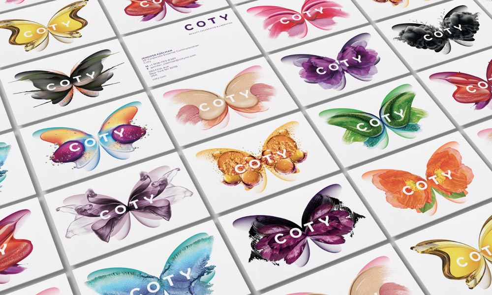
The rebranding strategy was based on the homogeneous representation of beauty.
The identity switched to joyful, colourful, and multifaceted to celebrate and liberate the diversity of beauty through the symbol of a butterfly.
These rebranding examples have given a completely new life to Coty by rejuvenating the spirit of tradition with a disruptive idea.
As any quality rebranding strategy of turning two brands into one, this one combined strengths from both brands to create an entirely new identity for both their employees and their target audience.
3 – Co-Op
In 2013, it was revealed that there was a hole of more than a billion pounds in the Co-op bank’s accounts.
The same year, the chairman of the bank at that time was caught up in a personal scandal.
All this caused a severe crisis for the whole Co-operative Group.
With almost two centuries of history, Co-op bank decided to adopt a visual identity that their customers would recognise and were happy to be a part of.

They rewarded its members with 5% on all purchases of their brand products in addition to the annual dividend.
The Co-op members also started receiving a 1% reward to donate to a local charity.
With such good rebranding examples and strategy, Co-op managed to set fundamental for their business with community projects instead of just supporting them.
The idea of tradition was highlighted with a new identity to remind their customers not just of Co-op tradition but of a familiar point in members’ lives.
4 – Airbnb
Airbnb was launched in 2008 as an online marketplace for people to list their owned or rented properties.
Regardless of its global success, it became pretty unclear what’s rentable and what’s not.
The company decided to rebrand by adding a new brand position and a new identity.
The old logo was replaced with a new one; they changed the brand font and created a bespoke colour called Rausch.
That colour was named in honour of the street where the story of Airbnb started, delivering the emotion and passion of the brand.
The new icon “The Bélo” highlighted four principles – People, Places, Love, and Airbnb, blended into a single “A” shape.
For Airbnb, rebranding meant to define a clear brand that would be understandable, approachable and attractive to its audience.
5 – Hewlett Packard Enterprise
The Hewlett-Packard Company announced it would split into two separate entities – HP, Inc. and Hewlett Packard Enterprise (HPE).
The latter included the Machine as a vision for their future of computing.
The Machine is designed to bring the promise of Memory-Driven Computing.
The rebranding challenge was to craft the vision, position and identity for the Machine and brand architecture around it.
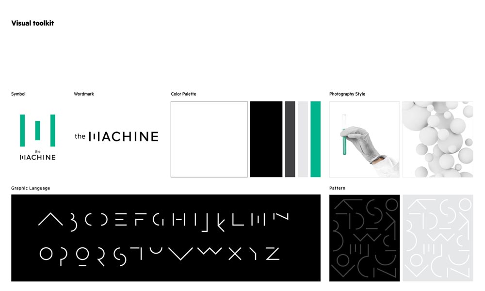
The M mark and proprietary typography were created for HPE signals making it a new language and way of thinking about computing technology fundamentals.
It was like a futuristic, new language for an innovative and forward-thinking nature of the company’s technology solutions.
This visual identity of the Machine demonstrated the HPE’s imperative to remain agile, decisive and fast in this face-paced world.
6 – GLPS

GLPS is a company specialised in lightning protection for the wind, aerospace, and construction industries.
As such, they’re tasked with selling protection for one of nature’s most chaotic and uncontrollable phenomena.
However, the sense of power and control was necessary for GLPS, so their rebranding strategy focused on the idea of empowering their target audience to take charge.
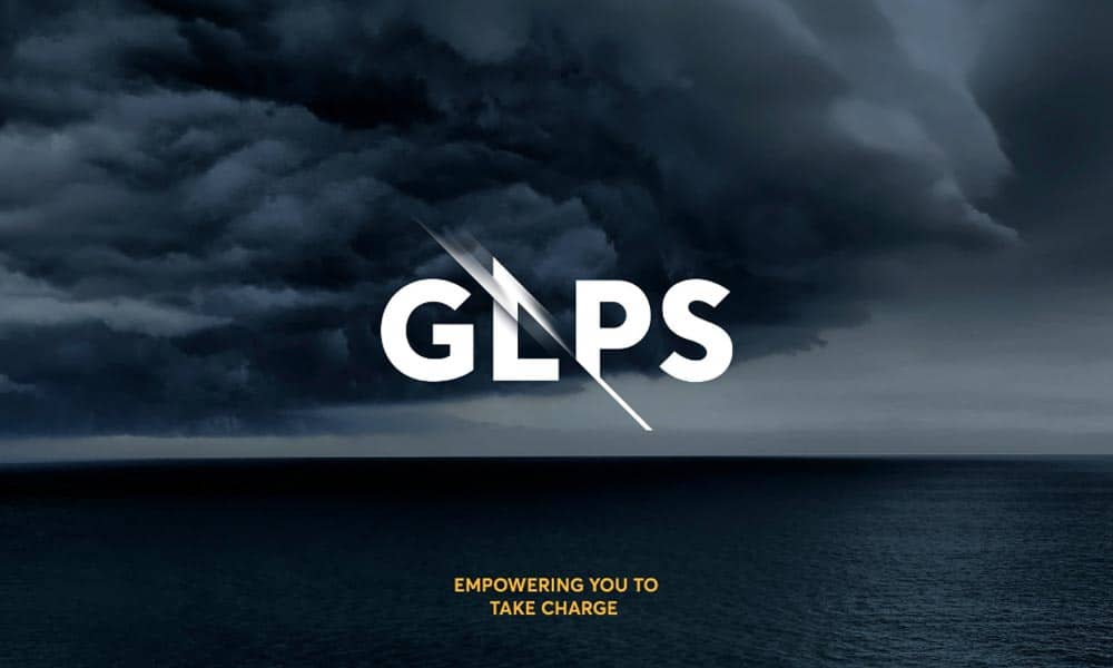
Their logo managed to demonstrate it perfectly by combining the lighting surge between clean and orderly type, which is a visual symbol of their protection solutions.
With their rebranding strategy, GLPS succeed in adding an element of control in the world of chaos to show their audience they can be trusted, and their expertise in this field is unquestionable.
7 – Burberry
With Angela Ahrendts as the new CEO of Burberry in 2006, the company started focusing on telling their story of moving forward to emphasise the best aspects of the brand.
Burberry was a synonym for fashion tradition and success for years, but something was missing.
So, they’ve focused more on innovation and embraced the new wave of social media communication and promotion.
In other words, Burberry started to engage their consumers to keep up with the trends digitally with these rebranding examples.
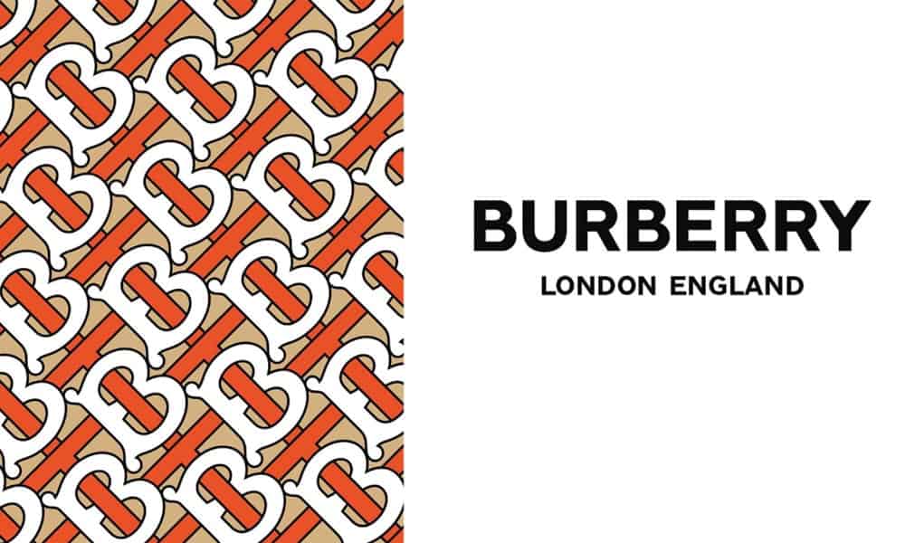
They even redesigned their Regent street story to reflect their official website connecting these both experiences: digital and retail.
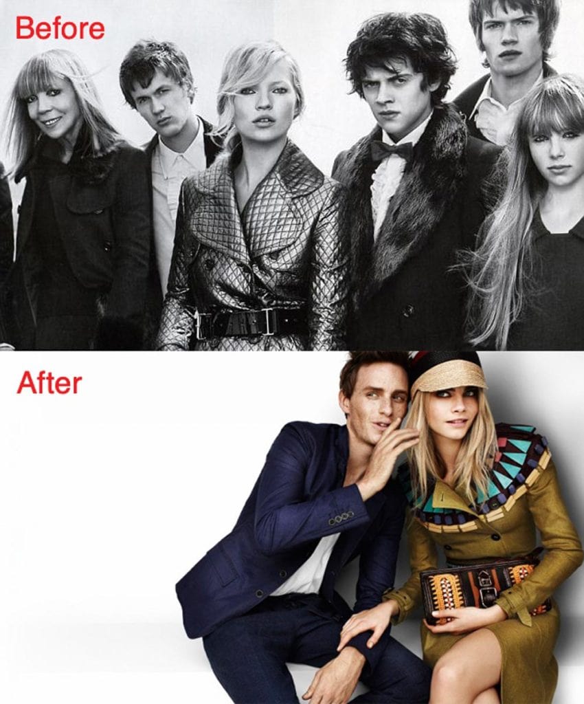
Burberry also made a strong focus on their “Britishness” by employing young British actors, musicians and models.
By recognising what their customers need in this digital age, the brand managed to stay true to its traditional values and reshaped them for new customer experience – the digital one.
8 – Ravensbourne University
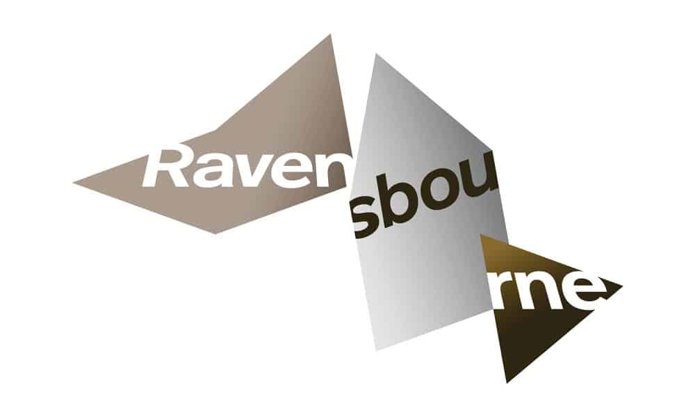
Ravensbourne University, founded in 1965, wanted to become an independent University with degree-awarding powers.
To do so, they needed to prove themselves as a creative, forward-thinking design institution.
They have changed their identity by developing a simple mark that opens up in an application to highlight the creativity of Ravensbourne.
The university’s new logo and identity were much more user-friendly both in aesthetic and implementation.

With revolutionising the experience for their students, existing and potential, Ravensbourne managed to position itself as an institution which is appreciated for the way it interacts with its audience.
After all, the way universities communicate with their audience will directly influence their reputation.
Concluding the Rebranding Examples
Implementing a successful rebranding strategy is not just reserved for companies which are struggling to survive in the market.
Rebranding can also be a proactive solution to induce business growth or expand to new markets.
Regardless of the reason, the business will always benefit from rebranding if it’s based on market research, and it gives customers something new or something improved.
What are some good examples of rebranding or rebranding examples that didn’t work out so well? Let us know in the comments below.
