
15 Nov How to Improve UX Design Through A/B Testing
How to Improve UX Design Through A/B Testing
The better you make your user experience (UX), the better your app will be received.
You could rely on user feedback solely, but integrating their feedback into two options of the graphical user interface (GUI) and A/B testing offers a better opportunity.
Your app or website determines your sales conversions through your funnel, and it needs a positively received UX and UI design.
Rather than wireframing your creation and just building it, wireframe multiple options, then A/B test them.
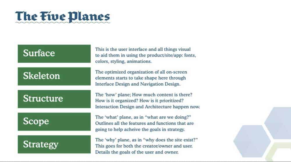
Whichever UI design provides a better UX, you use. You A/B test one element at a time of subtle differences between the pieces that comprise the UI and relate
to the UX on all five planes:
- surface plane,
- skeleton plane,
- structure plane,
- scope plane,
- strategy plane.
Similarly, you can test web copy and content this way to learn which message sells better.
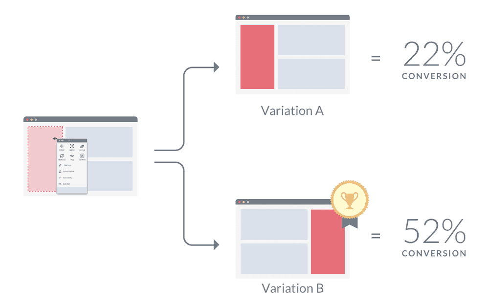
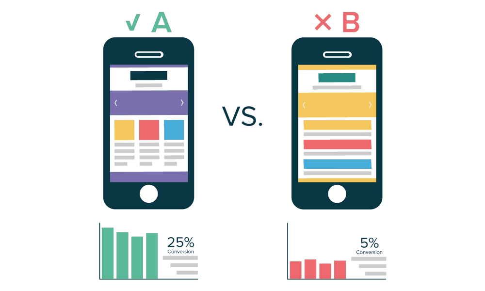
Both examples represent the concept of website A/B testing and mobile A/B testing, both of which refers to the comparison of two subtly different designs of a website or computer application.
Typically, the two designs exhibit a single, subtle difference, such as different background colours or button colours.
You’d use A/B testing to determine if orange and brown or blue and white resounded better as website or app theme colours.
Another example is if round or square buttons appeal to users. The “A” design would use all-round buttons, but the “B” design would use all square buttons. You use in your final design the buttons test users clicked on more often.
You might A/B test two menus – one across the top of the design, one down the right side. In each case of the A/B test, the difference is quite subtle and small.
Initially, marketers used the concept to test key phrases in advertisements. They would check whether audiences would buy a soap, for example, if the ad used the phrase “squeaky clean” thematically or if “clean and fresh” worked better.
The ads that ran in magazines and on television and radio used the language chosen by users in focus groups.
What would you want to do A/B testing on? Everything… one item at a time.
- Input controls: Your forms and input boxes let the user input information like their country of residence or date-of-birth.
- Informational components: The outgoing communication components on the page where you share information.
- Navigation components: Your menus and subsidiary navigational links that help the website visitors or application users quickly move from one area to the next.
- Navigation Components
- Containers: Users may or may not see the containers, but you test the methods that hold similar or related contents.
How much difference does getting the UI right contribute to the UX?
Survey respondents reported that improved website navigation could raise conversion rates by up to 18.5 per cent.
Making your website or app stand out vis a vis ease of navigation and use with understandable, enjoyable content puts you top over other similar services or products. Conversely, you could lose users or clients if they experience difficulties.
You might not think of the things that also largely influence user love or hate of a website or app. It would help if you had to A/B test white space, call-to-action (CTA) buttons and page load speeds.
White Space
You can make things far too crowded and unenjoyable for all when you include too many elements.
Users like to have space. They want gaps between various elements. It is almost as if they are giving the menu buttons and graphics and content personal space.
This white space makes the app or website more attractive and can boost your sales. Overcrowding overwhelms everyone and turns off buyers. Space is good, crowded is bad.
Users also like a smart design. Your CTA button and the wording around it matters.
Button shape and colour matter. So does placement on the page — the message surrounding the CTA button matters.
Getting people to your app or webpage is only one small part of it. You need them to want to stay there, read or watch the whole message and then buy.
This means you need to test within your actual target audience. More on that later.
Your third surprise in testing probably comes from load times. You might think everything is perfect. Users testing wireframes of your design might love its look.
You may test individual pieces and have super results with one or the other element. When you combine it all though, if your website or app takes more than three to four seconds to load, you have failed. They will leave.
You can A/B test these items quickly. Your users will tell you how much space is needed, which CTAs work to sell your service or product, and what takes way too long to load. It is your job to listen and implement what they told you.
Target Audience Testing
So, you need to test A and B options geared toward the same target audience.
Let’s say you have an app with an individual membership plan and a professional plan that costs $1,000 per month.
The features of these two plans and the app versions they offer vary vastly.
You should A/B test them separately within the target audience for each.
That means that you would test the free version that every person can download, install and use with limited features separately from the $1,000 a month plan and conduct each test within its respective target audience.
So, you would test the complimentary app version in a focus group comprised of low- to middle-income individuals who require a straightforward app.
You would test the high-end, professional plan app designed for corporate use in a focus group comprised of high-level executives with high-incomes who require the feature-rich design to accomplish their work.
The opinions of the two groups have no bearing on one another. You would commonly develop two app versions.
If the free app users like a grey and black interface, provide a choice of interface colour combinations in the paid app. This lets the executives choose the colour options they desire.
Users of your complimentary app might not mind music or interaction sounds, but the paid users want silence. You code the app to allow paid users to mute distracting sounds.
The two groups have different needs. They are two separate target audiences, and their input should only apply to their app version.
You need to conduct separate A/B testing for different levels of users. One size does not fit all, and one app will not work for all users.
Testing Your App
When A/B testing, you also need to test your two very similar designs as standalone products.
You can easily do this by including a snippet of test code in the code of each design. The system gathers information and sends it to a log file or another app.
You may find digital tools to help with your tests, but they primarily assist with the set-up and analysis, but some help with the implementation.
Here are a few applications to try out. They can vary on whether they are useful for set up, implementation or analytics.
The obvious analytics option is Google Analytics. A tiny bit of code gives you real-time digital marketing reports and website analytics.
A different Google product, Google Optimize, lets you set up, implement and analyse personalised A/B and multivariate tests. You get a visual results display.
Use Visual Website Optimiser if you lack the technical knowledge to run A/B tests. You can do geo-behavioural targeting campaigns and use this all-in-one platform to research site visitors, create an optimisation roadmap and run A/B experiments.
Get help with targeting and rule-based testing with Adobe Target. Maxymiser optimises both online and mobile app customer experiences.
You will need to analyse a tool’s capabilities before applying it to your design. The wrong tool won’t help.
Remember that your A/B tested element must work with all other aspects. Consider how the results of each test impact other project metrics.
You can use A/B testing to develop the perfect marketing messages and the ideal design.
Carefully put together, you can craft a killer app or website that makes every user happy.
You must provide options, and they must suit each person. They must be with a click to choose the option they desire and stick with it unencumbered.
You also must protect other users. For example, one user should not be able to add another to a chat room. They should be able to request to add only. Permissions must be two way.
A/B testing can help you modulate your choices for consumers. You will find what is relevant to each group. You then must create app or website versions that suit each user group.
The post How to Improve UX Design Through A/B Testing is by Stuart and appeared first on Inkbot Design.