
17 Dec White Space in Web Design – A Comprehensive Guide
White Space in Web Design – A Comprehensive Guide
Have you ever wondered what dictates the web design success of such websites as Apple, Dropbox, and Shopify?
The answer may not be difficult to find because it’s on the surface of simplicity and clarity.
Modern web page design is under the trend of white space that comes from the pages of glossy magazines like Esquire and Vogue.
That’s right; the migration of negative space to the big web has been only a matter of time.
Our comprehensive guide on the best web design trend that’s emerged in recent time covers how usage of white space makes the user experience extraordinary and straightforward.
Definition of White Space in Design
Typography, design, and white space are long-time friends, keep that in mind.
Magazines, newspapers, and yellow pages are minimally using negative space because of the volumes of reproduced information in these types of media.
The web is a more flexible and interactive thing for content consumers.
This is why the same rules that apply to traditional media and the use of negative space in design work differently during web development.
Appropriate use of white space design is already among the top design tips of the upcoming mobile apps – web developers also keep that in mind.
What is White Space in Design?
You’ve probably encountered the definition of the negative space in design.
Most web design tools account the need of designers to use white space to place the screen or page elements with the distance in between.
You don’t need to confuse empty space with the volume of the area filled with white colour from the palette.
Of course, it’s a convention that most times space is filled with white, but it can be any other colour, even the full transparency still goes here.
Considering today’s talk about web design, white space divides the functional elements on the page to make them easily perceptible by the final user.
Usually, on a web page, you can see buttons, images, links, and text.
Now, open the website that hasn’t received a visual overhaul in a long time.
See how crampy and low-worthy it is? This is because modern UI/UX pays tons of respect to white space techniques.
Typology of White Space
Different approaches to using white space are used by UI/UX experts now.
It’s the art of visual storytelling to use negative space to make them stay and explore your website.
Classification of spaces exists and should come in handy for everyone who wants to tame this neat tool to make designs breathe.
You can meet two types of white space perceived by the user consciousness:
● Active white space. When a web designer has the goal to guide your attention to a particular element on the page, it’s done with the help of active empty space. It is used intentionally to distance the items from one another to emphasise the separate ones that stand out and are looked at immediately.
● Passive white space. The kind of negative space that is organic and demanded to make elements observable and recognisable. It’s natural for people to see objects separated from feeling comfortable. Passive white space is precisely about that.
On the other hand, the size of negative space also matters because it can be either micro or macro.
Micro white space allows you to concentrate on the element as a whole.
For example, navigation menus, paragraphs, and text lines all appear with micro empty space.
It’s easier for the human mind to see structural parts of the whole webpage objects.
You see a navigation menu; you see links inside.
The first task is to identify where it’s located; the second is to dig into the elements contained inside the navigation.
Macro white space is there to separate functional and informative parts of the website.
The space between content blocks is often macro because it’s much more extensive than micro white space.
Open your favourite website and see how content flows to the centre of the page with spaces from left and right.
Find the navigation menu and article blocks. They’re like smaller islands of the more extensive archipelago that is the website itself.
What Features White Space Design Offers
At this point in our review, you’re probably asking yourself what’s the actual use of the white space in web design.
If you’re a freelancer, you’ll often have to create texts called design briefs.
To save your precious time and focus on their actual filling, we advise the service called https://writemyessaytoday.us/ – they also focus on creating amazing and vibrant briefs.
Below, we’ve covered the benefits of having a negative space design around the corner. After reading, you’ll know how powerful this approach is.
Better Text View

The last thing you want website visitors to investigate is what is written on the page anyway.
Generally, people do not spend more than 10 seconds on the website if they’re not engaged.
Hopefully, white space web design allows textual content to breathe and feel comfortable on the page.
The role of the designer is to free the space in the design to make it feel solid and connected.
Headings and paragraphs have to be distanced from one another to create convenient user experience first and foremost.
The right use of white space increases the readability of the text by at least 20%.
Create the reading experience natural for a person while reading.
Make visual stops like paddings and margins to keep readers skimming through your text.
Focus on the Product and Message

When you create a website with a marketing strategy in mind, you often want visitors to take action and buy the thing that you sell.
To achieve that and focus visitor attention on the converting elements of the webpage, the benefits of white space design are apparent.
The core message of your product can be lost among other visual information.
This is why you have to create a small ocean of white space around CTA, your order calculator, or sign-up form.
Remember that when a visitor lands on the web page, you have a minimal amount of time to create a genuine interest that will hold the human focus.
Behavioural factors are one of the most important not only in creating sales but for the means of SEO.
The right design will use white space to highlight the converting elements of your page no matter what.
Improved Content Flow

You’ve probably heard about the idea of “user journey” that works indeed visibly.
From the first second on the website, the user has to understand what is the pathway to move around.
The web designer includes navigation elements, headers with buttons with sheer portions of white space from all sides, and engaging texts with customer testimonials.
How can white space help?
People are following two types of content scanning patterns, Z and F-shaped ones.
Negative space facilitates the way for visitors to follow this pattern.
When people see a separate element, they scan it, and then move to the next one.
Think how complicated it would be without white space present on the web page.
The Premium Feel
When you see how glossy and spectacular are the pages of Vogue or Esquire, this is due to the large portion of white space that editors have allowed to enter the content area.
No one limits your web development team from creating a sense of luxury on the web pages of the product you produce.
Not only you’ll uplift the quality of user experience for the visitors, but also give a fantastic look to the main screens on desktop and mobile.
Use the spacious freedom of observing elements of the page and make it available for the visitors.
Great Examples to Prove the Power of White Space
We have selected several excellent examples of web design and negative space, walking harmoniously together hand by hand.
Many prominent companies have already accepted the standard of white space design in their projects.
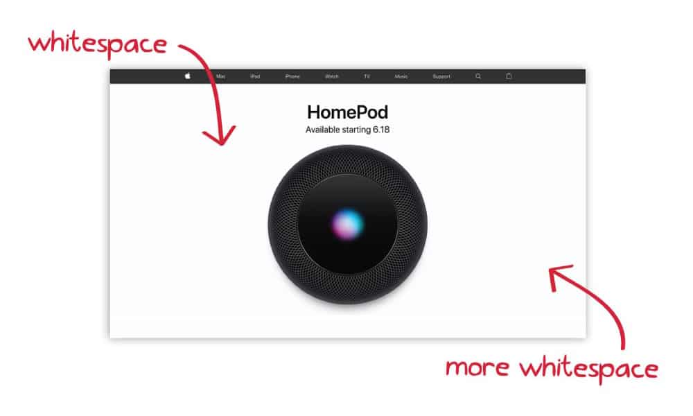
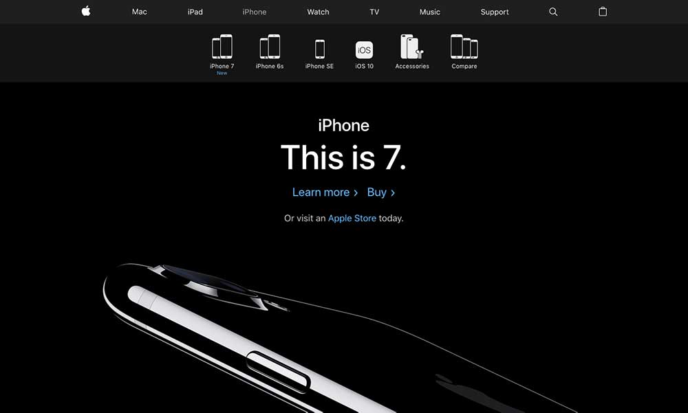
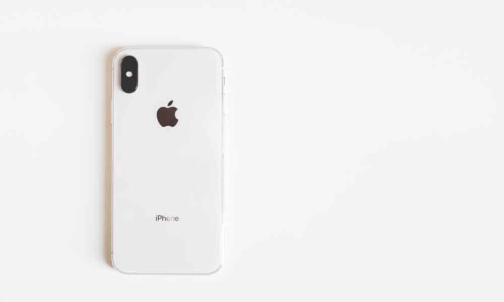
Apple
Apple is one of the companies that does not change its design language from year to year.
They’ve been a source of inspiration for many other websites in the spheres like e-commerce and news media.
See how little language they use to describe their products having a separate page for each?
A towering header with an even more enormous image says everything.
DropBox
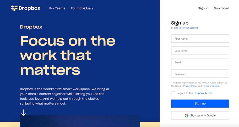
DropBox has decided to fill the white space with the brand colour that they’ve been using since the launch.
Fair to admit that blue contrasts so well with the goldish-creamy font. They say to focus on their brand in the text.
See how great and informative their approach appears; we love to see that DropBox smartly uses white space.
Shopify

Shopify took some inspiration from Google when creating the main page of their website.
They use so much white space across the search element – you’re left with no other choice than type something and look for the things they want you.
Final Words
When you think about white space design on your future website, consider the rules and recommendations we included in this guide.
The rule of negative space is to apply it moderately and where it suits.
Keep the line of balance between bringing up the information together and letting it breathe at the same time.
The post White Space in Web Design – A Comprehensive Guide is by Stuart and appeared first on Inkbot Design.