02 Apr The Gestalt Principles – Theory of Good Design Psychology
The Gestalt Principles – Theory of Good Design Psychology
The world of design is continuously changing.
Flat, Minimalist, Skeuomorphic – Realistic, Eclectic, Isometric – Asymmetrical, 3D, Art Deco – styles and trends are always in flux.
Every year there’s a new trend, and different way designs are being made.
What then, do designers fall back on as the constant to base their designs on?
Well, visual perception and human behaviour.
That’s right. The underlying psychological tendencies of human behaviour remain reasonably constant, especially in terms of perception.
How humans see, process and perceive visual information serves as the concrete foundation for crafting ingenious designs that make your websites or apps more relatable and compelling.
On these very lines, the Gestalt theory – a collection of psychological principles for visual design – was founded in the early 20th century by German psychologists Max Wertheimer, Kurt Koffka and Wolfgang Kohler.
Gestalt was not a designer – let’s just put that out there.
Gestalt wasn’t even a person.
As mentioned above, the Gestalt principles are the brainchild of German Psychologists Max Wertheimer, Kurt Koffka, and Wolfgang Kohler, who were all interested in finding out how humans extract information and meaningful visual perception from chaotic stimuli – the compulsion we all have to seek order in disorder.
Now, this may seem like a far cry from graphics (especially from logo design), but much to your surprise, you can use their principles to guide design decisions you make.
The fundamental core of the Gestalt theory is based on the psychological principle that humans see a picture as a unified whole instead of perceiving each individual part differently.
“The whole is other than the sum of its parts.”
Kurt Koffka
Most of the principles that govern design originate from this Gestalt theory.
It comprises of 5 Gestalt principles, and several related principles were added on later.
So let’s first take a look at the five governing Gestalt principles or the laws of Gestalt theory.
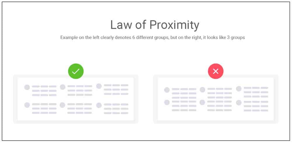
1 – Law of Proximity
In Gestalt psychology, the law of proximity says that objects placed close to each other are perceived as a group, indicating a relationship between them.
So even without a text explanation, a design can indicate that this set of items is one group and that is another, just by leveraging the law of proximity.
As a derivation of the proximity principle, objects without a relationship between them, when placed together, will create confusion among the audience, as the mind wants to perceive them as being of the same group.
Like in the picture below, the figure on the left clearly shows that you’re dealing with 6 bits of information that are individual yet similar.
On the right side, it appears that there are three primary groups of information with two sub-points in each set.
So when it comes to design, keeping the law of proximity can help your audience form the correct interpretations and identify the context of the visual.
Such grouping has the power to define the visual and psychological comprehension of your design in a big way.
Even if all elements are individually very different from each other in terms of shape, size or colour, they will look like a group when placed together.
So what you place close together and what you move away is critical to the perception a user forms.
This image from the MTV music awards 2002 clearly shows you who the organisers are and who the sponsors are, even without any title indication whatsoever.
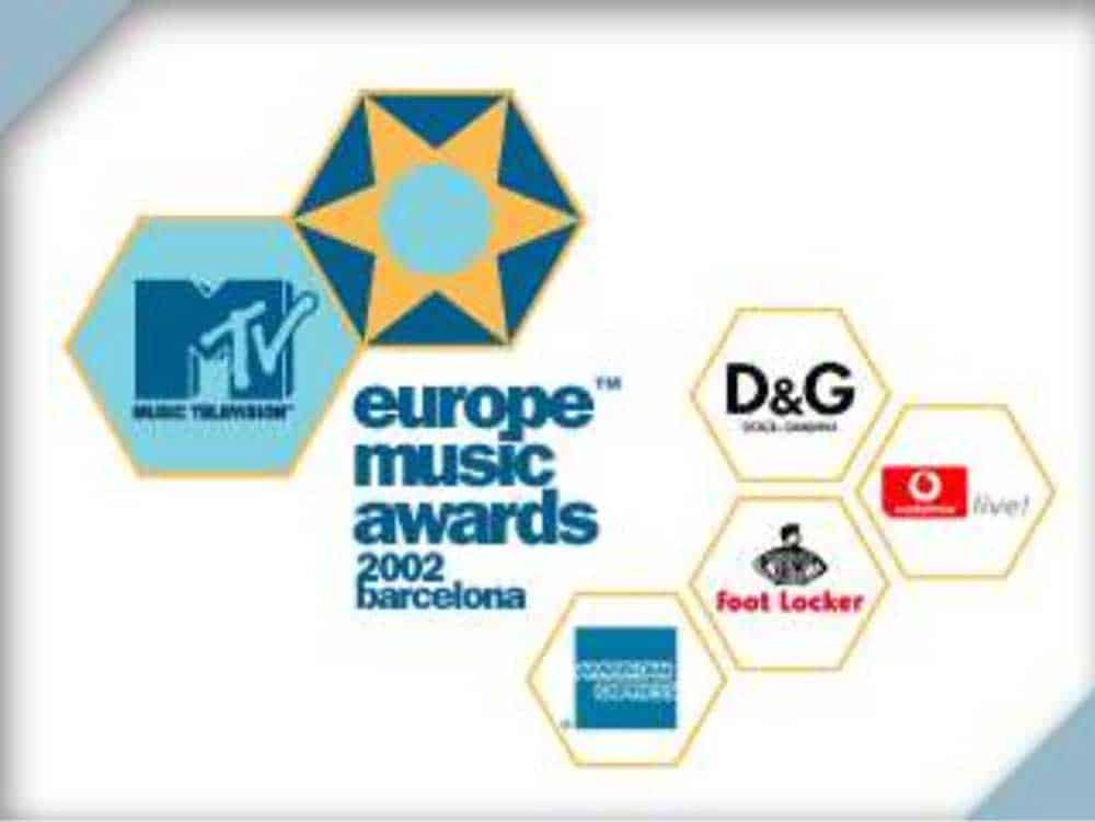
They are all random logos of companies in individual free-floating hexagons, and yet, you know exactly who’s a sponsor and who’s the organiser, through the Gestalt principles.
2 – Law of Similarity
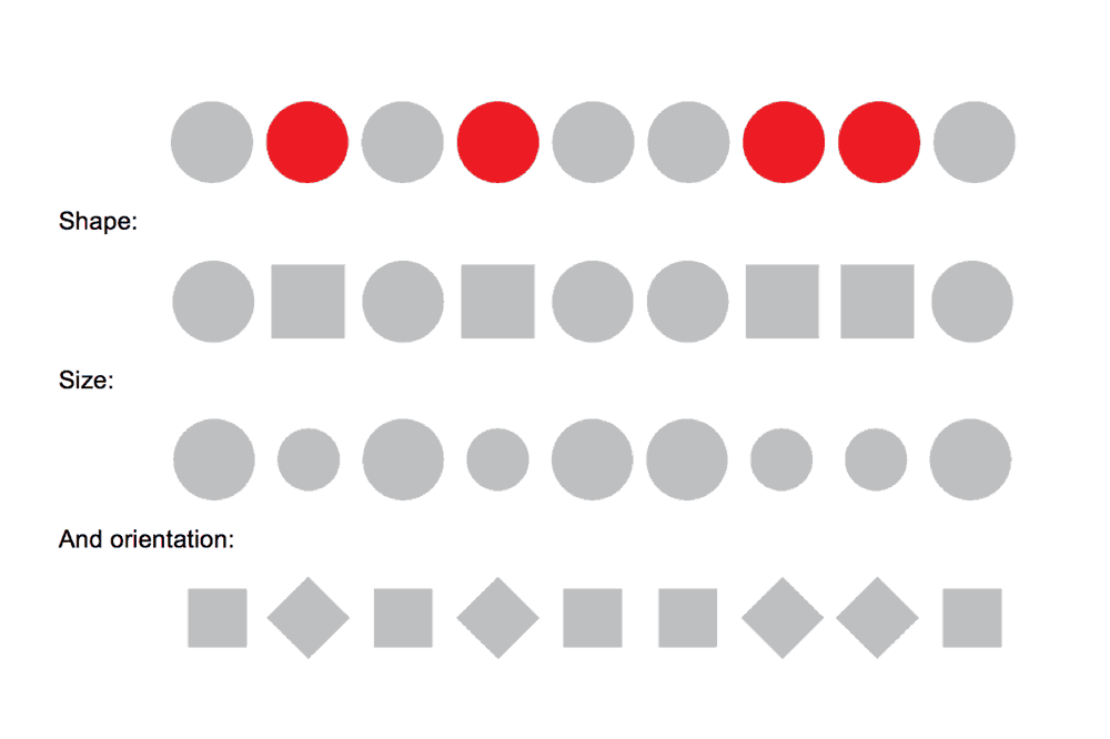
The law of similarity principle states that objects which look similar to each other are perceived to be in a group.
This could be elements that show similarity in size, shape, style, meaning, function or anything else.
They should look visually similar in any way, to ensure that the principle of similarity kicks in and helps viewers make associations and perceive items as being together and related.
The similarity principle helps people make sense of adjacent figures or overlapping images, using their different appearance and unique visual elements.
The law of similarity often works in conjunction with the law of proximity to create a holistic picture that triggers the right perception in people’s minds and establish a visual hierarchy.
3 – Law of Closure
The principle of closure principle proposes that the mind rushes to fill in what the eye can’t see.
Primarily, when humans come across a pattern with missing elements, the brain tends to fill the gap and produce a complete picture.
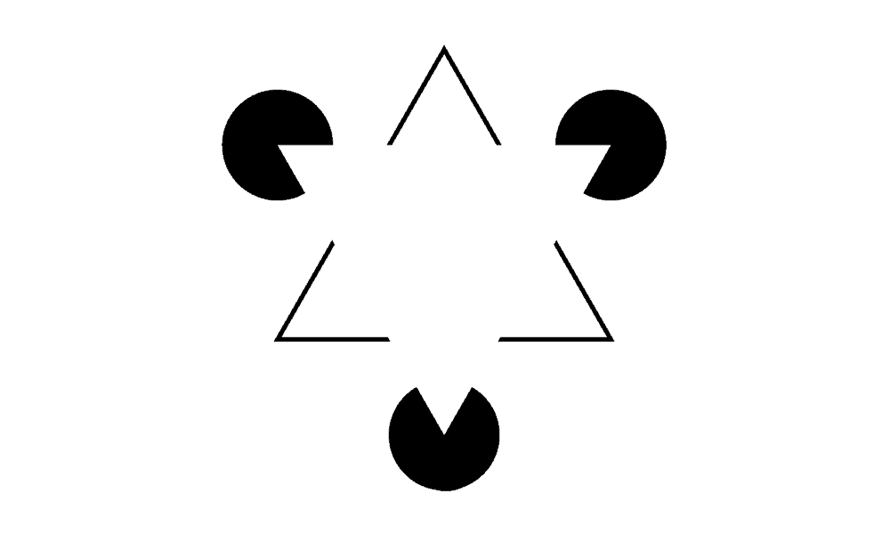
Isn’t it amazing how you can see a triangle in the image above, even though it is really just three Pac-man like circles grouped together with a notch cut out?
The principle of closure in Gestalt theory allows designers to make some dramatic statements without directly sketching out what they intend to express.
The idea behind the closure is to provide just enough information to the viewers, allowing them to draw the conclusion themselves, and then take a moment to admire the design.
It would be hard to talk about the law of closure principle without talking about the cover of Paul Thagard’s book Coherence in Thought and Action.
The example shows eight circles grouped together with random lines running through them.
It helps us to see the good form of a 3-dimensional cube that isn’t quite there, but it is.
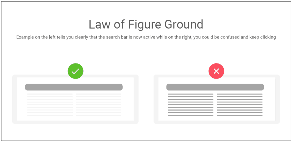
4 – Law of Figure Ground
The law of figure ground pertains to a harmonious relationship between a design’s background and foreground.
These Gestalt principles state that elements in a visual are perceived as either the figure or the focal point of your design that needs to make up the foreground, or as ground or the background of the plan.
Properly using it can influence where you draw the eye and what you make the focal point of your design.
Like in the figure below, when a user needs to perform a search, highlighting the search bar establishes clearly that the website is now listening to user input.
Once these Gestalt principles are mastered, and designers learn to establish a relationship between the figure and the ground, there is plenty of space to play, and some striking effects can be created.
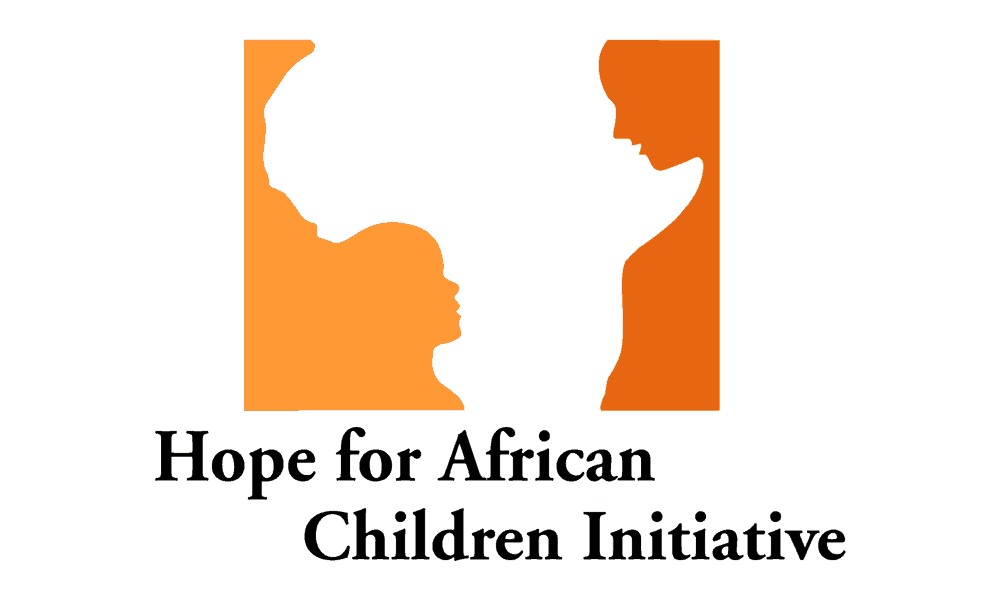
Some of the best examples of the law of figure ground are ones where both the design elements mean something; they are a clear picture individually and produce an entirely new and striking effect when seen as a whole.
For instance, take a look at this fascinating logo of the Hope for African Children Initiative.
What do you see first? A figure of Africa? Or a silhouette of two human characters, much like a child looking up at a mother?
Together, the two design elements combine to create a strong emotion of hope for African children, doing immense justice to the initiative. That is the power of good design through the Gestalt principles.
Also take a look at the familiar old Mac logo of a happy face, which also looks like a smiling face from the side, looking into what looks like a computer screen.
Doesn’t it imply that you’ll be happy once you use a Mac computer?

These visual elements are some brilliant examples if the law of figure ground.
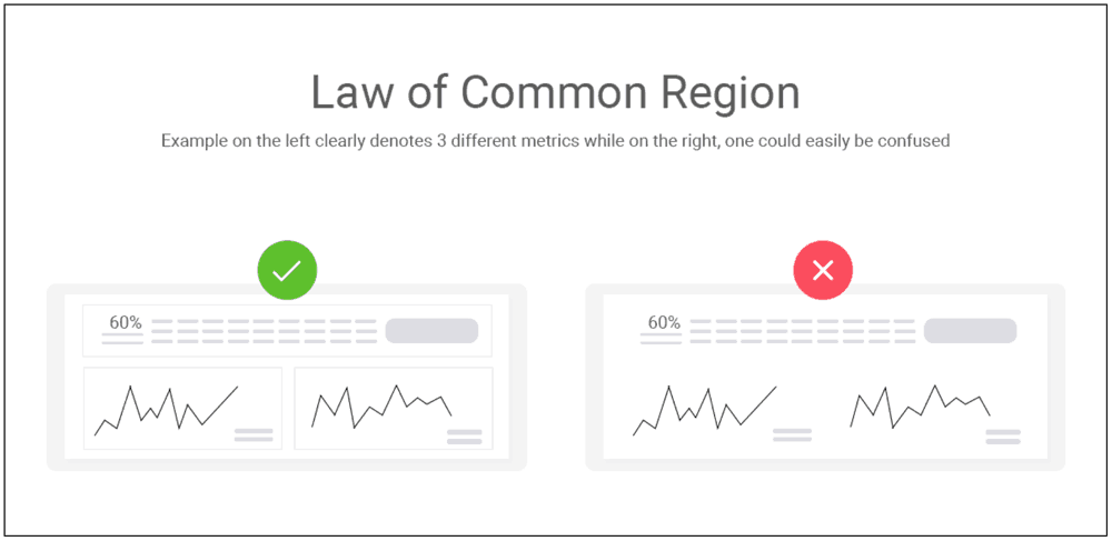
5 – Law of Common Region
Law of common region posits that elements that are enclosed within a defined boundary are perceived as a group.
So no matter how unique and different each individual element is – if it shows up in a closed region with other details, it is considered to have a relationship with all the other parts in that enclosure – common region.
Items featuring outside the box are perceived as being different from the group.
Therefore, adding borders to a page can establish clear groups and create a separation from the other visual elements on the page.
As in the following example of the Gestalt principle, the first picture shows three sets of metrics, individual and distinct from one another.
The second figure, however, implies that all the three metrics could be very closely related or even be different representations of the very same thing.
So those are five principles of Gestalt theory that form the base of much of the UX principles we follow today.
There are several other laws in Gestalt, too, that became popular over time and now play a pivotal role in shaping visual perception. Some of these are:
6 – Law of Common Fate
The law of common fate states that when humans see visual elements moving in the same direction, even when the movement is merely implied in an entirely static photograph – they tend to perceive that all of these elements are being triggered into motion by the same stimulus.
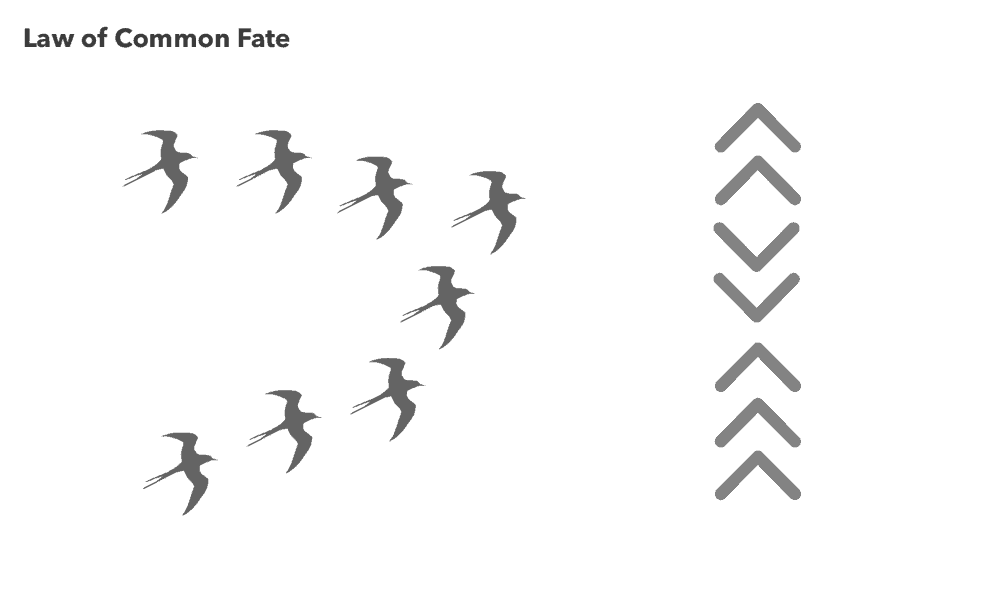
They are headed to the same or at least similar destination and hence appear to be in the same bandwagon.
When you see the movement of the scrollbar synchronised with the movement of the page, it is a classic example of the law of common fate in Gestalt visual hierarchy.
7 – Law of Continuity
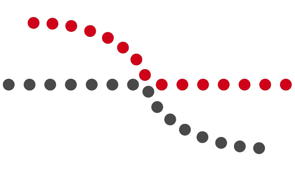
The law of continuity states that the elements arranged on a line or a curve are perceived as more related to each other than items that don’t fall on the track or curve.
This law helps designers present visual cues to make the viewers look at a specific part of the page, quite expertly guiding their gaze.
8 – Law of Symmetry
The law of symmetry proposes that humans tend to see objects as symmetrical shapes that take form near the centre and extend equally to both sides.

As a result, designs with symmetry are easy on the eyes and help create more balanced compositions.
Why are the Gestalt Principles important?
As you read through all these Gestalt principles, you found yourself agreeing to all of them, didn’t you.
It’s quite amazing how billions of humans around with so many different nations, cultures, identities and preferences, tend to display highly similar tendencies when it comes to visual perceptions.
In an age where design is more than just how a page looks, in fact when a design is a crucial marketing tool for every business, gaining a fresh understanding of the Gestalt principles will help you craft the best web and app pages that attract users and make them see just what you want them to see.
Examples of Gestalt Theory in Design
The human brain works wonders in unexplainable ways; we are hard-wired to see patterns, logic, and structure and make sense of this multiplexed world.
Many designers and advertisers have been capitalising on Gestalt principles and theory for an age. So, let’s get to it, shall we?
Closure or Reification
The human brain can fill in the gaps!
The law of closure or reification describes our brain’s ability to fill in the missing parts of a shape to complete it.
A dashed line, for example, can still form a circle or square for us.
In that way, having lines that are not closed completely doesn’t stop us from creating familiar shapes in our mind.
A great example of this is the Adidas logo.
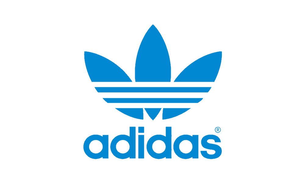
The three marquise shapes form the leaves (trefoil), but the apparent strike-throughs seamlessly create the signature three stripes of the Adidas brand.
Still, these stripes don’t stop us from seeing the whole image – they simply add another layer of complexity to it.
But how would you use this to your advantage?
Well, if you want to make something monotone, reduce all the shaded portions to black, and leave the rest transparent.
Even with minimal information, our mind can leap the gaps to form pictures – like the WWF logo, for example (the World Wildlife Fund, not the Wrestling guys…)

Proximity or Common Fate/Region
These Gestalt principles state that we group things that are moving in the same direction, and that we also imperceptibly group items by their proximity to other elements.
This allows us to interpret many small parts acting as a whole, which can be useful in design when we want to add patterns or textures to something, without losing the overarching image.
A great example of this principle in action is the Wella Logo.
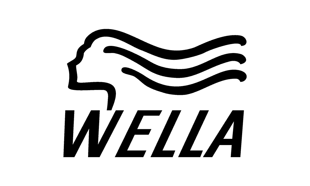
They use the line art to portray blowing hair strands that make the eyes glide through the lines or hair strands to the logo name.
It is worth noting here that the designer purposely added two extra lines, and because of their proximity, the viewer groups them as hair, seeing it as a fuller picture.
If you wanted to create a larger image out of smaller images that all have individual weight, this would be a great way to do it – composting geometric shapes into images is a popular method of utilising this effect.
Continuation
The continuation principles state that the audience will look for continuation in lines and shapes, and group them.
This is particularly apparent in logos like the Coca-Cola logo, and the Nike logo, where our eyes will naturally follow the flowing lines of the images.
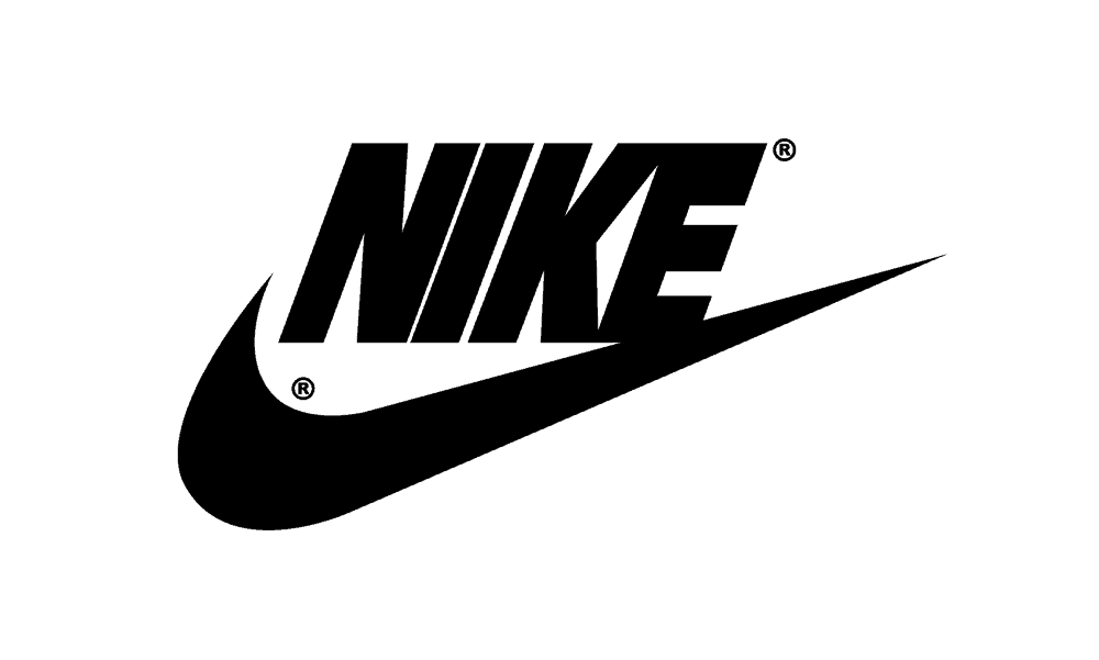
Jagged lines can create a sense of chaos, and smooth curves can create a sense of calm and peace.
In this way, you can use long lines that continue unbroken through your designs to evoke a peaceful emotional response in the viewer, or you can also do the opposite.
Element Connectedness
The principles that follow element connectedness maintains that humans will follow connections from one image to another to link them.
A great example of this is the PlayStation Logo, which (despite being in three separate parts) appears to us as interconnected letters lying on two different planes, i.e., vertical and horizontal.
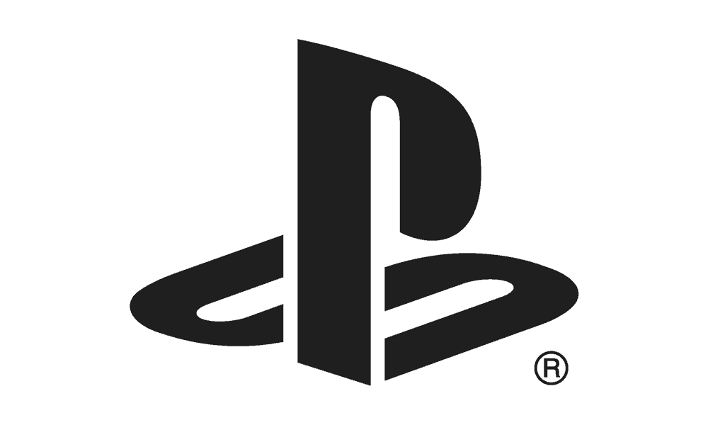
The human mind’s ability to link these two is imperative for making this logo work.
When viewers see two elements visually connected, they immediately assume that those two elements are bonded, despite the objects being unaffiliated otherwise.
You can use this to join two things for the viewer.
Flow maps and other diagrams where lines and arrows link different icons are a great example of this.
You can also create a sense of connectedness with a simple line – it’s just that easy.
Figure/Ground
This principle pertains to the innate human ability to perceive depth, even when there isn’t any.
Logos are often skewed to give them a perspective point, and as such, can effectively trick the eye into believing that they are, in fact, three dimensional.
This is due to the Figure/Ground effect, which states that when a smaller object is presented on a sizeable uniform background, we see that they are two objects, one of which is in front of the other, rather than a flat image.
This effect is apparent in the Sony Walkman logo.
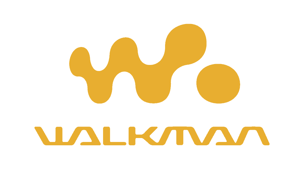
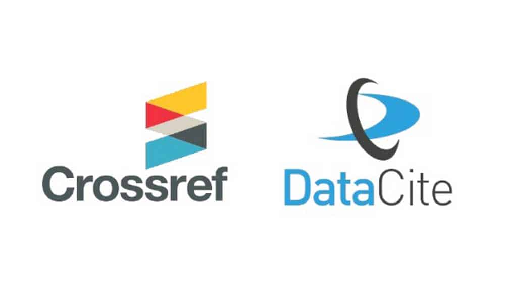
But, beyond that, even images which don’t utilise a perspective point can appear 3D by stacking the images and using the tonal range to create depth.
The Crossref logo creates a ‘spiral’ effect by using this principle, rather than merely three rhomboids partially covering each other.
Even something as simple as the outline of a face can create a sense of depth – like the two faces/vase optical illusion.
Giving your designs two ‘versions’ can be a great way to add complexity to your designs without actually creating something very complicated.
Similarity and Invariance
This similarity principle relies on the human ability to identify and group ‘like’ images or elements, despite their location or proximity.
This similarity principle does not necessarily always work for a picture, however.
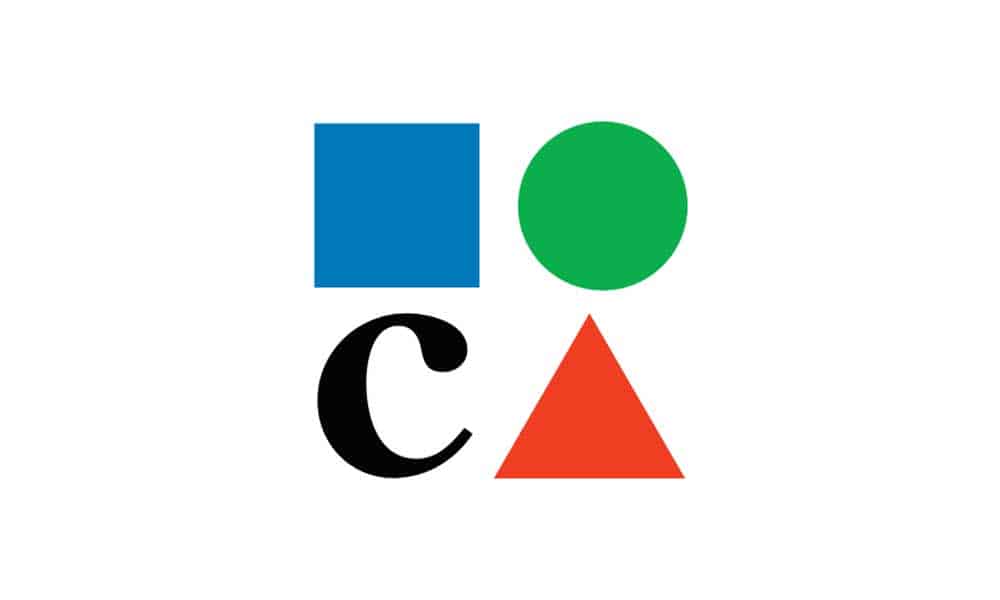
A famous example of these Gestalt principles not having the desired effect is with the Museum of Contemporary Art in LA.
Their logo features three shapes, and one letter – a square, circle, triangle, and the letter C.
The shapes are supposed to spell ‘MOCA’ but the human mind groups the shapes first and the letter second, which undermines the similarity effect they tried to create, confusing the viewer.
If you’re confident that viewers will be able to group like objects despite their arrangement, you’ll have more confidence to utilise space.
Designs that utilise words that appear with large areas of space between them are a great example of this similarity.
We naturally will read the elements together because of their similarity in nature.
Multi-Stability
Multi Stability is the strange ability that humans have to perceive two images at once based on incomplete data.
It’s similar to those optical illusions that ask whether you see two faces or a vase, or a rabbit or a duck.
Likewise, the Autumn Leaves logo utilises Gestalt principles with its leaf elements, which also shows off a leafless autumn tree in its midrib.

Flowing the principle, the NBC logo has brightly coloured elements set in a circular shape.
But, this is dual-pronged in that as well as looking like the feathers of a peacock (whose head you can see cut from the centre), they also look like rays of sunshine as the sun rises over their morning show.
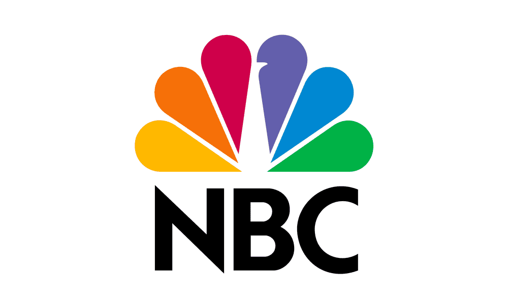
To utilise this Gestalt principle, the designer needs to subvert the way that things look in such a way for them to imitate something else, without losing their essence.
Look at a single design and ask how the elements could be transformed into something else to add a layer of meaning to it.
Symmetry
Despite being very perceptive creatures, humans do like everything in neat little boxes.
Things that are just off centre or misaligned will irk us to no end.
So, it’s no surprise then that symmetry is something that we like, as well as centralisation.
When elements line up neatly, and we can draw a line through them, we find it very visually pleasing.
It’s like those videos online that give you ‘satisfaction’, but all they are is things fitting perfectly into other things.
The Gestalt principle of symmetry is very similar to that.
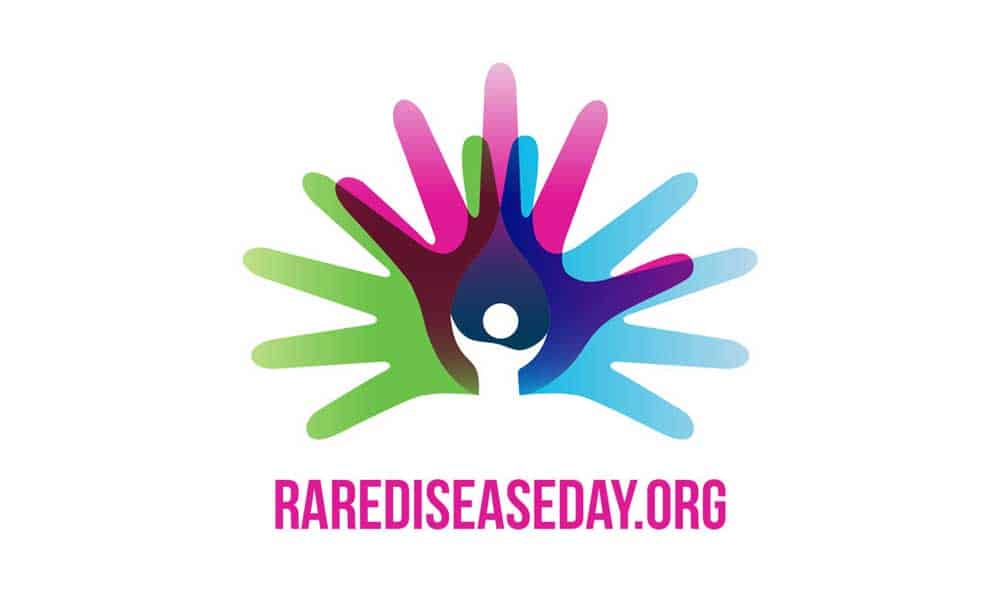
When it comes to designing a logo, we can use a balance to create patterns that we find enjoyable to look at.
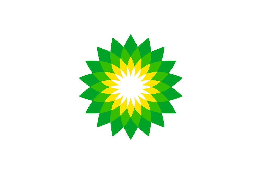
Both the BP and Rare Disease Day logos utilise symmetry to create exciting and aesthetic logos.
Conclusion
Psychology and design are two separate yet intertwined worlds.
While each can and does exist without the other, they share so many elements and traits that it’s hard to ignore the existence of the other.
Using Gestalt Principles may seem like a tall order at first, but if you look back at your previous design work, you’ll no doubt have used some of them without meaning to.
By using these principles consciously into your future work can benefit both, you and your clients.
And, when you know how to best use Gestalt psychology, you can please your user’s visual perception and spark interest.
Author Bio: Hiral Atha is the Founder and CEO of MoveoApps, a mobile apps development company. With over 14 years of experience in tech and software development, she has managed and led several app development projects from ideation to implementation.