15 Sep Top 5 Most Common Web Design Mistakes to Avoid
Top 5 Most Common Web Design Mistakes to Avoid
Website design takes at least as much thought as any other business you can think of.
And make no mistakes — that’s precisely what designing your own website is.
It requires that you put a lot of time and effort into it, which in itself is a serious investment.
What that means is you’ll have to plan ahead.
Each misstep that happens could potentially be very costly, draining even more precious time (and thus, money).
Naturally, web design mistakes tend to happen, and they’re all too familiar, but the less of them there are, the less expensive your project will be.
It’s highly likely you’ll be able to fix all problems you come across, but the damage will already be done.
Of course, if you’re building a website entirely by yourself, you know how vital the technical aspect is.
You need a site that’s fast, responsive, and secure.
Take Google’s Mobile-Friendly Test to see how your website scores. (BTW, Google is moving toward a mobile-first indexing system, so you’ll want to prioritize making your website mobile-friendly to ensure search ranking doesn’t suffer.) – GoDaddy
A successful website must also be bug-free, aesthetically pleasing, and easy to navigate.
That’s a whole lot to put on one’s plate, which makes pre-planning even more crucial to your business.
To that end, we’ve decided to put together this guide to help you navigate the treacherous waters of web design.
What this article should do is teach you to recognise some of the most common web design mistakes.
That way, you can learn to avoid them and take steps to ensure they never happen to you.
What Can Go Wrong When Designing a Website?
There are quite a few things that can take a turn for the worse during a process that’s as complex as building a website.
Web design mistakes and solutions come in all shapes and sizes, and they often require you to be creative.
With all the things to juggle as a business owner, consider hiring a professional web designer. – Fresh Sparks
Naturally, some web design mistakes are far more frequent than others, and those are the ones we’ll be focusing on.
By far, the worst offenders are:
- Lack of design and content authenticity
- Weak search engine optimisation (SEO)
- Slow page speed
- Poor placement of social media icons
- Information overload/underload and a bad CTA.
Let’s begin with a lack of authenticity, which is all too common these days.
Lack of Design and Content Authenticity
When working on a project that’s as demanding as designing a website is, you might be tempted to take specific shortcuts.
And there’s no better shortcut than just ripping off some successful website’s design.
It’s understandable and more common than you may think.
After all, that’s what templates and website scripts are all about.
But if you’re already doing the complex task of designing the website yourself, you should avoid being a copycat. And here’s why.
A website is usually the first contact a client will have with a business.
It should stun, daze, and wow the client, and stand out from the crowd of all the other identical websites.
If it’s not unique and gives off a déjà vu vibe, clients will likely forget it the second they leave the website.
You have to make an impression and be authentic, so avoid the pitfall of hijacking someone else’s design.
The whole point of content marketing is to show how you can deliver value and then to try and get people to subscribe. – Coredna
Of course, standing out from the crowd is not always relevant.
Webmasters of adult and streaming sites, for example, often use website scripts.
They know their clients don’t care about design or the feel of the website.
They come for the content, and that’s all there is to it.
However, it’s not just design that should be unique and authentic.
The same goes for the content you display on your website.
It’s entirely possible that the average visitor won’t notice a thing if you jack an article from someone else’s blog.
But Google will, and it will likely penalise you for plagiarising content, so all your hard work will go down the drain.
This can cause an immediate drop in business after a new website is launched, and it’s not easy for a non-SEO (search engine optimisation) professional to diagnose. – UpCity
Plagiarising content is one of the more expensive web design mistakes you can make.
If you don’t feel like writing original articles, it’s better to let a content writing company take care of that.
Weak Search Engine Optimisation (SEO)
It’s hard to say why many web developers and designers still ignore SEO, at least to an extent.
But make no mistakes, SEO requires planning, just like any other part of the designing process does.
Nowadays, it’s most commonly associated with textual content presented on a web page.
Everyone and their grandma knows that content must be unique, lengthy, and have relevant keywords placed naturally around the text.
But what’s often forgotten and disregarded are the images.
Your SEO depends on images more than anyone cares to admit, both directly and indirectly.
Sure, a website needs to look nice and provide great user experience, but certain technical issues are also essential for the search engines to show you some love. – AMA Boston
An example of how images can indirectly and negatively impact the optimisation of a website is the size of pictures you use.
It should range from 30 to 100 kb and a resolution of 72 dpi, as that will allow you to store more files on the server and also have them load much faster.
Website visitors are an impatient bunch, and you could lose precious converts if large images harrow the speed of your site.
But that’s not where the story of images and optimisation ends.
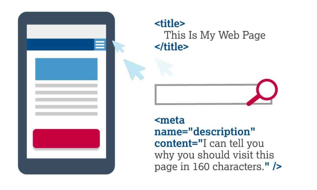
Remember how we mentioned the importance of keywords?
They can go anywhere: titles, subheadings, meta descriptions, bullet points, navigation elements, etc.
Among other places, you can also place keywords within the alt text of images.
Remembering that bit of information can help you avoid severe optimisation-related web design mistakes.
Slow Page Speed
As we’ve already mentioned, website visitors are quite impatient these days and expect the page to load almost instantly.
After all, why wouldn’t we set our expectations that high, given that we have the tech necessary to achieve that?
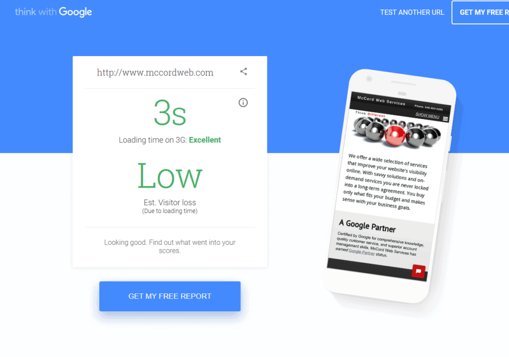
Well, as it turns out, someone was able to measure how long an average user is willing to wait for a page to load.
The magic number is only three seconds!
If it takes longer than that for your page to load, you’re highly likely to lose a potential customer.
Websites that aren’t optimised for mobile are likely to see high bounce rates, and with Google’s move to mobile-first indexing, this will hit especially hard. When this happens, it can increase your bounce rate, and negatively impact your SEO. – UpCity
So what can you do to improve page speed?
We already touched on the subject of images and how their size can affect page speed.
As you’d expect, the same goes for videos as well as other visual elements of the page.
Reducing the sizes of all those things can be beneficial for the speed of your website.
But far more important than all of that is a decent and reliable offshore hosting provider.
It matters a great deal to whom you entrust the hosting of your website.
Make sure to find a hosting company with cutting-edge servers, global data centres, and outstanding customer support.
You must be able to reach them 24/7 and have them help you with any issues your website is facing.
Poor Placement of Social Media Icons
It’s not unheard of for websites to place all the social media icons at the top of the page.
And while that seems innocent enough, it’s one of the web design mistakes that can cause multiple problems later on.
Firstly, our attention spans are not what they used to be. If you place all your social media icons where visitors get to see them immediately, you are inviting them to check out those platforms first — and the rest is history.
Once you redirect them to a social media platform, the users are probably going to stay there.
They might browse your posts if they’re interesting enough, but they’re more likely to wander off and never return.
Secondly, such placement of social media icons may be seen as aggressive and forceful.
Let your users browse the homepage first, and maybe even check out some other pages as well.
If they’re convinced, they’ll find your social media icons at the bottom of the page fairly quickly.
A call to action usually in the form of a button should tell them what action you want them to take and at least imply why they’re doing it. – Rex Freiberger, CEO, GadgetReview
Information Overload, Information Underload, and a Bad CTA

Lastly, it’s up to you to decide how much content you’ll provide the visitors with.
It’s one of the pillars of good web design — add the optimal amount of information and calls to action.
Call to action, or CTA should usually come at the end of an article or a product review.
In other words, you should place it strategically, where it makes the most sense.
In addition, high amounts of text can cause confusion and negativity impact conversion rates. – Raj Dosanjh, Founder, Rent Round
If you’re advertising a service, there’s no point in a CTA before the service is fully described.
The customers can recognise an aggressive marketing strategy and will reject it.
Even worse than showing too many CTAs is hiding the actual content from the visitors behind various design elements.
Hover effects, tabs, and accordions look all fine and dandy, but ask yourself, do you want to hide content from the visitors?
Study after study has come out that says sliders are terrible for conversion rates, yet I continue to see sliders on websites for companies large and small. – UpCity
Content that you spent time or money obtaining? The answer is no.
Make information visible, clear, and to the point, and your customers will surely appreciate it.
A concise design is good design.
Can these web design mistakes be avoided?
You can see how easy it is to fall into any of the traps mentioned above.
It’s up to you to decide how you’re going to optimise the page, or how much information you’re going to provide.
Remember to stay authentic and never stop trying to make your site load faster.
Usable websites offer great user experiences, and great user experiences lead to happy customers. – Smashing Magazine
Hopefully, we haven’t scared you off or made you doubt your idea.
The point was to introduce you to some common web design mistakes and show you the way around them.
But if you are uncertain about whether you can pull this off, it’s not the end of the world.
You can always put your unique idea in the hands of a professional web design company.
It’s the more expensive option, but you’ll save yourself much frustration later on.
And you can’t put a price on that.
Web Design Mistakes That Do Happen Even If They Shouldn’t
Some websites are so poorly designed; it is as if the designer was only concerned about integrating everything they knew without paying user experience any mind.
Here is a little tip: it is the design that attracts, not the features because no matter how great web features you have, you will have a hard time retaining visitors due to poor design.
Because of this, we will be sharing a couple of design mistakes that you need to get rid of!
1. Videos or Music on Autoplay

Websites that have videos or music on autoplay is a major pet peeve for many individuals.
That’s right: this is a faux pas that YouTube is guilty of. – CoreDNA
Not only is the music/videos uninvited, but it also slows down the pages that need to be fast.
Generally, online audience will wait around three seconds for a page a load.
However, with the autoplay setting on, the web page does not become fully functional unless the video/music has fully loaded.
This drags down the loading time, and before you know it, your visitors have already hit the back button.
This issue is made worse if the video is in HD quality.
This means that if a visitor has a weak data connection, they may be forced to wait around for some time.
Also, the majority of the people are already listening to something, so if your tab starts playing audio or music from the video, your tab will be the first one to be closed.
Although many website owners incorporate this option to help their visitors, it ends up doing precisely the opposite of the desired effects.
2. Cluttered Pages with Zero Whitespace

Your web design should not feel like a treasure map where one clue leads to the next one.
Instead, it should be like crisp white paper that only has relevant yet essential information on it.
This is exactly what users expect when they visit any web page.
Minimalism, within limits, is really the key to a high conversion rate. – UpCity
Often, the web pages contain a bulk of information with no clear guidance.
On top of this, designers sacrifice white space to make further space for their content.
Too much information crammed into a single web page would only overwhelm the visitors.
Or in other words, they will hit the back button before the page has even correctly loaded.
Maintaining a logical reading order still does not give you a green ticket to eliminate white space.
Even with the right hierarchy, cramming too many details within a single page will always put off readers.
3. Lack of a Search Box

The majority of the users do not have time to navigate the website to look for specific something.
This is where the need to have a functional search box becomes apparent.
Search boxes are not only convenient, but they are also a crucial element in improving user experience.
With a small website, skipping the search box is acceptable.
However, lacking a search box is a cardinal sin if your site has 10-12 pages; with each one having sub-pages.
Restructure your content If too many menus, overwhelming menu options, or illogical paths to content are your problem – you need to fix your website’s information architecture. – Forge and Smith
Keep in mind that websites are prone to getting big over time and by providing a search box, you will be making it easier for users to look for suitable information quickly.
4. Overdose on Visual Elements

Too much of anything is just wrong, and the same goes for visual elements.
Having too many visual elements in the form of videos, gifs, and images, etc. not only clash with each other but also take a toll on the load time of your website.
That said, incorporating too many visual elements is a speed killer because the excessive codes in JavaScript, jQuery, or any other front-end library file will only add to the burden.
On top of this, many of the integrated images are not optimised for high speed.
There’s a 100% free image compression tool online called ShortPixel that lets you compress up to 50 images at a time. – UpCity
Although background images or videos may add a nice touch, they are a bad design choice when too many of such elements impact the load time.
Want another reason as to why too many visual elements are a bad design choice? They are distracting.
Nowadays, visitors like more straightforward sites where they can find the desired information quickly.
If the website contains too many eye-catching visuals, the visitors may need additional time to navigate your website.
So, visuals are a big no-no if they are screaming for attention.
5. Still Entertaining Flash Player

What once was an important feature has now become a redundant element in many websites.
There was a time when Flash Player by Adobe supported the majority of videos and games.
However, the inception of Apple forced the software to spiral downwards.
Apart from the fact that Apple products do not support Flash, many new websites and famous web browsers are also phasing out the support for Flash Player.
More than half of all website traffic now comes from mobile devices, and this proportion is constantly growing. This is even more pronounced in regions like Asia and Africa, where mobile devices account for nearly two-thirds of all traffic. – UpCity
But, the main reason why Flash Player is suddenly on bad terms with every new internet browser is that it has failed to keep up with the changing times.
Flash Player is a closed source that sucks battery and memory of any device simultaneously.
Additionally, it is riddled with security loops and unpatched codes that have proven to be a hotbed for cybercriminal activity.
This information alone provides web designers with enough proof to abandon Flash before its official doom in 2020.
So, if your web design includes specific features that still depend on Flash Player, consider replacing the elements with something else!
6. Skipping Contact Information

As more and more malicious websites are making their way to the internet, the online audience is becoming more sceptical when it comes to browsing the web.
To save them from online scams, many web users have started looking at specific hints to identify an official page from a fake one.
One such hint is the availability of the contact information.
So, if you want to enhance the user experience, you must provide an authentic email address along with a toll-free phone number so that users can contact you in case of a bad experience.
Even if you are providing contact information, make sure it is in an easily accessible place.
Most people expect the information in a separate “Contact Us” page which they can access from the main menu.
Make sure that you create a separate page apart from including the contact information in the header or footer of your homepage.
Also, you need to include as many contact options as possible as some users prefer to call, some prefer to send an email while others prefer to leave a Facebook message.
Your “Contact Us” page should always be just one click away, or your information should be at the bottom of every page. Usability Geek
If necessary, you can also embed a Google Map on your contact page to help your local customers find your venue. In short, you must be ready to cater to all the users’ unique needs!

A website’s navigation needs to be as easy as ABC, and if it is taking some time for your users to find something, you need to bin everything and start fresh.
An excellent example of great web design is when it takes users a few clicks to reach their desired section.
However, the lack of menus and sitemaps further add to the difficulty of the visitors.
When it comes to mobile screens, web designers often forget about improving the navigation experience for mobile consumers.
Even if you are providing a good desktop experience, it does not count since you are ignoring the Responsive Web Design (RWD) aspect of your website.
Responsive design is the way your website responds to whether your visitor is on a mobile device or not. 72% of people use mobile-only when browsing the web. – UpCity
A good rule of thumb is to analyse and improve the navigational experience for desktop as well as mobile consumers simultaneously.
8. Using a Strong Colour Scheme

Nowadays, websites opt for complimenting colours in subtle shades and pastel hues.
However, you will be surprised by the number of websites that still insist on using intense, harsh colours.
There is nothing wrong with using harsh colours in combination with soft colours, as many designers employ this as a strategy to bring attention to the right buttons.
However, using clashing colours with the shades of the same intensity will not only overshadow the content but will also confuse your visitors.
Web designs that incorporate intense hues with no contrasts will get you nowhere.
If your goal is to put off visitors, then it may help you achieve this!
Takeaways
The tricky part of designing a website is getting everything right.
No matter, how careful you are, no matter how many companies you hire for web design and development services, or how many hours you put into this process, there is no guarantee that you will get everything right in the first try.
The best designer is the one who learns from mistakes and moves on.
It does not even matter if you have multiple elements of bad design within your website.
Now, that you know what those elements are and how they can impact your audience, you can work towards eliminating the issues!
We know, renovations do not come cheap and spending more money on something that has already drained your resources is not the most economical of options.
However, your website is your online representative, a brand face, which can buy over customers by simply performing better.
Your home page needs to answer this question in the first paragraph: How can my product/service solve my target audience’s industry-specific problem? – UpCity
So, would you want something cheap representing your business online when you have the option of polishing everything?
Think about it but do not take too much time as it may cost you your customers!
Last update on 2020-09-16 / Affiliate links / Images from Amazon Product Advertising API