18 Nov Top 10 Typography Artists Worth Following
Top 10 Typography Artists Worth Following
When expressed in artistic and inventive ways, typography moves away from being only words arranged for print and becomes inspiring and exciting forms of design.
In this article, we look at 10 of the top famous typography artists and their work.
Christopher Wool

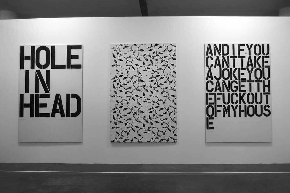
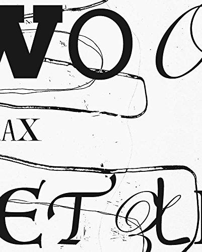
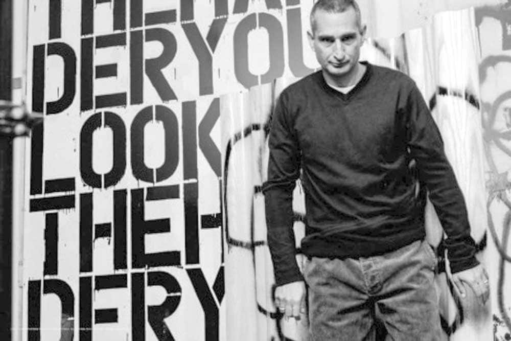
One of the most influential American typography artists living and working in New York City, Christopher Wool uses a wide range of techniques and style in his works.
He is, however, best known in the typographic world for his striking, large-scale paintings of black-stencilled type on white canvas backgrounds.
These pieces often have phrases with the words abbreviated, disrupted and in a grid format, making it slightly more difficult for the viewer to perceive and make sense of the piece as a whole.
Some are also somewhat enigmatic, one for example which says ‘The Harder You Look, The Harder You Look’.
These paintings are the most iconic of his influential career and are instantly recognisable and highly favoured.
More of his work can be viewed on his official website.
- English (Publication Language)
- 56 Pages – 06/12/2018 (Publication Date) – Holzwarth Publications (Publisher)
Craig Ward

This British-born typography artist and one of the most influential typography designers is exceptionally talented when it comes to creating attention-grabbing letterforms.
He uses an extensive range of media and equipment, generating stunning outcomes and effects.
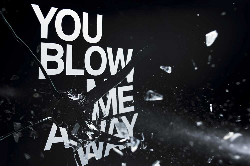
One of his most ambitious pieces is titled ‘You Blow Me Away’ which he collaborated with kinetic still-life photographer Jason Tozer to create.
With the type screen printed onto sheets of glass, they fired various objects through them and photographed the scenes at multiple stages.
The results were both unique and incredible.
Ward is also well known for his piece titled ‘Bad Typography Is Everywhere’ which highlights in a visually creative way the fact that the world is so full of lousy typography rules artwork that people often don’t notice the good.
You can view more of his work on his studio website.
Stefan Sagmeister


Stefan Sagmeister, of design firm Sagmeister & Walsh, is a New York-based, Austrian graphic designer and famous typography artists who is very well known for his album cover design and has a reputation for producing exciting and evocative typography art.
Typography features heavily in his work, and he uses a broad range of approaches to achieve his designs.
Alongside his client-based work, he conducts personally driven projects such as the ongoing ’20 Things I Have Learned in My Life So Far’ which includes his real-world typographic compositions named ‘Trying to Look Good Limits My Life’.
This consists of 5 separate pieces spelling out the words of the sentence using natural and industrial materials arranged in 5 different environments.
This maxim is also applied to a leather belt with the words created using punched out holes that also serve as the belt holes.
This project represents the dilemma Sagmeister faces in his work, whereby he always strives to be nice to people and loves to avoid conflict in life, which somewhat relates to a fear of rejection.
This, he feels, closes doors and limits what he does.
More of his work is featured on the firm’s website.
Alex Trochut
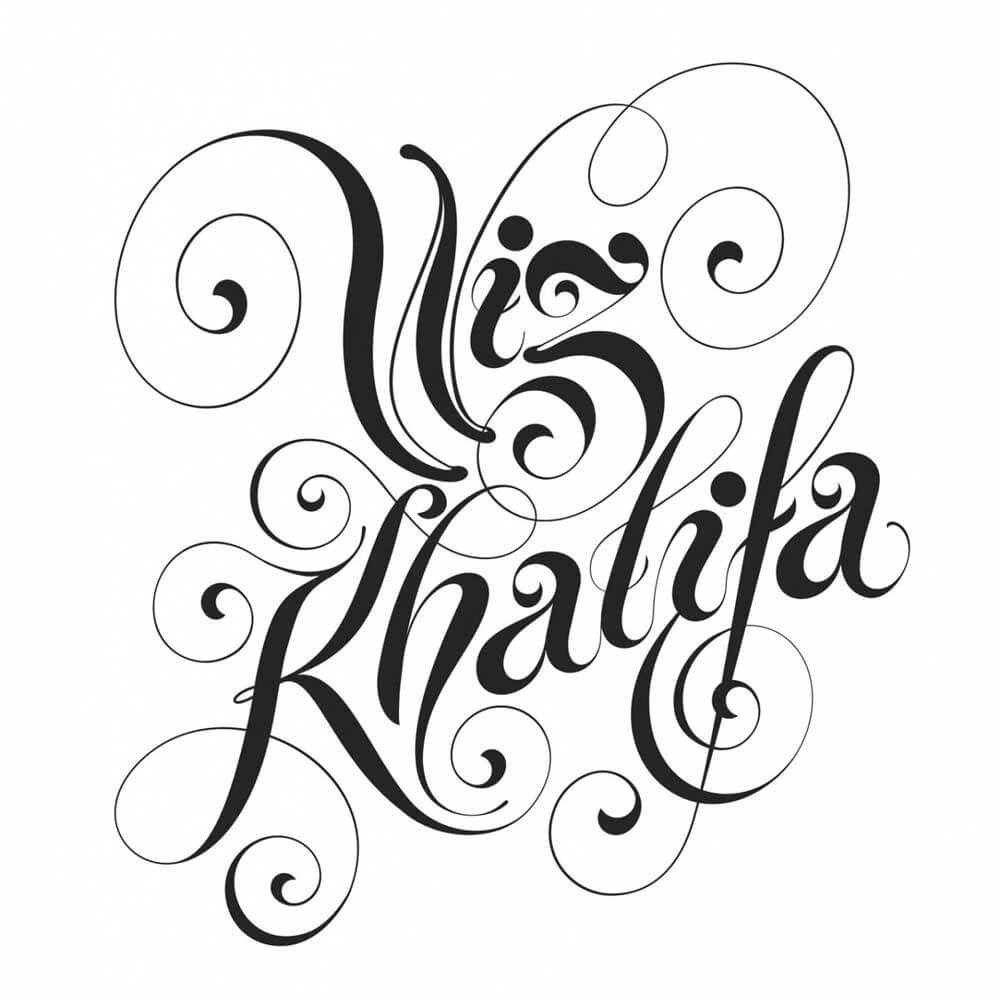
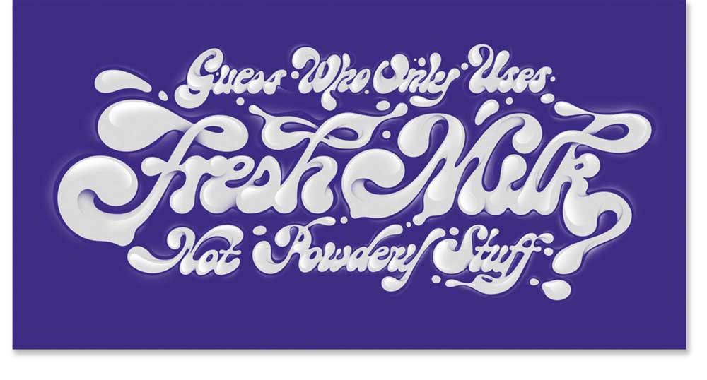
Barcelona-based Trochut is renowned for his extraordinarily intricate and detailed typographic design work.
Inspired by his Grandfather’s modular typographic and ornament system creation in the 40s, he has developed a unique and elegant style and worked for clients such as Nike and Coca-Cola.
One of his better-known unique typography print art projects is a series of designs titled: ‘Lorem Ipsum’.
These all feature the words ‘Lorem Ipsum Dolor Sit Amet’ in tubular style strokes.
He makes use of objects which are tubular such as pens, pencils and squeezed liquids such as creams and sauces and intricately weaves and intertwines the strokes to create the complicated yet visually pleasing effects he achieves.
Wim Crouwel
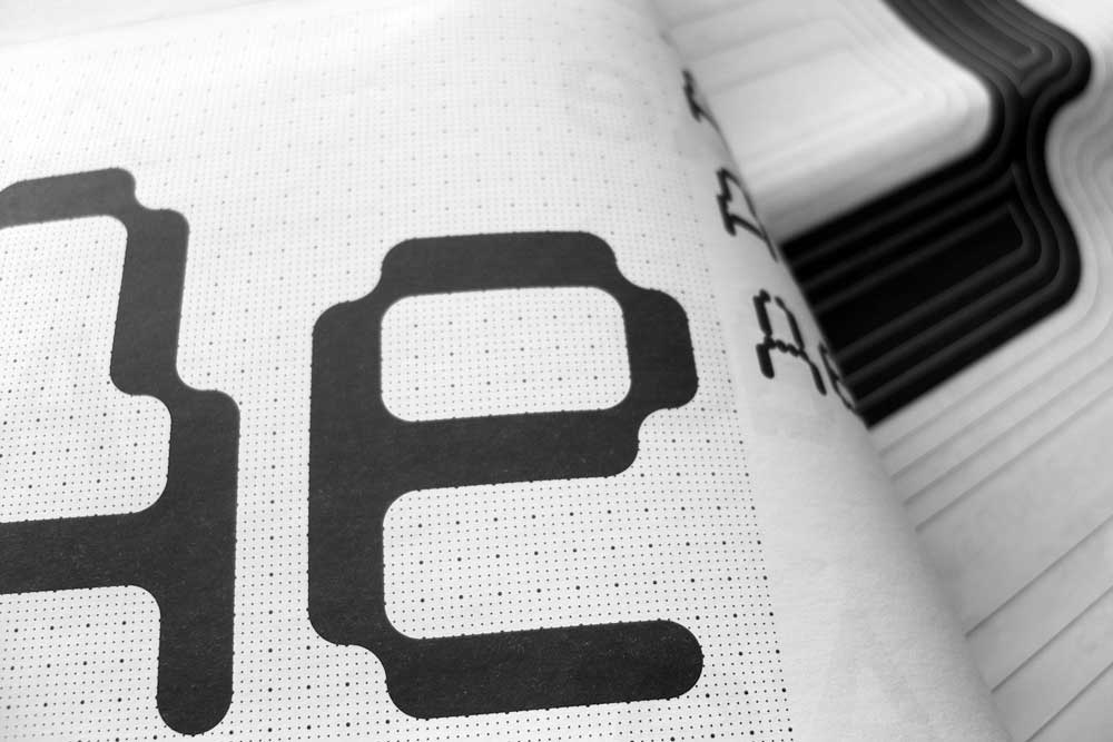
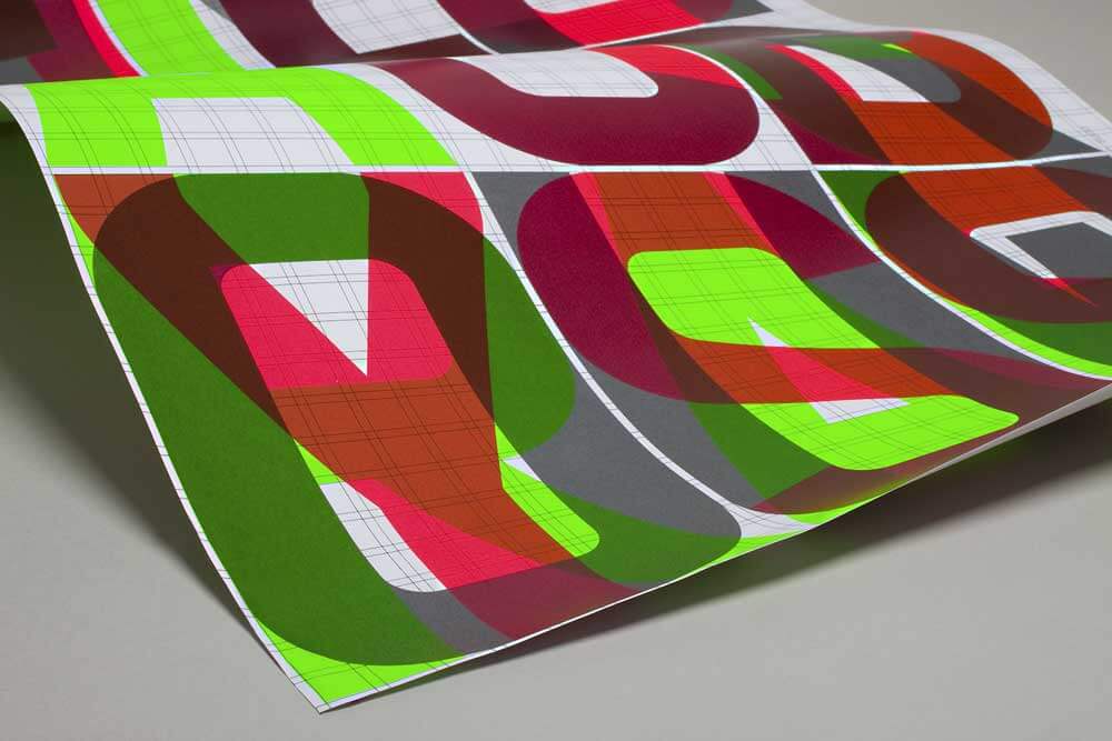
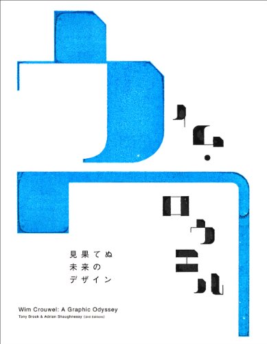
Wim Crouwel is a Dutch graphic designer and one of the most famous typography designers for his typeface design called ‘New Alphabet’ which he created in 1967.
The typeface was designed in such a way to make it represent the limitations of the cathode ray tube technology used in early typesetting equipment.
This technology limited the process of recreating type and so the typeface Crouwel created is entirely made up of only straight lines, 45 degrees and 90-degree angles.
This makes it reasonably hard to read, which was the main criticism from the design community at the time of its creation.
However, it was designed with aesthetic and theory in mind and was never intended to be used as a functioning typeface due to its illegibility.
As a display typeface, it is awe-inspiring, especially on bold coloured backgrounds, and reading it provides you with an exciting challenge, which makes it somewhat interactive as well as attractive.
- Hardcover Book
- Wim Crouwel; Tony Brook; Adrian Shaughnessy; Ichiro Saga; (Author)
- English (Publication Language)
- 09/01/2012 (Publication Date) – Bienuenushinsha. (Publisher)
David Carson
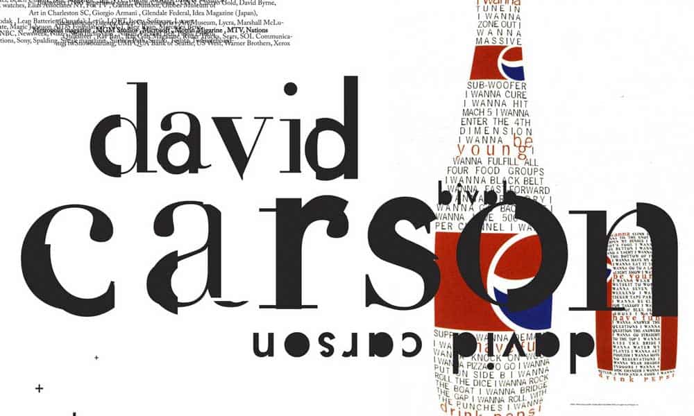
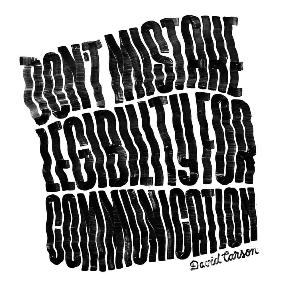
An American based graphic designer, surfer, and Art director David Carson earned a massive name in experimental typography artists.
Before getting into the field, he did a few months of unpaid internship and attended a few workshops held in Switzerland to make himself absolute in graphic design.
He started by being an Art Director for an international Magazine ‘Transworld Skateboarding.’
During his term, he gave the magazine a distinct look.
David started creating his signature style, a non-conventional photographic system, and a dirty type.
He also designed a ‘Beach Culture’ on the demand of Steve Pezman, publisher of surfer.
David is also known for being an art director of another American-based magazine ‘Transworld Snowboarding,’ that came into being in the late 1980s.
In the early 1990s, he came with his studio and started catching the attention of well-known brands, including Microsoft, Nike, Pepsi, Sony, British Airways, Intel, Fox TV, Prince, MGM Studio, and many more.
The overall best designer of the New York award-winning graphic designer, David, is considered 30 influential graphic designers who have impressed people with his graphic design skills.
He is also a publisher of 2 books that he wrote in different languages for everyone’s understanding.
Tobias Frere-Jones
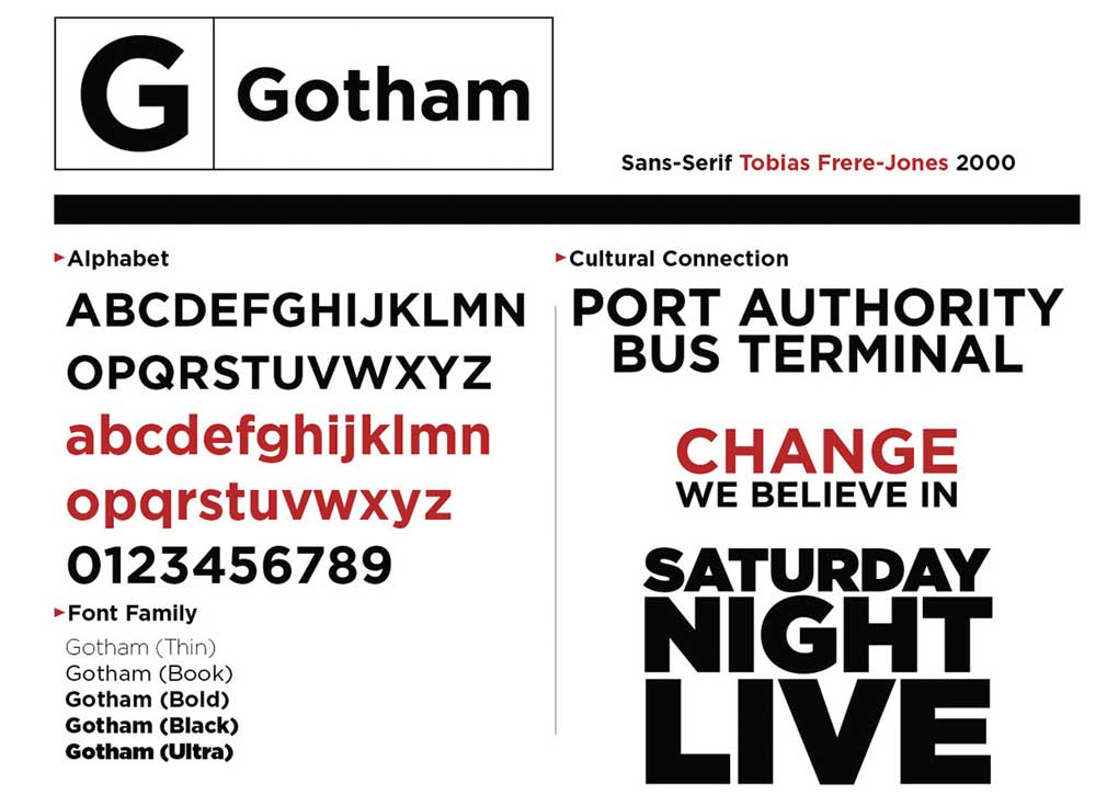
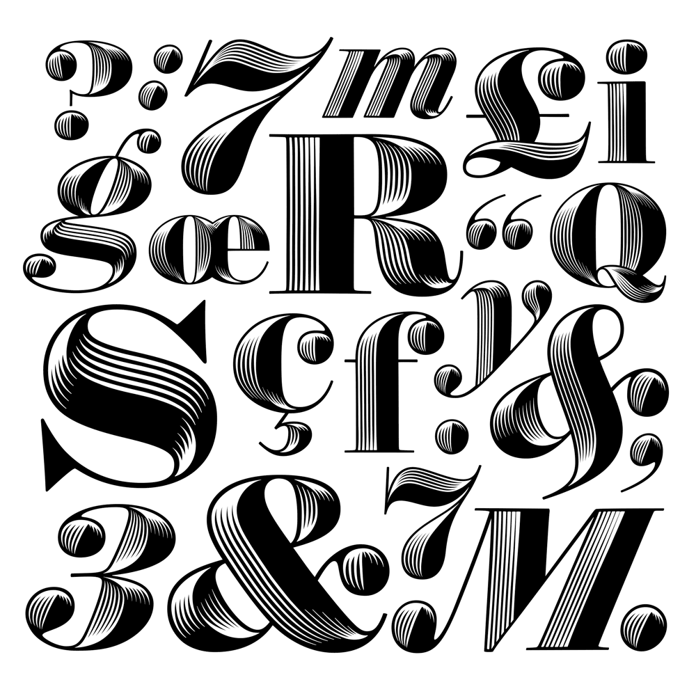
An American designer Tobias Frere-Jones is one of the worth praising graphic designers.
He is known for creating Gotham font, one of the highly used fonts worldwide by notable companies.
It received massive popularity after being inducted in Obama’s 2008 presidential speech campaign.
His other achievement occurs in 2001 by creating another typeface Archer.
He became a senior designer for Boston based company Font Bureau and taught design at Yale School of Art.
After teaching for two years, he started working with an American designer Jonathan Hoefler.
During the collaboration, both worked on many projects, including The New Times, GQ, The Wall Street Journal, Pentagram, and many others.
A considerable lot of Frere-Jones’ typefaces are enormous families intended for proficient clients; for example, Mallory, which starts in 2019, had 110 styles.
He was honoured with Gerrit Noordzij Prize by the Royal Academy of Arts for his various innovation in graphic designing.
Furthermore, he remained the recipient of the National Design Award.
In the last 25 years, Tobias has got his hands on some highly unusual designs, including Whitney, Interstate, Retina, Gotham, Tungsten, etc.
He is indeed one of those rare graphic designers who has done pre-eminent work in the visual design field.
Steven Heller
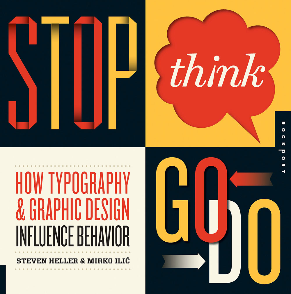
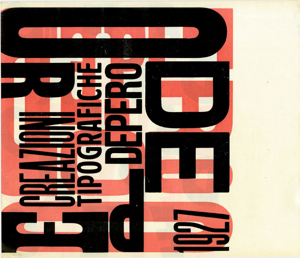
An American based Art Director, Author, and Journalist Steven Heller has made his name with famous typography artists by coming with something new to offer.
Without having any formal education, he became an Art director in the late 1960s with his learnings.
In 1974 he replaced Jean-Claude Suares and became an Art director for an American based Magazine, ‘New York Times Book Review.’
With time, he kept surprising everyone with something unconventional and innovative.
In 1984 his other achievement came into being.
Steven designed Masters’s programs for the New York-based college, School of Visual Arts.
The Award-winning Director, Steven Heller, was honoured with AIGA Medal, which is, according to American designer Paula Scher, a lifetime achievement award given from a workday between 4:30 and 8:45 A.M.
Apart from being a reputable graphic designer, he has also written many journals for different magazines, including Baseline, Design Issues, Graphis, How, Print, Speak, etc.
He is also an author of many worth recommending books, including Innovators of American illustration, wrote in 1986 based on a review of 21 present artists who created an individual life.
Steven is one of those graphic designers whom we found once in a lifetime, and that he has proved with his work.
Paula Scher
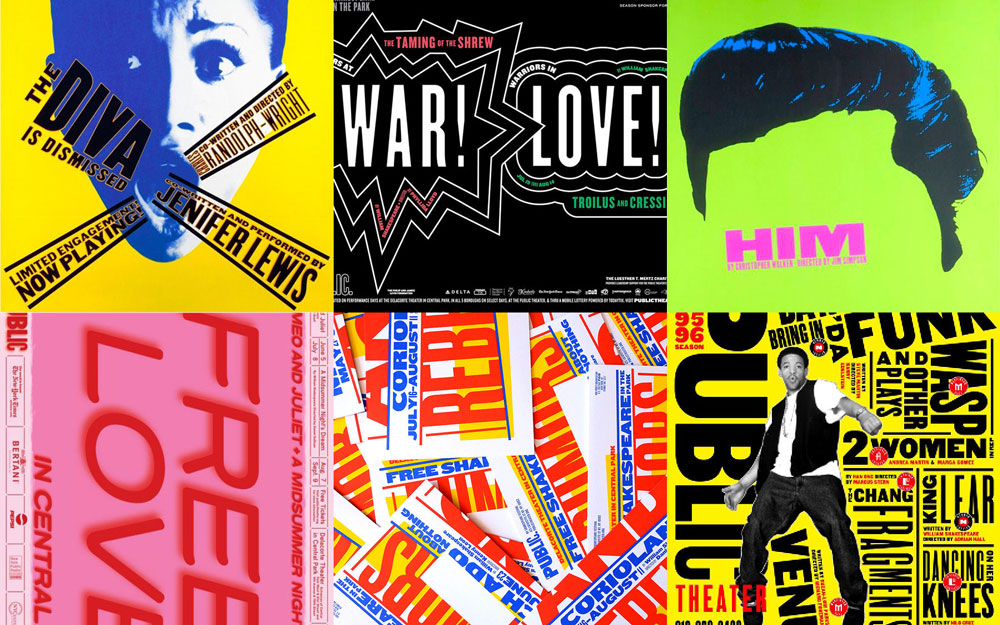
It wouldn’t be wrong to call Paula Scher, a New York-based graphic designer, one of the best typography artists who created a significant influence with her work.
She is an American painter, Graphic designer, and an Art Educator who masters in her work.
She is also known for being the first female principal in the London based design firm, a pentagram.
Her first job was as a layout artist that she performed for Random House’s children’s book division.
After doing two years of a job at the CBS record, she pursued her career as an Art Director.
Later, she again came to CBS Record, an American based music company, and started designing cover albums.
She has a track record of designing more than 150 albums for the company within a year.
A few of her iconic work includes Bob James and Earl Klugh, Leonard Bernstein, etc.
Paula is known for being a graphic designer who revives design styles and historical typefaces.
She has much worth admiring work in her credentials.
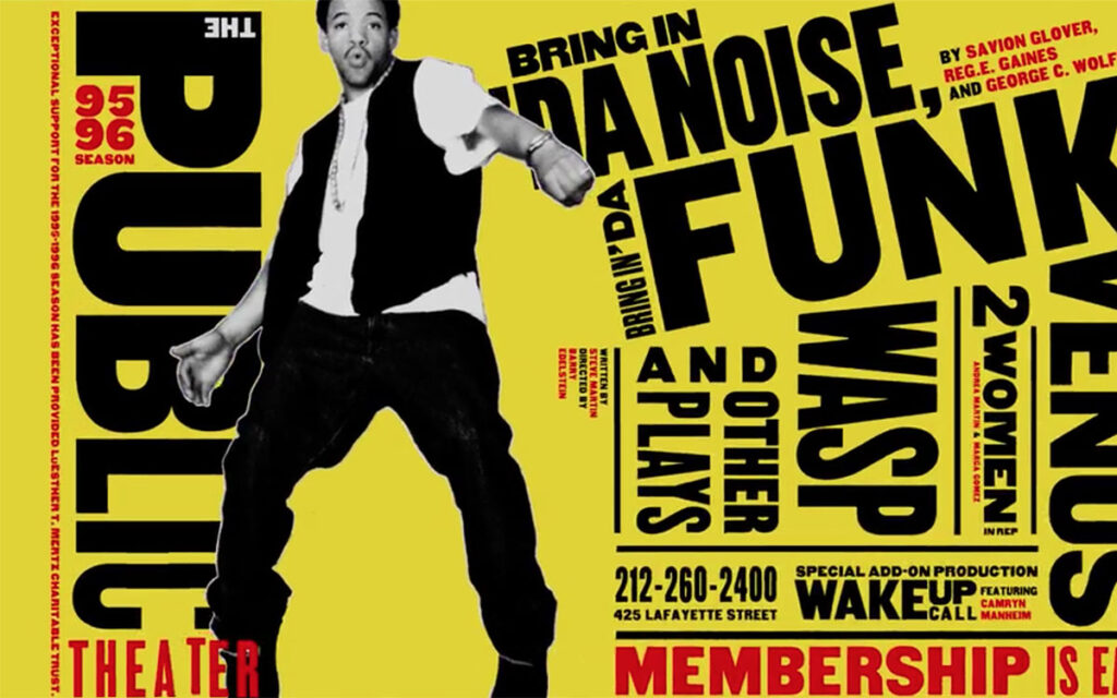
She is the one who introduced a promotional graphic system for the New York arts organisation, The Public Theater.
The program came into being in 1995 that influenced graphic designing from a theatrical point of view.
Gail Anderson
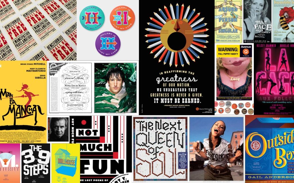
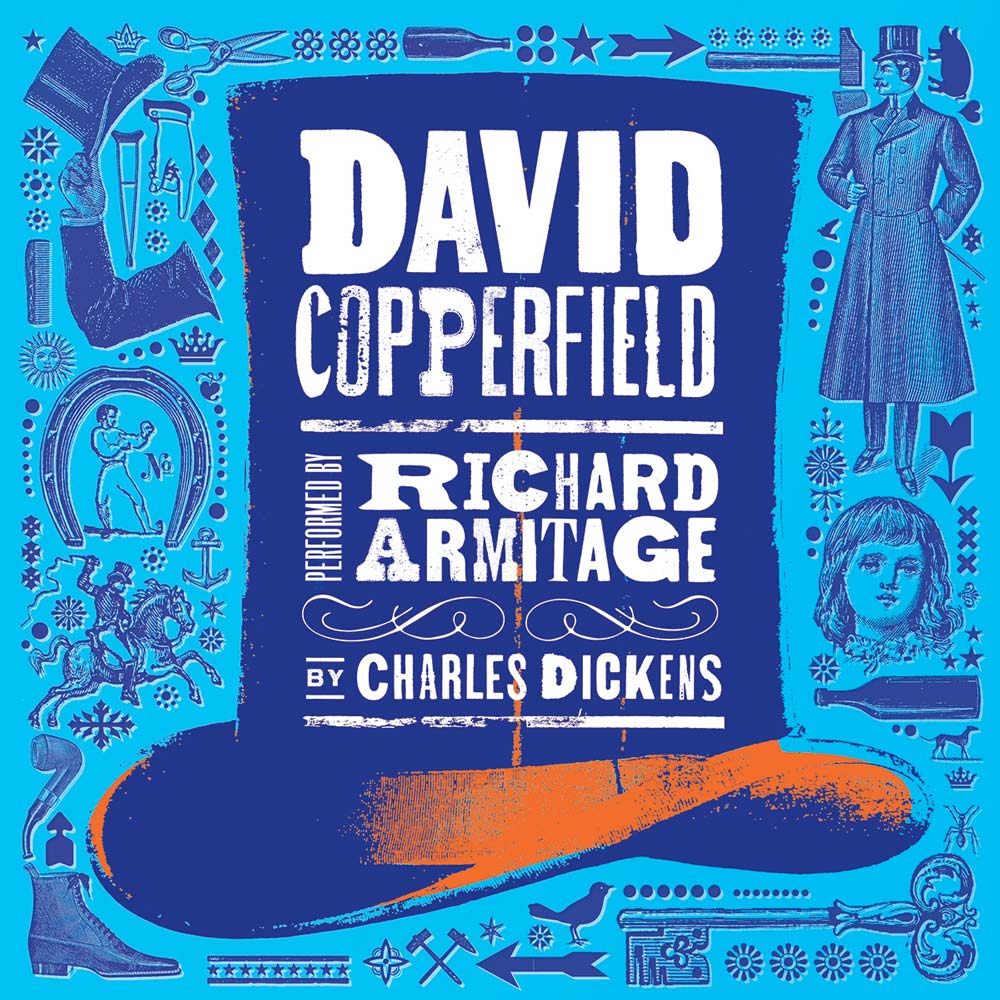
Another American based graphic designer in the worth recommending list is Gail Anderson, who has impressed millions with her work.
She is a writer, educator, and one of the most successful typography artists who started with a company, Vintage Books, and later made her name in the field.
She functioned as an Art director for an American magazine, Rolling Stones, for two decades.
After leaving Rolling Stone, she associated herself with an advertising agency, SpotCo specialising in Entertainment and Arts.
Gail is also known for being partners with Joe Newton.
She received massive acclaim in 2013 for designing the United States Postage Stamp.
Gail and Steven Heller remained a partner for 20 years.
During this period, she, along with Steven, wrote many books on graphic designing.
According to her, ‘Designing should be fun, and one should take steps by coming out of their comfort zone.’
She was the recipient of the 2008 Lifetime Achievement award for her services in the graphic design industry.
Anderson has always been obsessed with graphic design and always finds different ways to enhance her skills.
Her work depicts her fixation with her work.
She created her style and fused it in various commercial fonts, advertising posters, and vintage signage.
We hope you have enjoyed this article looking at these famous typography artists of the 21st century and their work.
You may also enjoy this post on famous, celebrity graphic designers.
Feel free to leave a comment below with suggestions of other famous designers and typography artists to check out!
Last update on 2020-11-19 / Affiliate links / Images from Amazon Product Advertising API
