07 Dec What Is The Golden Ratio? When And How to Use It
What Is The Golden Ratio? When And How to Use It
What do National Geographic, Pepsi, BP, Google, Twitter, and Apple all have in common?
They all use the Golden Ratio in their logo design.
One of the most powerful tools in any designer’s arsenal, the Golden Ratio helps to create designs that are accessible, clear, and pleasing to the eye.
This tool is not only one of the most downplayed, but it’s also ancient enough to have fascinated mathematicians thousands of years ago.
The ratio’s mathematical formula determines the best proportions for a design, whether the design is the cover of a murder mystery novel, a TV channel logo, or a building.
What makes it even more interesting is that the ratio is found in various manifestations in the natural world.
It has been described by many authors (including the writer of the da Vinci Code) as the basis of all of the beautiful patterns in nature and it is sometimes referred to as the divine proportion. (plus.maths.org)
Below, we’ll take a closer look at the Golden Ratio.
You’ll find out what it is, and when and how you can use it in your designs.
In Nature And Human Design
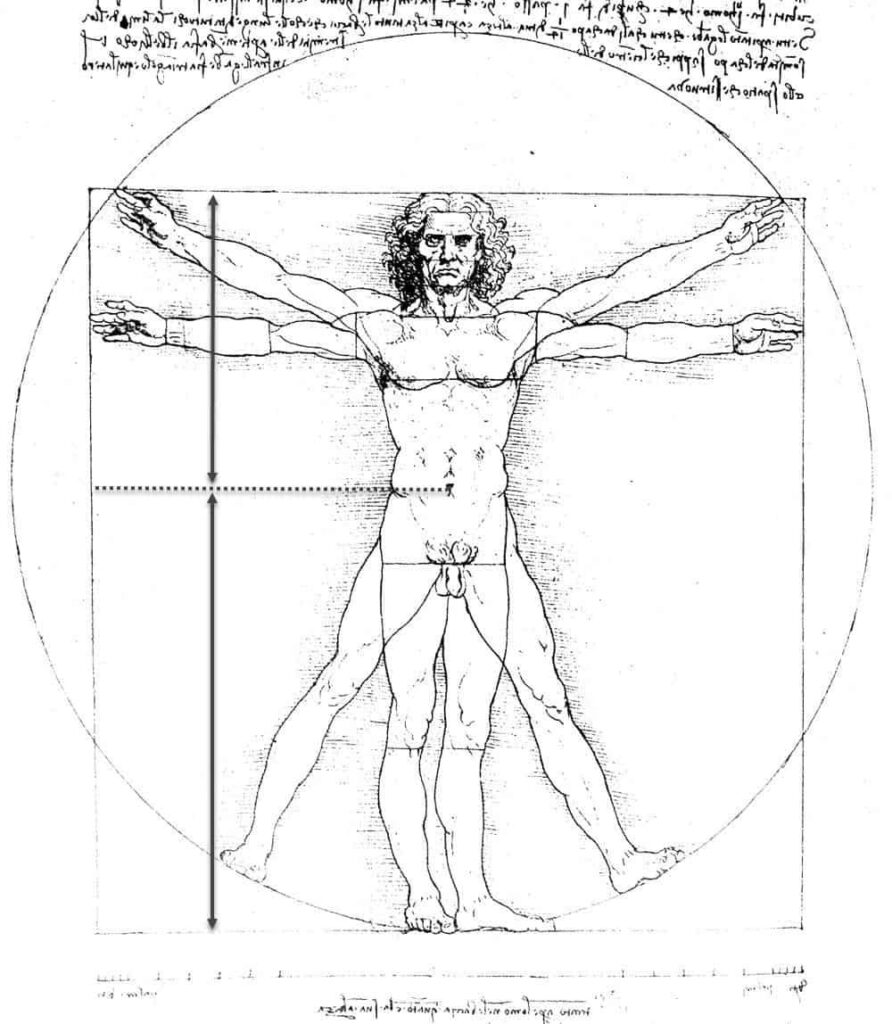
The ratio that Leonardo da Vinci knew as the Golden Section appears throughout the natural realm and in human thought and design.
You can find it in the spirals of galaxies and hurricanes, plants such as spiral aloe and Romanesque broccoli, and nautilus shells.
You’ll also see the Golden Spiral (more on that below) on the bottom of a pinecone, in a curled fern frond, the curve of a barrel wave, a sunflower’s seed head, and the curl of a chameleon’s tail.
In his book, Golden Ratio—The Story of Phi, the World’s Most Astonishing Number, astrophysicist Mario Livio wrote that the history of mathematics had not seen a more significant number.
He explained the ratio has attracted and held the attention of some of the world’s greatest mathematical minds.
Among them were ancient Greeks Euclid and Pythagoras, mediaeval Italian Leonardo Bonacci (Fibonacci) Renaissance Italian Leonardo da Vinci, 17th-century German astronomer Johannes Kepler, and modern Oxford physicist Sir Roger Penrose.
The Golden Ratio in nature and human design, and its properties, have also been studied, debated, and contemplated by architects, artists, biologists, historians, musicians, mystics, psychologists, and others.
If you want to see it in art and architecture, look at Leonardo da Vinci’s Mona Lisa, Sandro Botticelli’s Birth of Venus, the pyramids of Giza, and the Parthenon in Athens.
So, after all that, what IS the Golden Ratio, and how can you use it to guide your typography, layouts, and other design elements?
A Ratio For Beautiful Balance

The naturally occurring Golden Ratio creates a balance that is pleasing to the eye.
It’s represented by the Greek letter Phi (Φ), and it is expressed as 1:1.618033987.
You can apply it to single shapes such as rectangles and shapes next to one another when comparing their lengths or widths.
The ratio is formed by dividing a line into two unequal lengths.
If length A is 100px, then length B must be 161.80px.
The formula used to calculate the ratio is A/B = (A+B)/A = 1.6180033987.
Most representations of the Golden Ratio depict several rectangles and a spiral.
The Golden Spiral is logarithmic, and it grows larger by a factor of the ratio.
The spiral’s growth is created by the Fibonacci Sequence, in which each number is the sum of the two numbers before it (1, 1, 2, 3, 5, 8, 13, 21, 34, 55).
You can also use the spiral to help you create balanced designs.
Using The Golden Ratio In Graphic Design
One of the most basic ways you can use the Golden Ratio in your graphic design work is to calculate the size of one element concerning another.
Do this by multiplying the size of one element by 1.618 to find the size of another feature.
Here are a few other ways that you can use the ratio and the Golden Spiral in design:
Composing Images
One hallmark of a talented designer is the harmony you create between the various elements in your design.
Use the spiral to help you bring images into harmony.
You also can overlay the spiral on photos and other images to find the best places to crop them.
Designing Logos
Logos help build businesses’ corporate identity and the trust of customers.
They can enhance the exposure brands receive and help customers relate to brands too.
Logos must be designed well, and you can use the Golden Ratio to help you do that.
In addition to the National Geographic logo, the ratio and the spiral can be found in the symbols of Apple, Pepsi, and Twitter.
Use the ratio to guide the sizing of the text and the placement of images.
For example, Twitter’s bird logo was created by representing the Fibonacci sequence as circles, then using them to create a grid that formed the base of the design.
Let’s look at the Golden Ratio in a few other well-known logos.
Apple Inc.

At least two logos used by Apple Inc. were designed using the Golden Ratio.
The first is the familiar apple shape, the simplicity of which would never make you think that it’s curved, bite mark, and sections of several intersecting circles form a leaf.
The diameters of the circles are proportionate to the Fibonacci Sequence.
The second is the iCloud logo, which is a simple cloud design that wouldn’t look out of place in a children’s picture book.
Sections of several circles form the curves that form the cloud, and their diameters are determined by the Golden Ratio, which is also found in the ratio of the cloud’s height to its width.
British Petroleum (BP)

Numerous concentric circles form British Petroleum’s simple green and yellow sunflower logo.
Much like the circles used in the Apple Inc. logos, the Fibonacci Sequence determined their dimensions.
National Geographic

The yellow rectangle of the National Geographic logo is a simple Golden Rectangle.
The ratio of the outer width to the external length, and the inner width to the inner length, is 1:1.618.
The most famous application of the golden ratio is the so-called golden rectangle, which can be split into a perfect square, and a smaller rectangle that has the same aspect ratio as the rectangle it was cut away from. – Fast Company
Given the National Geographic Society’s commitment to publishing news about culture, geography, history, nature, and science, the logo couldn’t be more appropriate.
Pepsi

Pepsi is one of the world’s biggest-selling soft drinks, so it stands to reason the brand’s logo is recognised by millions, if not billions, of people.
However, there’s more to the logo than its association with the carbonated drink.
Several intersecting circles of various sizes form the red, white, and blue Pepsi logo.
The sizes of those circles are in a Golden Ratio proportion to one another.
The result is simple, unmistakable, and impactful.
Toyota

Three ovals of different sizes form the Toyota logo.
The logo is yet another example of impactful graphic design that uses the ratio.
If you measure the distance between the bottom inner edge of the small horizontal oval, and the bottom of the outer edge of the large horizontal oval, and the distance between the extreme top and bottom edges of the large oval, you’ll find they are in a Golden Ratio proportion.
Typography Sizes
Whether you’re working on a web page or an image that will be printed using a photo printer, some textual elements are more critical than others.
Use the Golden Ratio to calculate the best sizes for the typography of those elements.
Start by choosing the size of the smallest, least important text.
For example, if you choose a font size of 10px, multiply it by 1.618 to find out how big you should make the larger, more critical text.

Placements In Layouts
The Golden Ratio and Spiral can help you determine the composition of images, the size of text, and the layout of those various elements in your design.
The easiest way to do this is to overlay the spiral on the design.
Place an essential element, whether it’s an image or text, in the centre of the Golden Spiral.
It naturally attracts our eyes to the centre, and by putting the most crucial message in it, there’s little to no chance of viewers missing it.
When that’s in place, you can use the spiral to guide the position of the other elements.
Alternatively, place the Golden Ratio grid over your design, and use its various rectangles and the spiral to position the text and images you sized using the ratio.
Examples Of The Golden Ratio In Art And Architecture
We mentioned earlier that you’d find the Golden Ratio, Rectangle, Spiral, and Triangle in art and architecture.
Let’ unpack the famous examples we cited in a little more detail:
The Mona Lisa

Painted by Da Vinci between 1503 and 1506, the Mona Lisa is arguably the most famous painting in the world.
The portrait of Italian noblewoman Lisa Gherardini is known mainly for her enigmatic smile and eyes that appear to follow you as you move.
The painting is probably less well known for Da Vinci’s use of the Golden Section and the spiral that’s created within it.
If you place the Golden Spiral over the painting, it forms a frame around the woman.
It curves up from her left wrist, crosses her forehead and curves down to cross her chin, then moves past the dimple, and curves round to the tip of her nose.
The renowned artist and inventor also used the ratio in other works of art, such as his painting, the Annunciation.
The Birth Of Venus
One of Italian Renaissance’s great icons is Botticelli’s Birth of Venus, which was painted sometime around the 1480s.
The artwork’s popularity comes down to the artist’s skill, the beauty of the figures, the straightforward subject matter, and unbelievably pleasing proportions.
Botticelli achieved those proportions by using the Golden Ratio in various elements of the painting.
The Golden Spiral is found in the curl of hair on Venus’ right shoulder, and her navel’s the Golden Ratio point of the distance between her hairline and the bottom of her right foot.
Her navel is also the ratio point of the distance between the top line of her hair, and the bottom line of her left foot.
The canvas width of 172.5cm and height of 278.5cm have a ratio of 1.6168, which varies from the Golden Ratio (1.618) by a mere 0.08%.
This means the canvas itself is an almost perfect Golden Rectangle.
The Great Pyramid
The Great Pyramid of Giza, Egypt, also known as the Pyramid of Khufu, is one of the seven wonders of the ancient world.
It was the largest human-made structure in the world for almost 4,000 years.
While the incredible size of the pyramid gets most of the attention, many folks also know that it, along with several other structures at the necropolis, are aligned with various stars.
Less well-known is the Great Pyramid’s geometry, which varies from a perfect Golden Triangle by less than 0.025%.
A Golden Triangle has a base of length 1, a hypotenuse of Phi, and a height that is the square root of Phi.
The Parthenon

Completed in 432 BC, the Parthenon is a former temple to Athena, the ancient Greek goddess of wisdom, warfare, and handicrafts, in Athens, Greece.
The temple was the city treasury, and in later times, it was converted into a church and then a mosque.
The Parthenon is one of the pre-eminent symbols of Greece, and many scholars regard it as the highest expression of Doric order architecture.
Some of its beauty is because of the Golden Ratio.
Although it’s difficult to prove the ratio was used in the overall design of the structure, it can be found in the columns and structural beam on top of them.
The height of each column is in a Golden Ratio proportion of the beam.
You’ll also find that the width of each column is in that proportion to the distance from their centre-line to the outside of the column.
Aesthetically Pleasing Designs
The Golden Ratio and its related spiral are the keys to some of the most aesthetically pleasing designs on the planet, so there’s no denying their power and their appeal.
Use them in your designs and create work that has something in common with history’s greatest artists, architects, and designers.
Author Bio: As a seasoned freelance writer, Alisa loves to cover topics on all aspects of design, photography, art, and just about anything in the creative world. When she’s not typing away, she loves being creative and is usually covered in paint or graphite.