02 Jan Importance of Colour Choice in your Logo Design
Importance of Colour Choice in your Logo Design
First of all, what is a Logo?
In the form of images, shapes, or texts, logos are the first business identification points.
When developing effective logo designs, there should be a combination of both creativity and design skills.
An effective logo design should tell the story of the brand and business and allow potential clients to connect with it instantly.
It should not only build the brand’s recognition but also remain simple, appropriate and memorable.
Importance of Colour Choice in your Logo Design

Colour choice is a vital factor in the design of every logo.
A logo design with the right colour combination is the best way to highlight a business brand and attract all potential clients.
Going for the wrong colours can equally negatively affect your business.
Among the best ways to market a brand is through visual impression.
Still, the meaning of different colours on logos on people cannot be generalised due to other contributing factors.
Among the factors that determine the purpose of colours include culture, the context, and personal preferences.
Therefore, it is crucial for graphic designers to fully understand the impact of colours on brand identity and creating logo designs.
They must be knowledgeable in colour psychology to come up with logos that influence client traffic.
Why is it essential to choose the right colours for logo designs?
In the segment below, we highlight the extent to which colour influences brand recognition.
Colour Attracts Attention

Brands advertise on different platforms; social media, Tv adverts, Newspapers and Billboards.
According to research done on marketing strategies, the first thing that people notice on brands’ logos are the colours used.
80% of the memories the logo creates to individuals are based on the colours presented.
The colour you choose for your logo should enable the brand to create impressive visuals to consumers, thus remaining memorable and eventually gaining mass recognition.
It is essential to use simple combinations of bright colours since they are easily noticeable, increase concentration rate, and stand out from the rest.
Using Coloured Logos Is an Excellent Way to Reach the Target Audience
Through the use of colours on logos, businesses can reach potential product users.
For ages, coloured logos have been used to target different clientele based on various factors such as their age, gender, physical location and their way of life.
Customers are more likely to choose brands that relate to their interests, colour preference being among them.
Brands should understand the needs of the target consumers before choosing the logo design colours.
Before settling for the colours, brands should be aware that colours portray different meanings depending on the location, so researching prior is critical.
Colour Establishes the Identity of a Brand

When a company starts, the main focus is to develop an eye-catching logo, combined with its colour.
Before it gains popularity, the brand uses both the logo and its name.
After becoming successful in the market, the brand name is no longer a factor of concern.
Clients can recognise the brand based on the logo and the colours used.
For instance, colours and the symbols associated with sports brands such as Adidas and Nike have become so popular that they are identifiable even without the brand names being written anywhere.
Colour popularity is a powerful brand marketing strategy that leads some companies to trademark colours associated with them.
Colour Triggers Emotions
Through the use of colour, logos can evoke different kinds of feelings to the audience.
Customers are more likely to remember a brand and its product based on the initial emotional reactions.
Therefore, a brand must decide the kind of message they would like a specific colour to convey.
The main concern should always be; To what extent does the colour/s connect with the target market?
Below, we discuss different logo colours and how they influence brand awareness based on their universal perceptions.
Warm Colours: They include energetic colours such as red, orange and yellow. Usually, they evoke excitement, warmth and eagerness.
Cool Colours: These are the natural colours we notice in the environment daily. They include green, blue and purple.
Red
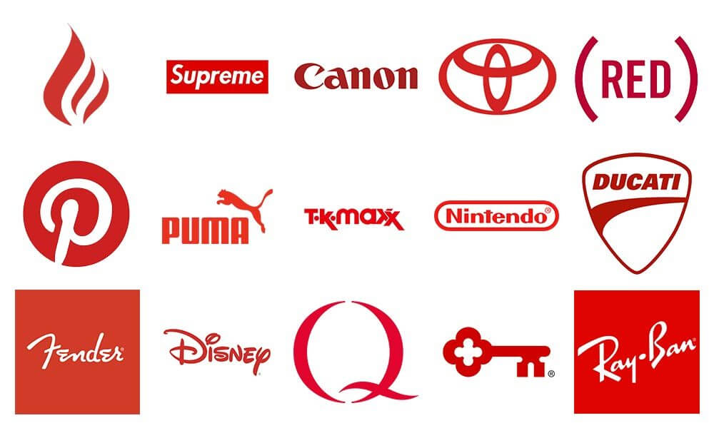
Red is among the most powerful colours that can be used in a logo design.
Red portrays a mixture of feelings.
It evokes feelings of power, passion, excitement, urgency, anger, desire, love and dominance.
It is intense yet very warm.
The colour red easily attracts people’s attention.
Thus, it is used in many signs, including compulsory and danger signals such as ‘STOP’.
Most brands also use red signs to alert people on ongoing activities such as ‘END OF YEAR SALE’ ‘BUY NOW’ and CLICK HERE TO ORDER’.
The characters reflect a sense of emergency and call for an urgent response, therefore attract more people.
The power of colour red remains undoubted even when it comes to bodily functions.
By looking at it, one’s pulse rate, blood pressure and body temperature rise.
It also increases the body’s metabolism rate, respiration rate and appetite.
Its appetite increasing factor makes it a preference by most eateries, therefore they use red in their logos to get more clients.
Due to the broad nature of emotions it evokes, red has been continuously and widely used by brands in the entertainment sector, general retail business and food industry.
Blue

There is a reason why blue is the most dominant colour among brands in the corporate world.
The colour is used in logos to represent hospitals, financial corporations, government facilities and technology companies.
This is due to its ability to bring a sense of trustworthiness and loyalty.
Blue slows down the heart rate, leading to a feeling of calmness, professionalism, integrity and stability.
There are higher chances of potential clients building their trust in your brand and the services you offer if the logo design is blue.
It boosts confidence and dependability on the brand and remains a right colour preference by both genders.
Although blue symbolises maturity, brands should remain keen on the blue shades they use on their logos.
Some shades can be dramatic, and others come across as cold and self-centred.
Green

Globally, the colour green is used to represent the environment, good health and proper growth.
It is also associated with healthy trees in forests and the general vegetation.
Green is a symbol of new beginnings, renewal, and peace.
Most brands aligned with environmental conservation, organic products, green energy and recycling prefer to use green.
It is the right choice for any company that is just starting and is optimistic about future growth.
It also has a relaxing and healing effect on people, making it ideal for use by any brand.
Yellow
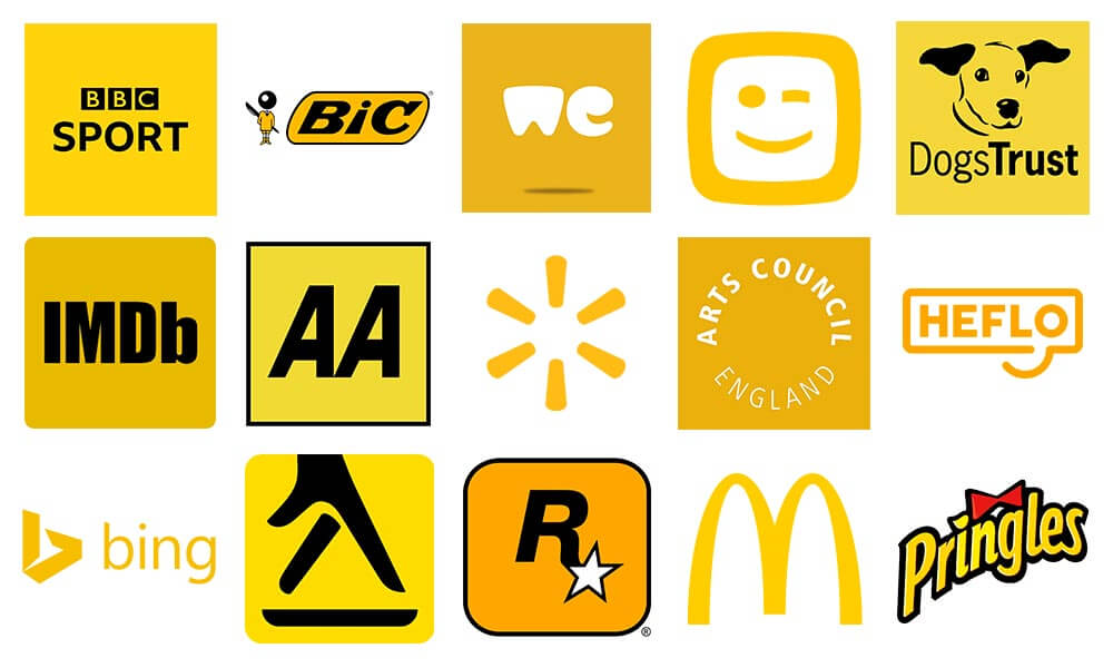
Yellow is a vibrant colour usually associated with the sun, gold, wheat fields, bananas or ripe lemons.
It is bright, lively and warm.
It is one of the earliest colours that humans came up with through mixing other shades.
Yellow brings in the feeling of positivity and makes people cheerful by generating warmth.
Generally, it brings so much energy in our day-to-day activities.
A brand that chooses yellow as a logo design colour will undoubtedly stand out, show accessibility, and attract consumers’ attention.
At times, yellow may not be suitable as a logo colour since it might put the brand across as cowardly.
When used in excess, it may cause impatience among people and lead to insecurity when used in very minimal amounts.
This makes it such a conflicting colour that should only be used with caution.
Orange
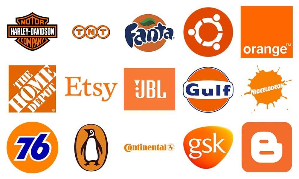
Most people are conflicted when trying to differentiate between orange and yellow, due to their similarity.
Orange is outstanding, cheerful, playful and warm, and associated with autumn.
It brings out the feelings of enthusiasm, approachability and energy.
However, many may see it as aggressive at times.
On the brighter side, it also boosts the activity of the brain and also triggers hung.
Brands that use orange logos are linked to the food industry and towards products that target children.
Brands can also combine orange with other colours to develop better and more serious, attractive logos.
Brands that target either female, wealthy or serious clients are not advised to use orange, since it does not suit those kinds of clients.
Purple
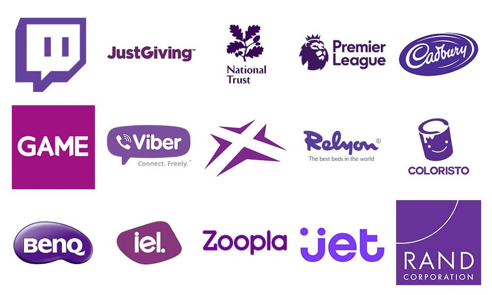
Purple is a rich colour that represents royalty, luxury, wisdom, courage and achievement.
It is delicate and leaves room for imagination while creating appeal simultaneously, thus creating mystery.
When used in the wrong way, the colour can depict immaturity or look oddly used.
The colour is also considered to represent spirituality and dignity, therefore its long association with the church.
Brands that use purple in their logos include luxury items stores, beauty products shops and education centres.
Most brands use purple to draw attention from clients who want an experience different from what they see.
It is also an excellent way to draw attention from the feminine side.
Black
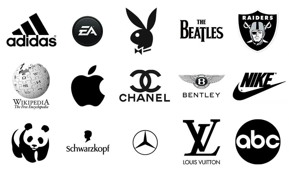
Black is a colour associated with mixed feelings.
Some associate it with bad luck, while in the branding world, it is a sophisticated colour that portrays authority and power, luxury and elegance and strength.
Black is very simple yet feels so modern.
Most brands use black since it boosts confidence in what they do and gives room for success.
Brands must ensure that their logo designs are a proper match when paired with black so that it does not showcase negativity.
Grey
You are looking for a colour that represents your brand in a credible, sophisticated and professional manner?
Grey is the way to go.
It is neutral yet portrays so much power at the same time.
It shows maturity, and when used in its darker shade, it is thrilling.
Brands can use grey in their logos as a background colour but should be very cautious about how it is used to avoid visual misinterpretation.
Lighter versions of the colour show easy accessibility of the brand and are more appealing to potential clients.
Single or Multiple Colours in Logos?
Single Colours
Most logo designers find it challenging to choose between single colours or multiple colours in their logos.
Single colours are minimalistic and impact clients since they can easily recall the specific colour and identify it with your brand.
They are also easy to apply due to their compatibility with almost backgrounds.
Multiple Colours
Compared to single colour logos, multiple colour logos are more complicated to use.
They require much knowledge in colour combination and a profound understanding of the meaning of the specific colours you want to combine.
It is essential to consider the two factors because they play a massive role in the logo and brand impression.
The main question should always be; what does the logo represent, and what is it aiming to achieve?
The questions should guide you to choose effective colour combinations.
Most brands that use multiple colours in their logos offer numerous services and target different people globally.
This ensures that the logo provides diversity and provides inclusivity for other people.
Conclusion
Logo designers need to think about the message that the brand wants to pass to consumers and the goals it has in place before selecting a logo colour.
Different colours have varying meanings depending on the culture of the people.
Therefore, it is vital to understand how colours are interpreted in a specific country, especially if the brand is international.
The colour you settle for should also enhance the visibility of your logo, thus the brand.
It should not be a distraction to the brand logo itself.
Author Bio: Kieran Fallon is the owner of Éire Graphic Design. Éire Graphic Design is a Dublin based graphic design company. We are here to help your organisation become more memorable through designing striking logos, eye-grabbing flyers, posters that pop, exciting animated emails and dynamic lightweight digital advertising campaigns – always backed by flexible and insightful support.
