28 Jan Web Design Best Practices: Checklist for a Great UX
Web Design Best Practices: Checklist for a Great User Experience
The role of a good user experience on a website is undoubtedly paramount.
It has a considerable impact on the website’s engagement and guides the users towards taking the desired action.
Therefore, web designers are diligent towards incorporating various web design methods to fulfil the users’ needs.
Steve Jobs once summed up UX in web design by saying that design isn’t only about looks and feel. Design is how it works.
The better the usability, the more satisfied will be the user. In other words, an enhanced user experience is the prime ingredient of a website that converts and escalates a business.
Finding the top of the range practices for a successful user experience often perplexes website creators. Some professionals swear by a method, while others advise staying away from it.
Moreover, with a plethora of usability, improving ways trending in web design these days, it is challenging to choose the ones that would give desirable results every time.
This blog post will get to know the website design best practices for an outstanding user experience that you can integrate into a site.
But first, check out some indications of a great user experience that you can strive to achieve.
Defining User Experience Goals
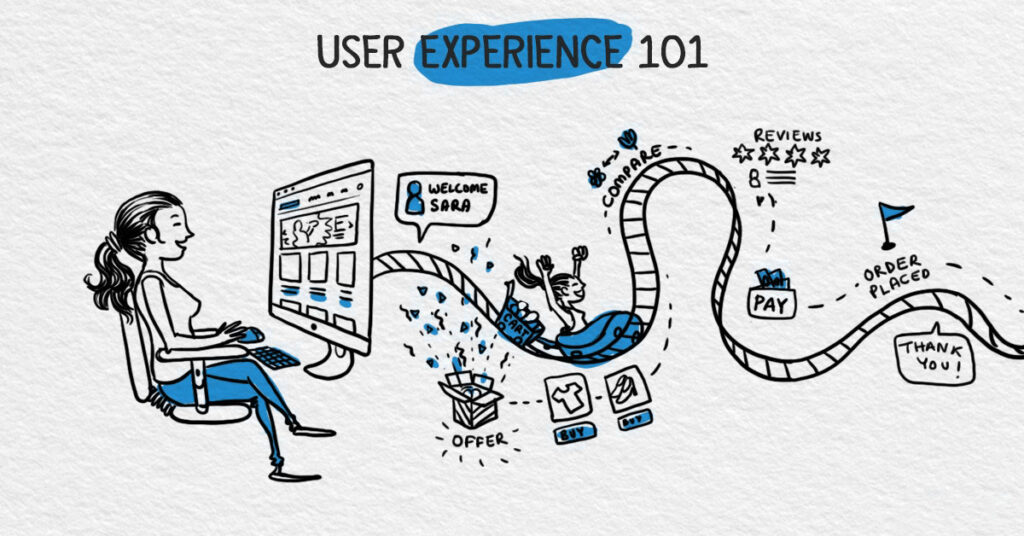
Web designers dedicate their efforts towards creating a workable UX design to achieve the following goals:
- Aesthetically Pleasing Design: For a remarkable first impression that convinces a user to stay, web design needs to be visually appealing.
- Thriving SEO Rankings: A website that ranks among the top three results on the search engine page proves that your content is findable and that your UX methods work correctly.
- Seamless User Flow: When users find a website easy to use, it is the first step towards conversions. They perceive your brand as a reputable one that acknowledges the users.
- Establishment Of The Brand’s Identity: Branding on your website, when done right, helps deliver the brand identity consistently to the users.
- Reduced Bounce Rates: The bounce rate is when the users immediately abandon the website as soon as they enter. When you nail the UX, bounce rates decrease significantly.
- Leads Being Nurtured Successfully: An exceptional user experience is a foolproof source to nurture the top’s leads to the sales funnel’s bottom. Conversions increase with frictionless usability.
- People Talking About Your Brand: When you begin to notice that people are saying good things about what you do and appreciating your brand, it means that they are having a good time interacting on your website. It also means that people find your content useful and trust you as an authority in your niche.
Now, let’s ponder over the top web design best practices to improve the user experience on your website so that you, too, can achieve the aims mentioned earlier.
1 – Identify Your Audience
Designer Frank Chimero says, “People tend to ignore designs that ignore them.”
The best way to make your website user friendly is to know who will use it.
When you closely track the interests, need, and website interaction patterns, it will be easier to design the UX.
Above all, it will ensure that you will get a higher number of leads and conversions.
Analyse the competitor websites and see what elements they include in their design that work the best for your audience.
As they have experience using those websites, the chances are that they are more comfortable with the design.
However, maintain a difference by adding your personal branding elements and a distinctive style that is your unique selling point.
2 – Leverage Visual Hierarchy
It is common sense to arrange the elements so that the most important ones influence the users first.
This is known as the Visual Hierarchy of the UX design. It makes effortless navigation possible and helps the user understand your product in a better way.
To establish visual hierarchy, findings from the eye-tracking studies are used to understand the users’ predictable page viewing patterns.
For pages with more visual content, the Z pattern for eye tracking is used.
But for the pages with rich text content, F viewing pattern works best. Besides this, size, contrast, and balance principles help to make the essential features stand out.
To place each component in its rightful place, you can use the following tips.
- Sizing of the crucial elements can be increased to draw attention towards them. Make sure to do it in a way that doesn’t make other features go unnoticed.
- After that, the incorporation of contrast in the design can also be of great help. Bolder colours help when you need to make anything prominent.
- Play with users’ perception by designing an illusion of distance between the sections. It will improve the user’s focus.
- Keep the design simple by creating harmony with symmetrical elements.
- Prioritise alignment by using a clean layout for the webpages. At times, you can deviate a bit from the format to make prime features look prominent.
3 – Optimise For Mobile Web Design Best Practices
The number of smartphone users in 2021 is expected to reach 3.8 billion, according to Statista.
This means that the number of users you can lose due to not having a mobile-friendly website will be massive.
Users nowadays expect websites to be mobile-friendly. They want it to be accessible and easily viewable on their phones.
The flawless functioning of all the touchpoints in a buyer’s journey is dependent on mobile optimisation.
This includes filling forms, logging in from social media, finding the physical address, and engaging with a brand via call or chat.
Investing in a mobile responsive user experience will bring significant ROI by reducing bounce rates and increasing engagements and conversions by leaps and bounds.
4 – Fast Loading Speed
How much time does a website have to get the user’s seal of approval? Just 3 seconds!
According to Google’s analytics on its benchmark data, 3 seconds is when up to 53% of users expect a page to load.
Anything longer than that results in page abandonment instantly.
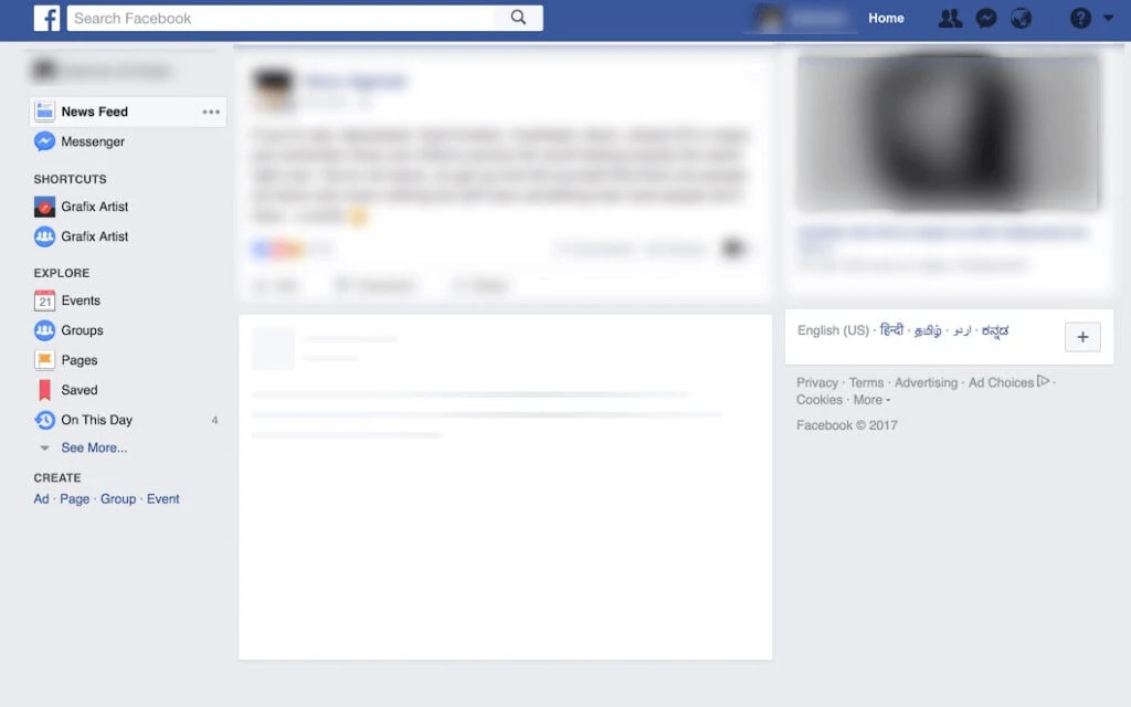
Images that are not appropriately sized and optimised are the prime reason for a delayed page loading. You can also try using a skeleton layout to communicate the necessary form to the user until the page loads.
Facebook uses the skeleton layout that works perfectly to make the user less frustrated.
5 – Impactful Branding
While the trending web design best practices may inspire all your website components, branding sets you apart from the competitors.
Your branding elements like branding on your website, colours, tagline, and the brand voice are the most potent weapons to create a great user experience.
Branding elements communicate who you are with the user.
They also play a crucial role in smooth interaction between the brand and the buyer.
They can easily relate to you and understand your product much clearly.
As a result, a positive perception is developed in his mind, which enhances usability.
6 – Sitemap Creation
Like a blueprint helps you design a building for its construction, a sitemap created in the development stage will significantly help you create a website with a perfect hierarchy.
A sitemap is a directory of all your webpages within the domain.
It helps with the SEO rankings as the search engine can crawl and index your website.
As the search engines rank all the pages, your website’s usability will boost due to being findable.
7 – Adequate White Space
While designing a website, one might think of adding components in every space available.
It is easy to fall into the trap of thinking that the valuable space might go waste.
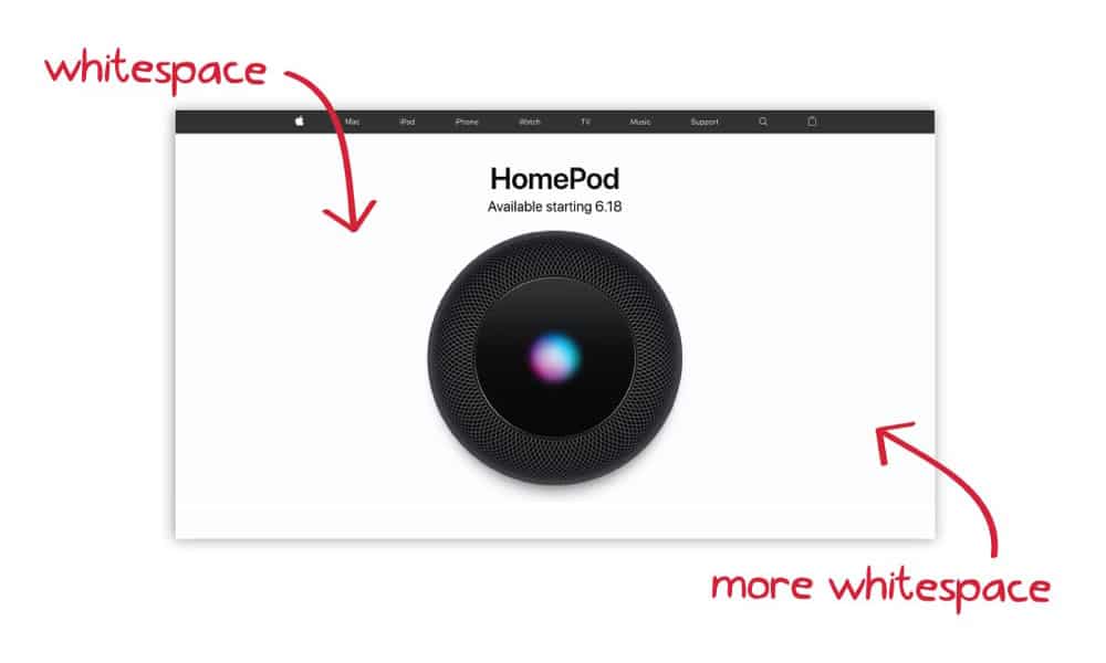
However, if your website doesn’t have enough white space, it will do more harm than good for a good user experience.
Graphic design legend Massimo Vignelli explains the importance of white space beautifully.
He says, “silence is noticeable in a world where everybody screams. White space in design is that silence.”
If there is much white space between elements, it will reflect minimalism and luxury. It adds clarity and helps put the spotlight where needed.
White space, therefore, enhances the UX by reducing confusion.
Navigation is the leading path from when the user enters your website until he takes the desired action (engagements, signing up, or purchase).
You should design the website in such a way that the user flow is smooth and precise.
The user should easily find anything that he is looking for. No guessing games, please!
However, that doesn’t mean that you should create a navigation bar that looks chaotic with every link placed in it.
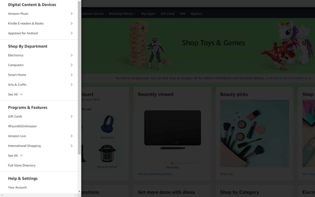
Take inspiration from Amazon’s nav menu, where they show high-level categories initially.
Depending on the user’s wish, they can dig deeper into the categories by hovering over the main categories.
9 – Predictable Layout Throughout The Website
When visitors use your website and view more than one page, a coherent layout will make them comfortable.
On further browsing, they will already know where they can find the needed elements.
It reduces the need to figure out what they need, focusing more on viewing the content.
Besides better usability, a predictable layout also contributes towards visual consistency that establishes a strong brand reputation.
10 – Removing Elements That Effect Design Efficiency
To make the necessary elements stand out, you should eliminate unnecessary features from your website.
They only impact the design efficiency negatively, harming the user experience.
Achieve the balance where there is nothing left to add and nothing left to remove.
11 – Engaging CTAs
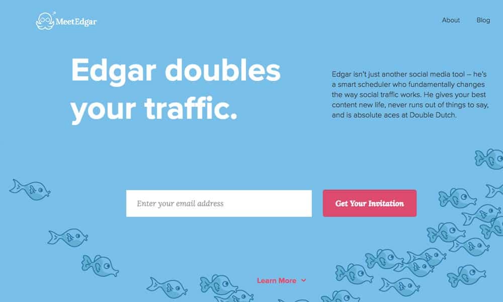
Call to action buttons that convince users to take action are your strength for a robust user experience.
On the other hand, poor CTA’s do not serve the purpose as they confuse the users. The button to click is right there, and they search here and there for an answer or a solution.
Personalisation rules the web design industry these days. Ace your CTA game by designing customised CTAs.
According to Hubspot, personalised calls to action, also called the smart CTAs, increase conversion rates by up to 202%!
Smart CTAs show different calls to action to different users. They can be designed by tracking user preferences.
If they can see a CTA that convinces them to do just what they need, they would likely click on it, increasing the click-through rates considerably.
The principle of visual consistency applies to the actual design as well. Keep them coherent and predictable for leveraging UX.
12 – Powerful And Relevant Imagery
The images on your website provide way more than visual appeal.
According to a study, the human brain processes 90% of the information via visual perception.
If the images are relevant, they help the user understand your brand by engaging them towards taking action.
Especially for a user who faces language barriers, pictures will help convey the message quite effectively.
Ensure the use of high-quality images as they impact users’ focus and the brand reputation alike.
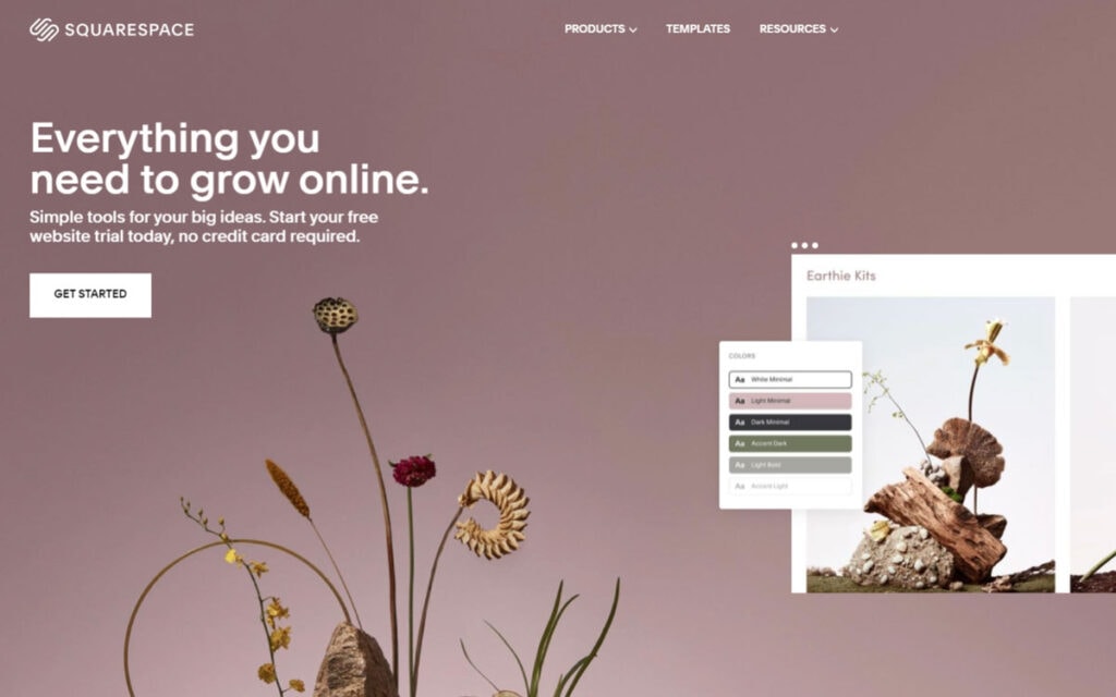
Squarespace’s straightforward design gels well with the bold imagery they have used.
E-commerce websites, specifically, rely heavily on images and videos for their success.
Using product images with multiple angles and details is the best practice to increase the buyer’s interest in purchasing the product.
13 – Readable Content
Written content comprises an integral part of your website.
From the content on the homepage, about us page to the blogs and product description, written content gives you a chance to provide information engagingly.
Member of the Forbes Technology Council and the CEO of Intechnic, Andrew Kucheriavy, advise about the importance of readable content.
He says that to increase readability, we can use line spacing between bulleted lists, numbered lists, lines, and paragraphs.
State one idea in one paragraph to reduce confusion.
A paragraph should not exceed a maximum of four sentences to make it easily readable.
The ideal way to do it is by stating an idea in one sentence and then explaining it in two or three concise and straightforward sentences before moving on to another idea in another paragraph.
Moreover, use mobile responsive practices by increasing font size according to the screen.
Using condensed fonts in the body will negatively affect readability. Avoid using difficult to read fonts for the sake of visual appeal.
Takeaway
To create a website with heightened usability, you can adopt the above-mentioned web design best practices.
As the users will find your website interesting and easy to browse, you will undoubtedly see the results of your efforts very soon.
They will realise that your brand is prioritising their ease, improving your brand identification and conversions.
Author Bio: Erica Silva is a blogger who loves to discover and explore the world around her. She writes on everything from marketing to technology. She enjoys sharing her discoveries and experiences with readers and believes her blogs can make the world a better place.


