11 Feb 3 Trends for 2021 Every Design Student Should Know
3 Trends for 2021 Every Design Student Should Know
The design field takes on many forms.
As a student in 2021, you may be dreaming of designing house interiors, clothes, websites, or corporate logos.
Every one of the existing prospects is entirely valid.
But even though they have definite differences, there are a couple of underlying standard features.
Things that any designer will understand regardless of their field of expertise.
At some point in any student’s life, it becomes a matter of personal growth to identify these underlying trends.
The trick here is that they are not set in stone.
The general trends are changing along with the world around us.
And every new generation will need a personalised approach.
Coming into 2021, let’s take a look at some of the most common trends this year has got in store for aspiring designers.
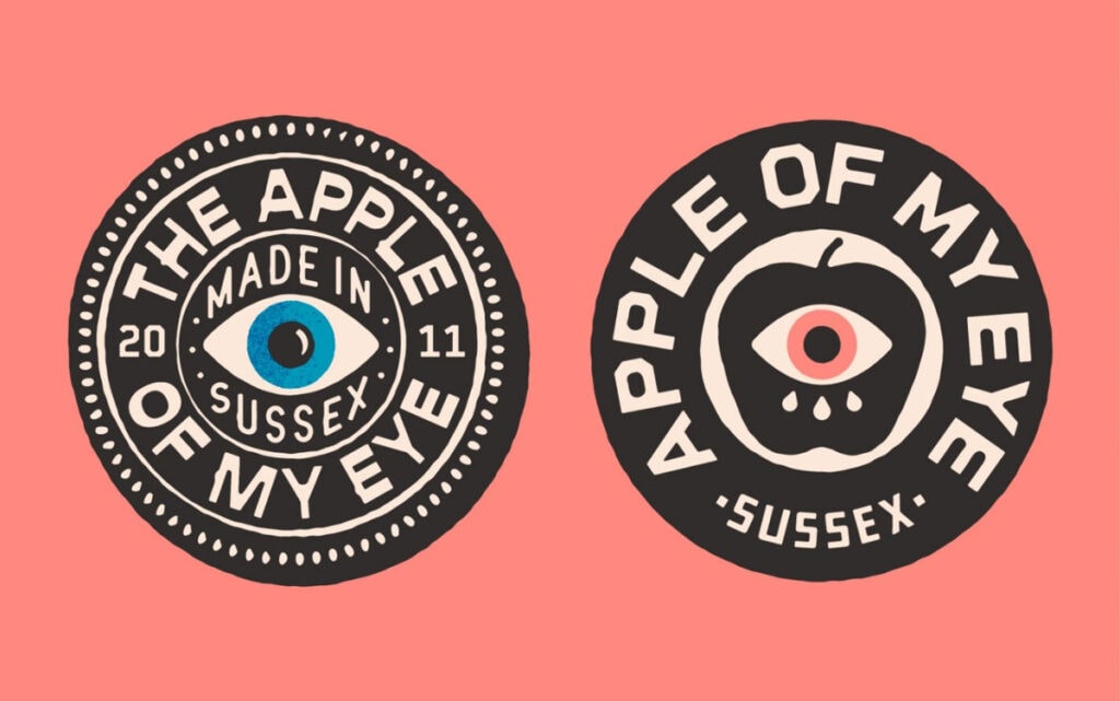
Retro

If you can’t come up with new ideas – dust off old ones.
This strategy has worked remarkably well at all times. And it still can be efficiently used to date.
We are moving at full speed through the beginning of a brand new century.
Mirroring the aesthetics of the same period scaled back a hundred years can give you a lifetime supply of exciting design ideas.
As you are researching the history of visual design, you shouldn’t forget about the present matters.
Keep your deadlines in check and don’t let them pile up.
Once you get behind, it can be tough to catch up.
Fortunately, there are plenty of sites like EssayWritingService.com that can help you keep pace.
Don’t be shy to use those if you feel like your situation is about to become unsalvageable.
But simply reviving old trends won’t work too well.
To capture your audience’s attention, you need to put a modern spin on your retro concept.
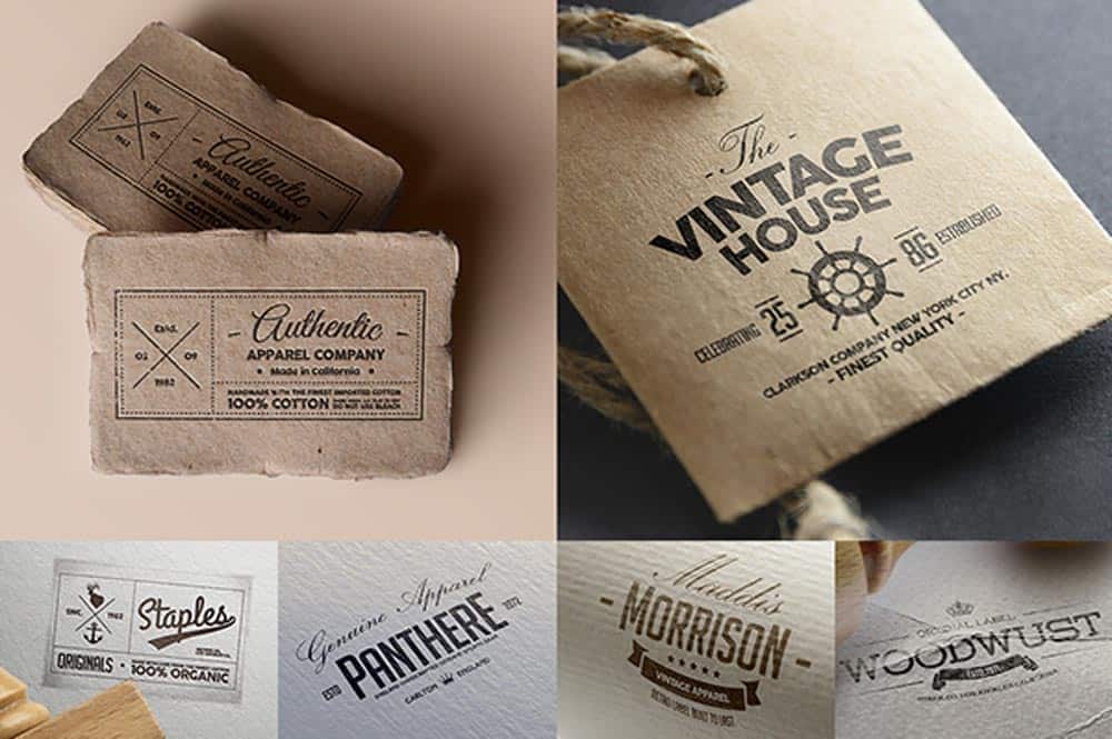
The past creates a feeling of nostalgia while the blend with the present grabs attention and presents something fresh.
This trick works pretty much in any design sub-field and with any theme:
But how would people that have never seen what it was like to live a century ago can feel nostalgic about those times?
It may seem strange, but the longing for the good old times transcends generations.
A kid who has never lived in the 1920s can still feel a sense of longing for this history.
They can still get a feel of that period via various music, movies, books, etc.
And that’s where the key to this problem lies. You don’t have to recreate an era to a detail.
You have to capture the image of it as your audience sees it.
That makes your task infinitely more manageable.
Just take everything cool about it (even if it’s fiction) and throw away anything that doesn’t fit or weighs it down.
Inject some modern elements here and there – and you have yourself a perfectly functional foundation for a new design.
Data visualisation
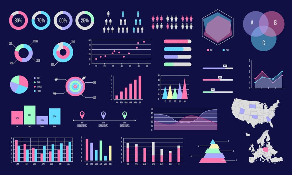
People today are looking for ways to cut corners to quicken the pace of their lives.
Reading walls of text is no longer efficient enough.
Visualising as much information as possible is the trend of 2021 that has been on its way to the top of the list for a long time.
So when designing any data medium, you need to consider putting as much value as you can into as little of a container as possible.
Text is subjected to a much higher level of scrutiny during the selection process.
Putting critical information into images or concise videos gives it a way better chance of getting noticed.
But don’t feel the need to stick everything on flashcards.
Visual information can serve as a hook to reel in attention.
Once you’ve got it, you can gradually redirect it towards something less efficient but more valuable.
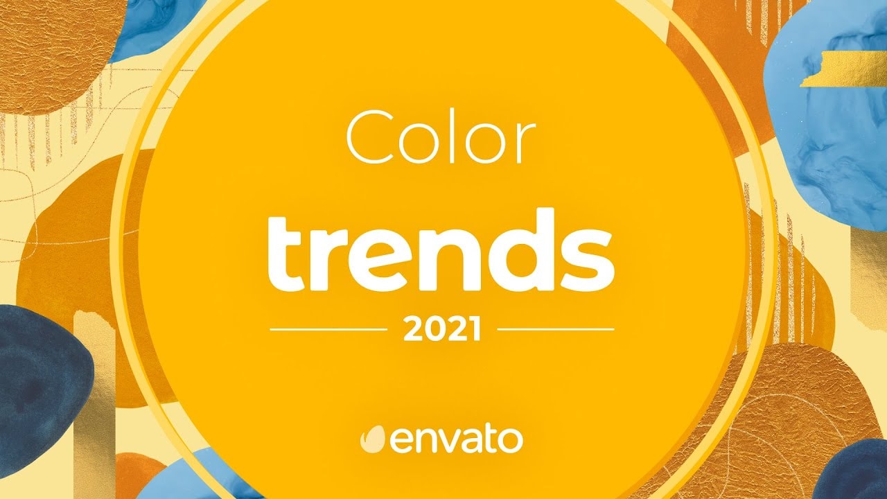
New age colours
When it comes to visual design trends, you have to pay extra attention to the colour palette.
Contrary to what many might think, it’s not just a matter of personal preference.
Design is a creative field, but it also has plenty of technical aspects that demand precision.
Picking up on the current colour trends is one of them. And you will do well following them closely at all times.
Now, the trends are never static.
They are continually changing.
And if you want to be a good designer you have to be changing with them.
Today’s hot topic is muted and toned down light colours. Using these creates a palette that doesn’t jump out at you and is easy on the eyes and at the same time provides an open, soft, radiant feel.
The info-environment the new generation lives in is bold enough as is.
Bright colours and various ‘attention-grabbers’ work well enough for now.
But the youth is slowly developing immunity to this sort of approach.
Toning your design’s palette down a notch in terms of brightness can help you not get filtered out like another piece of info noise.
Your best bet is to keep your colours simple and to the point. Going way too extra may not be the best choice at the moment.
Final words
Any sort of design field is pretty challenging to work with.
You are continually trying to keep up with the ever-changing likes and dislikes of your audience.
And it can be elementary to miss the mark.
However, this sort of job is also very flexible and rewarding.
Technical and creative disciplines overlap within this field, allowing you to flex your muscles dealing with routine problems.
Design can also be a way of self-expression.
And sometimes going against all the existing staples and trends can be a more beneficial course of action.
It’s not a precise subject by any stretch of the imagination.
Explore, take risks, develop your personal style.
Sometimes it will fail.
But other times you will be able to create something unique, unlike anything anyone has ever seen before.