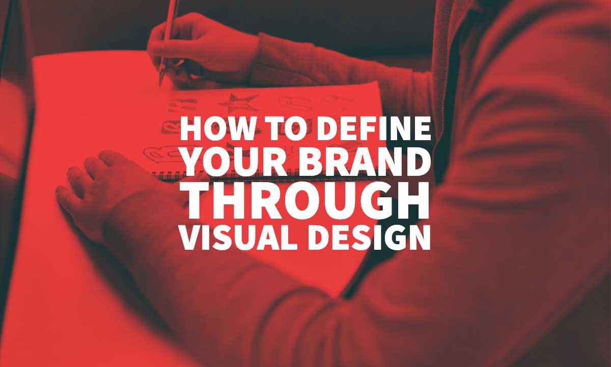
21 Feb How To Define Your Brand Through Visual Design
How To Define Your Brand Through Visual Design
Regardless of what you think you have created, how people perceive your brand will be based on what they interpret.
That comes mainly from what you push forward, especially as you build a brand identity.
It’s simple, but it requires time and effort to ensure you do it right.
Many startups fail to pay much attention to their visual identity which is what people will see.
They instead jump in every trend without adapting it to the value they want to deliver. That’s the wrong move.
Crafting a brand identity is crucial to every business.
Your identity instantly tells people who you are and what you are about.
The 5 Core Brand Elements

To push the right thing, you need to define your brand identity.
In doing that, there are core brand elements that you can’t take out.
Visual Identity
Your visual identity is connected to your brand strategy.
What you create should reach out to consumer needs, emotions, and competitive environments.
In simple terms, it’s about the visible parts of your brand like your logo, font, colours, and imagery.
All of which should send one meaning as to who you are without the use of words.
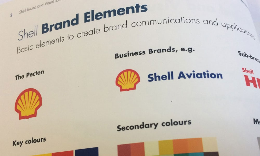
Nike’s visual identity is understood even from seeing only the logo.
That swoosh gives off positivity, a job well done, reinforcement, power, and speed – all of the traits that the company wants you to feel.
Brand Voice

The brand voice is how your company speaks; part of your brand personality.
The voice tells who your customers are and what they get from your brand.
It will show in your name, vision and mission.
That voice will also come up in your other interactions as well; like customer service, social media, press release, product copy, and descriptions, etc.
Associations
These are people, place, things, and other brands that add value to customer experience.
Things could be causes and events.
If you sell biodegradable diapers, you could associate with a cause for marine conservation or clean ocean.
Places can be your brand’s city of origin or channels it uses.
People are bloggers and influencers that have the attention of your audience.
Other brands can be suppliers and niche publications that your TA will read.
Choose your associations deliberately and wisely.
Positioning

Consumers expect certain benefits from products, and as long as you deliver those, your marketing should state that.
Your positioning should tell what sets you apart in the benefits you offer consumers — your brand promise.
Products And Services
Every other brand element is to sell this one.
What you do around selling your products and services will also define your brand.
The things you do to prompt people to respond that is your pricing and offers.
Your offers could be up/cross/down sells, tripwires, loyalty points, post-purchase offers email opt-ins, etc.
What Is Visual Design?

Visual design is creating aesthetic appeal through the elements of design to interpret a message and keep it consistent.
In branding, it should help not just only interpret what the brand has to say, but also help engage users, build their trust, and interest.
Defining a brand through visual design is not always easy.
You’ll need a guide and understanding of individual elements, and your brand value.
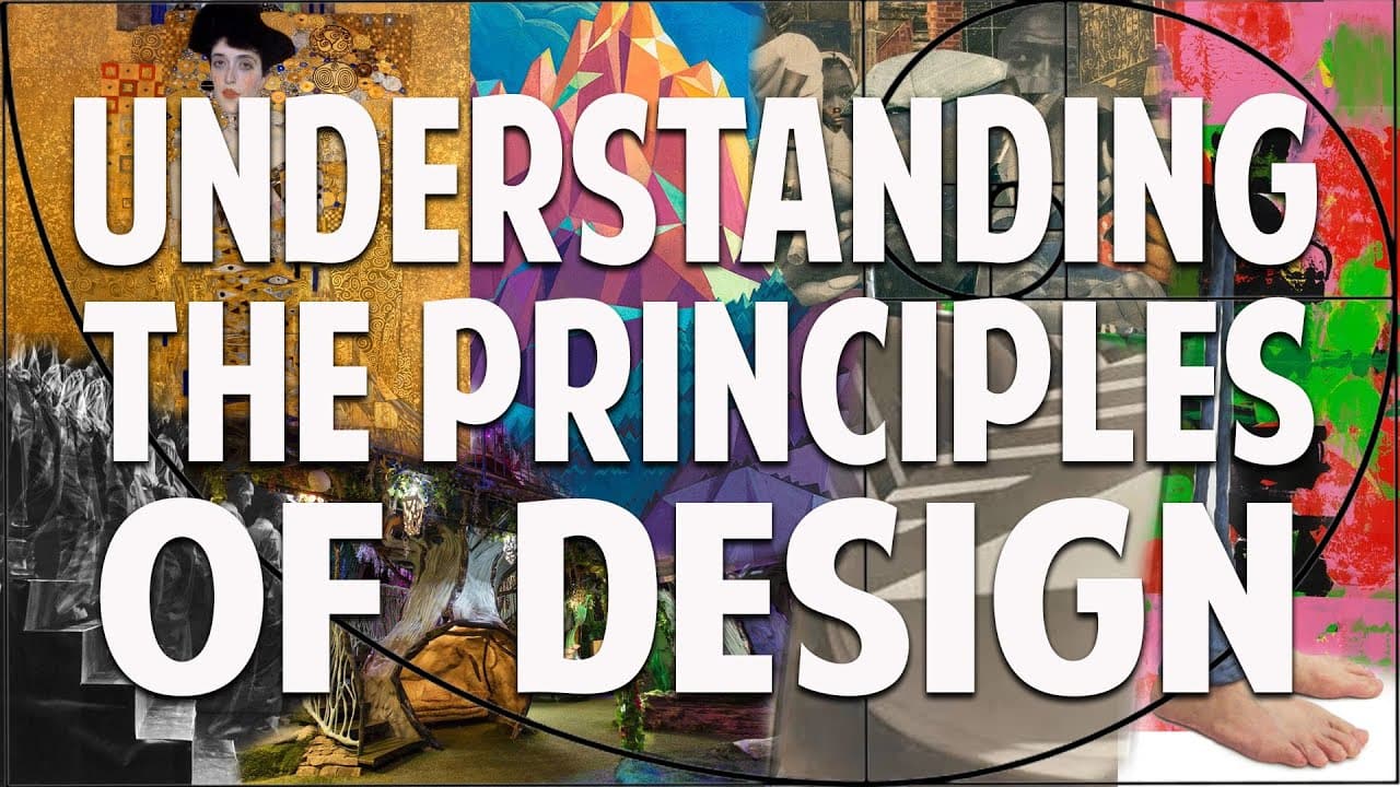
Elements Of Visual Design
You can break down every visual design material into the elements of visual design.
Understanding the essential elements also helps you grasp the fundamentals of visual design that end up coming out through illustrations, photography, and video.
These are the basic ones:

Line
A line connects two points.
It’s used in dividing space and drawing the eyes to a specific part of the design.
Colour
Colour is what anyone will notice most.
It creates mood, can tell your story, or alter impression.
The colours you use could make your brand seem very lively or less.
Space
Space is a trend in website design and many graphic design deliverables.
It helps create an overall image and message.
You can also use space to create shapes and lines.
Shape
Everything is a shape, and designs take one.
They can emphasise something, say a box around your logo design.
In most cases, they add interest.
Typography
Your font tells a story.
It has to go with the overall tone you’ve set in your branding.
It tells readers if you are selling packaged food, ebooks, or news.
It tells them if you’re quirky, childish or professional.
It also can make things memorable.
Texture
The way you use texture in your branding can bring a look or impression.
You can get 3D or 2D.
Have nature looking elements or textile patterns.
In general, it gives either more depth and detail or less.
Scale
Scale is size, and that can either add or take away interest from a part of your design.
When creating imagery for your brand, how much or less of a variation in the size you have will convey emphasis and depth on specific areas.
Dominance and Emphasis
Emphasis can make things intriguing.
It gives you something to focus on the minute you see the design.
It comes about from a high contrast which is a critical factor for photo composition.
Balance
Balance is about the distribution of the other elements of design.
It could be in discord.
That works if you want people to think or be disturbed by your image.
Otherwise, you have symmetry or asymmetry.
Harmony
At the end is harmony.
If after working the other elements, they don’t seem to fit in together, then you haven’t achieved this.
It’s all about your design giving off the details you are hoping for while being in one accord.
Now that you get the basics on visual design, there are things you need to do to develop, define, and communicate your brand value.
Develop Consistent, Flexible Brand Guidelines

With many people creating and bringing up ideas for visual materials, things will be added that do not connect with the business, and therefore not consistent with your other documents.
If your visual design is not consistent with the creative materials you send or is disconnected from what you want to reflect, it’ll be harder to establish relationships with your target market.
You would want your brand experience to be similar across platforms and materials.
That’s where brand guidelines come in.
See them as a manual or brand book on how to use your brand.
Everyone that works on your brand will use that material to remain consistent.
Develop guidelines that are consistent but flexible enough for creative juice to seep in.
Look at these 36 brands with good guidelines that could show you how to work yours.
Create Images That Connects Your Brand To Target Customers Lifestyle

Want to look the same as every other brand?
Jump on the wagon of identical content.
The chances are that the audience has seen it multiple times already. Thus, it makes no impact.
This is a mistake that I have seen many businesses make.
Copy-paste or changing one tiny thing, instead of creating their unique stuff.
They probably feel it’s cheaper to send those images, but that isn’t always true.
I’m a fan of creating my own images.
That’s one way to go viral.
When you create your own photos, it’s unique; it’s yours.
Even better, create things that connect with your customers’ lifestyle.
With those, you can define your brand mood and connect at the same time.
Tortuga Backpacks is one brand that does it well.
Their images revolve around the traveller lifestyle – packing, buying food, immersing in the foreign culture, airport, etc.
All you have to do is immerse yourself in your customers’ lifestyle and work around it.
If you sell female workout leggings, you can create images around the gym, hydrating, healthy eating.
When it comes to creating those images, these tips from 19 commercial photographers sure help a lot.
You might not have to spend much to get your own images.
Create Platform Specific Images And Social Posts

Many brands – even the big guys – make this mistake.
You get one image, post it with the same message all around your platforms.
On Twitter, you truncate the message with ellipses, or worse, continue your long caption in another tweet.
Nothing is more evident to a Facebook power user than a company that auto-posts to Facebook and Instagram at the same time.
I can’t tell you how many times I’ve seen a Facebook post that says, click on the link in my bio.
Obviously, that was copied from Instagram.
It doesn’t only affect posts, but visual content as well.
In the case of cross-posting, images from Instagram will show up as links on Twitter.
There’s also the issue of image dimension for each platform.
You end up with a hasty looking post that looks careless.
The best thing to do is to adapt your photos and messages to each platform.
Go with the right dimension for each platform.
On some, you could tell a more in-depth story.
If you are sharing a photo of a new product on Facebook, you could also add the process to get to that finished product on Instagram.
For the messages, you don’t necessarily have to craft new messages each time.
Just tailor it to the word count and vocabulary that the platform is known for.
Choose Photos With Good Composition

Using the right image is one of the best tips to score in online marketing, but unless you’re Nike, you’ll need to supplement the images you create with some stock photos.
However, not all stock pictures are good to post straight up; some look overly fake.
I hate seeing a bunch of fake smiles and white-teeth people pretending to be involved in whatever activity the picture is supposed to portray.
Instead, choose photos with a good composition to look more real.
Four elements increase the visual interest of photos:
Candidness: It adds life to what you’re trying to say.
Lighting and contrast; it does a lot for the mood of your photo depending on what you’re trying to say.
Perspective and depth: flat images are boring.
Lines and contours; take a look at the photo above, you’ll see there are lines all over the sink edges, for example.
How Will You Define Your Brand?
Your branding is not complete without the right visual design.
Ensure that you choose the right one to define what you stand for, want to be known for, and what can connect you with your target audience.
Achieving the perfect balance requires thinking, research, and understanding certain things like your persona.
Make it stick but flexible enough to push marketing.
Look at Google, their visual identity is dynamic, making it call to users, be it on their birthdays or a national holiday.
Sure, you don’t have to go all out, but you can allow room for creative input.
If you’re unsure of where to get your visual branding done or develop a brand, Inkbot Design does offer services in that aspect.
Author Bio: Darren has an MBA in Internet Marketing, but hangs his hat on 10+ years of experience in the trenches. Follow him on Twitter and LinkedIn to learn e-commerce.