
26 Feb Adidas’ and Puma’s Timeless Brand Identities
Adidas’ and Puma’s Timeless Brand Identities – A Logo Design History
Adidas and Puma, the two German multinational footwear and sportswear giants, do not need to be extensively introduced, do they?
Both of them are very well known for their sports goods, but only a few of us know about the complex history behind these huge corporations.
So how did it all begin?
Adolf Dassler, also known as ‘Adi’, started making shoes in 1924.
At one point his brother, Rudolf Dassler, decided to join him and the two started making shoes in their mother’s laundry room.

Later on, still years before founding Adidas, Adi and Rudolf opened a shoe factory.
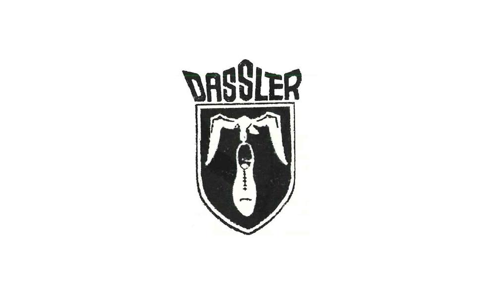
It was called the Dassler Brothers Shoe Factory.
The brothers, at first, specialised in making spiked running shoes.
Their company reached a milestone when sprint runner Jesse Owens won four gold medals in the 1936 Summer Olympics, all-time wearing Dassler spikes.
It was also their first sponsorship for an African American which, at those times, was a great deal.
The separation and family feud
Adolf and Rudolf had very different characters.
At first, it was beneficial as the brothers complemented each other in their work.
One was very focused on production; another gave more emphasis on sales.
However, later it became very problematic, primarily when there was political talk involved.
Nobody knows exactly what happened between the two brothers to cause the family feud and separation.
One of the theories is that both Adolf and Rudolf were members of the Nazi party, with Rudolf being way more involved.
With World War II developing at a rapid speed and decreased demand on the sports shoe market, stress and suspicion rose steadily.
After the war, Rudolf was approached by American soldiers and accused of being a member of the SS.
He was sure it was his brother who turned him in.
In 1948 Rudolf packed himself and moved his part of the factory to the other side of the river.
The rivalry became so feisty that the town became divided with the river splitting the two, since now, competitors.
It was also the time brand loyalty became very noticeable.
It started with the town’s residents who looked down at each other’s feet to see who supports which brother.
Moreover, the two football clubs in the area were sponsored by either Adolf or Rudolf.
Did you know… Up until this day, both Adidas and Puma are still headquartered in their hometown in Germany, Herzogenaurach, on the opposite sides of the river.

Adidas’ and Puma’s brand identity creation
Adolf registered Adidas’ name in 1948.
Quite naturally, its origin comes from his name.
Adi refers to his nickname whereas Das comes from the first letters of his surname.
Puma was registered the same year.
However, at first, it was called Ruda, following the same logic the Adidas name was formed, from the first letters of the owner’s name.
The name change from Ruda to Puma had multiple reasons.
Firstly, it is very similar to Ruda.
Secondly, it translates very well across many languages.
Moreover, thirdly, Puma, the animal, represents the values the company tries to share: speed and power.
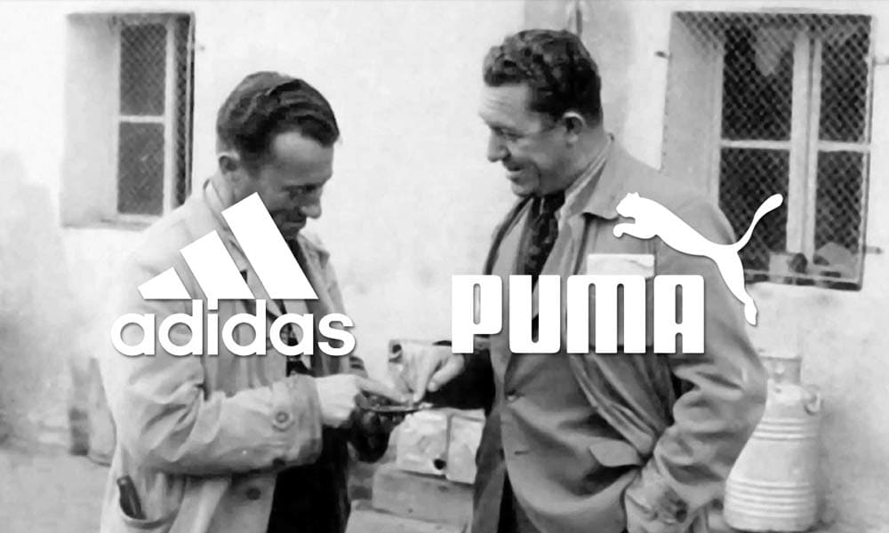
Adidas started to use three stripes to brand its footwear in 1967.
At first, the three stripes were used by a different brand.
It was a Finish sportswear company called Karhu.
It’s said that Karhu sold the three stripes trademark to Adidas for around €1600 and two bottles of whiskey.
Did you know… It was already in 1962 when Adidas introduced to the market the famous full body tracksuit with three stripes on the side.
Still, to this day, it is highly popular and worn by many, especially young people.
Puma’s animal logo design
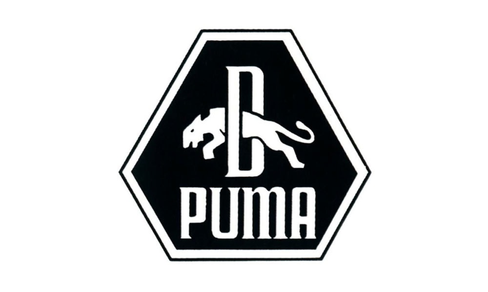
Puma’s first logo was an upside down diamond-shaped illustration.
Inside it, there was a beast image similar to a cat jumping through a letter D. (D coming from Dassler.)
In 1971 Puma had introduced its new logo design of a simplified wordmark with a cleaner image of puma jumping on top of it.
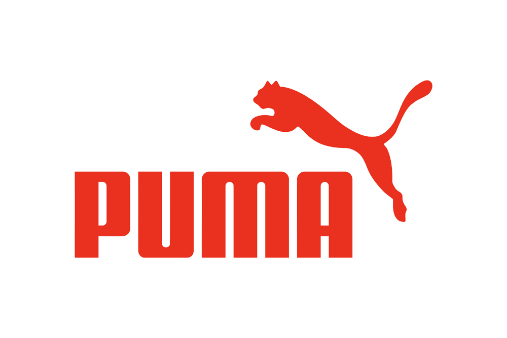
The logo remained unchanged until today.
The only altered thing is the colour palette of the company.
Currently, Puma uses mostly red and white colour scheme.
In the past, the logo mostly appeared in black and white.
Adidas’ trefoil logo design

In 1972, Adidas introduced the trefoil logo.
There were over one hundred logo designs presented to the team, among them was the trefoil the company uses until today.
It was developed the moment Adidas expanded its product portfolio.
Apart from the existing footwear products, the company additionally entered the leisure and apparel markets.
The three-leaf shape is meant to imitate a global map, representing continents were Adidas is present.
The first leaf is for the North and South Americas, middle leaf for Europe and Africa and the third one for Asia.
As you probably know, the trefoil features the three iconic stripes in the lower part of the logo.
It was a great success in the range of fashion products.
However, sports clothing was in need of a separate logo.
Adidas’ performance logo design
The performance logo was created in 1990 by Peter Moore, and it was dedicated to the equipment products only.
The logo continued the use of, already iconic, three stripes.
However, now they have been shaped into a mountain.
It is meant to represent all the difficulties faced by sportsmen and athletes as well as overcoming challenges.
Seven years after its creation, the logo was assigned as the company’s primary logo.
Previously used one, the trefoil, was repurposed to appear only on ‘heritage’ products like the Originals clothing line.
Did you know… The mountain logo was at first widely criticised.
It was called too simple and boring as well as visually unappealing due to its asymmetry.
The 2005 Adidas wordmark

In 2005 Adidas introduced a ‘new’ wordmark.
‘New’ because the combination of the word and icon had not been introduced before.
However, it features the three well-known stripes and the Adidas name in the same colour and font as before, keeping the company’s brand identity consistent.
Adidas seriously entered the global market after the acquisition of Reebok in 2006.
The takeover allowed the company to increase its sales in North America and become a direct competitor of Nike.
The two – Nike and Adidas – are now the most prominent sports shoemakers in the world.
In 2011, Adidas launched a global marketing campaign with a slogan ‘Adidas is all in’.
The purpose was to tie together all of the company’s clothing lines and logos or word marks.
Previously Adidas marketed lines such as Adidas Originals and Adidas Performance separately.
Now the aim was to present them unified to the sports clothing interested customer.
Adidas and Puma vs Nike
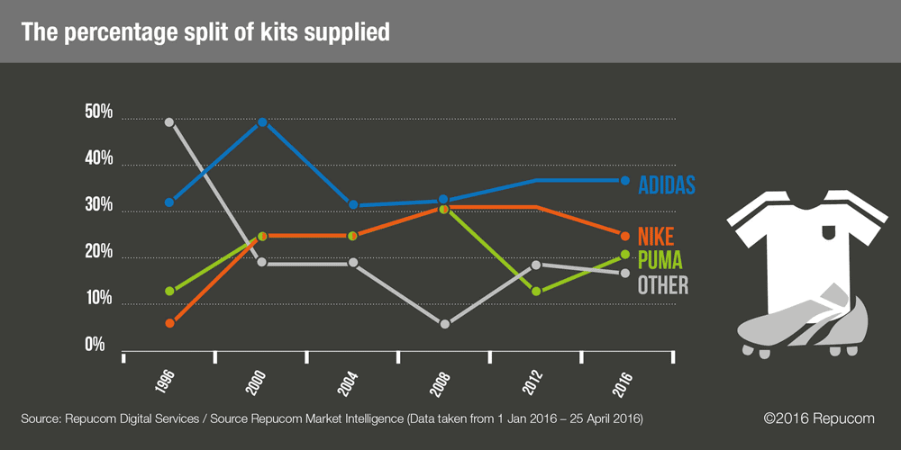
Adidas is the second biggest sportswear manufacturer in the world whereas Puma stands right next to on the podium.
Both companies compete with the number one winner Nike.
Despite all three trying to differentiate themselves from each other, there are plenty of similarities found between the companies.
Not jumping too far into the analysis, let’s only look at the Nike logo design history.
It was designed by Carolyn Davidson in 1971 for which the designer got paid a grand sum of, already famous, $35.
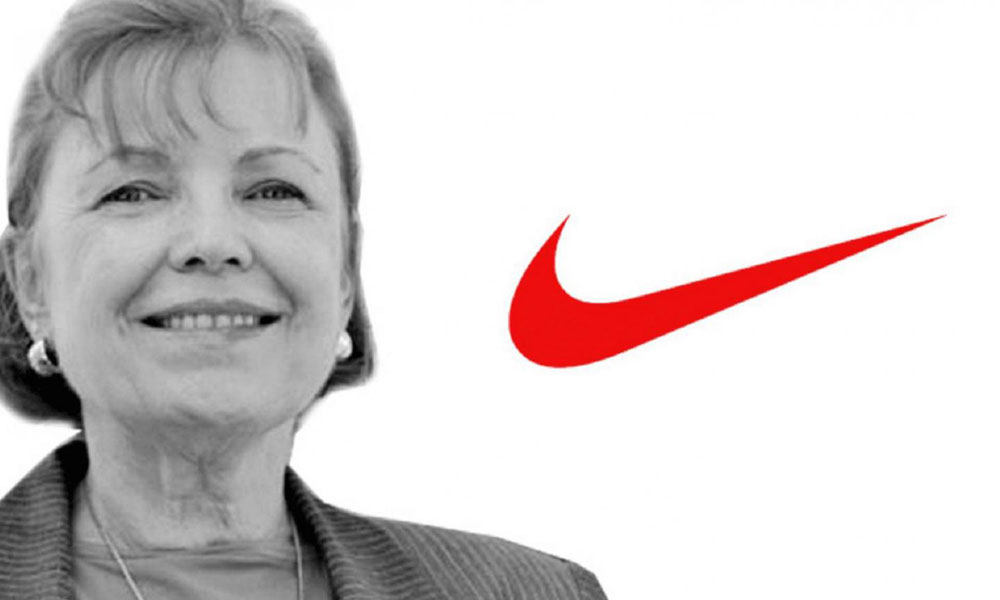
The logo is commonly referred to as Swoosh, and its primary purpose is to symbolise movement.
Additionally, the Swoosh wing is said to refer to the wing of Nike, the Greek Goddess of Victory, and the source of the company’s name.
Nike’s logo, similarly to Adidas’ and Puma’s, went through changes throughout the years.
First, it was changed to align it with the company goals, later showing more modern and simplistic design to keep up with the rapidly changing environment.
Moreover, all three companies put effort to reflect movement in their logos.
Nike with already mentioned Swoosh, Adidas with the climbing mountain reference in the performance logo and Puma, naturally, with the animal.
Despite that, all brand identities relate to some living reference with relatable personality.
Nike’s name relates to the Greek Goddess, Adidas to its founder and Puma to, again, the animal.
The end of the feud
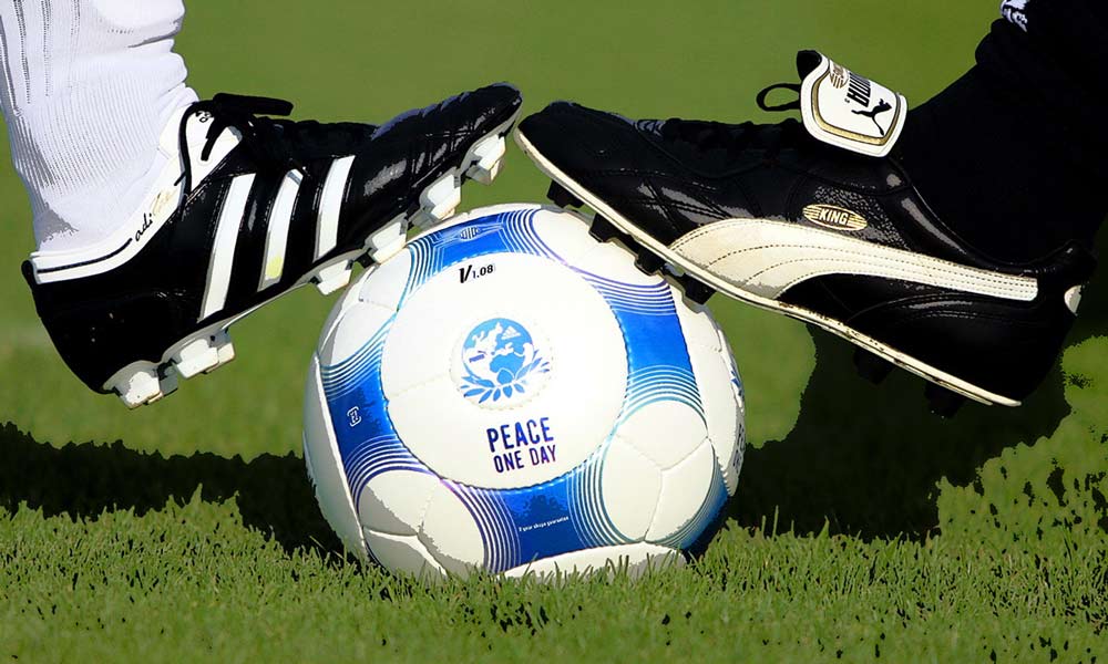
Adolf and Rudolf Dassler remained enemies until their death.
Even then, despite being lied down on the same cemetery, the distance between their graves was kept as long as possible.
The next generations, however, didn’t perceive the rivalry as serious and became mostly tired of the division in the town.
The feud officially declared a truce in 2009 when the two opposing football teams played a friendly match.
Since then, Adidas and Puma agreed to be healthy competitors, not enemies.
Throughout all these years Adidas took risky actions to change its logo thrice.
However, all those changes featured the famous three stripes which allowed the company to retain a coherent and familiar brand identity for its customers.
Despite Puma changing its name once and updated its logo into a simplified one, it also managed to keep a strong brand identity.
Currently, the two are healthy competitors on a global scale.
Despite Puma giving an impression to be doing worse, it is the third largest sportswear manufacturer in the world.
Also See: Adidas Ads in Print Magazines and The Company’s Marketing Strategy
Author Bio: Natalia Raben is an International Business student taking care of marketing @ DesignBro. A lover of design, photography and the arts.


