
20 Mar 7 Key Factors to Improve Conversion Rates Using Psychology and Web Design
7 Key Factors to Improve Conversion Rates Using Psychology and Web Design
What makes a good web design?
It’s one of the most common questions asked by website owners.
There’s no simple answer to this question, as the criteria change with every passing year.
Whether it’s Google’s algorithm or user expectations fueling the shift doesn’t matter, as web designers must adapt to the new rules quickly to keep their clients’ websites optimised.
Conversions are a good metric for proper web design.
If your choice of colours or branding isn’t getting people to the correct pages, you’re not doing the job properly.
To increase leads and improve conversion rates, every digital marketing strategy has to utilise psychological principles.
When you know what the users want, conversions are just a matter of patience.
Here are some key factors to pay attention to when designing your website.
1 – Use colours to your advantage

Proper use of colours can make or break a website’s design.
Plenty of web designers consider colours more of a necessary evil rather than a helpful tool.
One reason for this is that it can be challenging to apply colours and patterns in a meaningful way.
Many designers will slap on a few pastel colours on geometric shapes and call it a day.
Since this is what most websites do, it becomes harder to stand out from the competition.
Colours can be your biggest asset when it comes to website design if you use them properly.
With the right colour combinations and patterns, you can influence users on a psychological level.
Your top priority should be to make the colours pop and stand out.
They have to feel like an integral part of the design and not just act as background noise.
With a stand-out pattern, you can make your website more memorable and unique.
Users will associate a particular memory or emotion with your design if it’s interesting enough.
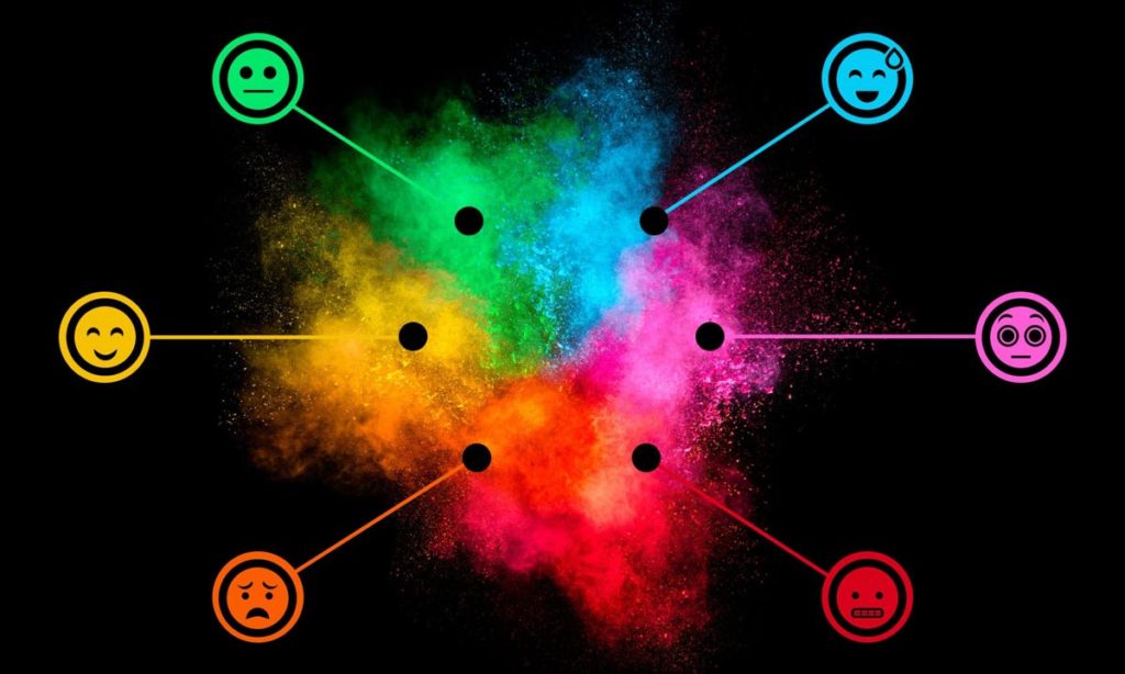
Choosing the correct colours is another important task.
As we all know, certain colours evoke specific emotions.
Something like yellow can stimulate the mind and give off a joyous and energetic vibe.
Unsurprisingly, we associate green with nature and growth.
Red is aggressive and striking, making it easier to catch users’ attention, while blue is calming and soothing.
You must decide what kind of energy your website should radiate and choose an appropriate colour to match.
2 – Understand user expectations

Web design is as much of an art as it is a skill.
Some designers see this as an invitation to reinvent the wheel in creative ways.
While creating something new and unique is desirable in web design, you shouldn’t stray too far from the mould.
There are certain elements that you should keep for the convenience of your users.
People are used to a few specific website layouts. Depending on what kind of website it is, they know where to expect certain elements.
For example, a cart icon in the top right corner tends to lead to the online shopping cart.
The navigation toolbar tends to be located in the same spot for most websites as well.
Deviate too far from the things users expect, and you can’t expect to convert them into leads.
Turning a website design into a challenge for visitors is a bad idea.
You want to introduce some flavour and uniqueness to your website, but don’t make it into a labyrinth.
If a user can’t navigate the website, it’s going to affect your user experience negatively.
Choose aesthetic elements that will set you apart from the competition, but take some notes from the most popular websites.
Users will appreciate it, and you can guarantee that they won’t get lost while navigating your design.
3 – Invite user interaction
Creating an attractive website won’t do you any good if users don’t interact with it.
They need direct encouragement to become leads.
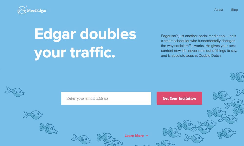
This is where Calls to Action (CTA) come in.
You must use them to stimulate the user to decide whether to open a particular page or purchase a product.
Implementing effective CTAs is easier said than done, as the wrong move can mislead or irritate a potential customer.
It would help if you utilised psychological principles to make CTAs more attractive to users.
Don’t be too aggressive with your choice of CTA elements.
You’re not trying to boss the user around.
Instead, you want to give them a solution to a common problem in a helpful way.
User-friendliness and subtlety have to be your greatest assets when designing a CTA.
Keep the CTA close to the middle of a website page. Focus the other elements around it so that it doesn’t feel out of place.
It should dwarf other features without feeling too overwhelming on the page.
This way, users won’t be confused by the layout of the website or the purpose of the CTA, and they’ll be more likely to convert.
In most cases, the CTA will be a button that leads to another page, but this isn’t a rule that you have to follow.
It can be a piece of anchor text with a link or a video clip you want users to view.
You can turn even animations into CTAs if they serve a particular function.
Put yourself in the shoes of a user and figure out what they want to see.
If you presented a common problem, you should also present the CTA as a potential solution.
They want a quick solution and a fast website that will lead them to it.
Users who need a specific product should be convinced that the link will lead them to the best possible product version.
Mould the rest of the page compliment the CTA, and you’ll find that the number of leads will increase dramatically.
4 – Use matching ads on the landing page
There’s nothing users hate more than irrelevant ads on pages that they visit.
If they’re looking at your website for a product, offering them an out-of-field solution to another problem won’t help keep them on the page.
Nobody wants to be bombarded with irrelevant ads, which is why you must adapt your sales strategy.
If your website only hosts its own ads, you should try your best to place them correctly.
If there’s a sale on a particular kind of product, only show banners for this sale on pages for similar products.
This way, users will see ads for things they need at that moment, increasing the chance to improve conversion rates.
After all, if they need that product, why wouldn’t they choose one that’s on sale?
Placing sale ads on the landing page is good practice.
A user can check out the main page and see exactly what they need right from the start.
They’ll only need a few clicks to get to the product they want, making the website feel helpful.
They’re more likely to purchase a product if the path is as short as possible.
If you feature ads from partner companies, it would be best to choose placements wisely.
Be clever with where you put the ads so that they don’t feel out of place.
If possible, use cookies to provide personalised ads to users that visit the website.
5 – Keep the branding consistent
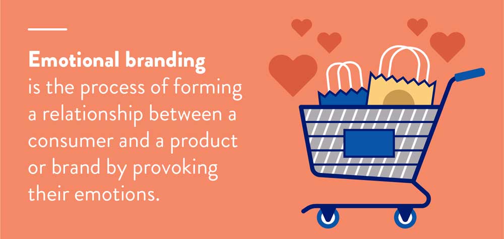
Branding is a crucial part of every marketing strategy, whether it’s on or offline.
It also plays an enormous role in website design.
Strong branding influences users on a subconscious level.
They like it when a brand is consistent, as it increases their trust in the products and services it offers.
When creating written content for a website, designers stress the importance of keeping the tone and voice consistent.
If a user can recognise a brand by the way text is written, you’ve successfully built your marketing strategy.
This same principle applies to the way you design your website.
Users take note of the colours, fonts, and designs that you use on a page.
If they vary from page to page significantly, you won’t get your message across too well.
Subconsciously, they’ll connect the lack of quality design to lower quality in products and services.
Once you’ve chosen a design, you have to apply it evenly across your website to create a powerful sense of branding.
Everything from the colours to the logos has to be similar enough to create a recognisable brand.
6 – Improve page load speed
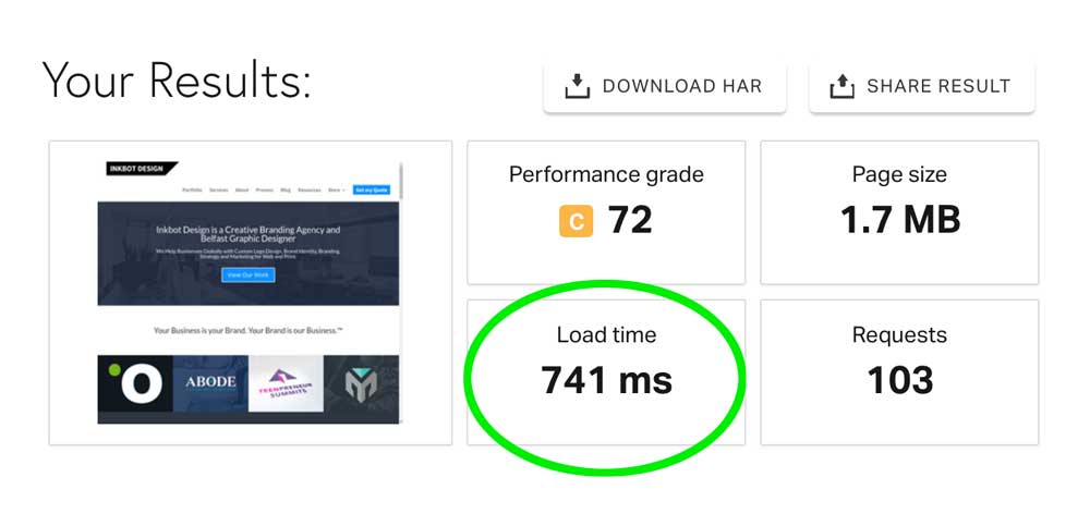
When it comes to retaining users on your website and reducing bounce rates, load speed is king.
You want users to get a smooth experience when they click on your website in the search results.
If they’re skimming through similar results and a website loads too slowly, you can guarantee that they’ll move on to another link.
Because of this, it’s crucial that you focus on improving load speed for all of your pages.
This may be one of the more challenging aspects of website design.
You have to make a page attractive and fill it with necessary elements without causing too much of a delay when loading.
Balancing these aspects of a website requires tons of experience with web design and a keen eye for optimisation.
After all, you’re competing with every other website with the same goal while having more or less of a budget for it.
Because of this, most website owners look for outside assistance to optimise their pages’ load speed.
When you’re designing a fast-loading website, would you rather have an in-house team or let a company like SEO Sydney Experts handle it?
Most people choose the latter option for multiple reasons.
Diverting resources to a team specialising in SEO lets you achieve an optimal page load speed compared to the competition.
At the same time, it gives your in-house team more time to work on the website’s actual design and branding.
Combine these two factors, and you can guarantee that your website will turn out perfectly.
Not only will the page load speed decrease bounce rates, but it will also draw the attention of search engines.
You can be sure that the website will end up on the top of search results for particular keywords.
7 – Create a responsive design
One of your main goals should be to cater to every kind of user.
It doesn’t matter what kind of device they use or how they access your website.
Whether they’re searching for a product using an iPhone or a Samsung fridge, you have to make sure your website can match their browser and screen size.
This is why responsive design has become a key pillar of web design.
While the actual adaptation is all about the back end and how it interacts with different devices, designers have to keep this in mind for the front end.
Will the colours and patterns still look good on a smaller screen, or will they give off a cluttered feel?
The best way to tell would be to test your website on all kinds of devices.
Try out every kind of browser and device, even if they aren’t prevalent.
Just because only one per cent of users utilise a browser doesn’t mean that it won’t affect your leads.
One per cent is probably no small number when comparing it to the total number of individuals in your target demographic.
Mobile web design has become more relevant than ever.
The number of mobile users has overtaken desktop users, which means websites have to adapt to increase the number of leads from mobile searches.
Google’s algorithms are giving more and more relevance to websites that work well on mobile browsers.
Keep this in mind when designing your website, and you’ll be able to improve rankings significantly.
Conclusion
To improve conversion rates is no walk in the park, especially if you’re a web designer.
You have to pay attention to countless details and make your website as practical as it is attractive.
At the same time, you have to keep up with the latest SEO trends to get the search engine algorithms’ attention.
In many ways, it’s a monumental task.
By enlisting experts’ help, you can drive down the workload and focus on what makes a website attractive to users.
Use your resources wisely and keep psychological principles in mind, and you’ll create an optimal website to generate leads and improve conversion rates.