

08 Apr Top 15 Creative Business Sign Ideas & Examples
Top 15 Creative Business Sign Ideas & Examples
Your business marketing has to focus on many different aspects. But the most important factor will always be how recognisable your brand is.
These signs play a significant role in how people see companies and whether they trust them or not. They’re as important as a good website or social media presence.
Although your business is more than a sign, you must have one that is easy to recognise. People need to identify your sign no matter where or how they see it.
It shouldn’t matter if the signage is on a billboard, on your website as part of a content funnel, or the side of a building.
What is Business Signage?
You can create beautiful signs by using quality graphic design software. You don’t have to understand the design principles, but it would be good to read up on them.
There are many examples of great signages that will help you get inspired and create something extraordinary for your brand.
Your business signage is just as important as any other part of your brand. It goes a long way towards increasing your business awareness and loyalty.
Signage is representative of a business and should be well-planned. People tend to make assumptions about companies based on their signage, so it’s crucial to get it right.
Signs can be used to advertise a business on a large scale and are visible to many eyes at once.
With unique signage, you can attract new customers and increase your reach.
The best signage can draw people in and get them interested in the business. Let’s look at an example or two (or 15!) of some of the best business sign ideas.
Creative Business Sign Ideas to Inspire Yours
1 – Mercedes Benz
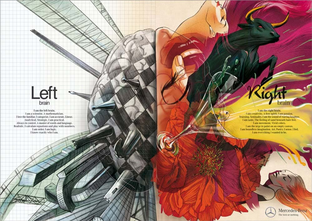
Mercedes Benz is a car company that needs no introduction, yet it doesn’t neglect marketing.
Their sign tapped into the belief that humans use either the right side of their brain or the left.
The side used determines if you are analytical or creative in your thinking process.
Mercedes used this concept to demonstrate that its cars are both innovative and logical, giving people the best of both worlds.
2 – Microsoft
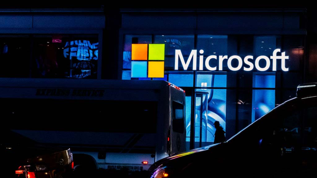
Microsoft’s design is perhaps one of the most recognised globally and shows that good signs don’t have to be fancy or complex.
The signage used on Microsoft buildings (and all their products) is bright and visually pleasing.
It helps a lot with brand recognition and even customer retention because it’s reliable and so well-known.
Outdoor signage is usually illuminated to be more visible – a nice trick that always works well. Creative placement of colour and lighting can make even a small business stand out.
3 – TV3
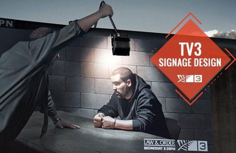
Source: designhill.com
This signage by TV3 is unique in that it uses the billboard’s design to make it grab attention.
Although a simple photo is used, the intelligent way the light is pulled into it makes it stand out.
The design also cleverly uses the light to remind one of a police interview room – very apt since the advertisement is for a crime show.
If you can develop ideas to use your sign environment, you’ll attract many eyes and potential buyers.
4 – Zoo Zurich
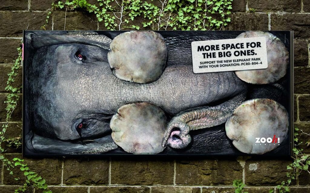
Zoo Zurich used their sign quite skillfully and evoked emotion to make it more impactful.
The signage aimed to get customers to donate and help them give elephants bigger living spaces.
The visual show of a cramped elephant pulled at people’s hearts and succeeded in grabbing their attention.
Although the zoo is a small business, it used suitable graphics and display location to talk to customers directly.
It is always a good idea to have emotions as part of your business sign ideas, if possible.
5 – Milk Bar
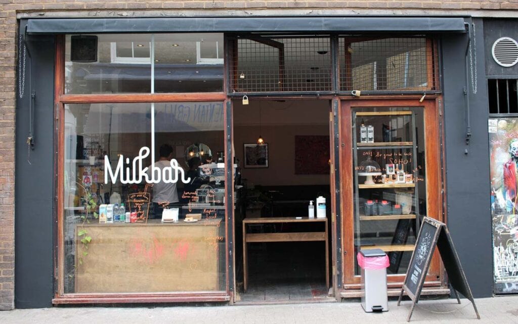
Milk Bar came up with a striking design that is unique but not at all overly complicated. It’s very simplistic and almost minimalistic.
The lettering is designed to make people think of milk because of how it flows. The white also adds to the illusion.
If you can use fonts, lighting, paint, and colours to represent your brand in this way, your signage will be a winner.
6 – Eristoff Vodka
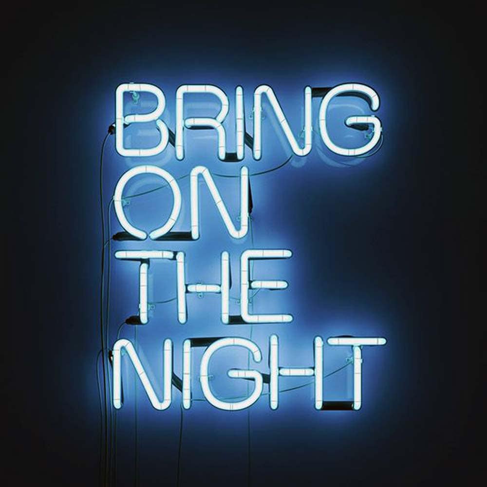
As a vodka provider, Eristoff Vodka’s target customers are the younger generation that likes to party.
This sign spoke directly to that demographic by representing late-night adventures.
The neon light is a nice touch that made the signage get more attention, and the words ‘Bring on the night’ drive the message home.
By using bright neon in their sign, the company made sure it gets noticed. No fancy fonts or images are needed here!
7 – Fenway Southway Finder
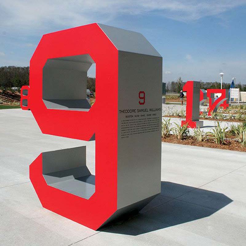
Here you have a unique signage design that effectively grabs attention. Hotel Voskresenskoe made it, and the numbers are in a bright red, which draws in the eyes.
The numbers are indicative of how far certain facilities are. This example shows that businesses don’t have to limit themselves. Their branding can be on indoor and outdoor elements, as long as they get visibility.
8 – McDonald’s
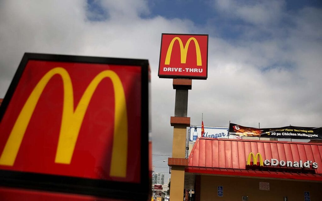
Keeping the same signage for long can stop attracting people’s attention, eventually leading them not to notice it anymore.
However, there is something to be said for consistency. McDonald’s signage is easily recognisable – their lettering and graphics are always the same.
Customers love when businesses stay the same while improving over the years.
Sounds contradictory, doesn’t it? If businesses improve their services, their branding remains the same; their customers grow to love them more.
9 – Papa John’s
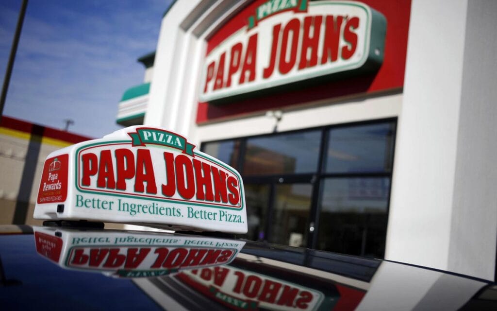
Papa John’s Pizza opted for a simple but slightly elegant design, which is used in their signage.
The banner is a classy touch, and the store name is prominent in big letters.
By sticking to three colours that complement each other – green, red, white – the signage is simplistic with good visibility.
10 – The Mulberry
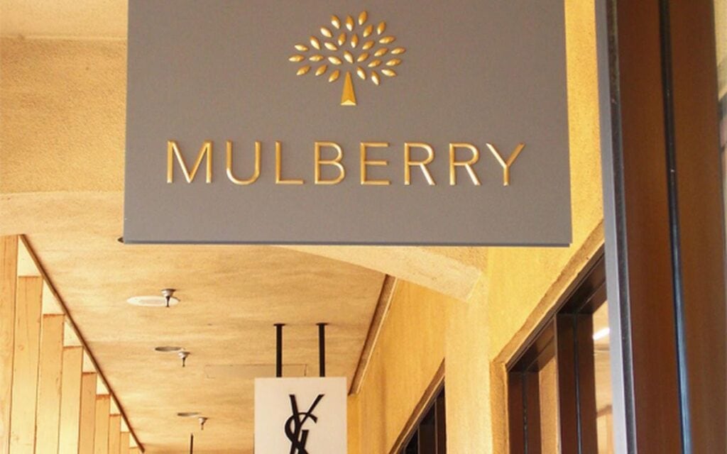
Mulberry, the English luxury fashion company, might be fancy and aimed at a high-income market, but they kept things simple when designing their signage.
A simple but beautifully stylised Mulberry tree is all the business chose to use. It is paired with a font, Mulberry Bespoke, which was designed for them.
The design speaks of class and character and is used on products and outdoor signage of the store.
11 – Nike
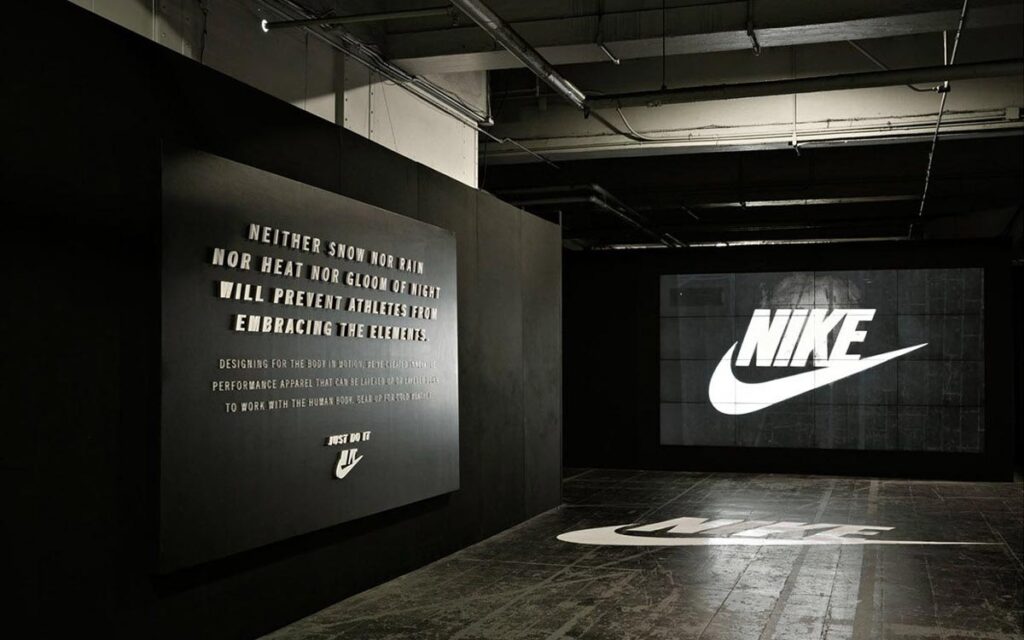
Few people in the world don’t know what they’re looking at when they see Nike’s trademark swoosh.
It is basic but still manages to be highly visible no matter where it’s placed.
Nike can place the swoosh on merchandise, massive billboards, banners, and shop windows, and it will still get attention.
Ensuring that their signage is immediately associated with them, the company now knows it can use it wherever they want with success.
12 – Amazon

Amazon, the e-commerce business giant, decided to use a visual value design in more ways than one.
The arrow that points from A to Z shows that they sell everything, ‘from A to Z.’
It also looks like a smile, creating a sense of trust and customer satisfaction.
Amazon uses the same signage design and fonts on all its products, packaging, and advertising. It is consistent and reliable, which are sound principles for any business.
13 – Supercuts

Supercuts is another business that chose to keep things simple but interesting.
The logo (and all their signs) is nothing more than the business name in the same font every time.
The word ‘super’ is bolded, emphasising it and making people think that the cuts are super.
It’s a fundamental idea that works well and looks good on any form of signage.
14 – Hilton
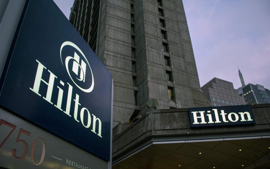
The Hilton Hotel chain isn’t a small business but chose signage that isn’t overpowering with a sense of sophistication.
You can find their design in two forms – either just the word ‘Hilton’ or the name and an ‘H’ with a swirl.
Making the ‘H’ so distinctive and sticking to blue no matter where the signage is used ensures that people will never forget it.
15 – Gold’s Gym
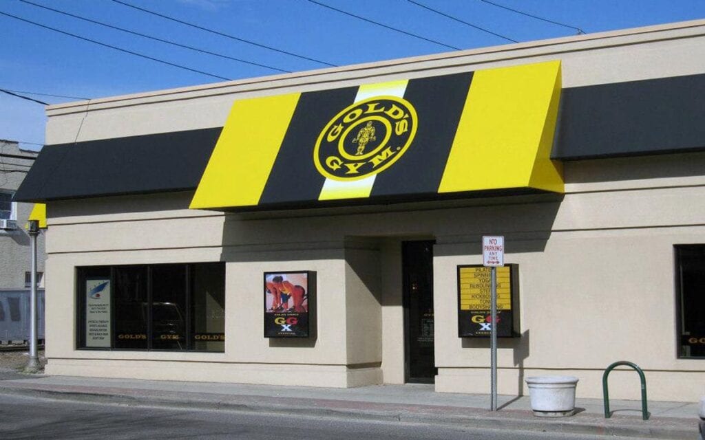
Gold’s Gym decided to clarify their brand by choosing a sign with an exercising character.
There is no mistake that the logo belongs to a gym, so it was a good idea.
However, thanks to a unique font and prominent colour, people will recognise it quickly.
Using images like this on signs can work very well. But it’s essential to make the design unique by combining it with the businesses’ theme.
For instance, gold’s Gym’s signage is widely recognised not only in physical locations but also on social media.
They know how to leverage the brand image powerfully across various platforms and as part of their content marketing activities to boost their success through strong social media KPIs.
Over To You
Now that you know what it takes to come up with a great business sign, it’s time to get creative.
Take inspiration from the businesses and the ideas in this article.
Whether you’re a small business or big enterprise, your signage must demand attention.
It might seem as daunting as writing a one-in-a-million project proposal or wedding speech, but it’s not that difficult.
It would help if you did your signage designs with care, so don’t hesitate to work with a designer to get you even more inspired.
Author Bio: Mark Quadros is a SaaS content marketer that helps brands create and distribute rad content. On a similar note, Mark loves content and contributes to several authoritative blogs like HubSpot, CoSchedule, Foundr, etc. Connect with him via LinkedIn or Twitter.