
14 Apr Why a Mobile-Friendly Website Should Be a Priority

Why a Mobile-Friendly Website Should Be a Priority
The mobile responsiveness of a website is a deciding factor for your business’s success or failure.
This is because mobile phones have become an integral part of our lifestyle as nearly half of all internet traffic is generated by these devices.
Reports suggest that over 4.66 billion people worldwide used the internet in 2021; that’s almost 60% of the world’s population.
It is interesting to note that internet users are growing at a steady rate of 7%, which means over 875,000 new users turn to the World Wide Web each day.
In total, around 92.6% of internet users use mobile devices to go online.
This shift in consumer behaviour has compelled companies to design mobile-optimised websites regardless of their business niche and size.
Only a mobile responsive website with an intuitive user interface and the best user experience can frequently get your traffic to return to your website.
It also assists in lead generation and conversion while enhancing your business’s standing in search results.
With this in mind, let’s understand what exactly is meant by mobile-friendly websites and why they are essential for businesses.
What Is A Mobile-Friendly Website Design?

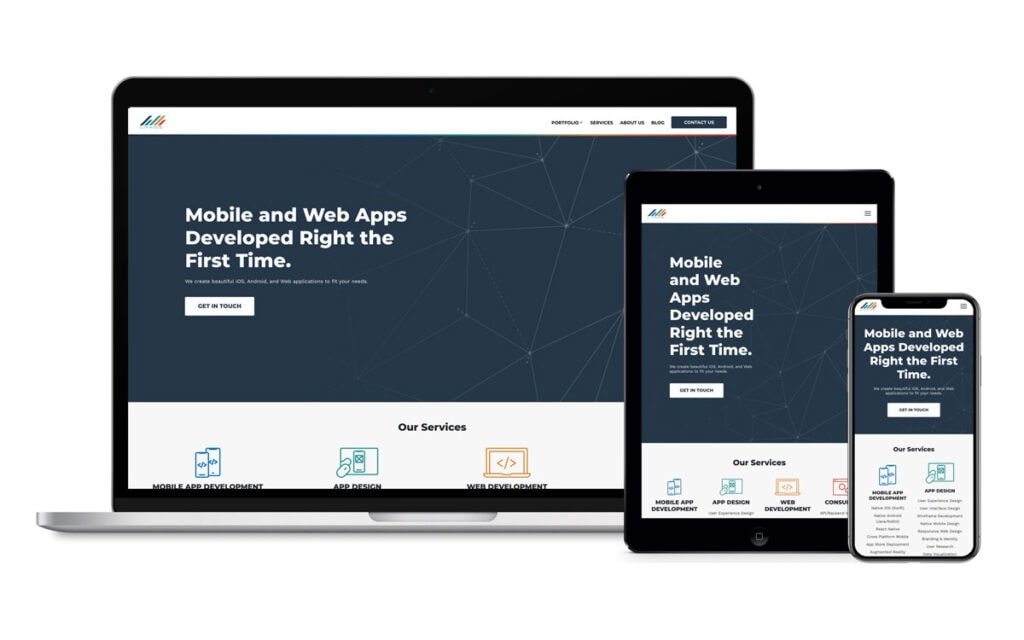
A mobile-friendly website displays correctly on the small screens of iPhone and Android mobile phones and even hand-held tablets.
If your website doesn’t do that, your visitors might be experiencing unreadable text, ill-placed images, and side-way scrolling.
With a mobile-optimised website, you can use the limited space to display your website’s crucial elements that your user needs the most.
In other words, a mobile-optimised website fits into a phone screen so that your users can easily view its content.
Additionally, the text on a mobile-friendly site also automatically resizes according to the screen it’s displayed on. This makes the site easy to read and navigate.
Are Mobile-Friendly And Responsive Designs The Same Thing?
Websites with a responsive design adjust their setup fonts and content to look good on any screen size, be it desktop, tablet, or mobile.
It includes dynamic content composed of optimised images spaced according to the device it is being accessed by.
This means that a responsive design website will look differently on a desktop, laptop, and smartphone.
If you access the website through a desktop computer, you will see the entire website. Still, on a tablet or smartphone, the layout and images are optimised for the small screen.
They are designed while keeping the user in mind and delivering seamless usability and user experience regardless of its access.
On the other hand, mobile-friendly website design only reformats and restructures the website design for mobile devices.
In a mobile-friendly website design, you will experience simplified navigation that includes significant touch points along with reduced graphics.
The Impact Of Mobile-Friendly Websites On Search Result Rankings
A mobile-optimised website satisfies Google’s mobile-first indexing requirements, helping you rank higher.
This allows users to find you among relevant mobile-optimised search results, giving you better opportunities to convert them into customers.
Employing Google’s mobile-first indexing approach as a search engine ranking strategy is all about offering the best mobile navigation experiences to your visitors.
It’s also important to note that your business is five times more likely to lose visitors if your website is not mobile-friendly.
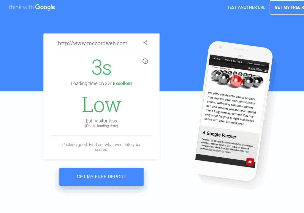
If you are unsure whether your website is mobile-friendly or not, you can use Google’s Mobile-Friendly Test Tool.
The Importance Of A Mobile-Friendly Website For Your Business
A mobile-friendly website is no longer just an option. It is a necessary digital marketing strategy for businesses to attract traffic coming from mobile phone devices.
There are several reasons why a mobile-friendly website is vital for your business to gain a competitive edge in your industry.
Increased Search Engine Rankings
According to the Google Page Experience update, that takes a website’s mobile-friendliness and page loading speed into account while ranking it on search engines.
Google is now employing different ways to integrate a visual indicator in the search results that specifies a visitor if he/she has a good user experience with the website.
Some of these visual indicators have been used by Google before, such as mobile-friendly labels or slow labels.
By offering information on the quality of user experience, they help them decide on the website from the search result they want to visit.
This means you need to prioritise mobile optimisation as it satisfies the new Google algorithms that in turn advocates for your business and increases its rankings in the search engine.
Improved User Experience

The Google Analytics’ Benchmarking feature suggests that mobile devices drove 68.1% of all website visits globally, increasing from 63.3% in 2019.
It’s vital to ensure that they enjoy a seamless user experience when browsing, shopping, or interacting with your site in other ways.
If your user experiences a hard-to-navigate interface, you risk losing them to your competitors’ sites that offer a simple and easy-to-use interface.
A simple user interface that allows your users to quickly search for what they are looking for on your website creates trust and credibility for your business.
Include mobile-friendly elements such as sticky headers, powerful call-to-actions, an easy navigation search bar, or a “switch to desktop” option that enhances your user experience.
Enhance Your Brand Visibility
One of the most significant benefits of a mobile-friendly website is the increased visibility that allows you to tap into an audience of millions by increasing your brand’s visibility in the market.
This is because a well-optimised site that offers a seamless user experience shows your visitors that you care about them and how they interact with your brand.
This, in turn, fosters meaningful relationships between you and your visitors, leading to increased conversions and loyalty.
Moreover, this encourages them to recommend your brand to other people in their social circle that further improves your business’s visibility.
But suppose you have a dysfunctional website that is hard to navigate on a mobile device. In that case, it can be challenging to ensure that your website visitors return or remain loyal to your brand.
That’s why you need to ensure that your website is not only mobile optimised, but it displays all the necessary content above the fold and improves the user experience by reducing annoying pop-ups.
Builds Credibility For Your Brand
SWEOR suggests that 57% of internet users will not recommend a business to others if it has a poorly designed website.
This is why it’s imperative to create a mobile-friendly website that reflects your business goals and attracts potential customers.
With a mobile-friendly website, you can reach out to more customers and offer them valuable experiences to ensure their satisfaction.
Since your visitor’s perception of your business depends on your website’s usability, offering a mobile-optimised website helps you earn their trust and improve your brand’s reputation online.
Moreover, a mobile-friendly website creates awareness about your brand that elevates your credibility in the industry.
Reduced Bounce Rates
If your website does not look good on a mobile phone, you will experience high bounce rates.
Visitors will abandon your site if they have to tap, zoom or squint to read the text or if it requires add-ons to display content on the browser.
But with a mobile-optimised website that offers effortless navigation, optimised page load times, and clear CTAs, you can reduce your site’s bounce rate.
It’s also a good idea to integrate optimised images, improve your content to make it more high-quality and informative, and enhance the effectiveness of your CTAs to reduce your website’s bounce rate.
Tips For Creating A Mobile-Friendly Website For Your Business
Here are five ways to ensure that your website looks good on mobile:
Create A Wireframe

Creating a wireframe serves as a structural map of how you will display your mobile-friendly website. With a planned out wireframe, you will understand how your website will look after completion.
This is an integral part of project planning that decides the performance of your mobile-optimised website.
With clearly stated objectives, you can design a more efficient mobile-optimised webpage that aligns with your business goals.
Plan Your Content Alignment And Design
Designing a desktop website does not demand as much attention towards content placement as it offers a larger space for the content you want to add.
But to be mobile-friendly, your content should look good on a smaller screen which can be challenging as the copy, videos, images, and all else must be correctly designed and optimised to guide your user.
To solve this issue, take a minimalist approach towards a mobile-optimised site. Too much content crammed into a small screen can put off the visitors, resulting in a higher bounce rate.
Focus On CTA Placement
Nielsen Norman Group’s study suggests that internet users spend 80% of their time “above the fold” on a web page.
This means that the content attracts them at or near the top of the web page.
This is why ideal CTA placements need to be above the fold to grab the customers’ attention and prevent them from scrolling down without taking action.
Also, assess your web content to see where you can insert a subtle yet relevant CTA that keeps your visitors invested in your products or services.
It’s also important to keep user experience in mind while placing CTAs, so they don’t disrupt your visitors.
Optimise The Web Page’s Loading Speed
A website’s loading speed serves as the biggest reason for high bounce rates.
Search Engine Journal suggests that over 70% of consumers say that a website’s loading time affects their purchasing decisions.
Google recommends a loading time of under 2 seconds – the slower your website, the faster your visitors will bounce.
This is why you need to use lighter elements on your website that do not affect its loading speed.
To ensure faster loading times, optimise the images, resize them to a smaller ratio, or convert them into JPEG format.
You can also use CDNs and plugins to build a website that weighs very little and loads quickly.
Don’t Use Flash
Using Flash for your website can slow down your page’s load time, affecting your site’s user experience.
Android or IOS devices can’t display Flash animations. Many browsers have also stopped supporting it.
Google, Microsoft, and Mozilla have disabled Flash players and plugins in your web browsers as of January 2021.
So, say goodbye to Flash and look into alternatives such as HTML5 if you must have interactive content on your site. And don’t forget to make it mobile compatible.
Make Mobile Testing A Priority

There are hundreds of mobile phones with varying screen sizes, network speed, and pixel densities.
It isn’t advisable or even possible for you to test your website on each device.
But since testing is an integral part of improvement, you can try the various apps and programs to ensure your website’s mobile readiness.
Plan out the entire testing process by determining which devices and browsers you can use to benefit from this data.
Also, optimise the site for the mobile device models and browsers you need to check.
Keep a close eye on the time required to test the mobile-optimised website on all the devices.
After this, you need to validate the screen size and the navigational flow to determine any weakness from increasing or collapsing the browser window.
Moreover, your mobile testing strategy should allow you to maintain the highest rules to ensure consistent quality.
Smartphones and mobile technology play a significant role in driving commerce in the digital world.
As a result, mobile-responsive websites are no longer a luxury but a necessity for businesses that want to leverage more traffic and establish credibility with their customers.
Use the tips and techniques detailed above to ensure that your web presence serves mobile customers just as spectacularly as it does desktop visitors.