
16 Apr 13 Mobile Interface Design Trends to Follow
13 Mobile Interface Design Trends to Follow
Whether it’s an app screen, a web browser, or a watch, you can guarantee users’ attention if the design is done well.
But mobile interface design trends quickly change each other, so you always need to keep track of it. So, let’s find out what’s trending right now.
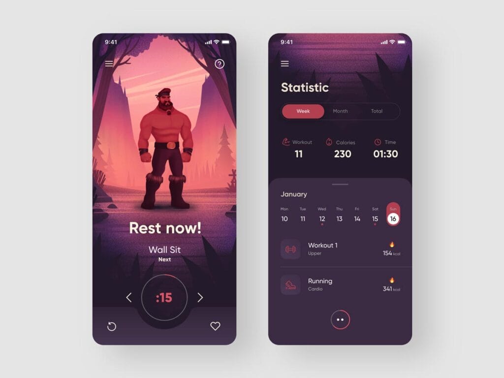
1 – Light design
In the flat design, there was a tendency to a light aesthetic. The space around the object is not used or framed (using gradients, shadows, and the like).
This allows you to create a simple interface with a focus only on important information.
Design elements that do not carry a semantic load are removed, and there is a clear rejection of useless decoration.
The light design does not distract attention to unnecessary things and helps the eyes to calmly glide across the screen and focus only on the content.
This solution makes it easy to navigate the interface, which is vital for the user. The elegant modern aesthetic is not only pleasing to the eye but also leaves a good impression.
2 – One typeface for everything
Designers abandon the large variety of fonts on the screen and pay attention to typography.
Instead of using multiple typefaces and typefaces, they change the font size. This allows you to highlight individual parts of the content.
Using a single font to the maximum in the entire application works not only for recognition but also for connecting different channels: the application, mobile, and web versions.
This allows you to collect all the elements in a single, integrated interface. Besides, it is more convenient for users to scroll through the simple text to find the information they need.
3 – Numbers in the spotlight
User preferences are increasingly shifting towards simple interfaces.
Therefore, important information is brought to the fore: the numbers are highlighted (again by increasing the font size and bright colours) to attract the audience’s attention.
Using larger fonts and rich colours, it’s easier to draw attention to a specific area without intrusive commands and additional clicks.
The user perceives information faster due to its convenient location and easy navigation.
4 – Micro-interactive
Micro — interactive elements are small elements, such as animations, that appear depending on the usage scenarios.
Such scenarios in different situations may include:
- Standard operations.
- Pop-up messages on the screen.
- Elements that respond to a click.
The micro-interactive is used as a signal for the user’s action. For example, it adjusts the settings for itself and helps it with pop-up messages-hints.
Apps with a well-designed interactive experience are easier to use, more interesting, and better memorised by users.
5 – Minimalistic colour palette
After the general spread of the flat mobile interface design trends in 2013, when everyone was inspired by the clarity and simplicity of the design, the use of simple colour schemes became fashionable.
Today, designers and users alike prefer a small number of colours.
Colours are necessary to emphasise the general mood, direct the user’s attention where needed, and establish connections with the brand.
With a small number of colours, it is easier to reflect the corporate identity of the company.
Also, users like this aesthetic because the attention is not scattered. In using many shades, it is easier to find critical functions and navigate the flow of information.
Trends are always an evolution. But designers need to understand that minimalism is not another trend.
It is a design language that also manifests itself in architecture, fashion, graphic design, etc.
You can control this language; it can change, transform and take different forms, but no matter what manipulations you do with it, the philosophy of minimalism remains unchanged.
Minimalism uses only the essential design elements and the complete rejection of everything superfluous or unnecessary.
Each element of the design layout should have a straightforward use, and if there is no use — this element is superfluous.
This is what minimalism is all about. So, for many years, minimalism remained popular, ascetic and functional, inspired by the principles of Scandinavian design.
The philosophy of minimalism is timeless, but naturally, web design is constantly evolving and improving. So, how has minimalism changed in web design?
Previously, minimalism in web design was aimed at reducing cognitive load and usability. The distinctive feature of the layouts was simplicity—a large amount of space, simple shapes, limited colour palettes.
However, along with technical advances and knowledge about UI and UX, bright visual effects broke into the usual minimalistic layouts.
Recently, the vast expanses of free space are combined with rich graphic elements and extraordinary animation.
Today, minimalism has not gone away. All the elements on the sites have a clear goal. It is no longer only related to functionality; it can be caused by a visual code, harmony, visual rhyme, rhythm.
6 – Multi-layer interface
Previously, mobile interface design trends followed the principles of skeuomorphism. Designers assumed that the design follows the shape of a real object (for example, a calendar on a computer looked like a desktop paper calendar, all icons were made in 3D).
With the popularity of flat design, you can see how this principle shades away because it became possible to depict depth in other ways by using layers.
This helps to create a sense of depth and size, to create a tangible object.
An authentic flat design runs the risk of being “too flat”, and the line is thin: how can a user navigate and use a flat application if used to 3D volumetric design?
There is a solution – layers. Layers help you overlay one object on top of another, build relationships between elements, and highlight the most important things.
Transparent buttons are buttons without a colour fill, whose borders are marked with a skinny outline.
In this case, only simple shapes are used: rectangular or square, with angles or rounded. The text in these buttons is minimalistic and straightforward.
Transparent buttons attract the user’s attention while at the same time remaining unloaded, unobtrusive, and look modern.
Besides, it is possible to build a hierarchy if several types of buttons are used. For example, transparent buttons are used to indicate additional functions or intermediate actions, and for some, shadows are used so that the user can easily read hierarchical relationships.
8 – Gestures
With the introduction of gyroscopes and motion sensors, user devices have become more competent.
Human interaction with the device has become possible with the help of taps and natural gestures.
People intuitively understand how the device will respond to a gesture.
If you ask a user (no matter what gender or age they are) how to delete an item, they will wipe it off the screen in one motion.
As the experience increases, users click less on the buttons and scroll more.
The methods of interacting with the device are becoming more interactive, and the screen is becoming more than just a tap area.
9 – Movement
Thanks to innovations in technology, designers can control the movement of layers with styles.
Moving design elements take various shapes, including transitions, animations, and even textures that mimic 3D depth.
Users have learned how to set everything in motion without prompting designers or developers.
They independently transform content, modify elements, objects, and data, and quickly read the most important things.
Movement attracts attention. But it is essential to understand that it can help the user and can distract him.
In general, the visual display of the response often increases the audience reach due to the wow factor.
Animation graphics, also known as motion graphics — is a visual design that animates a static image.
The Internet, media and advertising, television, movies, mobile apps, video games — none of these areas can do without it.
A motion designer conceives every animated text or image that occurs in everyday life.
Animated graphics use three channels of information: image, text, and sound, and the viewer learn the data better.
With motion graphics, you can visualise factual data and abstract ideas. Visual effects, audio, graphic design, and various animation techniques are used for this purpose. This turns a static image into a dynamic one.
The animation graphics must be distinguished from the usual video and the usual animation. Motion graphics are not a cartoon, they illustrate data or ideas, and do not reveal a full-fledged plot.
Motion design is ideal for creating meaningful yet concise messages. It is also a good choice for complex projects in which the essence is not otherwise disclosed.
Three main advantages of animated graphics:
Quickly delivers the message. In advertising and infographics, brevity and clarity are vital parameters due to time constraints.
It reveals complex ideas, concepts and systematises data in a simple and understandable form. This is precisely the case when an image is worth a thousand words. In a short video, a vast amount of information is placed, and at the same time, it is easily absorbed by the viewer.
It quickly catches and holds attention. Most users choose video over reading. Animated graphics are attractive to the viewer, and therefore so popular.
10 – Short user scenarios
The user no longer needs to understand the complex structure of the pages.
The designer creates a single page on which additional elements appear as needed.
This solution helps to save both time and effort. For example, a form automatically appears or highlights when the user reaches a particular area and disappears when they move on to the next.
Smartphone users like it when everything is easy and straightforward in the app.
The whole design experience minimises the user’s effort and increases the response rate, so the scenarios become shorter.
11 – Design standards are the best solution
Design standards are the process of forming a visual language at the initial stage of design.
Groups of standards are defined: colours, icons, and general presentation of materials.
Defining standards helps you create a logical and consistent product without inconsistencies across platforms.
This reduces the possibility of implementation errors to zero and makes it easier to change the project in the future.
12 – Modules and blocks-without rulers
Previously, designers used rulers and dividers to highlight a particular part or category on the screen. The result was a compact but overloaded interface.
Having abandoned the lines, the designers began to group the blocks, separating them from each other with “air” — a space. As a result, the app’s appearance looks cleaner.
The desire to get rid of formal lines and separators appears due to the requirements for the modern appearance of the application, for which functionality is in the first place.
To make the most of the space, designers began to look for less intrusive ways of highlighting. For example, instead of drawing lines, use an increased font size or link images.
13 – Prototyping
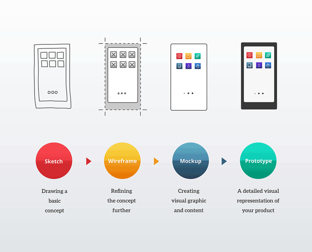
Prototyping is a preparatory activity, working on an early version of a product.
Using prototypes allows you to create a functional design, predict possible changes and respond to users’ wishes without wasting the designer’s time and effort.
By creating low-cost, practical solutions prototypes, you can qualitatively work out the critical components of the project: important characteristics and technical requirements.
This helps you save time and resources, learn from experience, and better manage the product creation process.
Prototype — a working model, a prototype of a device or a part in the design, construction, or modelling.
In the context of interface design, it is a full-featured HTML model of the site that works through the browser and clearly illustrates the entire principle of interaction for different use cases.
It turns out that the prototype illustrates the appearance of the pages and responds to some scenarios.
It so happens that day after day, we turn to different sites in search of a solution to a particular problem.
Whether we need to find a definition of a word, buy a vacuum cleaner, or buy movie tickets, we follow a specific pattern of behaviour and set expectations each time.
And if the navigation pattern and content of the site matches our habits – this leads us to achieve what we want and business owners to convert.
One of the critical tasks of the interaction designer is to identify mobile interface design trends and expectations among the intended or existing audience of the project.
Author Bio: Alicia Burmeister is a digital designer and contributor to https://essayswriting.help/. She is also passionate about innovation and social media marketing.