

01 May Mobile-First Design Tools: Benefits and Importance
Mobile-First Design Tools: Benefits and Importance
Designing mobile-first has become an integral step while creating an app.
The mobile-first web design has grown over the first few years after the rise in mobile buyers.
Now is the time to pay attention to the mobile-first philosophy.
It is a design strategy that indicates that when you design an app, start prototyping and sketching the smallest screen first.
After that, you should work with large screens.
It helps in giving the right dealer a relevant user experience.
Over the years, the decline in the growth of desktop users has initiated the rise in mobile platforms.
Through this article, you will come to know about using mobile-first design tools.
Higher conversion rate

The mobile-first design leads to an increase in conversion rate by 64% compared to the average desktop.
It means designing your website for your mobile-first can give you more profits.
Also, Google ranks companies for mobile-friendliness, so it makes sense to consider this factor.
The process of designing from the small to the large screen is named progressive engagement.
It means creating a solid base and adds more things as you go ahead.
Creates a strong foundation
Creating the mobile-first and responsive web design will strengthen other designs like desktop and tablet.
The foundation must be strong and always needs to be content.
The mobile-first design helps in emphasising content over navigation.
As a result, the users will get the required data, making things easier as you start designing with the smallest screen.
Mobile content: The first thing
In the mobile-first design, content always takes the first place.
The mobile-first design gives users the right content they look for.
Designing by keeping the stringent limitation will allow you to concentrate on essentials and strip away extraneous elements.
A mobile user looks for different aspects compared to a desktop user.
On desktop, you are more likely to see additional features and white space.
These things are absent in mobile websites, and the same applies to images.
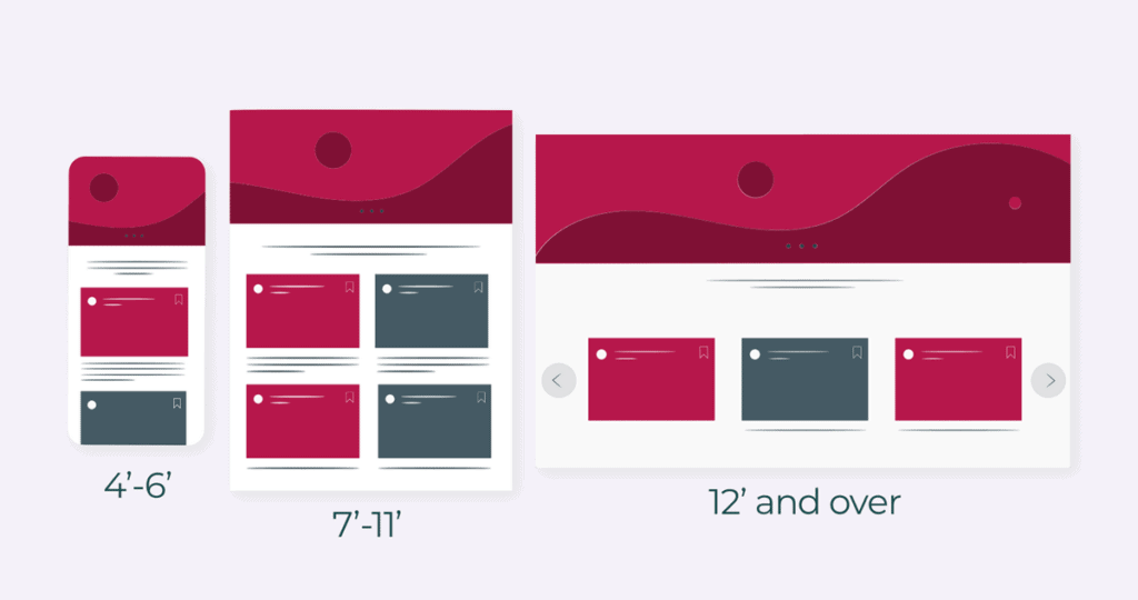
Breakpoints are crucial, and they should be mentioned depending on the device.
When you change the browser from large to small, you see the layout of the content changes.
Resize the content below 1223 pixels wide, so the content changes accordingly with the medium.
Importance of mobile-first web design
The stats revealed that as of September 2020, Google counts mobile-optimised sites.
It is one of the reasons you can browse websites on Apple watch also.
Mobile websites have been something that’s considered the last parameter while creating one.
But you must know that more than 50% of the internet traffic comes through mobile devices.
It shows how important mobile-first web design has become.
Mobile-first vs responsive design
The difference between mobile-first and responsive design is explained here.
A mobile-first is creating a site for a smartphone without adjusting its content to the desktop version.
Responsive web design is designing a desktop version and rearranging and hiding the content blocks while proceeding for smartphones and tablets.
Final thoughts
Neglecting mobile-first designs in today’s era won’t be wise to do as you also lose much traffic.
Delivering the ultimate user experience is what you should consider in today’s time.
Incorporating this will not only make your first approach easier for both the designer and user.
Now it’s time to explore different settings on your own and include new elements to better feel for the mobile-first web design.
It will let you enjoy more traffic on your website and book an appointment with the experts to create one.
Speaking with the designers will help you create an optimum site through which you can receive more traffic.