
25 Jan 12 Famous Company Logos and How They Made a Marketing Impact
12 Famous Company Logos and How They Made a Marketing Impact
Identity is one to be cherished, nurtured and developed.
Much has been invested in such a non-material thing, but without a doubt, it is needed to achieve one’s goals.
If you would venture into the open world with the mindset of making it big, you need something that people will surely define you as great or worth spending money and time on.
Something worthwhile to engrave in their memories and spend their time talking about.
With the imagination of the human mind, there are countless shapes, colours, lines, and even words that can make a solid impact in the business world.
Logos have long been used to create identity.
As I have mentioned earlier, identity is essential for the success of either a company, a brand or an individual.
Big time entrepreneurs have created a world full of demand and commercial enterprises by choosing the right combination of shapes, words and colours that identifies who and what they represent as well as secure the people’s trust and confidence.
Now if you want to start raking in the bacon for your upcoming business endeavour, you might want to check out these 12 famous company logos and how they made a marketing impact in their industry.
This will help you out big time in designing and choosing the right logo for your dream.
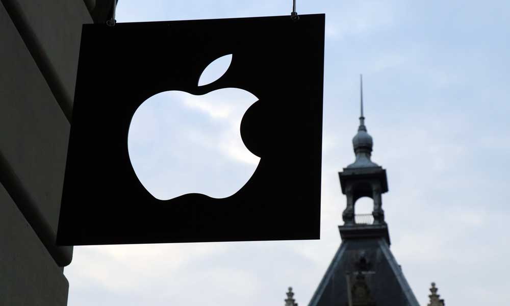
1 – Apple
Honestly, I don’t know anyone who hasn’t seen or does not recognise the Apple logo design.
Apple has been more than successful in making the world a technologically inclined place.
Its logo, which is a literal apple that has been bitten off denotes the simplicity of using its product with a dose of detail and articulation.
The curves of the apple define the stylistic artistry, and the flat black chrome colour denotes sophistication.
It is definitely an eye-catcher for individuals who seek a user-friendly and straightforward gadget for their daily lives.
2 – Coca-Cola

The most popular soda product, Coca-Cola, has captured the hearts and minds of soda drinkers worldwide with its trademark red and white logo.
However, primarily, the company chose red to be their primary colour because red is a very powerful, psychological colour – it denotes excitement and energy.
The fonts that they use reflects the classiness of its product, meaning that the ingredients and processes that they use come with precise thinking, consideration and care.
It’s no surprise that people from all over the world love this brand.
3 – Nike

Ever wonder why the big check logo has been successful in the sporting goods industry?
Well, Nike does not use a checkmark for its logo.
It is a representation of the wings of the Greek goddess of victory, which name is also Nike.
Now the reason why it is in the form of a check is that they wanted to express positivity and success, making it more marketable than ever.
Honestly, up until now, I prefer to wear Nike rather than any other sporting brand because I feel that if I wear this brand, I can achieve almost anything.
This brand has penetrated the minds of athletes and aspiring sports enthusiasts all around the globe and has changed their doubts into positivity.
4 – LG

One of the most successful companies in the appliance and technology industry, LG continues to supply its consumers with quality gadgets and appliances.
Its logo, which uses the letters L and G have been combined to resemble a happy face.
The red circle around it signifies that they are committed to friendship and community.
These traits and shapes were able to penetrate the customers’ desire for something that they can rely on and someone who can take care of their needs as well as their inquiries.
5 – Target

In the United States, Target has dedicated its existence to providing the needs of daily activities to customers worldwide by offering all sorts of products and making them available to the masses.
Its logo, which is an actual Target, has been tested through time and has been one brand that consumers trust since its existence.
They chose to use the colours red and white because red reflects passion, commitment and sheer attention.
The white colour denotes cleanliness, purity and good intentions.
The circles, on the other hand, indicate the commitment to the community, customer service and care.
Through these fine attributes, the customers feel that they have everything they will ever need at Target.
6 – Google

Google can be considered one of the most relied upon names in the world.
Almost everyone has used this six-letter word and have attained much knowledge and answers from it.
Google is the number one used search engine in the world and is the basis of many SEO rankings to date.
Its vivid image denotes a friendly nature that everybody trusts.
Its spacing provides focus on the letters and its difference and advantage among other competitors while the elegant and straightforward fonts provide class and express ease of access.
7 – FedEx

One of the largest and most widely used logistics companies in the world has found success with its logo and is continuing to entice more and more people to its services.
The secret of their famous company logos lies between the letter E and X, which has a hidden arrow when you look closely enough.
This arrow symbolises the speed and accuracy of delivery services all across the globe and until today, FedEx hasn’t disappointed.
Moreover, for their other brands, this company changes the colour of letters E and X to match what their other endeavours denote and create their own identities.
8 – Toyota

Toyota has been in the automobile business for decades and has been branded as one of the most successful ones up to date, and all over the world, their two intersecting circular shapes denote the meaning of strength and dependability.
Furthermore, these perpendicular oval shapes express dependability and that the company’s heart is centred on the customer, meaning they are proud of their customer service.
Moreover, also it forms an abstract letter “T” to match the company’s name and be recognised almost instantly.
9 – Shell

This company has fueled countless vehicles around the world since the oil industry started and continues to please its customers with its outstanding services and products.
The history of this company’s logo, which is literally a shell dates back to the early 1900s.
Actually, Shell started as a company that trades and sells seashells; that is why it was named that way.
Over the years, this group explored its endeavours to the oil industry, to which its famous company logos also evolved in shape, colour and design but not its concept of a literal shell.
Today, it uses the colours Red and Yellow to represent and resemble the Spanish Flag which Californians used to be from.
And lastly, its strong and hard bold fonts strongly backs up the ideology of a mollusc, which also represents ecology and constant change.
10 – eBay

In 1997, Auction Web renamed its logo to eBay, making a huge impact on its company’s growth and development.
eBay’s crooked, and overlapping multicoloured letters have been successful in finding customers what they want and what they need.
These letters were intertwined to denote how its community interacts and how united it is while different colours symbolise fun, excitement and friendship.
11 – Mcdonald’s

In 1940, two brothers, Richard and Maurice Mcdonald opened up a burger restaurant that later became one of the most iconic food brands in the world, and as the logo persists, has billions and billions served.
Its golden arches symbolise its first design that is made into a letter M, making it more recognisable while the golden colour symbolises its value and how it values its customers.
The red colour symbolises passion for making people happy and satisfied while its fonts make it simpler and easily reached by the masses.
12 – Mercedes Benz

Lastly, this car company has brought class, comfort and style to countless car enthusiasts across the globe.
Mercedes Benz was able to make a logo that everybody would recognise and will be able to penetrate their souls.
It’s elegant, so was able to make a logo that everybody would recognise and will be able to penetrate their souls.
Its silver colour expresses professionalism, security and high value.
Its shape which is actually a star represents air, land and sea, which is also a segment of the automobile sector.
Moreover, most importantly, the fonts that it used was able to make the users feel that it was all about comfort, luxury, style and finesse. No wonder it held up to its name for a long time.
Now you see how essential these famous company logos are and how a collection of colours shapes and letters bring fame and fortune to a business.
I suggest that you take in some pointers and make sure that what you use to make your logo expresses the true nature and intent of your product and service.
Now, if you are going to outsource your logo to an agency or a freelancer, make sure that you ask them these questions first, so you know if they are legitimate or not.
Know the back story of any famous company logos? Let us know in the comments below.
The post 12 Famous Company Logos and How They Made a Marketing Impact is by Stuart and appeared first on Inkbot Design.