26 Jan 10 Call To Action Design Ideas To Make Your Visitors Act
10 Call To Action Design Ideas To Make Your Visitors Act
There are plenty of factors that influence the success of your web project.
The design of your site, the content that it contains, the colour scheme, navigation patterns, and a whole lot of other aspects should be taken into account as you work on a useful and usable site.
However, nothing can compare with the importance that the call to action design elements bears.
The web is made up of call to action designs; you may not even notice this.
However, when you build a website, you need to realise the effect that call to action designs have on your site visitors and use them correctly.
Things get more straightforward when you use ready-made website designs.
You need to pay individual attention to each call to action that is used on your site to get your business on the right path to professional and financial growth.
What is a Call to Action?
A call to action is a word or a short phrase that prompts a reader to take a particular action.
A call to action design can be presented in the form of a button, link, image or another clickable piece of content that makes it easier for the site visitors to browse your content.
Call to action can encourage such steps as reading an article, downloading a file, making a purchase, subscribing to a service, etc.
In fact, the rest of the design elements and pieces of content on your site do the preparation job before the customers take the specific action that the call to an action intends them to do.
The text of the call to action design tells the site visitors what exactly you want them to do.

10 Psychologically-Proven Call to Action Design Tips That Work
There are plenty of factors that influence the proper choice of the call to action for a specific web project.
Working on the best call to action design, you need to take into consideration the goals of your site, your clients, and the brand identity of course.
Based on these factors, you can choose the optimal colour, size, and location of each call to action on your site.
1 – Your call to action should stand out from the rest of the content on your site.
All the intentions that you put into the design and development of the calls to action will be useless unless those are easy to spot on your site.
The colour palette should look contrasting to the rest of the elements on the page.
You should also keep in mind the fundamental principles of colour psychology in design.
For example, on food-related websites, a call to action in red, yellow or green will help you to achieve the best effect.
2 – Place the calls to action in prominent spots.
There isn’t a single rule on the right placement of a call to action on a web page, whether at the top or the bottom.
Then thinking about the location of the call to action design on your site, keep in mind that you have the intention to make people act with a click on it.
The request should be located in the places where the users are ready to take action.
As a rule, a call to action button follows other pieces of content that prepare to take specific actions.

3 – Call to action designs should be short and precise.
The main rule is to make it desirous for the user to click the message that you place on the call to action, and what action they need to take.
Describe the action straightforwardly.
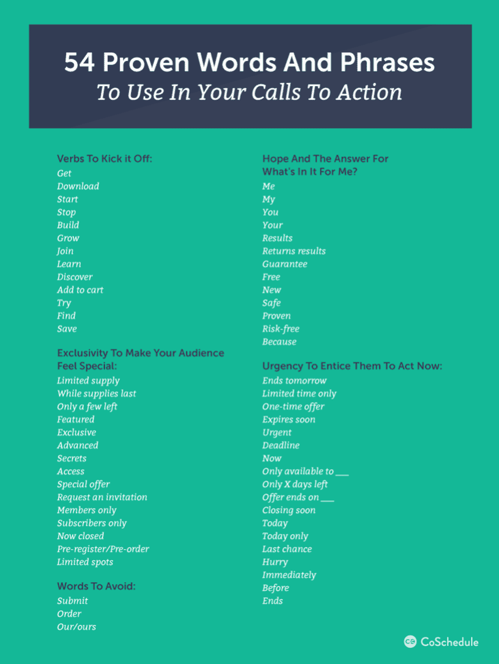
Use simple and short words like Try, Register, Buy, Sign Up, Download, etc.
4 – Use powerful, imperative verbs.
Call to action prompt the site visitors to take some step, the language that you use for the copy is essential.
Call to action starting with imperative verbs deliver the explicit invitation to the work.
By using operative action-oriented words, you strengthen the users’ confidence in the particular choice towards a clock on the call to action design and completing the indented action.

5 – Add a sense of urgency.
The call to action should make it evident that the users need to take action now.
Otherwise, it will be too late.
The right call to action design motivates the users to take action at the moment they reach them on the web page and read the copy.
The most popular power-verbs that result in immediate actions are Now, Today, Here, and the phrases containing this type of determination.
6 – Reveal the benefits that the users will derive from your offer.
When you ask your visitors to take action on your site, get ready to give them something in return.
The competition is getting tough on the modern-day web.
Other brands like yours can engage users with more luring offers.
To keep customers with your brand, make a clear statement of the benefits that they will derive from your offer.
For example, there may be a call to action like “Start Your Free Trial”, “Download without Registration”, “Create a Site Code-Free”, etc.
7 – Make the rest of the site elements support the call to action design.
A call to action is the culmination of the pitch that you reveal on your site.
Before your site visitors take a specific action on your site, you need to prepare and educate them about this.
As you work on the page layout structure and the data for your web page, make sure that it leads towards completing the intended action.
How can you do this?
The layout of your site should be built in a way that “guides” the users towards the call to action.
There should be enough negative space around it.
Avoid placing any distractions near the call to action.
Make it quick and easy to locate the button, link or image that is intended to be clicked on for the completion of individual actions.

8 – Do not annoy users.
Cleverly designed call to action can bring you the desired rise of user engagement and increased conversion rates.
However, trying to manipulate the users’ actions on the web, we often sound too pushy and annoying, which makes the users leave never come back.
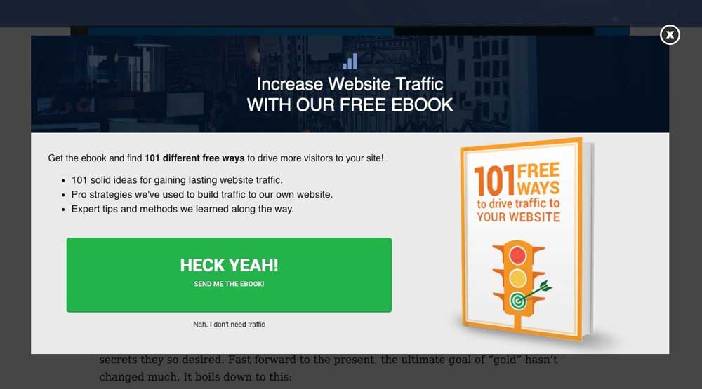
For this not to happen, do not overuse overlays and popups on your site.
Massive animation effects can only do more bad than good for your site.
A customer can be distracted and irritated by seeing multiple bright elements coming up here and there on the page.
Strike a balance in everything.
9 – Add a call to action to every page of your site.
If you run a multipage website, make sure that every page of your online resource features a call to action that leads towards a conversion.
Your site should contain something that would motivate users for further browsing and investigation of your resource.
On reaching the end, people will just leave.
What kind of a call to action design can you add to your site’s pages?
This may be a newsletter signup form.
You can also invite the users to join the community of your social media followers.
The call to action on all pages of your site should not necessarily be the same.
You can use the smaller actions that lead people towards your primary goal.

10 – Run A/B tests and check the results.
You never know what techniques work on your site until you try.
Experiment with different shapes, colours, texts, forms, and placement of the call to action designs on your site.
Watch the stats and the reaction of the users on different call to action schemes.
If your primary goal is to make people buy something, then compare stats on how people react to the “Buy Now” and “Purchase Here” call to action examples.
These two may look equal.
Still, they can trigger different actions of the site visitors.
Wrapping Up
When choosing the best approach to add the call to action to your site, keep in mind the purpose that you want to attain with its help, as well as your target audience.
Do not focus on the conversions only for your call to action designs.
You may have the best call to action copy and design, but your efforts will be wasted if you do not appeal to the users’ emotions.
The post 10 Call To Action Design Ideas To Make Your Visitors Act is by Stuart and appeared first on Inkbot Design.


