13 Jul Branding Psychology – How to Use it & Where to Draw Inspiration From
Branding Psychology – How to Use it & Where to Draw Inspiration From
As designers, we have immense appreciation for brands who demonstrate compelling and thoughtful designs — but we also know that design dreams don’t only begin and end with a trustworthy style guide.
When we think about the brands that inspire both creatives and consumers alike, there’s much more to it than colours, font styles, and imagery.
To really speak to your target market, you must know your audience inside out and play to their personality, emotions, and buying habits.
In the branding world, this practice is commonly referred to as “brand psychology.”
Branding psychology is grounded in the understanding of the human mind and its emotions.
By researching your audience and crafting your campaigns to their unique qualities, many experts believe that this method can effectively build loyal fans and consistently generate new ones.
Additionally, branding psychology has proven to be an especially effective strategy in behaviour-change campaigns, like anti-smoking ads, for example.
Curious about how branding psychology could enhance your brand?
In this post, we’re dissecting psychology in branding: how you can use it, where to draw inspiration from, and more.
Examples of Branding Psychology
Like the human brain, branding psychology is complex.
There are several different strategies to choose from depending on who your audience is and whom your brand wants to be.
Some of the most common tactics we see in branding psychology include:
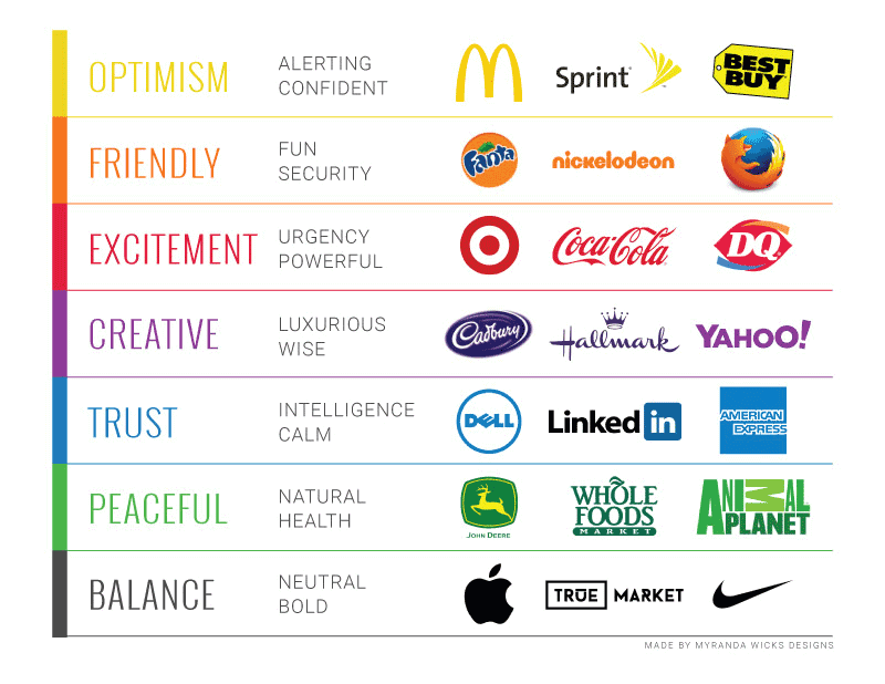
- Colour use — Colour is one of the most commonly used and most effective displays of branding psychology. Think about when you’re painting a room in your house — you likely consider how each hue would affect your mood and the overall vibe of your household — shades of blue serve up serenity while brighter tones like yellow or orange evoke energy. The same idea goes for branding. Obviously, you’ll want to stick to a specified colour palette to be used throughout your branding, and an extended version to be used for campaigns and other communications. As you pick out these tones, keep the guidelines of colour psychology in mind:
- Red = exciting
- Orange = friendly
- Yellow = optimistic
- Green = peaceful
- Blue = dependable
- Purple = creative
- Green = calm
- Brand voice — Your brand’s voice is another crucial element that defines your organisation from your competition. It’s also a valuable tool to use to help you connect with your target audience. As you begin to develop your brand voice, think about how your audience would speak to one another — are they casual and conversational, or do they prefer more formal communication? In addition to mimicking the dialogue used by your audience, you can also help your potential customers visualise your products and services by using descriptive words that evoke emotions such as luxury, utility, and more. Whether you’re writing a blog entry, product description, or social media post, you’ll want to make sure your brand message is consistent throughout.
Let’s take a look at an excellent example of brand voice from Mailchimp:
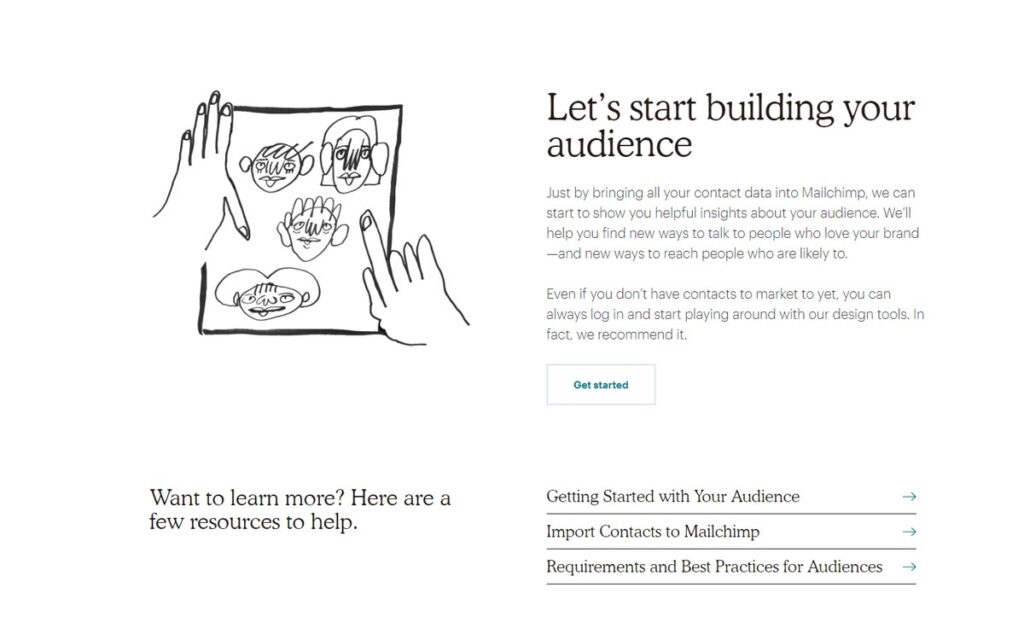
MailChimp, an email marketing platform, infuses helpful tips throughout their website.
By using a conversational tone and supportive language, like, “we recommend” and “Here are a few resources to help,” they set a trustworthy tone with their existing and prospective customers from the time they join.
- Social appearance — Becoming a successful brand is more than just creating an epic logo design. To resonate with the modern shopper, brands must also socially appeal to audiences. From contributing to social causes to engaging with audiences, these steps show empathy, authenticity, and compassion. As you build your brand, think about how your mission and messaging can translate to charitable causes and connective experiences. Studies show that social responsibility and philanthropy are becoming increasingly important for consumers purchasing decisions, specifically with millennials. Millennials have become the most significant purchasing demographic, so appealing to their priorities, can be an essential brand strategy.
Here’s a stellar example of how powerful social appearance can be for a brand from Patagonia:
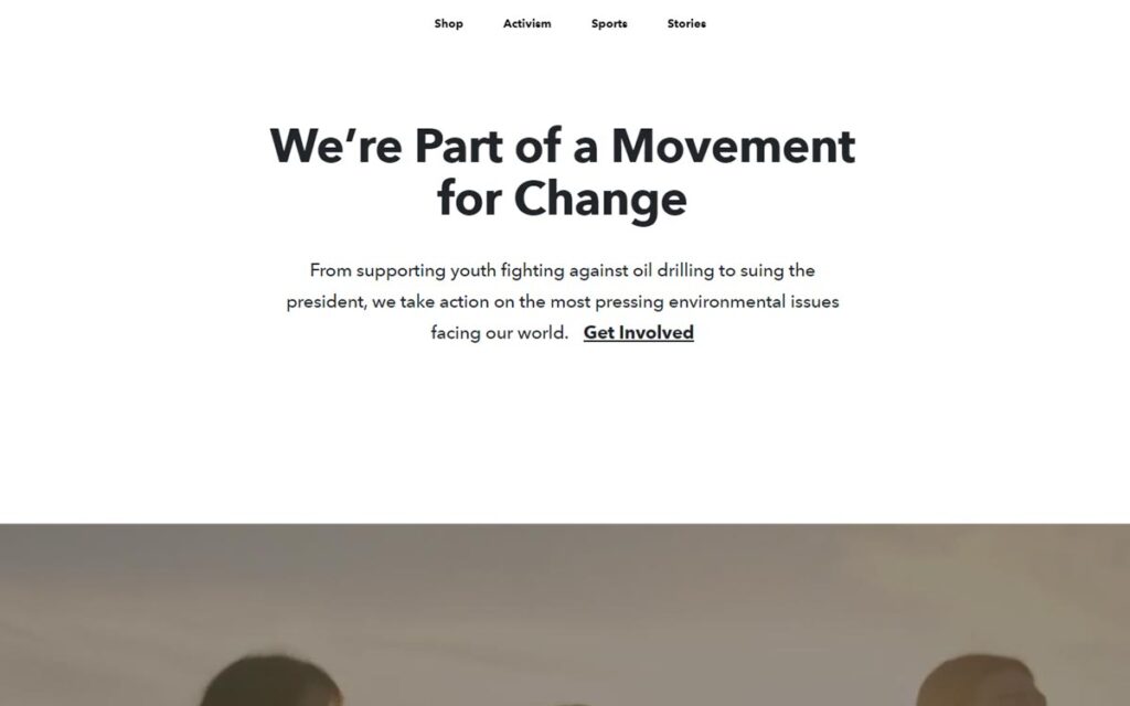
Patagonia has long been lauded for their commitment to activism.
From environmental to social justice causes, the outdoor clothing company has done a great job incorporating their social beliefs into their brand image.

In fact, this page on their website is entirely dedicated to their activism. How does this impact their customers?
It makes them feel like they are also doing something good!
By expressing their beliefs to the general public, they can attract and inspire like-minded individuals to buy their products and in turn, become a part of the Patagonia lifestyle.
- Storytelling — This approach can bring a genuinely humanistic experience to your brand. Whether it be the stories from your founders or your customers. Storytelling is a powerful way to resonate with your buyers. This helps to not only connect with your audience but can be a great way to capture their attention as well.
- Imagery —They say a picture is worth a thousand words, and the adage couldn’t be more accurate in the context of visual design. The imagery you choose to represent your products and culture have a significant impact on your customers’ perception of your brand. If your brand embodies total elegance, you may opt for photos with luxury accents and fancy backdrops. In contrast, a rugged outdoor brand would probably want to choose images that are rawer and display sensations of adventure.
Let’s take a look at how imagery comes into play from Objective Wellness:

In the example above, natural supplement company Objective Wellness, piques their audience’s interest with high-quality photos of their organic ingredients.
This transparency evokes feelings of trust, health, and wellness, which all fit perfectly into their overall brand image and mission.
Additional Considerations
Establishing your brand is not only crucial for your consumers and driving sales, but it also plays a role in organic rankings.
Google’s algorithm update has noted the importance of expertise, authority and trustworthiness (E-A-T) signals.
These signals help brands rank higher in the search engine results page (SERP), based on how qualified they are to write about and promote relevant information to their brand.
This means that earning trust with your consumers has additional benefits.

With so much competition and so many options for consumers, being a trusted source should be the priority when establishing your brand’s approach to marketing and resonating with your audience.
Wrapping Up
Using branding psychology is a great starting point to build your brand.
By using colour psychology, brand voice, social appearance, and imagery to your advantage, you can not only foster a more reliable connection with your existing and new audience but also forge a loyal network of customers for years to come.
While it may appear that using branding psychology is the main priority for building a relationship with your customers, it can affect numerous aspects of your business.
For example, incorporating social awareness campaigns can not only earn accolades with your customers, but it can also open the door to various PR opportunities and brand exposure.
Through careful consideration when developing your brand, you can place your company on the forefront of progressive, thoughtful and well-respected business practices.
As you experiment with branding psychology using these methods, keep these general tips in mind:
- Know that actions speak louder than words. If something is in your mission statement, like social justice, for example, make sure that in addition to talking about it, you be about it, too. There’s no use in calling out a brand value if you don’t intend to live it. Additionally, if you claim to represent or stand for something but don’t back it up with action, there could be unintended backlash from the media or consumers.
- Get to know your audience. Understanding who your customers are, their purchasing habits, aesthetic preferences, and communication needs are crucial to crafting a brand that they’ll resonate within the long-term. There are a variety of tools available to help you identify who your audience is and what they want. One of the best tools available for this is Google Analytics. By setting up Google Analytics for your website, you can track how and why potential customers convert, how they landed on your site, and their journey while on your site. This is an invaluable tool for getting to know your audience.
- Be authentic. Whether you’re building a brand campaign or offering customer service support, your brand needs to be genuine and consistent in every interaction. This establishes a sense of trust. This can be a difficult challenge because like all things, change is inevitable. If you do decide to take a new approach with your branding, it’s a good policy to do so with complete transparency and honesty with your audience. By rebranding with openness, you may even create an opportunity for consumers to chime in on what they want from your brand. Direct audience feedback is invaluable and should always be received with the utmost consideration.
Have you already experimented with branding psychology?
Share your experience with us in the comment section below!
Author Bio: Samantha Rupp holds a Bachelor of Science in Business Administration and is the managing editor for 365businesstips.com. She lives in San Diego, California and enjoys spending time on the beach, reading up on current industry trends, and travelling.
Branding Psychology – Maximising the Influence of your Logo Design

Your business logo design is the cornerstone of its brand identity.
It is the face of your company and the sign of the trust it offers.
We see numerous logos every day, but we remember only a few.
Only the ones that are engraved in our subconscious mind. Why?
Because the ones we remember tell us a story.
A logo design makes a brand unique and offers a company much more than just recognition.
It is the symbol of trust that brings reoccurring sales with the same customers.
Growing sales will convert into year over year growth in the revenue, which is precisely what companies like.
Some businesses, in the thrill of getting started, mark the logo of their mission as the last priority.
They are blinded by the buzz of hiring staff, buying furniture, designing their website, but forget to give a face to their business.
The fact is, having a logo from the very beginning of your venture can have positive psychological effects on you and your team.
Your employees get to interact with your company’s logo, which cultivates a sense of attachment and care in them.
A logo will distinguish your business from the rest.
It will be helpful in communicating with the industry in which your business operates and the services you provide to your audience.
Many companies have implemented the Keep It Simple Silly (KISS) methodology in their logo designs.
Keeping the logo understandable and straightforward shows that your brand respects transparency and is serious about the services it offers.
Meanwhile, other businesses have opted for a complicated logo with a mix of shapes, colours or symbols, to distinguish their brand from a pool of competitors.
Cactus Dental, a clinic for dentistry has planned well while designing their logo.
In fact, they have done a great job considering the infinite conventional dental clinic logos used around the world.

Brands these days can be very creative with their logos.

Some logos have been designed ingeniously to reveal a hidden meaning.
FedEx, one of the most popular logistics brands in the USA, has a hidden arrow in their logo (between E and X) which represents speed and accuracy in their services.
Amazon, the largest e-commerce giant on the planet right now, has an arrow in their logo pointing from A towards Z.
Amazon is merely suggesting to their customers that they cover many categories on their platform, selling everything from A to Z.
A logo can contain an image, a text, a symbol or a mix of all.
Keep in mind, that the aim to design a logo for your company is to allow your brand to communicate with the public and to make a lasting impression on your business.

The Branding psychology in a good Logo
A good logo must adhere to your brand’s culture.
It should be able to mirror your brand values and your entire mission, in a pair of symbol and text.
Differentiating your business from others is vital, and that is the job of a logo.
It is incredibly crucial to the success of a business.
If your customers can relate the excellence in quality products to your logo, then you are assured with reoccurring sales.
When a customer is in the futile search for quality and solution to their problem, their first contact with your logo will compel them to make a buying decision.
Such a relationship with the customer will inevitably result in higher sales and revenues for a company.
Throughout the history, a logo has been an essential part of the social and cultural community.
Rulers would carry their imperial seal with proud, that would also encourage the army in the wars.
Today, your logo holds the power of positivity and adds a sense of team spirit to your company culture.
A logo reflects the marketing efforts of brand managers associated with your company.
It highlights a company’s core principles and connects a brand with its customers.

A random Logo serves random meaning
A logo should not be based on a random idea or personal taste.
A good logo should be in line with the brand’s mission, and its objectives, strategies, ideology, and commitment should be incorporated into it.
The choice of colour, font, and symbol used in the logo can affect the customers aesthetically and emotionally.
Although it is normal for a brand’s logo to evolve, one should bear in mind that their logo will have to influence the public for at least a couple of years in the future.
The best logos are the ones that can easily adapt to multiple platforms like a banner ad, email templates, prints, stamps, brochures, web and mobile pages, mobile apps, textile prints, etc.
The famous Facebook logo, for example, is a perfect example of such a logo.

A good logo design should be easy to remember and should make a clear statement.
What benefit is of a complicated logo that your customers cannot recognise or remember?
It should not be a poor copy of another successful competitor.
If you want to be instantly recognised, then you cannot leave room for confusion among your customers with your logo.
Some brands design big logos for their web pages that fail to fit a small-sized header in a mobile application.
Usually, the logos with an image are difficult to fit in web or mobile page headers.
However, some brands like Paperell.com have smartly implemented an image in their logo that can fit both mobile and web platforms.
A good logo is timeless
A brand may redesign their logo every few years or decade, but the basic structure should remain the same.
The best examples of such logos are Apple Inc, Walmart, Quaker, Burger King, Domino’s Pizza and the famous James Bond double-O-seven (007) logo as well.

Your Logo colour influences your Brand
Everything about your logo, be it the colour, image, icon, shape or font, can have interesting psychological effects on your customers.
According to an infographic by Colourfast, 93% of buying decisions are made on visual perceptions.
Over 85% of the customers regard colour as the main reason to buy a particular product.
Different colours can trigger different emotions.
For example, many pharmaceutical or health brands like Tropicana and insurance companies like GEICO use green and blue colour in their logo, which merely indicates that these brands care about health, growth, care, and peace.
The fiery and bold colours of McDonald’s, LEGO, Red Bull and LAYS share youthfulness, optimism, playfulness and energy.

One cannot imagine KFC in blue colour unless KFC is a blue chip software brand or a toothpaste brand like Oral-B.
In fact, the blue colour in the brand logo of insurance and banking companies indicates that these businesses are reliable, honest, secure and trustworthy.
This is how the colours influence the branding psychology.
Most of the brands stick to one particular logo colour, although others may choose a mix of colours for a combination of emotions.
For example, luxury brands like Gucci, Prada, Mercedes, Rado, and Bentley, usually stick to pure solo colours like silver, black or white.

Meanwhile, Google, Microsoft, and eBay involved a variety of colours in their logo, since these brands work with a diverse group of products and services.
There are no fixed guidelines though.
A brand should choose a logo colour that suits their personality and can help in building trust with their customers.
Think of the shape of your logo
Insights from psychology are often used for branding.
The shape of your logo can play an essential role in influencing your target audience.
The human subconscious mind works in mysterious ways.
People react differently to a logo shape, and it is the job of a brand manager to consider the importance of the same.
Your customers will remember and retain what your logo shape is talking to them.
Think of those curves and the circles that are complete and close.
Such logo shapes will combine emotions of love, strong relation, and closeness.
Companies like Pepsi, Land Rover, GE, Starbucks, Samsung, etc., are trustworthy, mature and long-lasting companies.
These round logos send a positive emotional message to their customers, engraving the impression of happiness, perfection, and rhythm.

On the other hand, companies like Microsoft, American Express, Adobe, Dominos, BBC, and IKEA, etc., keep a square or rectangle logo shape.
These brands suggest discipline, order and perfect organisation.
Millions of customers have built a strong bond with these brands over the years, and their stability is unmatchable.
The square represents the primary foundation required to build trust, loyalty, and partnership.
Logos with triangle shapes are associated with energy, science, and innovation.

Companies like Mitsubishi Motors, Delta, CAT, etc., are linked to innovation in technology and thus feature a triangle shaped logo.
Research has provided us with numbers that show rectangle logos (50%) are most preferred by brands, followed by square (22%) and circle logos (20%).
These are not the only shapes though.
Companies choose to keep a mix of shapes or abstract shapes for branding.
For example, Cisco and IBM are perhaps the most famous brands that have built their value over time.
They have branded their values by implementing horizontal and vertical lines in their logos.
Apple’s famous and iconic ‘bitten apple’ logo was adopted based on Newton’s discovery of gravity after his observation of the apple.
The company has served its customers with innovative technology and creative ideas year after year, building a multi-billion dollar business worldwide.
The famous Swiss Army Knife company Victorinox AG uses a cross logo that resembles the coat of arms of Switzerland or their national flag.
The product was built to provide safety and ability to perform multi-tasks in solving a problem.
Their logo correctly emphasises Swiss craft skill and quality.

Nike is one of the most successful sports brands in the world, and their famous Swoosh logo is nothing but the art of simplicity.
The original logo, which was not a square or a rectangle, was designed in 1971 for just $35 by Carolyn Davidson.
Nike’s customers trust the brand with quality sportswear and can quickly make buying decisions as soon as they connect with the logo.
There is no doubt that the Swoosh logo has helped in creating a healthy customer relationship for Nike since the beginning in their first retail shop in California, and went on further to build a $124 Billion sportswear company.
Talking about small shops that turned into world-class business giants, we cannot ignore the famous brand names like Dominos and McDonalds, or the leading ice cream franchise Baskin Robbins.
BR was founded in 1945 with the merger of two small ice cream parlours in California that went ahead to become the world’s largest ice cream company.
Their branded logo of pink-blue colour signifies the pink spoon offered by the parlours and the trust in quality and excellence of the products.
Branding psychology can make all the difference
When people choose their favourite brands, it is more to do with their minds than their eyes.
The psychology behind the structure of a brand can make or break its influence over its customers.
It is of utmost importance to the branding builders to study the basic human psychology while planning their strategies.
Logos can help us in creating a beacon of loyalty and trust among our customers.
Although consumers may change their methods of purchase or ways of interaction with the products in time, their basic psychology will remain the same.
In today’s competitive world, there is no doubt that logo designers need an edge.
Understanding the branding psychology can help you in maximising the influence of your logo.
Last update on 2020-07-14 / Affiliate links / Images from Amazon Product Advertising API