
26 Mar Colour Theory: Why is it Important, and How is it Used?
Colour Theory: Why is it Important, and How is it Used?
Since childhood, we start realising how some colour combinations are more appealing to the eye than others.
You don’t have to be an expert in colour theory to notice that blue skies over a golden field bring a sense of peace.
But if you want to know why you feel a certain way about specific colours, colour theory can be of great help.
Besides, knowing the tricks of colour theory can help you create an atmosphere you are aiming for.
In general, what colour theory stands about is how the different colours interact among themselves.
Although it was introduced by Isaac Newton three hundred years ago, the colour wheel is still the most used tool in colour theory.
Colours come in different flavours. We call those monochromatic, analogous, and complementary.
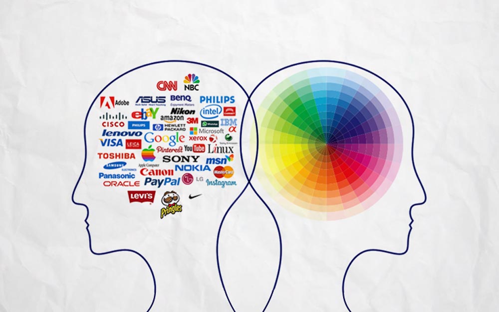
While most people don’t think about it very often, many companies consider colour theory when designing their products, interiors, or visual identities.
There is a vast availability of information on the Internet, such as reviews of Essayexaminer, data on learning activities, information about various resources and designs.
Here we have picked the best data available on the colour theory and its use in design and photography.
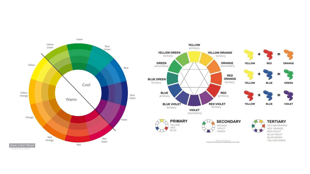
The colour Wheel
Isaac Newton was the first to create a colour wheel.
He did it by using physics and creating a colour disk whose colours were based on light reflection off prisms. He put the building stone of how we use the colour wheel today.
There are two such models. One of them is blue, red, and yellow. Those are known as being the primary colours.
They have corresponding secondary colours that are green, orange, purple.
Also, we have tertiary colours – green-yellow, then yellow-orange, next is orange-red, afterwards comes the red-purple, then we have purple/violet-blue, and last but not least, is blue-green.
The second one is the red, green, blue wheel (RGB). This is used in the digital colour system.
There are subtractive and additive colours.
The subtractive is the physical colour that does its job by removing the light. Additive colour is the digital one.
It adds light with further addition of colour. Thus, by subtracting, you eventually reach black; you will finally get to white by additive colouring.
Colour Harmony
Colour harmony is the visual result that follows from adhering to the colour wheel’s rules.
You need to be aware of what is the meaning of the colour wheel’s colour placement.
There are nine main rules: about the primary, secondary, and tertiary colours, about the intermediate, complementary, and monochromatic colours, as well as the rules about analogous colours, triadic colours, and tetradic colours.
Primary, Secondary, and Tertiary colours
We have red, yellow, and blue as primary colours. Starting from them we can find all the others.
With different proportions of some of them, we can create secondary colours.
Secondary come from the – surprise, surprise! – primary colours. They are green, purple, and orange.
Afterwards, we need to think of tertiary colours.
They come about when we mix primary with secondary colours – all in all, their number is six.
There are also intermediate colours.
They are the opposite colours that you can find on the colour wheel.
They are between the primary and secondary colour pairs on the wheel.
When they get their names, the first part of the name stands for the primary colour.
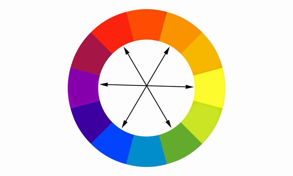
On the other hand, complementary colours stand for a method that consists of combining those colours that are opposite to each other.
On the one side of the wheel, we have warm colours, while on the opposite one are the cool colours.
By combining a cool one with a warm one, you achieve better contrast.
The goal that we look for here is to create a harmonious scheme of colours.
Still, don’t use complementary colours in high saturation because that will be hard on the eyes.
Instead, use one as the primary colour, while the other one – as the complementary colour.
Monochromatic colours
Monochromatic are those from a single hue, with the tones, shades, and tints of a single monochromatic colour. For instance, monochromatic will be pale blue with darker blue.
Analogous colours
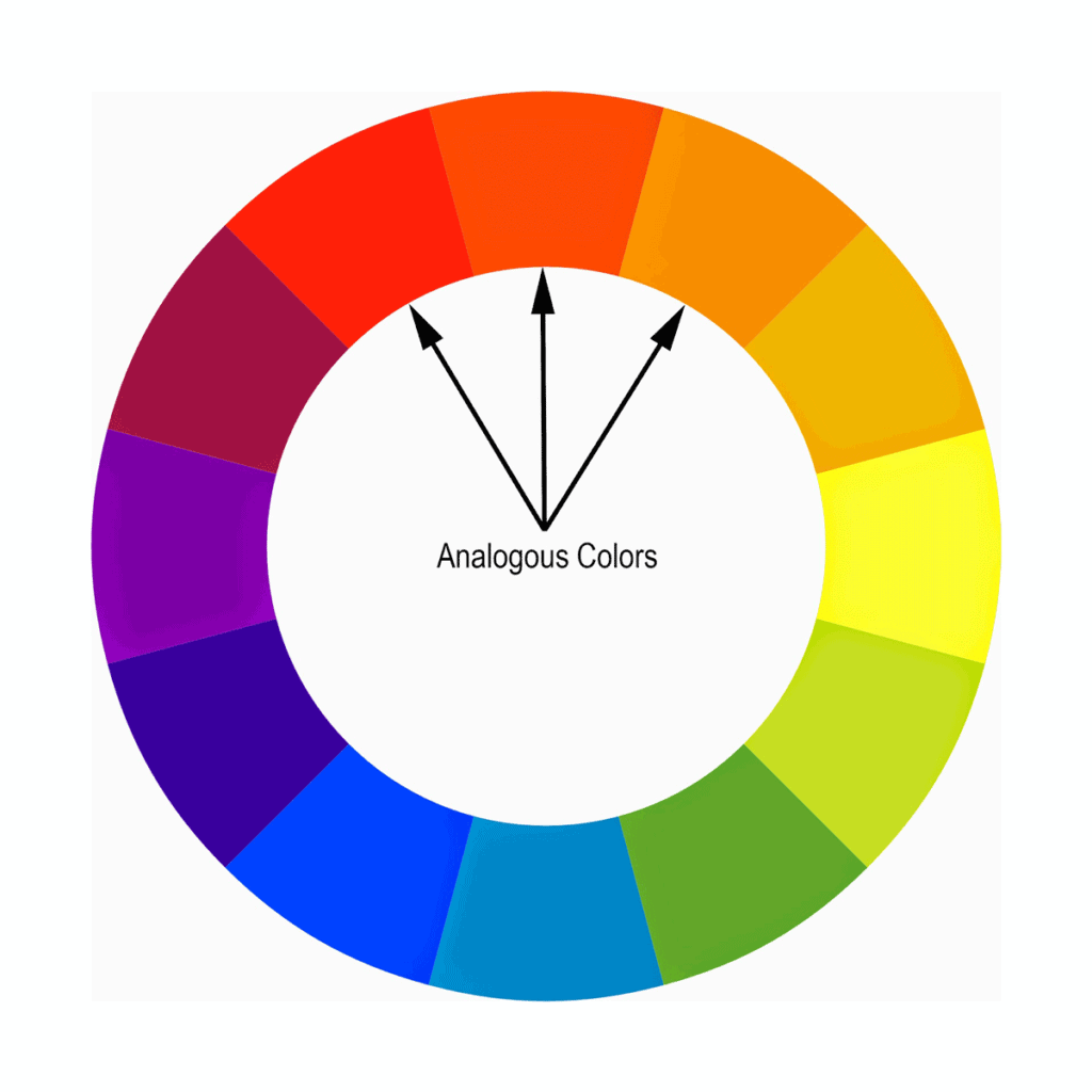
Those are the colours that sit next to each other on our colour wheel.
Analogous means that they perform a similar function, but there is a slightly different origin.
You can find analogous colours everywhere, and they succeed in the creation of a harmonic image.
There are also triadic colours – three colours, forming a triangle on the colour wheel.
They contain vibrant and rich colours with a huge contrast.
On the other hand, Tetradic colours combine four colours, combined in two sets of complementary ones.
On the one side of the resulting triangle, the short one, only one colour separates the ones you picked, while on the long side, we have three intermediate colours.
The Meaning of colours
Green is most commonly associated with health, nature, and vitality.
We use it highly in natural beauty and health products, as well in those products that are environmentally friendly.
For a natural feel of the design, you can use green nature hues.
Red is a primary colour. It possesses quite a significant power. It can convey various feelings and emotions based on the context.
In some cases, it signifies love and passion, while in others, it conveys rage and anger. Red is usually associated with strength, and in many designs, it is used for the display of power.
Blue may be seen as a colour that denotes calamity, while others may see it as conveying sadness.
It has a history of denoting masculinity. So, designs use blue for men’s health products.
Dark navy blue is used in designs for business campaigns to display professionalism and seriousness, and a conservative look.
Purple has been associated with royalty and majesty. It is a colour that denotes luxury and is used to convey expense.
Orange denotes the yellow colour’s happiness, combined with the energy that steams from the red colour.
It signifies joy and sunshine. Orange can also signify the tropics. It shows creativity, fun, happiness, and warmth. It shows vibrancy, general wellness, and emotional wellbeing.
It is thought that orange offers us emotional strength in times of hardships.
Yellow may mean freshness, positivity, brightness, and energy. It shows positivity, sunshine, confidence, and it encourages communication.
It is used in many designs aimed at children for it grabs the attention and shows fun.
But if you use too much yellow, that may have a negative result of lack of focus, frustration, and inability to perform tasks.
Pink is the colour of femininity and shows love, kindness, and calmness. It is a romantic colour that is relaxing and soft.
Black denotes mixed meanings and emotions.
For some, it shows mystery, evil, sophistication, grief, aggression, power. It can both signify negativity and positivity.
It can be quite a powerful tool for use towards rebellious teens or those who wish to cover fears, insecurities, and different feelings.
This colour is typically used in contrast with the white colour, and this is quite a practical design.
White comes about looking fresh and promoting mental clarity; white has its associations with innocence, obviously, with cleanliness, also obviously, but also with purity and innocence.
It will give one’s design a classy look, as long it is not overused or too bright light. A benefit is a fact that it goes well with all the other colours.
Colour Theory in Web Design
A good colour combination is one of the pillars of successful web design.
No matter how high the quality of your written content, it has to be presented in a way that makes it readable and attractive.
When it comes to text, contrast is your best friend.
You can never go wrong with black and white, but you can also try tints and shades of complementary colours.
This way, you can take a step away from the traditional black and white but keep a sharp contrast between the text and the background.
If you’re dealing with a longer text, don’t experiment and keep it simple.
According to neuroscientists, our eyes tend to focus on contrasting images because of their high visual saliency.
In the modern world, where we are overwhelmed by the amount of information floating around us, our eyes have automatically learned to choose objects that stand out among others.
The saliency of an object is determined by its colours, contrast, brightness, and patterns.
For example, when first launched in 2016, the new Instagram logo didn’t receive a warm welcome from the public.
However, it was a strategic move. Yellow, orange, magenta, and purple are the most aesthetically pleasing combinations you can find on the colour wheel.
It combines vibrant warm colours that give you a sense of excitement and harmony at the same time.
Besides, the logo imitates the sunset and the golden hour, a time when you can take great photos.
When Instagram was first created, it was a platform where one could share images with friends and family, so the camera logo was a natural choice.
However, as Instagram evolved into a powerful platform for creators, it felt a need to take its visual identity to a higher level.
Highlighted by a white outline, the colours of the logo create a visually salient image that appeals to our brains and conveys the company’s values simultaneously.
Interior design
Another area where colours play a huge role is in interior design. When it comes to designing a home, many factors have to be taken into consideration.
Besides the fact that we all have our personal colour preferences, every colour gives our brain a signal and determines the way we feel in a room.
So even if bright red is your favourite colour, it doesn’t mean it would be a good choice for your bedroom walls.
Typically, we want to feel differently in different rooms, and the colours we are surrounded with can have a substantial effect on our perception of a place.
Yellow, for example, is a good colour for a kitchen, since it can boost your motivation and appetite while also creating a friendly family atmosphere.
For bedrooms, it is better to stick with calming cold colours such as grey or navy blue.
Unlike web design, interior design doesn’t rely on the contrast that often.
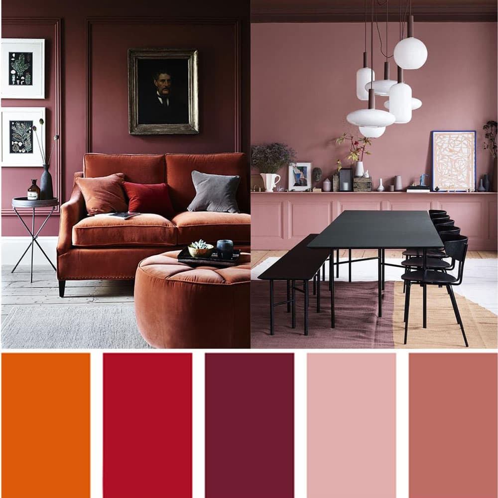
Many designers favour monochromatic colour schemes—an approach when one colour from the colour wheel is the base colour, and other colours used in space are its tints and shades.
Designing a room around one colour is a simple way to create a sense of harmony and elegance.
At the same time, a monochromatic background is excellent for highlighting bright or contrasting accessories.
Photography
While photography is more about capturing something than creating it, we still gravitate towards colour pallets that please the eye.
A photographer who knows colour theory can decide what elements to include in the frame and what should be left out.
If chosen well, bright colours don’t overwhelm the viewer. Instead, they create a sense of balance.
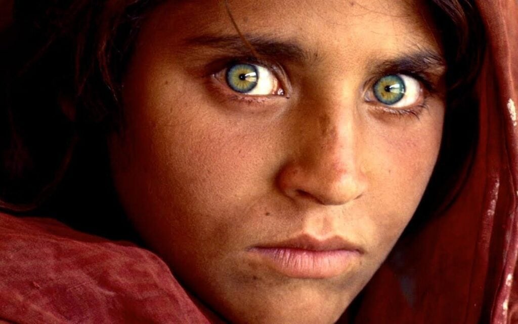
That is one reason why Steve McCurry’s “Afghan Girl” is one of the most recognised photos in the world.
Taken at a refugee camp, it became a symbol of Afghanistan and the Afghan people’s struggles.
A simple yet strong colour combination is one of the main reasons behind the photo’s success.
The green background and elements of the girl’s clothes highlight her piercing green eyes, which are the main focus of the picture.
Paired with a crimson red, which may be interpreted as a symbol of the war and its bloodiness, both colours let the viewer concentrate on what matters without getting distracted.
Author Bio: Laura Fields is a professional writer who tries to understand various aspects of learning, design, and productivity. She tries to give vital information to her readers, comprehensively and interestingly. She loves to research different topics and present them in an easy-to-read but informative way.