06 Oct History of the Audi Logo Design
History of the Audi Logo Design Meaning and Evolution
In this post, you will learn the history of the Audi logo design and Branding.
Audi has emerged as one of the leading and premium automotive brands in the world.
It is almost more than a century that the company has been a top-notch leader in creative design and technological advancement in the automobile industry.
With outstanding performance and extraordinary interior design, Audi cars are synonymous with high speed, safety, comfort and sophistication at its best.
The German automaker is synonymous with excellence.
The leading and one of the most successful automobile brands in the world has a long and fascinating history.
The German auto manufacturers are known for their technological innovation, style, efficiency and luxury, and Audi cars are no exception.
You will be surprised to know that the company is the amalgamation of four different companies, one of them which named “Audi”.
With no prospect of continuing production in Soviet-controlled East Germany, Auto Union executives began the process of relocating what was left of the company to West Germany. A site was chosen in Ingolstadt, Bavaria, to start a spare parts operation in late 1945, which would eventually serve as the headquarters of the reformed Auto Union in 1949. – Wikipedia

The story of the four rings Audi logo design
If you have a look at the logo design components of Audi, you will find there are four rings.
It is yet not confirmed behind the real inspiration of the logo design of the German automaker.
However, there are several beliefs and speculations regarding the same.
Some claim that the design was an inspiration from the Olympic rings.
In fact, the majority of the people have the view that the four rings represent the four different companies that eventually merged into one and formed “Audi”.
The company name is based on the Latin translation of the surname of the founder, August Horch. “Horch”, meaning “listen” in German, becomes “Audi” in Latin. (en.wikipedia.org)
On the 100th birthday of Audi, in 2009, there was an alteration made in the designing of the logo and currently features the same.
The slogan of the company is Vorsprung durch Technik which, meaning Advancement through Technology.
Series of transformation over the years
In the past so many years, the logo has transformed concerning the forms and shapes.
If you follow the pictures of Audi’s logos over the years, you can notice the makeover that the design has undergone.
There is a modification noticed since the company was primarily four separate ventures and then merged into a single unit.
Some way or the other it can be said that the real meaning of Audi logo is “unity”.
Audi is the merging of four different companies
During the final twenty years of the 1800s and the first ten years of 1900s, the so-called Audi company was four different automotive ventures.
Merging expertise Right after the merger, each of the four brands was assigned to handle a particular portfolio as part of the whole Auto Union AG – DKW was to work on motorcycles and small cars, Wanderer was to deal with midsize cars, Audi would make cars in the deluxe midsize segment and Horch would work with the top-end luxury cars. – Hindu Business Online
They were all very proud of being the top notch in the manufacturing of the vehicles with the latest engineering technologies.
The four companies included Audi, Horch, DKW and Wanderer.
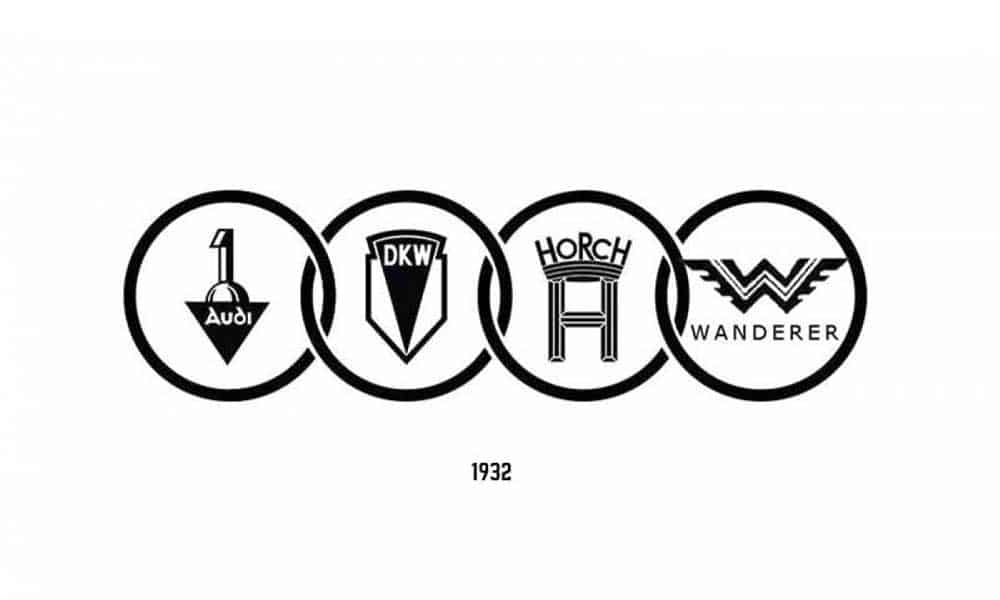
The companies, Audi and Horch, were owned by the company founder and an extraordinary engineer, August Horch.
Each of the four companies featured their independent logo designs.
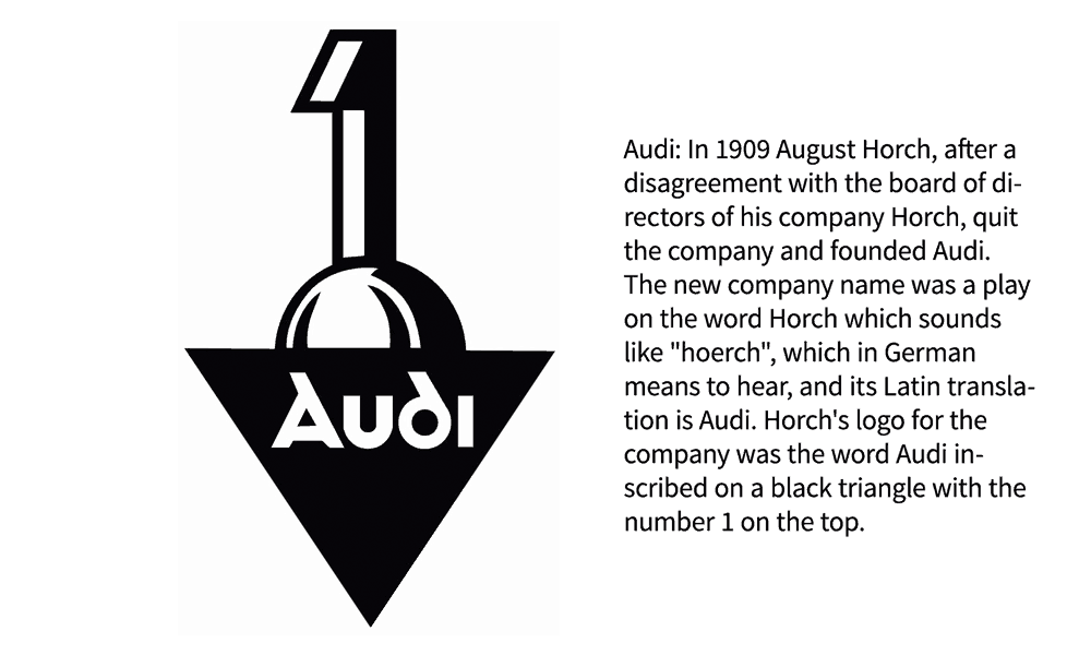
In the initial days, the logo of the Audi company featured an upside-down equilateral triangle.
Moreover, there was a stylized numerical one that represented as a gearshift elevating from behind.
It was around the year, 1932 when the four independent automobile companies combined into one and came to be referred as the “Auto Union AG”.
With the amalgamation of the four car companies, the logo designs also got unified into one, and the first solo Audi logo was materialised.
Over the years, several minor changes have been made to the Audi logo design, with the final modification done in 2009.
The current logo design presents the luxurious and the elite cars and sports cars that we know.
The initial shape of the Audi logo design
The shape of the current or the modern logo design by Audi that you notice today took place as early as 1932 when the four companies merged into one single unit.
The conglomeration of the four independent companies united to become “Auto Union AG”.
The first very logo design of “Auto Union AG” comprised of four interwoven rings with the logos of the four companies within the circles.
The logo represented the unity and cooperation that the brand stands for and believes in.
Over so many decades till today, the logo design has gradually transformed.
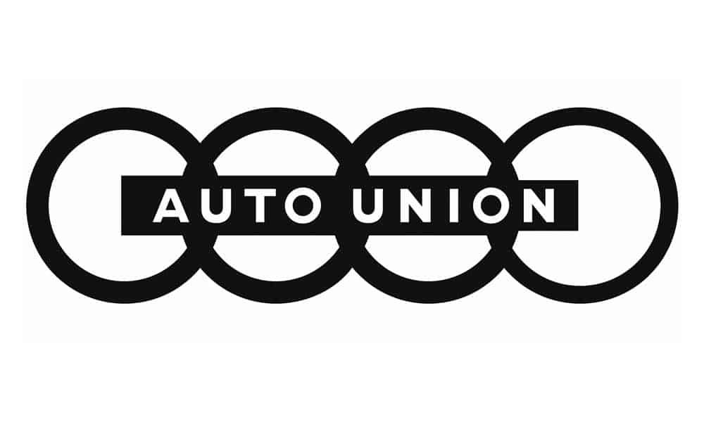
Initially, the logos of the four companies were eliminated from inside the rings.
It was substituted with the phrase, “Auto Union”.
Finally, the current Audi logo design represents just the four interlacing rings without any company names or words inside them.
The last change in Audi logo design was in 2009
It was way back in the year 2009 when the last makeover was given to the Audi logo, at the 100th birthday anniversary of the company.
Nothing significant was changed, except for the fact that the four rings were given more joined together and a better interlocking appearance than before.
The changes that took place over the years concerning the company logo designs say a lot about Audi.
It reflects the true meaning of unity on the one hand.
On the other hand, there are beliefs that the company lost its focus on what it stood for.
Whatever might be the opinion or thought process that people have in regards to the transformation of the logo designs, it seems people are using the Audi logo wallpaper more than ever before.
They are readily available online for free download as well.
The colour of the logo symbolises the power and elegance of the Audi brand
Have you noticed the stunning shiny colour of the Audi logo?
If you look carefully, you will find that much credit for the appeal factor of the logo design lies with the bright and the shining silver chrome colour of the logo.
It gives a modern, elegant, and classy touch to the entire design.
Moreover, the colour also symbolises the innovation in design, technology and the power of the brand identity.
Silver is the colour of sophistication
Silver is one such colour that has been long associated with the representation of high tech, industrialisation and modernisation.
Moreover, the glossy silver chrome finish is also related to the grace, glamour and elegance, and Audi car models are no less.
Every Audi car model that gets released in the market is featured with the characteristics that compliment with the sophistication of the colour.
The use of black in the commercials
You might have seen in several commercials of Audi cars, the use of black colour along with the silver chrome shade.
It is mainly meant to display the power and elegance that every Audi car model has been endowed with.
The German automaker is synonymous with all such qualities.
You will find the best of such features in Audi’s S series cars, like Audi S3, S4, S5 and so on.
The font used in the Audi logo
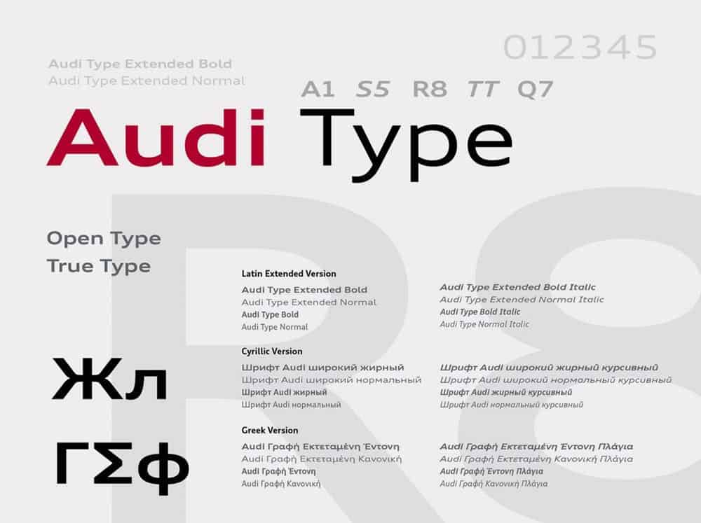
The font used in the Audi logo has a story of its own.
The font in which the Audi name is written next to the logo was initiated for the first time in 2009.
In 1997, the Sans font was created by Ole Schafer.
In 2009, MetaDesign was given the responsibility to design the customised corporate font for Audi.
It was designed by Paul Van der Laan, and Pieter von Rosmalen.
The font has been ever since featured in so many marketing elements and products of the Audi.
The font is seen on floor mats and tires.
There is a plethora of wallpapers and pictures on the same and are available for HD download.
Several theories for the interlocked rings in the Audi logo
No such confirmed resource tells the actual story of the use of the four interweaved rings in the Audi logo.
As mentioned above in the article, there are several beliefs, and it is still a mystery.
It is firmly believed that the inspiration of the four rings is the Olympic rings.
In 1936, the Summer Olympics was held in Berlin.
It was more or less around the time when the four companies merged into one.
Legal action was taken against Audi
It is usually believed that the Olympic rings served as the inspiration, with the twist in the design with four rings of the four companies, instead of the five Olympic rings.
However, this theory has not been confirmed by anyone either.
Perhaps, there is one aspect of the Audi logo that you might be unaware is that the International Olympic Committee instituted legal action against Audi in 1995.
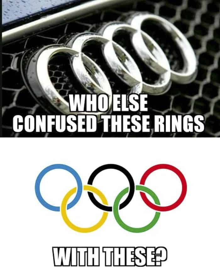
The legal verdict was in favour of Audi
The resemblance of the four rings to the Olympic rings was not seen in the proper eye of the Committee.
The International Olympic Committee had the idea that the resemblance of the logo to that of Olympic rings just couldn’t be just a coincidence, but a planned out design.
The Committee sued Audi in the International trademark Court, but the verdict was not in its favour.
Audi was relieved since it did not have to make any changes or pay compensation.
Despite the verdict in favour of the Audi company, the majority of the theories that came up portrayed the logo design as the real inspiration from the five rings of the Olympics.
Audi logo is recognised worldwide
The logo design of Audi is considered as one of the most recognised and reputed logos in the world.
Moreover, the company’s tagline is also not far behind from roaring popularity across the globe.
However, the tagline, Progress Through Technology has often been modified in several countries as an endeavour to make it more exciting and promotional.
The emission scandal of Audi
The emissions scandal that occurred included some controversial discussions.
It was a fun intended discussion that turned into a scandal.
The favourite Muppet character, Kermit The Frog shamed the CEO of Audi, by saying that it is entirely not an easy and straightforward task to become green and promote ecology when you are one of the leading and the most successful automobile makers in the world.
A dope logo that is more popular?
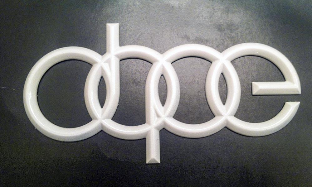
There is a shocking fact that the Audi logo design that very few people are aware of.
There is a knock-off logo that is believed to be more popular.
It receives more leads on Google than the original logo of the automobile company.
It is also referred as the dope Audi logo.
The logo consists of the word “dope” in a stylized font so that it appears similar to the famous original logo.
The internet is filled with such Audi vector images in different file formats.
One of the most beloved logos
The logo becomes to one of the most respected and admired automotive companies in the entire world.
The logo design represents the brand of the company in the real sense.
There was an emission scandal in 2015 and Audi did lose some of its brand image.
However, the company has stood firm for so many decades.
The shape, colour, design layout, font, and every aspect of the logo represents the true essence of Audi that it stands for.
Hence, it will not be wrong to say that Audi has one of the best logos in the world.
