29 Jul How to Choose Perfect Landing Page Colours and Images
How to Choose Perfect Landing Page Colours and Images
It is a universally acknowledged truth that good web design boosts conversions.
With analytical data being widely available through tools like Google Analytics, Clicky, or SEMrush, you can now have full insight into:
● where your web visitors are coming from
● what actions they’re taking
● how they’re interacting with content
● how many of them convert
● your marketing ROI, and much, much more.
Paired with proven best practice advice and an experienced design team, you can get a great website that will help your business get to the next level.
But what happens if you’re operating in a highly specific niche?
Surely the unique requirements of smaller segments of the market need to be taken into account during your branding journey?
A Word About Niche Markets
In today’s highly competitive market, small companies will find it hard to stand out.
So, instead of competing with global corporations, which can afford to sell at a lower profit (mainly due to larger quantities), they can decide to specialise their services highly.
This is good for business for many reasons, including:
● reducing competition
● focusing their energy on a highly specific area in which they’re an authority
● targeting a narrower audience and catering to their needs
● creating a better jumping-off point for further growth
But just as serving a niche market comes with benefits, it also necessitates a slightly different approach to branding.
In these cases, the entire business team, from product developers to designers, copywriters, marketing specialists, and even customer service, needs to have a clear idea of the unique wants of their clients.
And not just that, but they have to develop an online and offline user experience that identifies and efficiently solves those needs.
This means that with a solid understanding of the niche market, and audience, a design team can make visual element choices that will support the brand’s intentions.
Here are a few areas to pay attention to when choosing landing page colours and images.
Landing Page Colour Psychology
The main intention of branding is to communicate your mission and values to existing and potential customers.
And you don’t just want to do this with words.
Actions will always be the main determining factor in the reputation you create for your company, but it’s also not a bad idea to consider the importance of first impressions.
In a physical setting, entrepreneurs have around seven seconds to make a first impression.
Unfortunately, in the digital sphere, this is pared down to just 50 milliseconds.
Ultimately, this means that you can’t afford even the smallest mistake on your homepage or landing pages.

Of course, usability and layout will play a significant role in securing that positive reaction.
This is why so many experts swear by minimalistic web design.
After all, it minimises the chance of making a mistake.
Still, you’ll find that the most powerful element for leaving a good first impression will be the colour scheme you choose.
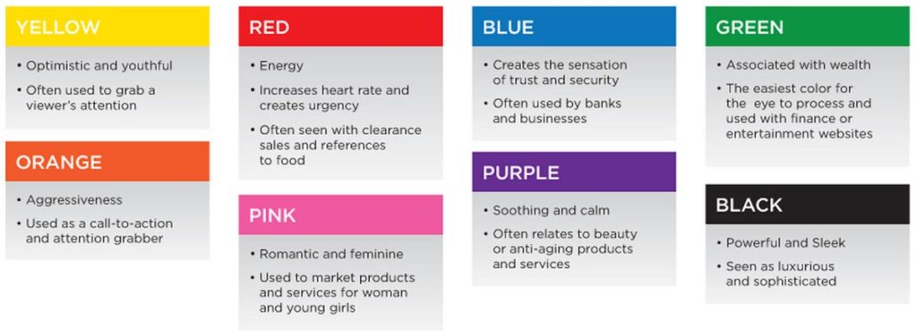
There’s a lot of information on the internet regarding how colour schemes evoke feelings or boost conversions.
But, according to scientific research, these claims are mostly untrue, as colour perception depends on cultural context.
So, instead of going with a specific choice because it “communicates calm,” brands should instead choose colour schemes to:
- create a distinctive look that differs from their competition,
- work on constructing an identity and impression they want their audience to get.
For instance, a company that deals with sleep-related products would most likely choose to go with blue or green.
These are often thought to communicate warmth and calmness. Yet that doesn’t have to be the case.
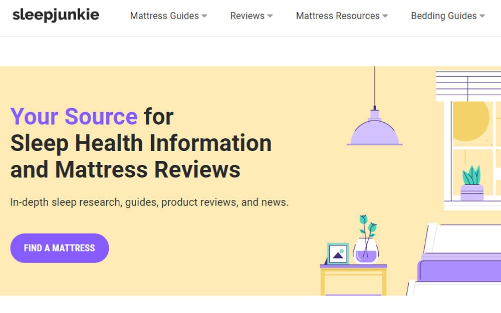
As you can see in the example of Sleep Junkie, the brand chose to go with original pastels that allow them to stand out from the competition.

And, perhaps even more importantly, the fact that they’re not limiting themselves to a single choice enables them to serve a variety of subjects better.
This is crucial, considering that their primary focus is research-driven sleep health information.
Emotional Impact
Much has already been written about the importance of appealing to consumer emotions.
And we must not forget the impact visuals can have on eliciting an emotional response.
For example, imagery that shows human faces will automatically receive more attention than that showing inanimate objects.
Similarly, humans are wired to get a dopamine surge when they see babies.
They also experience emotional contagion when shown visuals of smiling faces.
So, when choosing visual elements for your niche landing pages, consider the response you want to receive.
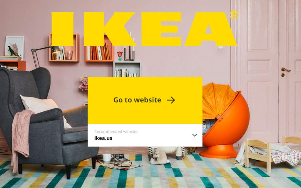
A furniture company might want to look up to Ikea, whose strategy is to show off their products in a lived-in environment.
This way, the brand allows consumers to perceive the brand’s products as familiar, as they are always shown in a homely atmosphere.
Furthermore, potential buyers may recognise certain elements that awaken nostalgia, like the children’s toys in the example below.
Replacing Text
When designing niche landing pages, it’s not a bad idea to consider the effectiveness of different elements at conveying a message – especially if your products require in-depth knowledge to understand.
So, while colours or images evoke emotional responses, illustrations hold the potential of giving instructions.
Plus, they do this without unnecessary wordiness.
To uncover the full potential of visual data, we should first consider the way our brains are wired.
Physiologically, we are more capable of processing information that is presented through images.
Research done so far shows that it takes less than 13 milliseconds for a person to get the general theme of a picture.
Of course, going into detail requires more time, but the difference is still incomparable to that which we need to understand a text.
Furthermore, it has been shown that humans learn better through visual feedback.
After all, 90% of the information we receive is visual, and we process it 60,000 times faster than words.

So what does this relate to niche landing page conversions?
Well, one of the main aspects of the perfect landing page is its ability to showcase the benefits of a product or service.
And while copy plays a significant role, sometimes it can be just a bit too overwhelming.
Just think about Amazon product pages – they’re barely readable on anything other than a desktop device.
Now imagine if they were selling something more specific – like three-bolt cycling cleats to someone who wants better shoes to do their spinning class in.
It would be a nightmare in the making.
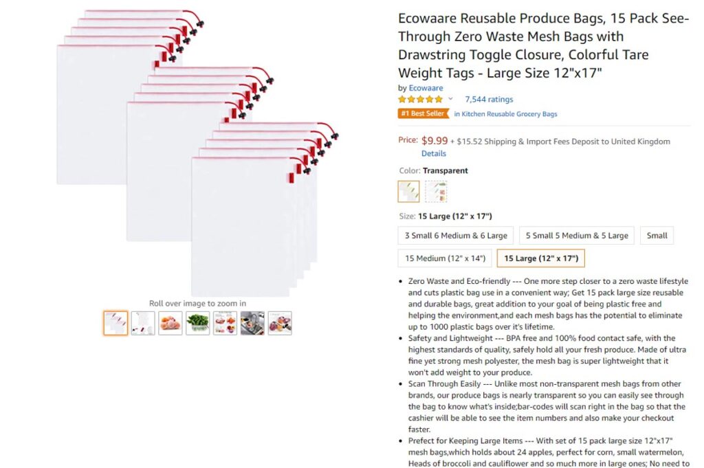
Compare the example shown above with a landing page that maximally uses visuals.
You’ll quickly find which is better at showing off the benefits of a product, and at moving website visitors further down the sales funnel.
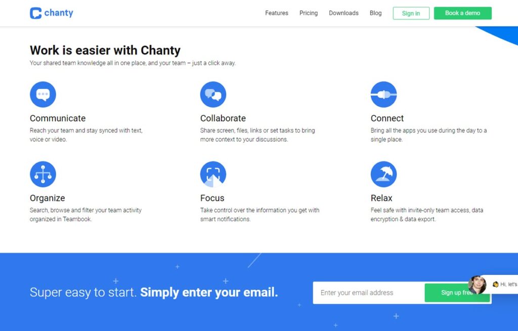
The features section on Chanty’s webpage uses six straightforward illustrations, with minimal amounts of text.
All of the entries address one aspect of the app and are followed by a short sentence to elaborate.

This way, potential buyers get easy-to-consume content that answers their needs, yet doesn’t waste their precious time.
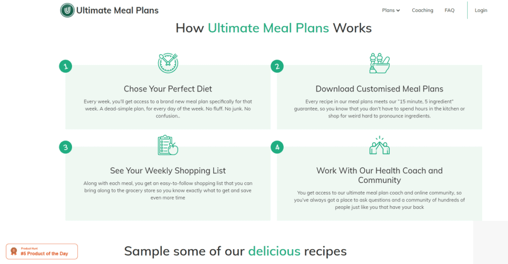
Something similar was done in the “how it works” section of the Ultimate Meal Plans website.
Here, the illustrations are used not to showcase the benefits of a healthy diet, but rather to describe the process which the users will go through if they buy a subscription.
The sections are also numbered. This gives a crystal clear picture of what potential buyers will get, and thus effectively manages expectations.
Putting It All Together
Finally, there is one more thing to consider when designing landing pages for your business, and that’s how you put all the elements together.
Choosing a colour, infographic, or image just because they look good won’t lead to the results you’re after.
If they’re irrelevant to your offer, or worse, if they misrepresent your company’s values, they can do much more harm than good.
So make sure to always work closely with your designer on choosing a look that truly represents your brand.
Look up to industry leaders like Apple, Adidas, Spotify, or Trello.
These are all companies who have come up with highly recognisable visual identities.
And, their websites do a great job at showing off products, often using almost nothing but visuals.
But, don’t neglect to put your own mark on everything you do.
After all, the reason why you entered your niche was to offer something that no one else in the market could.
And, of course, don’t forget about the impact of a good layout, with easily distinguished elements, well-placed CTA buttons, high-quality copy, and an intuitive UX.
Because no matter how much you spend on marketing, customers will leave if they find your website to be slow, disorganised, or unfocused.
Conclusion
There’s no such thing as the perfect landing page design. So don’t be afraid to experiment.
Whether you use A/B testing or analytical data to improve your landing pages, you’ll find that an approach that leaves room for improvements always works better than trying to reach perfection.
Plus, it doesn’t limit your growth; instead forces you to do better every single day.
And in the end, that’s one of the key elements of success – so embrace it wholeheartedly.
Last update on 2020-07-31 / Affiliate links / Images from Amazon Product Advertising API