03 Jun How to Choose the Best Fonts for a Website
How to Choose the Best Fonts for a Website
Fonts speak volumes about your brand and can be crucial to your online story success. However, selecting the best fonts for a website does not have to be a challenging task.
To establish a professional brand and a reliable entity, continue reading for some practical tips to choose the best fonts for a website design.
Why Choosing the Right Font is Important
The typography or font for a website determines how it makes users read and feel. It allows the users to focus on the content, and it affects how it is understood and perceived. It can set the identity and personality of your product and improve the overall user experience. The magic happens when it works unnoticeably while making your design visible and legible.
Primary Types of Fonts
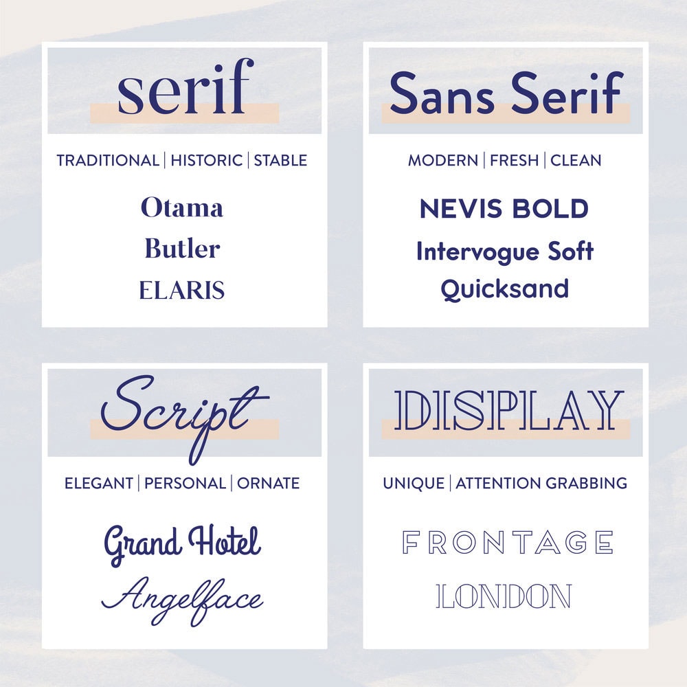
Before going to the main topic, it is crucial to determine the primary font styles. There are four main categories of fonts to choose from. These fonts are cursive, decorative, serifs and sans serifs fonts.
There are many other types of fonts, but for now, let us consider the main typographies in this article.
Serifs
Serif fonts are recognisable by the small line attached to the end of the stroke in a letter. Often, these little details are referred to as the feet of a letter form. Examples of serif fonts include Georgia, Caslon and Garamond.
They are known for their sophisticated and elegant qualities. Most traditional publications like newspapers, books, and magazines use Serif typeface for most of the body.
Sans Serifs
Sans serif typefaces are the ones without the serif or “feet” detail on the letters. These are the most used and best fonts for a website because they are the easiest to read and are highly versatile. They often appear more modern than serifs.
They are usually the default type of fonts on operating systems and browsers. You can use this to your advantage by using the default font for a website.
This will avoid additional font load time while rendering your site. You can see this implemented on 1nine.com.
Previously, Sans serifs were the most used fonts for logos and website designs as they are visible even on low-resolution screens. However, these days, screens have better and sharper resolutions, serif fonts can be used comfortably. Examples of Sans Serif fonts include Futura, Helvetica and Avenir.
Script / cursive
The script fonts look like cursive handwriting or calligraphy. They can be very fluid and are commonly used as a display font for headlines.
Formal scripts can look elegant when used in wedding invitations, and modern ones can be more casual. However, avoid using script fonts for a full-body copy as they can get hard to read.
Decorative Fonts
Decorative or display fonts are best suited for headlines in short copy, but not for a full body text. They can make your headlines stand out, but they can also make it look cheesy when overused, so use carefully.
You can use decorative fonts to add some funk and experiment with highlights on your website.
Things to consider before Choosing the Best Fonts for a Website
Fonts keep updating, and there are going to be thousands to choose from, whether it is web-safe or not.
It can get tricky, especially when trying to create a user-friendly website because every user has their preferences.
You might want to use the latest font for a week and then find a better one the next. But when it comes to professional websites, you will notice that they stick to a maximum of three different fonts throughout the website pages.
So before choosing the font for your website, ask yourself these questions:
- Do you want practicality or functionality?
- What vibe do you want to communicate?
- Is your brand inspired by the classics or the new font trends?
Whichever you pick, make sure that your website has readable fonts that convey your brand identity.
Appropriateness
The first thing you will want to consider for your website is appropriateness. Just like you dress for an occasion, make sure to use fonts appropriate for your brand.
For example, if your brand represents something timeless, classic, or reliable, choose a font with serif details. On the other hand, contemporary and playful brands can experiment with Sans Serif fonts.
Legibility and Readability
These two words might sound the same, but they are different in a few ways when it comes to a website page.
Legibility means distinguishing each letter clearly. Some font looks excellent when each letter is precise in the headline.
However, when you take it on the body, it sometimes gets fuzzy, and the font’s intricacies make it challenging to read at a small size.
Readability refers to how texts are arranged so that you can quickly identify the letters and read the text.
One factor that significantly affects the readability of any text content is the spacing between the letters in the text, between letters or groups of words.
Another way to make website fonts more legible is by choosing the right size and colour of fonts. It is a good practice to consider how each font colour contrasts with the background and never use a font smaller than 12 points.
Select a Typeface for the Body Text First
Since the body text is an essential part of the overall look of a product, it is crucial to choose the fonts for the body first.
The body typography will determine the decision of any other typeface like the headlines and labels. The look and feel of the body text will have a high impact on your website’s typographic quality.
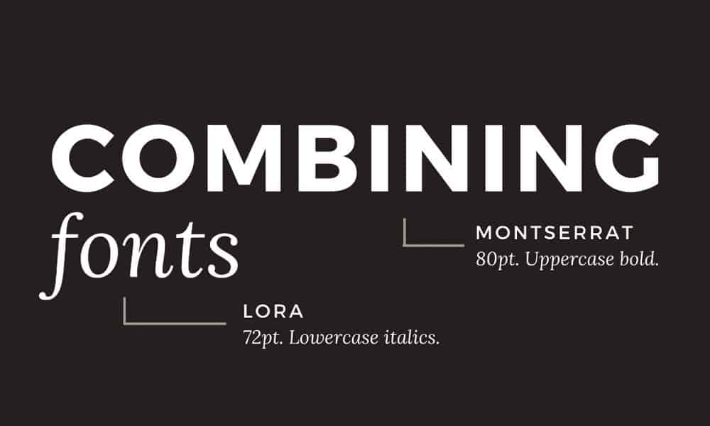
Pairing Fonts
Another one of the most crucial feature to consider is pairing fonts.
While there are no limits or rules on how many different fonts you can use on your texts, here are some guidelines to help your selection be more appealing.
Opposites Attract
The general rule to remember is that opposites attract. You can choose a block of San Serif text and pair it with a serif body because they inherit some similarities.
It can balance the boldness and the tension of the intersection of text.
Another example is using a heavyweight font with a lightweight font or a script font with a san serif.
For website content, it better to use the serif with the san serif fonts. However, you can also mix up the fonts to create unique visuals and custom logo designs.
So if you want to get creative and combine different ones, here are some tips to help you choose.
Experiment with the Font styles
Almost all modern web fonts already come in different styles. The “style” refers to the distinct size or different weights for body and headlines.
When choosing a font, a quick way to narrow options is to pick only those fonts with at least four styles. You will need to have at least an italic, regular, bold, and bold italic style.
Need help with web design?
Get a FREE Quote today
Choose From the Same Font Family
If you still want more options to combine fonts, here is a quick tip for you. Some font styles come with both serif and san serif typefaces.
You will probably come up with unique and attractive designs if you play around a bit to mix and match them.
Pair Fonts by Similarity or by Contrast
If you want to add more striking features to your website font, then you can pair them by contrast or by similarity.
There can be a beautiful design by combining the x-height, width, mood, or colour variation, width. To find an appealing result, trust your instincts and have fun creating beautiful texts.
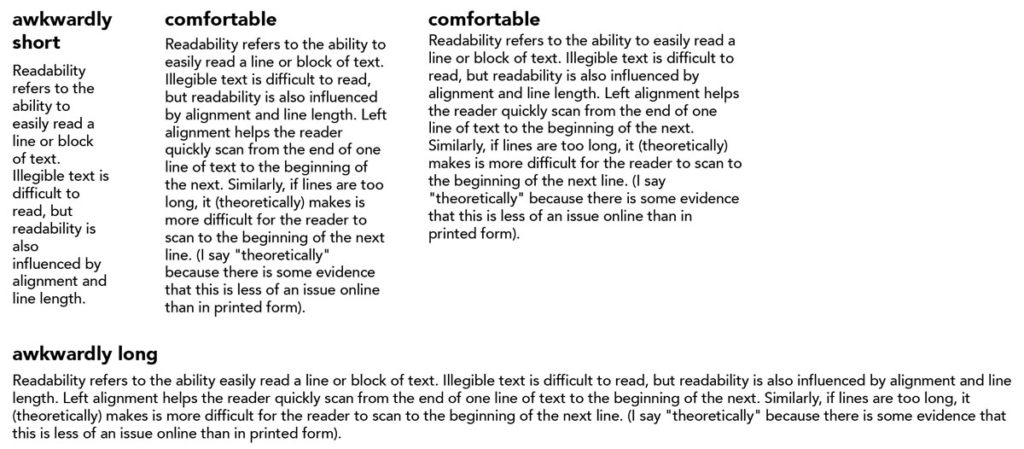
Balance Line Spacing and Point Size
The main factors that influence a product’s readability are the right balance spacing and point size.
The vertical distance between each line is called the line spacing. To improve the overall readability of your website, use a comfortable reading font size for the body text. For website design, the ideal size is usually between 14 and 25 pixels.
In most cases, the ideal line spacing is between 120 and 145% of the point size.
120% is not too tight, but also not that relaxed. It is comfortable enough for shorter length whereas 145% of point size is very relaxed. It is more appropriate for long reads like articles and blog posts.
Watch your line length
The horizontal distance of a group of sentences and texts is called the line length. Using long lines is one of the most common problems that designers face when creating websites.
The ideal line length is usually between 45- 90 characters, along with the spaces.
On the other hand, shorter lines make a significant impact on design legibility since they are easier to read than longer lines. This is a subtle trick that website designers use to keep the readers hooked to the text.
Proper Punctuation
Using proper punctuation on your website determines the quality of your content. A small misuse can turn off an ardent reader or a sharp-eyed user and spoil their engagement.
Remember to check that the apostrophes and the smart quotes and are curly or curved. They are not to be confused with straight quotes. The smart quotes look like number 6, whereas the straight quotes are vertical.
Similarly, with dashes: Don’t confuse them with hyphens.
They look alike but are different in their tone and functionality. Using it in the wrong place can reduce the quality of user experience, so make sure to pay attention to these small details.
Conclusion
Several websites provide high-quality fonts with intricate details. Invest in these premium fonts to establish a professional-looking website.
Whether it is a start-up company with historical influence or a classic brand breaking into the modern market, fonts are all you need to reach the right audience.