24 Sep How to Design a Social Media Friendly Logo
How to Design a Social Media Friendly Logo
Social media platforms are, by far, one of the liveliest and most competitive marketing spaces today.
This allows them to be their own eco-systems with their own rules.
If brands want to survive and prosper, they need to oblige to those rules and adjust their strategies accordingly.
One of the branding elements that are heavily impacted by social media standards is the brand logo.
To enjoy success with your brand, you need to ensure you design a social media friendly logo.
Why Does Your Business Need a Social Media Friendly Logo in the First Place?
The same way people judge you by your clothes, hairstyle and makeup when they first meet you, social media users consider the page they stumble across online by its logo design.
While there is a heated debate going on about which one – the logo or the name – is the more important attribute of the brand image, this article will argue that the former has more weight online.
Without a doubt, usually, we refer to a brand by its name (think about it yourself, how often do you talk about the Nike swoosh without actually mentioning the name of the brand).
However, on social media platforms, most of which are heavily visual-centred, the logo is the branding element that gets the most use.
Essentially, it is the face of your brand. So, naturally, you want to get it right.
However, there is more to a good logo than only representing your brand online.
It is now a necessity for modern businesses to come up with professional and artistic logo designs that can bring traffic to your website. Especially business logo design demands innovation and attention from the customer that can connect people with a specific product or service. – Web Precious
Here are the top reasons for adjusting your logo to fit the social media requirements:
It Raises Brand Awareness
Your logo is a crucial tool for ensuring your target audience remembers you and stays reminded about your existence.
One of the most common and most effective uses of the logo in marketing is branding content you create and distribute so that the value you provide to your followers is associated with your brand.
It Differentiates You from the Competition
Your logo can help you stand out from other players in the market you are operating it.
It Gives You a Competitive Advantage
Having a well-designed logo that appeals to the aesthetics of your target audience can be the driving force behind choosing you over your competitors.
While it is not as important as some other factors that affect the perception of your brand, it is still a part of your brand image.
Putting an adequate amount of effort and thought into developing a meaningful and robust logo is capable of showing your audience that you are an expert.
Think about it this way: would you ever trust a brand with a poorly designed and badly executed logo?
Chances are, you would deem it as unprofessional and not worthy of attention.
It Helps You to Build Your Brand Identity
Although you do not necessarily have to tell your entire story through your logo, it can help to add more flavour to your brand.
A logo that aligns well with the other elements of brand identity reinforces the message you are trying to convey.
Attributes to Consider When Creating a Social Media Friendly Logo
As you can see, your logo can make your brand! However, it can also break it if you do not approach the logo creation process responsibly enough.
In the highly competitive environment that social media is, you need to adhere to some rules to have a chance to gain a competitive advantage.
Here are some of the seven crucial points to consider when crafting a social media-friendly logo.
Colour Scheme
While only 4% of the world’s population has synesthesia (‘a perceptual phenomenon in which stimulation of one sensory or cognitive pathway leads to involuntary experiences in a second sensory or cognitive pathway’), many people still think in images.
One of the critical characteristics of any image is colour.
Hence, colour as an element of any logo is a vital attribute to consider.
Being a designer, it’s your job to choose a colour scheme that syncs your emotions with your audience’s state of mind. – Web Precious
There are different ways in which colour can be implemented in the logo creating process.
First of all, you need to understand that every colour has its connotations and, therefore, evokes certain emotions in the people seeing it.
There is scientific evidence to suggest that different colours are associated with different feelings.
There is the psychological meaning behind each of them.
For this reason, you need to think carefully about your brand and what it represents to select the colour scheme that would align well with your brand’s core principles, vision, mission and goals.
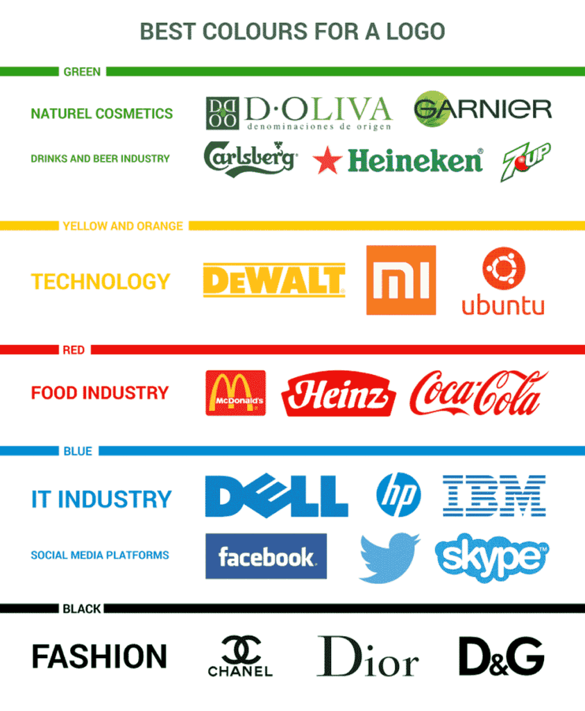
Depending on what your call to action is, you might choose one of the following colours to make its way into your social media-friendly logo:
Red is an attention grabber – if you want your followers to have the urge to do something, if you intend to practice aggressive marketing, red is the colour you should incorporate into your logo.
Yellow is the colour of the sun – therefore, it is often associated with mental well-being, happiness, calmness and cheerfulness. However, keep in mind that it is a risky colour (in fact, maybe even riskier than red – in more significant volumes it can be distracting and even unsettling), so use it in moderation.
Blue is the colour associated with creativity, innovation and imagination. It is an edgier colour that can be perfect for adding a little dramatic effect on your logo. At the same time, however, too much colour blue can be a sign of melancholy. You do not want to leave your followers feeling ‘blue’ after they see your logo, after all.
It’s also the colour of choice for numerous social media sites’ logos, including Tumblr Facebook Twitter Linkedin Skype It follows that they picked blue for sound reasons. – Online Logo Maker
Green is the symbol of fertility, life, new beginnings and hope. It is safe and calming and, weirdly enough, it has a healing effect on people.
Purple is traditionally the colour of luxury, mystery and nobility. Despite it being a funky colour, it is also a very rich one – so, inevitably, it is associated with power, ambition and passion.
Black is most often the showcase of strength, authority, sophistication, and elegance. However, too much of it can be a sign of negativity.
When creating a social media friendly logo for your brand, you might also consider the intensity of colour and not only its shade.
Do you want it to be subtle and gentle, or would you rather it to be bold and loud?
Depending on the answer to those questions, you might want to either use pastel or bright colours.
One thing to remember is that you should not replicate the signature colours of the social media platform you are establishing your brand on.
Modelling a logo colour scheme on those of successful social media brands amounts to playing the odds. – Online Logo Maker
If you go with the ‘ corporate colours’ you are risking getting lost in the interface.
Size Matters: Pay Close Attention to the Aspect Ratio
The next thing that you need to take into consideration is the size of the logo you create.
It is a regular practice to optimise your logo so that it is visually appealing – you need to choose a size that would fit all of the elements of the logo nicely.
However, social media gives yet another reason to keep your aspect ratio in check.
WATCH YOUR ASPECT RATIO Most of the marketing advisors will tell you that your logo design shouldn’t include detailed graphics or it shouldn’t be overly wide. – Web Precious
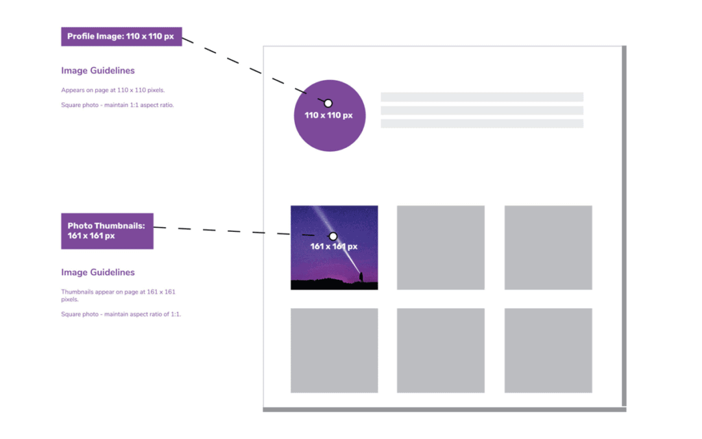
Most social media platforms have specific requirements when it comes to profile pictures and crop all the logos uploaded to fit those.
If you do not want your logo to be missing out some crucial parts, you need to keep those requirements in mind when designing your brand picture.
What you are aiming for is for your logo to be as straightforward as possible, not too clipped or reduced since you want to maintain the high quality of the image.
Here are the profile picture dimensions for the most popular social media platforms:
- Twitter. 400 x 400 pixels (file size must be less than 2 MB)
- Instagram. 110 x 110 pixels.
- Facebook. For desktop: More than or equal to 180 x 180 pixels. For mobile: More than or equal to 140 x 140 pixels.
- YouTube. 800 x 800 pixels.
- Pinterest. 165 x 165 pixels.
- LinkedIn. 400 x 400 pixels.
Of course, you can upload images with the same aspect ratio but bigger dimensions, however, you should not use logos smaller than the ones outlined above.
That will make them more pixelated and, therefore, appear less high-quality.
Consistency
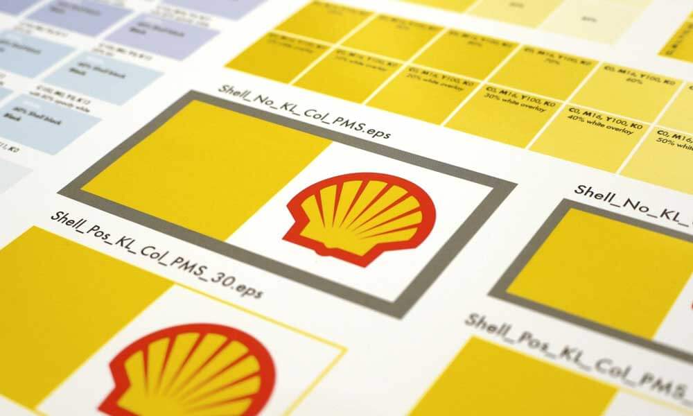
It is essential that you stay consistent with your logo use.
The very reason you bother creating one is so that you could enhance your brand identity and mark the content you post online with your brand.
However, it is only possible if you stay consistent with the logos you use to do it.
An enticing logo design doesn’t need to adhere to strict guidelines but it should hold the ability to fit perfectly into every situation. – Web Precious
While it might be a great idea to design several variations of the same logo to use for different platforms regarding the specifics of social media, you should not go overboard.
Having too many options can be confusing for your target audience and would hinder the development of uniformity of experience instead of fostering it.
Besides, when creating multiple logo variations, you need to stay consistent with the critical logo element you have chosen for your primary logo: the colour scheme, theme and fonts.
The only way to make it recognisable is to make it aligned with the brand.
Simplicity and Legibility
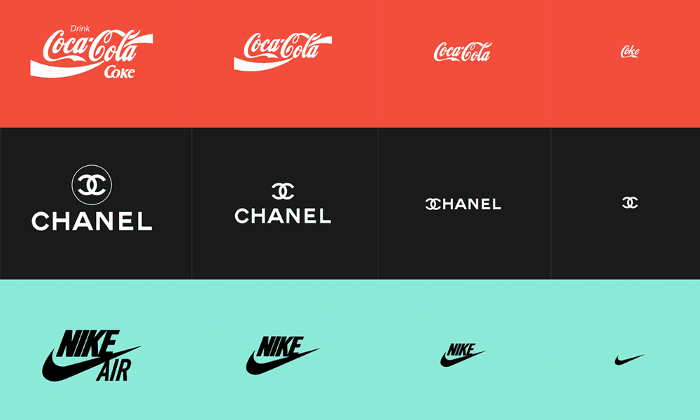
You have already seen the dimensions of profile pictures on the most popular social media platforms above.
Those are tiny – no matter how hard you try to save the quality of your logo, some elements of it will inevitably be distorted and cropped out.
Unfortunately, resizing can harm the visibility of smaller details and make them completely illegible.
KEEP IT SIMPLE Avoid using thin lines, unprofessional fonts and overly detailed graphical elements while designing your logo. – Web Precious
The compression of the image can even make your picture messy and overloaded.
Therefore, when designing a social media friendly logo, you need to remember that and avoid using excessive details, unnecessary lines and too much text.
Keep your decorations to the minimum and exercise your creativity instead.
Indeed, a simple arrangement of geometric shapes and lines is much more successful at delivering a message than intricate clip art composition is.
Besides, your followers are not going to spend too much time analysing your logo, trying to look for the smallest details.
Furthermore, you might also want to keep the colours of your logo down.
Flamboyant, colour-block logos are often less successful than the more subtle ones.
Colour is the most fundamental thing that comes in your mind while designing a logo for your social media marketing.
Although multi-coloured images are fun and attract lots of attention, there is always a risk of them getting rendered poorly or being an annoying distraction from the contents of the page.
Shape and Form: Seek Versatility
The next thing you need to remember about your logo is that it is going to be used on many different occasions.
Therefore, you need to think about the versatility of the image you create to represent your brand.
Be consistent with your logo designs and try not to have too many different logos in use. By defaulting a logo design on your social media outlets save you from reshaping or adjust it every time the site receives an update. – Web Precious
Some of the tips to make your logo flawless and suitable for various channels include keeping the graphics and text on your logo separate from each other.
You cannot possibly foresee all the possible uses of your logo: who knows how small or how large you will need it one day.
Usually for smaller spaces, to maintain consistency, spaces brands use one of the elements of the logo instead of trying to squeeze the whole thing into a small profile pic holder.
Either that would be just one letter or a silhouette present on your regular full-version logo; you need to make sure that it looks self-sufficient on its own.
The only way to achieve this is to divide the text and the image.
If they are intertwined, it will be challenging to break it down into pieces effectively and seamlessly.
Don’t Feel Obliged to Tell a Story
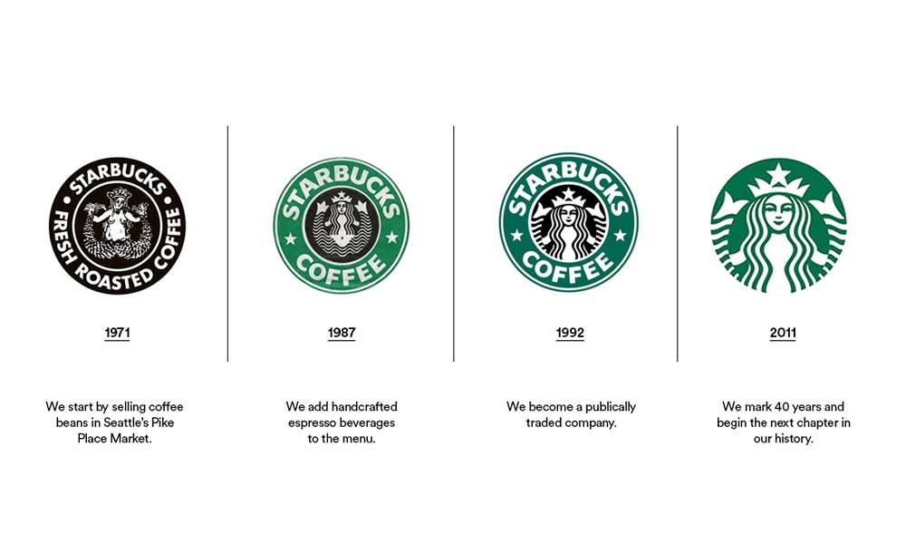
As has been mentioned, your logo is a small picture.
Therefore, you need to think of the ways to introduce your brand in just a couple of lines and shapes.
At the same time, however, you do not have to lose your mind over trying to fit your entire brand story into one little piece.
In today’s digital age, your logo has to be ready for anything. Simplicity is extra important with digital designs in order to grant the logo the freedom to shrink in size without losing its distinctive qualities. – 99 Designs
While it is nice to have a strong logo that would enhance your brand identity, sharing your core values or merely building an association is enough.
Often, brands have more than one thing that they want to tell their followers about themselves.
That’s perfectly fine! Just save that conversation for other forms of communication and keep the visual compartment clean and straightforward.
Get a Second (and a Third) Opinion
Once you are done designing your logo, reach out to your focus group or someone from your target audience who is not biased to see how your followers will perceive your logo.
As a social media logo designer, you spend too much working on it and get too attached to your creation.
Therefore, for a fair assessment, you need to receive an appraisal from outside.
DOs and DON’Ts for creating a Social Media Friendly Logo Design
Here’s a little checklist of how you can further enhance your social media friendly logo:
DO Keep Up With the Trends
Stay open-minded to the world around you and listen closely to the trends.
Those can give you a lot of good ideas and even promote the development of your social media logo.
DO Leave Some Room for Customisation
You never know how your brand will change in the future.
Perhaps, you will go through a complete rebranding and will have to redesign the logo altogether.
However, it is more likely that you will implement slight changes that will only require minor changes.
Make sure you leave room for those.
DON’T Use Borrowed Images
The worst thing you can do is steal someone else’s picture or part of it to use it for your logo.
Not only is it copyright infringement and can cause some negative legal consequences, but it is also a sign of irresponsibility.
Using someone else’s work for your logo is a telltale sign of your lack of creativity and investment, which can quickly ruin your brand reputation and brand image instead of improving it.
DON’T Make Your Logo Too Attention-Grabbing
Yes, you read that right! Usually, creating a bright and eye-catching logo is a good thing.
The newest Facebook logo (which is being slowly rolled out) is simply the trademark ‘f’ centred inside a circle.
However, everything is right in moderation – if you craft a logo too attention-grabbing, you risk it overshadowing the content you post under your logo.
Author Bio: Eric Brown is an experienced journalist who enjoys writing about sport and lifestyle. He has recently launched his own website csgobettingg.com where he covers topics of great interest for modern men.
Looking for an Attention-Worthy Logo
Inkbot Design can help you.
