
17 Dec How to Design Pop-Ups and Opt-Ins That Actually Convert
How to Design Pop-Ups and Opt-Ins That Actually Convert
Pop-ups and opt-ins have a terrible reputation as annoying or invasive to someone consuming content. The fact is, they’re on every website for a reason. They work.
What makes the difference between an annoying pop-up and one that converts are factors such as design, timing, and proper branding. Poorly optimised opt-ins don’t convert because they’re off-brand and invasive.
How do you change it? How do you design pop-ups and opt-ins that actually convert? Keep reading. We’ve got some tips to help you get started on building a successful campaign.
Don’t Be Generic and Have Intention in Mind
How many blogs have you been to that use the same old tired pop-up template? Do you think they get many people signing up for their newsletter?
Unlikely.
Large brands have the budget to hire the best designers and copywriters. It’s bloggers and affiliate marketers to see the most significant gap in skill and knowledge.
We see this kind of thing happening because blog owners know they need an email list but have no idea what to do with it.
The first rule of designing great pop-ups is to realise your intention. What’s the point of your email list? If you don’t know, you can’t expect a website visitor to know either.
Branding
What is branding? Is it a logo? Is it the design of your merchandise? Is it all of these put together?
Not really. A brand is a customer’s intuitive feeling about your business, service, and products.
The job of everyone associated with your company is to steer people’s opinion of this business to what you want.
When someone in business says something like, “ Use this font. Use blue and black. This needs to be on brand”, it doesn’t always mean what you think it means.
If the colour scheme you often use is blue with black, it makes sense. Blue is a calming colour. This is why it’s often seen in bedrooms. It also makes people think of the sky or even heaven.
Often, people will talk about the feelings of specific colours. Blue makes people think of trust, friendliness, and loyalty.
Think of the companies you know that have blue in their branding. There are a lot—especially tech companies. Microsoft, AT&T, Facebook, and Google all utilise this colour.
Black, on the other hand, symbolises power and sophistication. Have you ever heard of a little company called Apple? Luxury brands love to use black. Think Polo, Burberry, Jaguar, and Lexus.
There is a reason these brands choose the colour schemes they do. Your logo and colour scheme isn’t your brand; they’re a part of it.
So if you’ve chosen blue and black for your business, you want people to think you’re trustworthy, loyal to your customers, and you’re also sophisticated, luxurious, and a force to be reckoned with in your space.
Branding Your Content
Your pop-ups and opt-ins are going to be included somewhere in your content. This can be a landing page, blog content, or even some product pages.
We’re assuming your website is branded to the gills, and it’s precisely how you want it. It would help if you matched your pop-ups and opt-ins accordingly.
This includes using the same type of colours, language, and even image types that you would find on the same page your customers, or potential customers, are currently viewing.
Language is one of the most significant issues we see with pop-ups and opt-ins. If your brand is known for using casual, down-to-earth style language in its copy, why would you use something formal and stuffy in your pop-up?
This is what people at a company mean when they say “keep it on brand”.
What kind of fonts do you use in your blog post? Spacing? All of your copy should match.
Most companies do a decent job of keeping all of their copywriting on point with their brand. A group that tends to struggle more than most are bloggers and affiliate marketers.
So many of these folks think all they need to do is throw up a cookie-cutter email grab, and their sales will sore to new heights. That’s not how it works. We wish it were that easy.
Excellent affiliate marketing websites need to be versatile to make sales. They have to write great content, be honest, likeable, and build out an entire brand from scratch with no one else’s help.
The same goes for every facet of their website, including marketing copy like landing pages, opt-ins, and pop-ups. If you want to promote the best affiliate marketing programs, you’ll need to use pop-ups strategically to convert.
The most significant difference between affiliate marketers and large brands and companies is that you, as a blogger/marketer, have the luxury of listening to your readers’ suggestions and adapting them to your marketing plan.
In short, your readership can help you both develop and build out your brand. You’ll need to do this to be successful. We’ll get into how you can do that in the next section.
Timing
You may have heard from someone on your team or read it online that Google isn’t a big fan of pop-ups and opt-ins. And you’re right. They aren’t.
The kind of pop-ups they dislike and penalise a website for meeting specific criteria.
Full-page pop-ups and opt-ins that appear as soon as a visitor reaches a page risk being penalised. Google has even said it outright, which they don’t ordinarily do.
So now, let’s talk about timing. It’s everything. It’s the difference between a conversion and a potential customer who becomes disgruntled and leaves your website, never to return.
Most of the tools on the market that help brands build pop-ups now offer a variety of timing possibilities. You can bring your pop-up in from any direction. You can make it any size, from entire pages to tiny boxes.
Sounds pretty cool, right? Keep in mind that just because it seems cool to you, your customers may not be too keen on a full-page opt-in box email grab.
You can also alter the settings to tell the pop-up when to come on to the screen and how far into your content your reader should be before it arrives.
Placing and Timing Your Pop-Ups and Opt-Ins
As an example, let’s say you have a piece of really engaging content. Users who read this content are approximately halfway down your funnel.
They aren’t a customer yet, but they’re interested, and this isn’t the first time they’ve been to your website.
You can set your pop-up to appear on the screen when they are 60% of the way scrolled through your blog post or whatever content you decide to use here.
This is not the first time this customer has visited your page, and they’re more than half finished with their current piece; this is the perfect time to request something from them.
But what’s it going to be?
What do you want from them? They’re interested in your brand. Are they just doing some extra research? Think about this piece of content that they are now reading. What is its purpose?
Is it a blog post that’s informational? Is it a piece that has a lot of data or statistics? Whatever it is, this is the perfect time to go for an email grab or possibly offer this potential customer something for free.
Do you have a coupon or special deal going on? Is it only available to people on your email list? Let this potential customer know that they could be missing out on something extraordinary. Tell them about all of the perks that come with your newsletter or email subscription.
Give them something for free. Brands give things away for free all the time. If you go to a festival or event, vendors are always handing out free branded items. It could be pens, t-shirts or hats, maybe even stickers.
Websites can do the same thing with digital goods or content. This can include digital items like calendars or other printables, coupons, and ebooks.
If people come to your website to be educated on a product or service before making a large purchase, educate them. Do it for free. If it turns into a sale, then it’s always going to be worth it.
And once you have their email, you can send offers regularly. They can forward these emails to friends and family, share what they learned on social media, and mention your brand on their blogs and websites.
Proper placement of your pop-ups and opt-ins will drastically increase your conversion rates. We can’t stress this enough.
Design
Finally, we’re getting into the fun stuff. At least we think it’s fun.
Designing your pop-ups and opt-ins doesn’t have to be complicated. All you need is a decent piece of software or plugin and a solid copywriter.
What should go into designing the best pop-ups? How are you going to sell your products or brand with them?
The first question we need to answer is, what is our intent? What do we want our customers or potential customers to do, and how do we want them to feel about it?
We don’t want them to question their decision or our motives.
Bring It All Together
We’ve already discussed branding and timing, so let’s put them both into action here. Let’s say we want someone to join our mailing list. In return, we’ll give them 25% off of their first purchase.
We’ll also email them about discounts and deal in the future, along with any early release information on products or services.
Let’s also assume we’re using a calm, friendly voice. The customer is scrolling down a piece of content. It’s their first time with us.
It’s an informative blog post about picking the right shoes for dancing. They make it two-thirds of the way down the page, and then our small, noninvasive pop-up comes up from the bottom of our website.
With our pop-up, we can have an image of something related to the product. Ideally, we’d like it to be similar to something we already have, if not one that we use often.
Combine this with your colour scheme of choice and add in your casually-voiced copy along with information on the discount.
“Join our mailing list to receive 25% off of your first order”. It’s really that simple. It’s straightforward.
Don’t use the word “submit” in your button. It’s a turnoff to most people. Instead, stay with your friendly tone. Go with “Join the Fam” or “Dance with Us”.
Your CTA buttons should stand out. You want to design your pop-ups and opt-ins to entice the reader to click on them. All the excellent copy in the world isn’t going to matter if no one clicks on the button.
It doesn’t matter what the colour is; it just needs to pop. Colours that stand out and signal a user to act would be green, blue, and sometimes even purple. Other colours will also convert as long as they stand out against the rest of the design.
Play around with the design and copy until it reads and appears ultimately “on brand”. Not only will this pop-up look great on your website, but it will covert better than opt-in forms that do not match your brand and its tone.
Do Some Testing
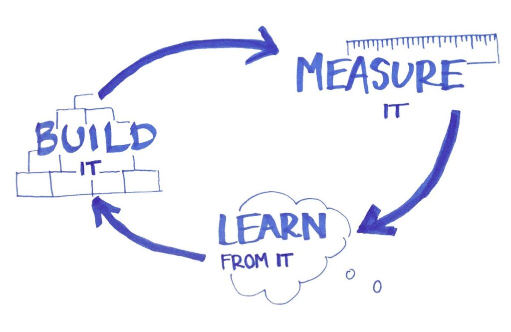
The chances of your first effort being perfect are pretty slim. It would help if you did plenty of A/B testing on your pop-ups to optimise conversions.
To run successful experiments, you’ll want to try using different pop-ups and opt-ins on pages with similar intent and organic traffic.
This is also an excellent time to play around with advertising on different platforms and see how your pop-ups fare with traffic from these sources.
Make sure to track all of this information with spreadsheets. Figure out why some pop-ups and do better than others. Then all you need to do is find a way to replicate this success.
How to Design Pop-Ups and Opt-Ins That Actually Convert – Wrapping It Up
If you think this seems like much work, that’s because it is. But if you’re looking at a 1% conversion rate versus a 3% conversion rate, the work is worth it.
Combine everything your company believes in to incorporate your brand into the efforts. This includes everything the company wants to convey in just a few words.
Time your pop-ups and opt-ins with your customers in mind, and you’ll be on your way. If you enjoyed this post, you might also enjoy this post on tailoring your business site to potential customers.
The post How to Design Pop-Ups and Opt-Ins That Actually Convert is by Stuart and appeared first on Inkbot Design.