
17 Jan How to Use Great Design to Increase Sales
How to Use Great Design to Increase Sales
Design is more than some text thrown onto a screen and combined with lovely images. Those who work in the field know how complex it is to create a human behaviour and psychology design.
It’s much more than creating a homepage, fixing up a logo design, or posting photos from products online.
If done right, design can be your best tool for attracting sales and increasing leads. Especially now in this technology-driven world, great design is one of the vital elements of marketing.
However, big success comes with significant responsibilities, which means that you must dedicate tons of time, effort, and knowledge to make this right.
How a great design can increase sales
Before we see some actionable tips to make this happen, let’s clarify how a great design can help you boost sales. When experts use design to create a message, they can achieve the following:
- Grab the attention of the target audience
- Communicate the company’s values, the product’s values, etc.
- Optimise the customer experience by adapting to their needs and behaviours
- Convince the visitor/ viewer to take action, i.e. make a purchase, sign up to the newsletter, create a profile, etc.
- Garner more organic traffic
- Raise awareness, spread word-of-mouth, and foster trust
Now that we’ve discussed the perks of great design, it’s time to get to the action. You can’t expect any of the above unless you do it right. That being said, here are some tips you could use:
1 – Mix your visuals
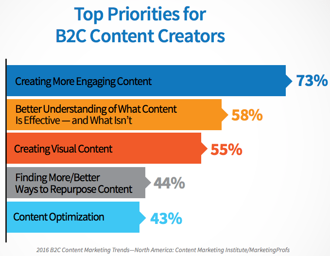
Visuals are the most significant part of a great design. According to the latest report on content marketing trends by the Content Marketing Institute, 73% of experts focus on creating more visual content for their online presence.
If you look at the graph below, you’ll see that 55% of them are already working hard on their visual content.
Visuals are very compelling for grasping attention and sharing the message more memorably, and they save much space in terms of text.
One photo can say a thousand words, and a short video has convinced people to take action effectively.
Designers have tons of options for visuals these days. Let’s take a peek at some of them.
Posters
Creating a great poster requires a lot from you. You need to know which colours to choose, which font is best, what images to add to the poster, etc.
If you don’t have much experience in this, you should click here to learn more about creating a custom poster.
Posters have been trending for a long time, even before the online world existed. This is how people shared information about events and new products in the past – and it is still very effective today.
Nowadays, this is one of the most demanded types of content designers require.
You can use sites like HelloPrint to create posters with ready templates. The process will take much shorter, and you will have enough time to focus on the remaining of your designs.
Infographics
One of the most popular forms of visual content used in design today is the infographic.
In a single image, you can communicate much information, especially if you have many numbers and stats to share.
If you want to simplify the process, click here to learn more about it and find some tools to make it happen.
Statistics for infographics are pretty impressive.
According to TheContentClub, an infographic is 30 times more likely to be read or at least skimmed through than a written post.
Not to mention, if it has an appealing design, it will capture the reader’s attention and help them focus on the most crucial piece of data.
Memes and branded quotes
In the last decades, these have done very well on social media views and shares. They also prompt people to engage and build a connection with a brand.
With the right meme or branded quote, you can pull people toward a brand’s website or social media channel.
Designing memes takes a lot of creativity and an eye for detail.
You should click here to learn how to design them and get some help in doing so. Adobe has a great selection of templates you could use to speed up the process.
2 – Pay special attention to the colours
Colours have an enormous effect on the quality of your design – and not just in terms of aesthetics. When you use the right colours, you can trigger the desired emotional response in viewers.
Colours have the unique power to affect customer behaviour, make a great design stand out, and highlight the most crucial message.
Whether you’re designing something, the site’s colour scheme or a visual, you should prioritise colours. You can refer to many guides when picking your colour scheme.
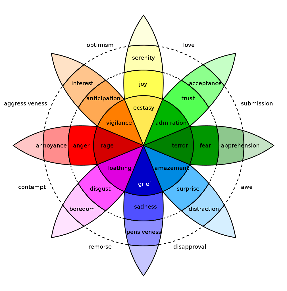
For example, the thorough work of the famous psychologist, Plutchik. He theorised that emotions are split into eight categories: sadness, joy, trust, anticipation, disgust, surprise, anger, and fear.
He assigned a colour to each emotion.
Check out the Plutchik colour wheel of emotions and use it as a reference guide to the emotions that your design can invoke.
3 – Keep things simple
Messy designs might look good, but they are too overwhelming.
People are busy these days, and if you throw too many things at them at once, they won’t want to spend their time trying to navigate your design.
It can be very tempting to use various design tools and insert plenty of things into your creation.
Still, try not to do this. Minimalism has shown fantastic success these days, especially for professional-looking web design.
The Nielsen Norman Group has researched this, and their findings all point to this. People prefer minimalism in design because they can easily navigate it, are more intuitive, and appear more professional.
When we speak of minimalism, we think of combining only a few colours and shades of the same, using much white space, and not overwhelming the customer with many graphics and big chunks of text.
4 – Design with mobile users in mind
Did you know that over 59% of consumers research the products and services on their phones before they purchase?
Over 2 billion people use their mobile devices to browse and make purchases online. Any design or marketing strategy that does not consider mobile optimisation is doomed to fail today.
That being said, your design should look ideally not just on the desktop version but also mobiles.
So, what do we mean to optimise your design for mobile users?
Here are some tips to get you started:
Proper use of spaces. The space on a mobile device is far more limited than a desktop. When you’re done with your design or in the process, you should check how it looks on mobile. Do some testing to get it right and cut out anything that doesn’t have to be there to make it easier on the eye.
Minimise the site weight. Mobile users expect the sites to open fast, and they want to see your design as soon as possible. Unless you want them to leave because your designs load too slowly, you should minimise the weight and maximise the loading speed.
Keep the navigation visible. Users should not have to scroll to take action or navigate through the site. Make this available to them whenever they need it. The CTAs should be easily accessible to users without requiring them to scroll to the bottom or top of the page.
5 – Use design to control how visitors browse the pages
As the designer, you have the power to determine what people will do on a website. That’s immense power, but also a big responsibility.
If users can’t find what they need almost instantly, they’ll disappear from the page, and your great design will be a failure.
Users are somewhat predictable when it comes to design.
They’ll process visuals better than written communication, make the decision when you provide them with your most significant incentive, and probably go to the shopping cart once they see the price.
This is a powerful tool that you can use to determine how users will navigate through the pages.
What can you do?
Place the images on the pages strategically to control how they view the page.
Break up the monotony by using white space and adding visuals in between blocks of text. Add the CTA every time you think you might have convinced them to take action.
Final thoughts
Businesses constantly search for ways to attract more leads, and as a designer, you are a big part of their strategy.
If you want to design the digital presence, you should consider everything from your target audience’s needs and preferences to your options for colour, font, types of content, etc.
Most importantly, remember to have some fun – this is, after all, a very creative job!
The post How to Use Great Design to Increase Sales is by Stuart and appeared first on Inkbot Design.