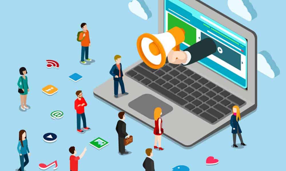
16 Jul How Website Design Hacks Will Boost Web Conversions
How Website Design Hacks Will Boost Web Conversions
Your website is more than just a place to get your name out to millions of people.
It can be a potent tool to generate leads and potential clients or customers.
Just like any instrument, it can’t be dull; otherwise, it won’t be able to cut through the thousands of other websites competing against yours.
Keeping your platform sharp will allow you to earn more clicks and, ultimately, more conversion in the long run.
For you to achieve the best results, you’ll need to optimise your web design.
It will provide a thorough, creative, and successful approach to making your business profitable.
You don’t need to hire a web designer to increase your website conversion rate, follow these steps to create a responsive design.
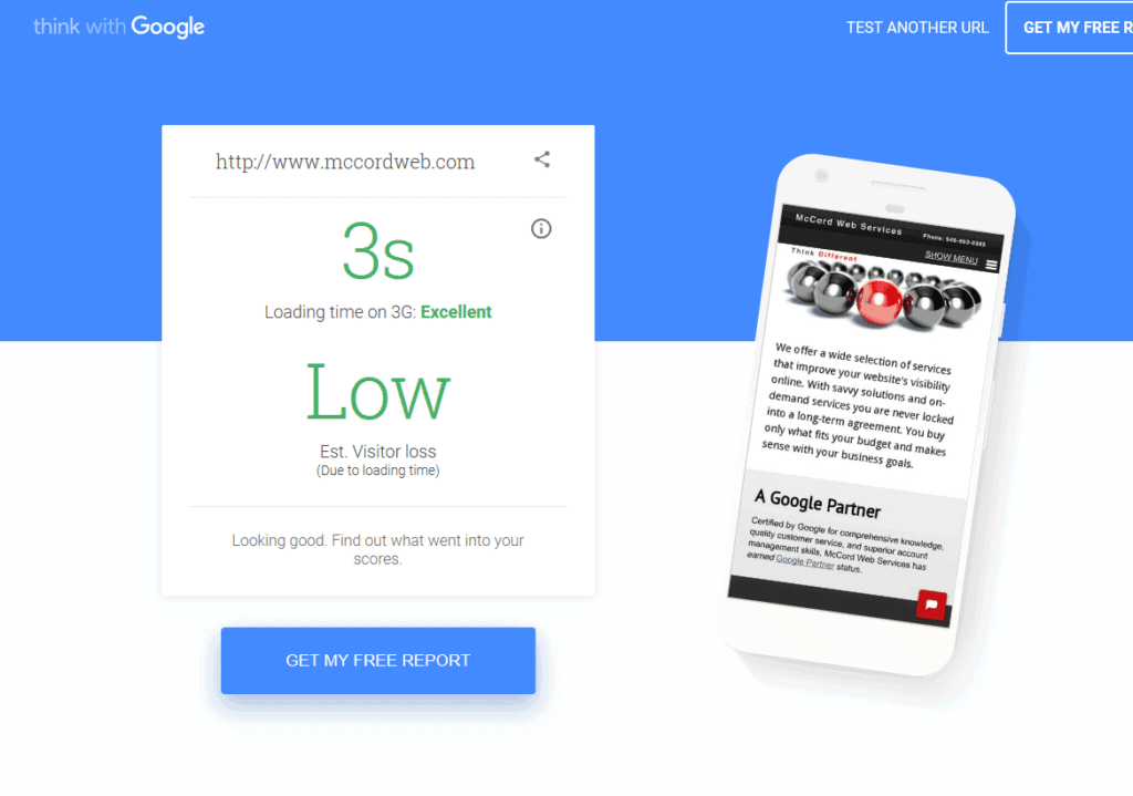
Boost Your Loading Speed
There’s nothing worse than visiting a platform and waiting forever for it to load up completely.
While this may be contributed to your ISP, it can easily be due to your website itself, namely what aspects you used to design it.
Having too much content on your page, like plug-ins and large images, can slow the loading speed.
Keeping these aspects reduced or even removed on your web page design can help to improve this aspect.
Another way to increase your loading speed is to use a reliable web host.
A robust hosting service, primarily if you use WordPress to create a website, will keep everything running smoothly.
E-commerce businesses thrive on this concept and rely on the best hosts to keep people on the site longer with higher conversion rates.
If you increase seconds on your load time, you will lose clients in the long run.
Keep Mobile Web Design in Mind
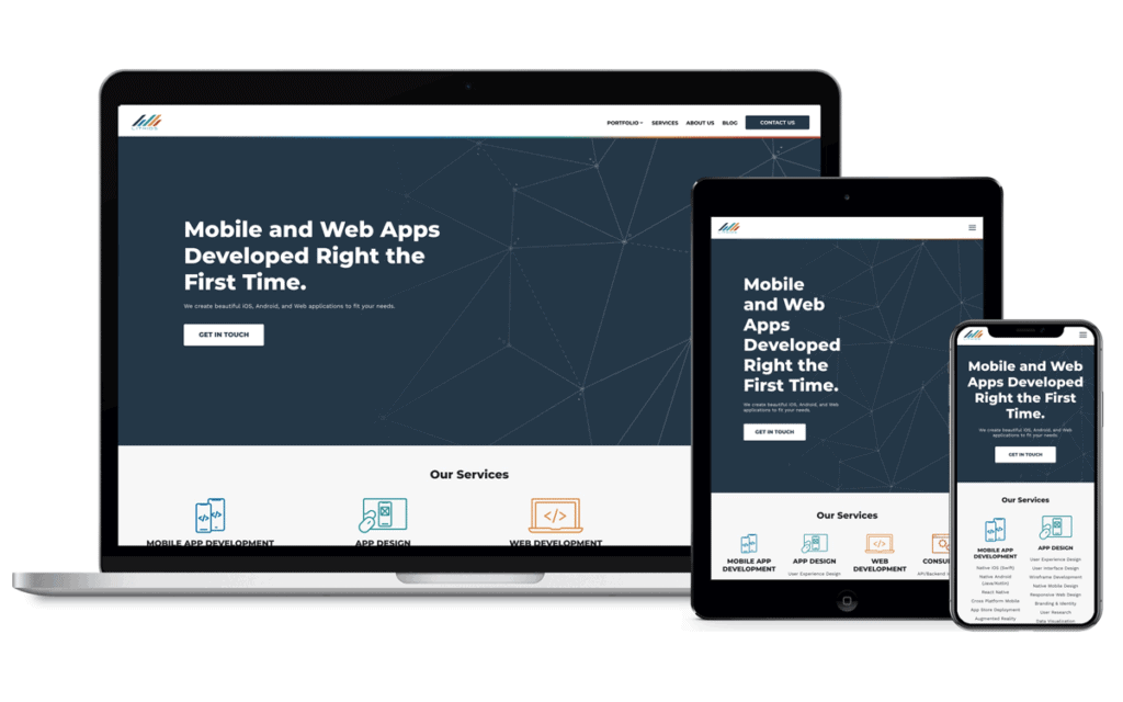
The great thing about having a website is that it can be pulled up on desktops, laptops, tablets, and smartphones.
That does come at a cost, as adjusting the desktop version usage may not render it to mobile devices.
Given the fact that most phone owners use their phone in portrait rather than landscape mode, your headlines may go from one line to two or three, interrupting the flow.
That can affect how many people stick around on your website, much less click on your offers.
Google search results prefer websites that are optimised for mobile.
Keeping your creative design concise with appropriately-sized headers, images, and widgets will reduce your drop-off rate.
Having your paragraphs split into smaller sections will increase readability as they scroll through the page to come across your call-to-action.
Always keep your audience in mind when considering what responsive design is, especially if your product or services caters directly to mobile users.
Make Your CTA Stand out
Your call-to-action (CTA) is your endgame as you consider the best website design.
What’s the point of going through a website if there’s no incentive to move to the next step?
Attaching a CTA button gives your audience the path they need to your product or service.
Just like having a well-thought-out web design is crucial for conversions, so is an optimised call-to-action.
When adding a CTA button to your page, the critical thing is making it stand out from everything else.
The colour should be unique and not used somewhere else.
Instead of the standard “click here,” it should tie in directly with your business.
Keep it at an appropriate length, no longer than a few words.
Finally, make sure that it follows logically with your content.
Coming across a CTA that’s interrupted by miscellaneous add-ons can be frustrating.
Go With the Trend of Voice Search
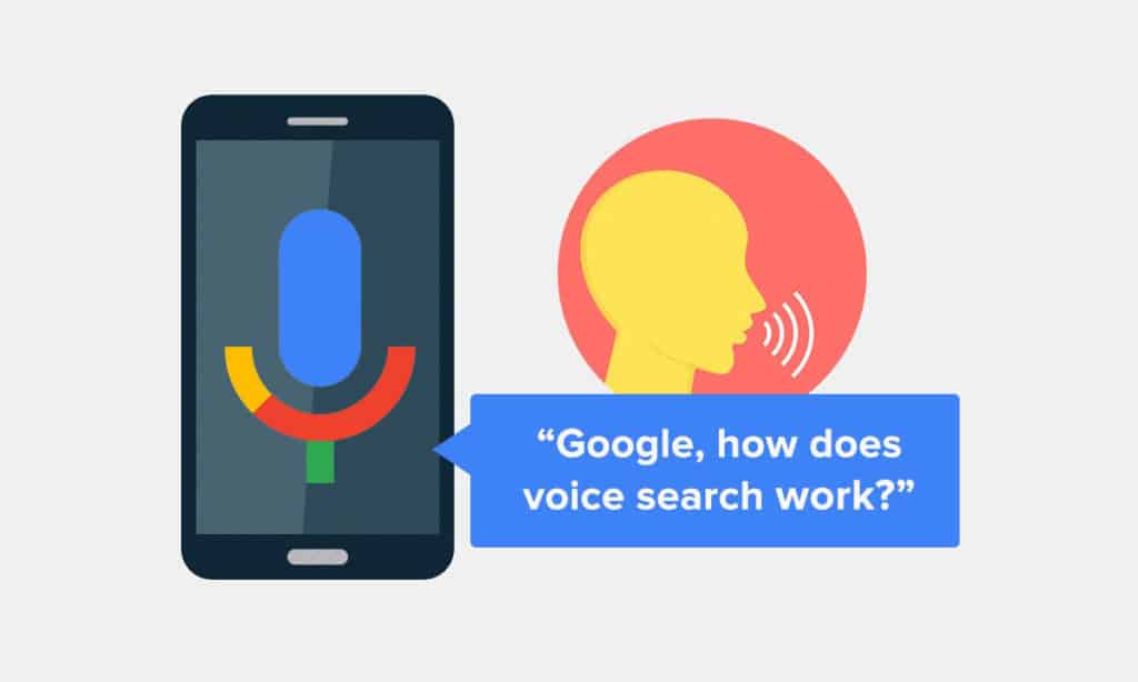
More and more people are using voice activation on various devices at home.
When Google first introduced voice search, it was perceived as a mere novelty.
But thanks to advancements in speech recognition technology, voice search has become a part of many people’s everyday lives.
It’s natural for any company’s marketing strategy to optimise their pages for keywords people type into Google.
But if you want to be at the forefront of the latest marketing trends, you should also consider those keywords users might search by voice.
An excellent way to start is to include a FAQ page with information about your products or services.
Don’t Forget Content Marketing
You’ve probably heard the saying that content is the king.
Well, get this: it’s still true in 2020.
Believe it or not, but people do love to read as long as the text offers them value.
If you’ve never really written any content for your website, you might wonder what you should even write about.
Don’t worry; it’s simple. Start with some target market research:
- Go to online forums or Facebook groups — wherever your potential customers might hang out online.
- Find out which topics interest your audience the most. What do they want to know? What would they be interested in reading? What relates to them?
- Then go ahead and write some excellent articles on the topics that popped up most frequently.
This is a fact: companies that utilise content marketing in their strategies have a much higher conversion rate than those who believe content has no value.
Informative articles are an excellent way for readers to develop relationships with the brands they love.
And yes, this includes your brand, too.
Give your customers a chance to get to know you better by displaying your unique voice in some great articles.
Update Your Keywords for Search Engine Optimisation
People who have passed web design courses will tell you that search engine optimisation (SEO) creates an organic approach to increasing your website’s presence on search engines like Google.
This does not mean buying your way to results through paid viewers or gimmicks, but rather using specific keywords to improve your ranking online.
The keywords should pertain directly to your website’s primary goal.
For example, a platform specialising in selling kitchen equipment should feature phrases like “equipment for your kitchen” or “cooking utensils.”
They need to be mentioned prominently and repeatedly across the headlines, subheadings, content, and wherever your web copy is used.
This allows search engines to scan the pages and bring your project closer to the top of the results list.
Show Customer Feedback
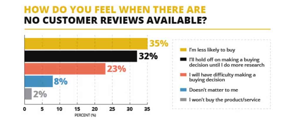
If you’ve spent much time building your business, why not use customer feedback to let others who are new to your website know why they should invest in your project?
E-commerce giants like Amazon use this feature effectively by making their product reviews the main feature.
Utilising web design software that creates a review section can let customers look at other opinions about your products or services as the added benefit of generating leads.
If your website doesn’t feature a review section, you can still take advantage of positive press.

Relying on reviews from social media sites or snippets of feedback from customer emails can generate those same leads without interrupting your responsive design.
Add the feedback as images and place them strategically on your site.
Do not overuse, or you may turn your website more into a vanity project rather than a lead-generating tool.
Rely on Landing Page Videos
If the written copy is the king of generating conversions, then video content is the strong queen.
Your product or service can be described adequately with the text.
However, sometimes it needs that extra visual flair that can only come from showing it in motion.
Consider a website that sells drones. Giving the customer a rundown of its features and benefits through text is suitable for a basic introduction, but it may not be enough to make it a specific conversion.
Images can highlight the visual and dimensional aspects of the drone, but your customer wants more.
A video can show off how it could look in their backyard with the added flair of text copy.
Your video should be able to convey your business, product, or service and explain why customers should continue to follow along.

At the same time, you may need to sacrifice other images or add-ons that can overwhelm the area around the video, especially if you’re worried about loading time.
A well-crafted video can make up for any pictures or web copy that you choose to remove.
Updating your web design is your ticket to increasing conversions for your business.
Even if you consider yourself a Web Design Guru, there are still ways to boost user activity that are low cost but highly effective.
By focusing on your loading speed, mobile layout, CTA button, customer feedback, and videos, your website is guaranteed to convert viewers off the fence and into your pocket.
Do you have any web design inspiration?
Curious about building more business through your platform?
Let us know in the comments below what is responsive web design to you and how you plan to increase conversions!
Need help with Web Design
Get a FREE Quote Today
Author Bio: Thomas Glare is a passionate freelance content writer, always striving to inspire others and bring insight into the endless possibilities of the modern times we are currently living. He also spent much time collaborating with some prestigious online casinos, thus being No. 1 expert in matters of gambling. He continues to improve his knowledge and is the co-designer of a free book of ra, one of the most popular games from Novomatics.
Website Design Hacks to Turn Your Visitors into Paying Customers
You probably already know:
Nowadays, having a fully functional website is essential for any business. After all, more than 80% of people prefer shopping online.
However, here’s the deal:
There are more than 1.5 billion websites available on the Internet, and around 200 million of these are active.
Moreover, with 200 million websites fighting tooth and nail to capture the attention of the users, just having a business website isn’t enough anymore.
As it turns out:
The attention span of today’s ever-so-discerning users is 8 seconds which is less than that of a goldfish.

It just takes 0.05 second for users to form an opinion about a website and 57% users avoid buying from or recommending a business with a poorly designed website.
And that’s not all: 96% of website visitors do not buy the first time around, and 88% of them never return to a website if faced with a bad experience.
As a result:
You end up losing traffic, user trust, and conversions!
Despite putting up a great looking website loaded with the best of content, flashy graphics and the promise of a great after sales service.
Now here’s the BIG QUESTION:
What should you do to turn your website visitors into actual paying customers?
Just spare 3 minutes and check out these 7 instantly actionable website design hacks to turn your website into a lead magnet.
Hack #1: Unleash the Potential of Mobile First Designs
You probably already know:
More and more people now prefer using their smartphones to bank, shop, and socialise.
Smartphone usage and mobile apps outdo desktop and tablet usage when it comes to browsing, buying, etc.

And that’s not all: Statista reveals that by the end of 2019, there will be more than 5 billion smartphone users worldwide.

Here’s the shocker:
More than 67% of users prefer buying from responsive websites only.
And over 61% of people abandon a website if faced with an average or bad mobile experience.

Bottom Line:
If you’re looking to turn strangers to your website into actual buying customers, you’ll need to embrace mobile-first website design in 2019 and beyond; lest be ready to get your conversions and revenue objectives hit rock bottom.
Want proof?
An award-winning website with more than 8 million visitors annually, CarFinance 247 was able to increase its conversion rate by 31% by building a new mobile-first homepage design.

Now that you know how important is it to embrace mobile-first design to turn visitors to your website into actual buying customers, it’s time to walk you through the next hack on the list.
Hack #2. Consistency is The Key
You’ll be surprised:
89% of consumers carefully search the web before buying. 75% of consumers make buying decisions based on a company’s website design, and 94% of first impressions are driven by website designs.

Here’s the BIG QUESTION:
How do you make that killer first impression with your website design?
The answer is more straightforward than you would have imagined.
You can easily make that killer first impression by ensuring consistency across your website.
As it turns out:
Consistent branding impacts and influences conversions in a big way!
In fact, a consistent brand presentation can increase revenue share by 23%.
Don’t take our word for it…
Check out this example:

Now, who doesn’t know about Apple?
However, the fact that you probably don’t know is that Apple ensures consistency across its website.
This helps the company easily convey its brand value and increase the brand recall value, without having to run from pillar to post.
We’re sure now you know how consistent branding across your website can help you turn your website visitors into actual buying customers, without having to run from pillar to post.
Let’s move on to the next hack on this list.
Hack #3. Let the Web Design Elements Breathe
As discussed earlier:
It just takes .005 seconds for visitors to form an impression about your website.

This means:
You’ll need to make that first killer impression within 0.005 seconds; otherwise, visitors will abandon your website and Google will drop your website like a stone on the SERPs.
However, how can you make that first killer impression without having to spend through your nose?
By letting enough breathing room for your website elements!
You can do this by leaving enough white space — also referred to as negative space.
White Spaces give different graphical or textual elements on your website room to “breathe” visually.
Remember, grouping website elements too close may make your website look cluttered.
This may overwhelm your website visitors and encourage them to abandon your website within seconds resulting in a considerable loss of potential sales for you.
When building your website, use enough cell padding and margins to increase space between graphics, copy, and other site elements.
Check out this example to understand how Apple uses white space smartly to ensure that its website looks cleaner and classy.

Hack #4. Play by The Hick–Hyman law
Did you know?
If you increase the number of choices for your consumers, you also end up increasing the decision time.
Yes. That is right!
According to Hick-Hayman law, the time taken by people to make a decision depends upon the possible choices available to them.
Increasing the number of available choices impacts the time taken to make the decision logarithmically.

What does Hick’s Law mean for you?
When designing your website, you must remain careful of not overwhelming your visitors with too many choices of products, services, graphics or copies.
Instead, you must focus on offering the best choices on your homepage and restrict other offers or options to the product pages.
Not long ago, one of the world’s most popular social media platforms, Twitter presented many choices on its home page.

And then Twitter redesigned its home page using the Hick’s law:

As you can see, Twitter’s new home page looks a lot cleaner and directs users to sign up or login without overloading them with significant volumes of information.
Now, we’re sure you know how using Hick’s Law can help you turn strangers to your site into actual buying customers.
Let’s move on to the last and perhaps the most crucial hack on our list.
Hack #5. Don’t Forget the Rule of the Thirds
We’re sure you’re wondering:
“What is the rule of the thirds?”
Well, here’s your answer:
According to Wikipedia, ‘The Rule of Thirds’ is a guiding principle that dictates that web design should be created by dividing it into nine equal parts by two equally spaced vertical lines and horizontal lines.
And the most critical component or the web element must be placed along their intersection.

This means:
When designing your website, you must do well to place the most important elements of your website including your CTAs, graphics, etc. on these green dots.
And all the other elements on the website must flow naturally around the components placed on the intersection.
Here’s how it helps:
Human eyes naturally drift towards these green dots when looking at the web page and placing essential elements on these green dots can help you direct the attention of your visitors to the most critical or relevant aspects of your site.
And don’t worry, this approach works for all types of websites, no matter what the objective of your business is.
Check out the example below to understand how our eyes are drawn to the menu, logo design, and tagline of the website.

If you want to direct your visitors to take the desired action, you may choose to move your CTA on the intersection.
Here, the CTA “Make an Appointment” could easily be moved to the top right intersection to make more and more visitors click on the CTA.
Hack #6. Colour It Right
When a website turns into a lead magnet, there’s hardly any luck involved.
It’s the colour coordination of the website that does all the hard work of turning website visitors into actual buying customers.
In fact:
Research by the University of Winnipeg in Canada found that 90% of people often judge a website’s credibility based on its colour coordination.
Bottom Line:
Investing a little time optimising the colour coordination of your website can go a long way in helping you boost your site conversions.
Carefully analysing and selecting colour patterns that effectively communicate your brand message and unique selling proposition can help you make big wins, without having to break a sweat.
Looking for Proof?
A popular graphic design online, crowdsourcing marketplace was able to increase conversions by 65% by using green as the predominant colour on its landing pages.
Here’s how the firm landing page looked like before adding green colour:

Here’s how the company added green colour to its landing page and increased its conversions by over 65%.

Before you jump into action and start selecting the colour for your website, ensure that pattern recognition and familiarity are your objectives.
Hack #7. Keep it Large and Legit
You probably already know:
A picture is worth a thousand words.
But here’s something you probably do not know:
Larger pictures convert better than smaller pictures.
In fact, according to Forbes, 50% of all online buyers believe that large product images drive their buying decisions as compared to product descriptions or reviews.
Here’s the deal:
Bigger images that are relevant to the web page content help portray the brand message effectively.
Want Proof:
Dell was able to decrease the bounce rate on its contact page by 27% and increase conversions by 36% by using larger images.
Dell was looking to increase the lead form submission rate on its ‘Contact Page’. This is how the original ‘Contact Page’ looked like.

The team at Dell decided to make radical changes to the background image of the page and add a mega background image on the page.
Here’s how the redesigned web page looked like:

The amendments made by Dell paid off and helped it increase lead form submission by 36% and decrease the bounce rate on the page by 27%.
Now, we’re sure you know how using large, legit images on your web pages can boost your conversions.
Wrapping it Up!
Remember, your objective is to turn your website visitors into actual paying customers and increase your conversions.
Put these easy hacks into practice and start engaging your target audiences.
However, don’t forget to do split testing and run experiments with different website designs and layouts to find the best-converting website design.
Also, analyse the website design of your competitors and find out what is working for them and carefully mull over the ways you can use their design principles to turn visitors to your website into actual buying customers.
Author Bio: Payal is a Content Consultant at Enuke Software, a pioneering Blockchain and Enterprise App Development Company in the USA. Payal is passionate about the start-up ecosystem, Crypto world, entrepreneurship, latest tech innovations, and all that makes this digital world. You can contact her at [email protected]