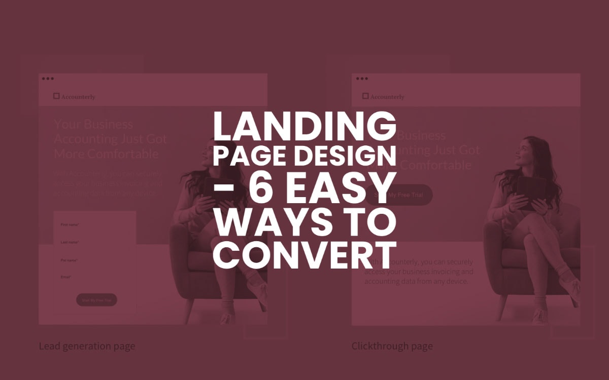
18 Feb Landing Page Design – 6 Easy Ways To Convert
Landing Page Design – 6 Easy Ways To Convert
Landing page conversions are highly unpredictable because they largely depend on human behaviour.
Also, many elements factor in landing page conversions, so lots of businesses struggle with it.
You can choose to give up on landing page conversions as a WordStream study reveals that the average landing page conversion rate is 2.35%.
You can also work on going in deep and understanding why your conversions are in the average range.
The same study reveals that the top 10% of landing pages are getting conversion rates of 11.45% or higher.
In this guide, we’ll dive deep into some of the strategies you can implement to convert more visitors from your landing page design.
1 – Start with the Objectives and Purchase Intent
Not every prospect is the same. Every landing page visitor has different goals, objections, and different levels of familiarity with your offering.
Using the standard “landing page design tips” around the internet wouldn’t be the best idea. It would help if you thought about what your user wants.
Research your Ideal Buyer Persona
To start with, you should go in-depth with your TG research.
Your landing page offering should solely work towards one goal – solving the users’ pain points and getting them closer to their goals.
For this, you should be thorough with your research.
To understand your audience, you can take help from your current customer pool. Identify common patterns and traits.
You can survey them to understand how you’ve helped them with your offering. Understand which part of your offering most appeals to them.
You can research the market and identify the gaps that you can fill.
Hop on your competitors’ websites and social media, and find out everything about their value proposition.
Also, learn about how users are responding to their offers. This step will not just help you to perfect your offer but will also help you fix your messaging.
Understand the Purchase Intent
The prospects’ purchase intent can alter the way they perceive your page and make purchase decisions.
For instance, if a user is one step away from making a purchase, you don’t want to be convincing them about the basics of your offering.
Instead, you might want to convince them that your offer is better than your competitors.
Similarly, if the user is getting familiar with the offer and the purchase intent is low, your hook will be entirely different.
An example would be the case where your primary landing page traffic source is PPC. Then the purchase intent of the visitors will be relatively high.
If your primary source of traffic is native and then the purchase intent wouldn’t be as high. Hence, you’ll need to persuade the user through your landing page messaging.
Figure out your Value Proposition
Every winning landing page must be optimised to have a unique, valuable value proposition that is one of the main reasons for the higher conversion rates.
A value proposition can be anything unique that makes your offer irresistible.
It would be best if you diligently spent time perfecting your value proposition. Market and competitor research come to great help here.
Your value proposition should directly speak to your prospects’ pain points and remove any objections that they may have.
A good value proposition can be a special offer, social conformity, something that adds credibility to your brand, or a never-seen-before offer.
A great example of a good value proposition would be this landing page design of WordPress.com.
The page is mainly focused on adding credibility and social proof to the brand by stating that WordPress is the world’s most popular website builder. Most of their visitors would probably be sold at this value proposition.
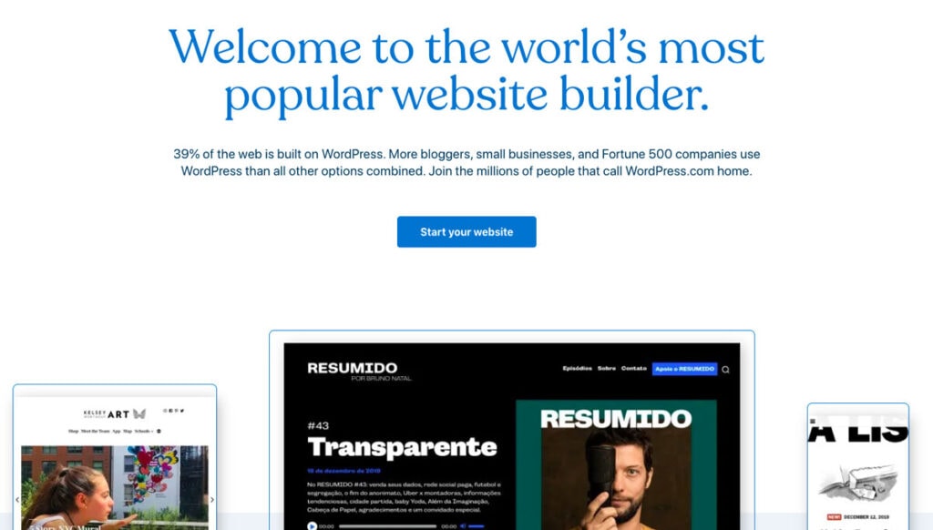
Source: WordPress
2 – Fix the Flow of the Copy
The copy of your page can entirely transform how any visitor perceives your landing page design.
Even the difference of a word can lead to a considerable bump or drop in your conversions.
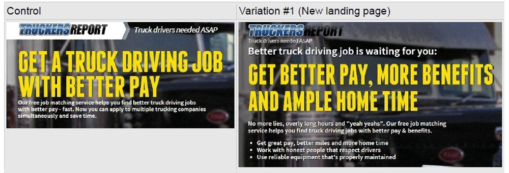
A case study by CXL reveals how they increased the TruckersReport’s landing page conversions by 79.3%.
One of the main factors that they focused on was to fix the headline copy to address the visitors’ pain points.
Here are a few ways to fix the flow of your landing page copy:
Address the Pain Points and Objections First
People are desperately searching for solutions to their pain points. So, having a resolution to their pain point should be the icebreaker on your landing page design.
In the previous example, “get better pay, more benefits, and ample home time” pretty much sums up the pain points that TruckersReport’s TG would face.
It would help if you also focused on removing any objections that your prospects would have. This could be anything that is stopping the user from opting for your offering.
For example, suppose that your prospect wants to learn to trade in Forex. Their pain point might be that they don’t want to spend hours every day on it.
A common objection can be that they don’t know anything about trading in Forex.
So, if your landing page copy states that the user can “Trade in Forex without spending hours every day, even if you know nothing about Forex,” then you’re highly likely to convert more visitors from your landing page.
Build an Emotional Connection by Using Empathy
Selling is not just about talking about the right things logically.
It would be best if you also tried to have an emotional connection with the visitors.
Empathy is one of the most wonderful tools that you can leverage for having this much-needed emotional connection.
Once you’ve spoken about the visitors’ pain points and removed any objections, you can follow this up with empathy.
For example, a statement like “I was like you five years back. I lost thousands of dollars” would instantly get the user more interested.
Storytelling is a great way to show empathy.
Talk about your story or narrate someone else’s story to let the user know that you understand their current situation.
Remember to be authentic and only state the truth. Visitors can quickly call your bluff, and things might backfire.
Show them a Solution
Next, you can sell them your offering – a perfect solution to their pain points.
Make your copy more benefit-driven. Make the visitors imagine their life with your offering. You can, again, make use of storytelling here.
Make sure that your solution aligns with your messaging. Stay true to your claims. Do not deviate from what you offered to do for your visitors in the first place.
Use Abundant Social Proof
Strategically placing social proof on your landing page copy might be the last piece of your puzzle.
By now, the visitors are almost convinced with your offer. It would help if you gave them the last push in the form of social proof.
You can add social proof in the form of testimonials, customer success stories, brand logos, trust badges, and anything else that helps visitors with conformity.
For instance, on ActiveCampaign’s landing page, you’ll see they have added their G2 rating.
This small part of their landing page design makes up a great form of social proof.
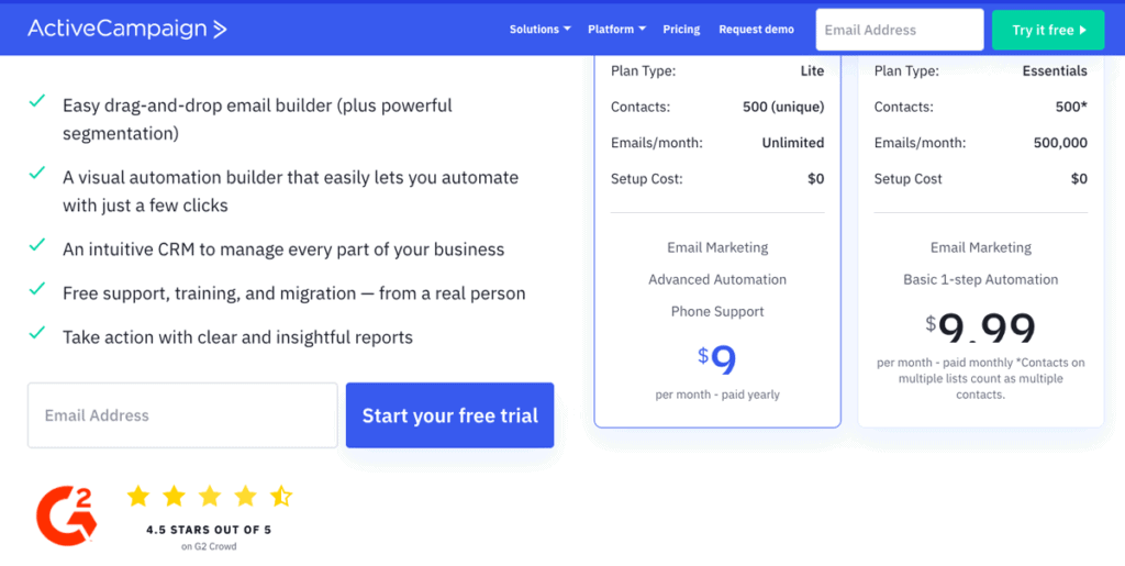
Source: ActiveCampaign
3 – Make the Content More Customer-Centric
As discussed before, emotions play a massive role in the art of selling.
When you strike the right chords with your landing page visitors, it would be a game-changer for your conversions.
For this, you ought to take a more customer-centric approach.
Many businesses make the mistake of merely talking about the features of their offering.
Your visitors do not care about what it is that you are offering. They are only interested in how you can be of help to them.
Once you understand what your user wants, you can tweak your entire landing page content based on that.
For example, suppose that your offer is a product that solves some pain points of your prospects.
Then, merely talking about the features in the product description wouldn’t suffice.
Instead, it would help if you discussed these features’ benefits and how they could solve customer problems.
Take, for example, the following landing page design by Spotify Premium.
They have taken a customer-centric approach by talking about how users can listen to distraction-free music with unlimited skips – precisely what their customers want!
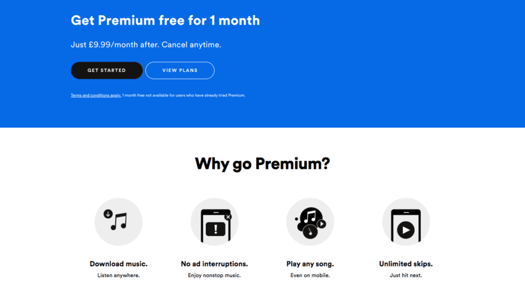
Source: Spotify
4 – Ensure Consistency in Workflow
Not all landing pages are the same. Not all of them have the same workflows and the same traffic sources.
Depending on these factors, you may need to have different landing pages to ensure consistency in the workflow.
Without consistency, your visitors might feel deceived, and this will lead to landing page abandonment.
When the user sees an ad to the landing page design and until the checkout page, the workflow should be as seamless and smooth as possible.
So your visitors will encounter a consistent experience across different pages and will slide down your funnel like a slippery-slide.
Depending on your offer and where the visitors are coming from, you may need a squeeze page, a lead capture form, or a long-form sales page.
So, it is essential to decide on the workflows and have different landing pages based on that.
For example, a visitor coming from a link in the Instagram bio should be directed to a landing page different from someone clicking on a CTA on your email newsletter or a native ad.
Having the same landing page for these will lead to inconsistency in workflow and messaging, which will lead to a reduced conversion rate.
Similarly, user devices also matter. You must ensure that there is consistency in the workflow for visitors using mobile devices or desktops.
What you also sell matters here. Not every offer is the same. Every product or service will need different forms of convincing.
If you run a high-ticket affiliate marketing campaign, then the visitors will need a lot more nurturing as compared to, say, a low-ticket product.
You might have to capture the emails first before you talk about your offer for high-ticket products or services.
But, a low-ticket, impulse purchase product doesn’t need much nurturing. You can directly take the visitors from the landing page to the checkout page.
5 – Leverage Visual Elements
Did you know that the human brain processes visual information 60,000x faster than text?
So, when you want to capture your landing page visitors’ attention and keep them hooked, you should use visual elements.
Images do a great job of complementing your landing page copy and grabbing the visitors’ attention within the first few seconds.
You can strategically place images on your landing page design to use it to drive attention to your CTA.
If you see Bluehost’s landing page, you’ll notice that they have a beautiful display of all their website templates.
Such visually appealing images make your users want to learn more about your offer and ultimately convert.
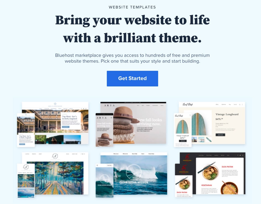
Source: BlueHost
Videos work great too at convincing the visitor of your offering.
A study by Unbounce shows that adding a video to the landing page of Vidyard increased their conversion rate by 100%!
You can add various types of videos to your landing page design.
The videos can tell the story of your brand or talk about your product. You can also add customer success stories to your landing page that will double as a great social proof form.

Source: Vidyard
6 – Start Working on Converting More Visitors from your Landing Page Design
Optimising your landing page design for increased conversions is not just about perfecting your landing page elements.
It starts with researching your potential customers, perfecting your value proposition, fixing your workflow, and tweaking your copy to convince your visitors the best.
If you’ve been lagging in any of these areas, you should start implementing these strategies right away.
Over time you’ll see some significant improvements in your landing page conversions.