22 Jun Minimal Web Design – Achieve More with Less
Minimal Web Design – Achieve More with Less
Your website is one of the most important aspects of marketing your company, regardless of what your business might be.
That website reflects you and your business and is the face of your company on the internet. Many are so concerned with reaching the largest possible audience, that they send their visitors into sensory overload.
However, feedback from internet users has shown that they preferred a minimal web design in nature, without the clutter that can turn off site visitors.
There are some strategies that can be used to achieve this minimalist design, and in this article, we’re going to discuss some of the essentials of keeping it simple.
Essential Elements Only
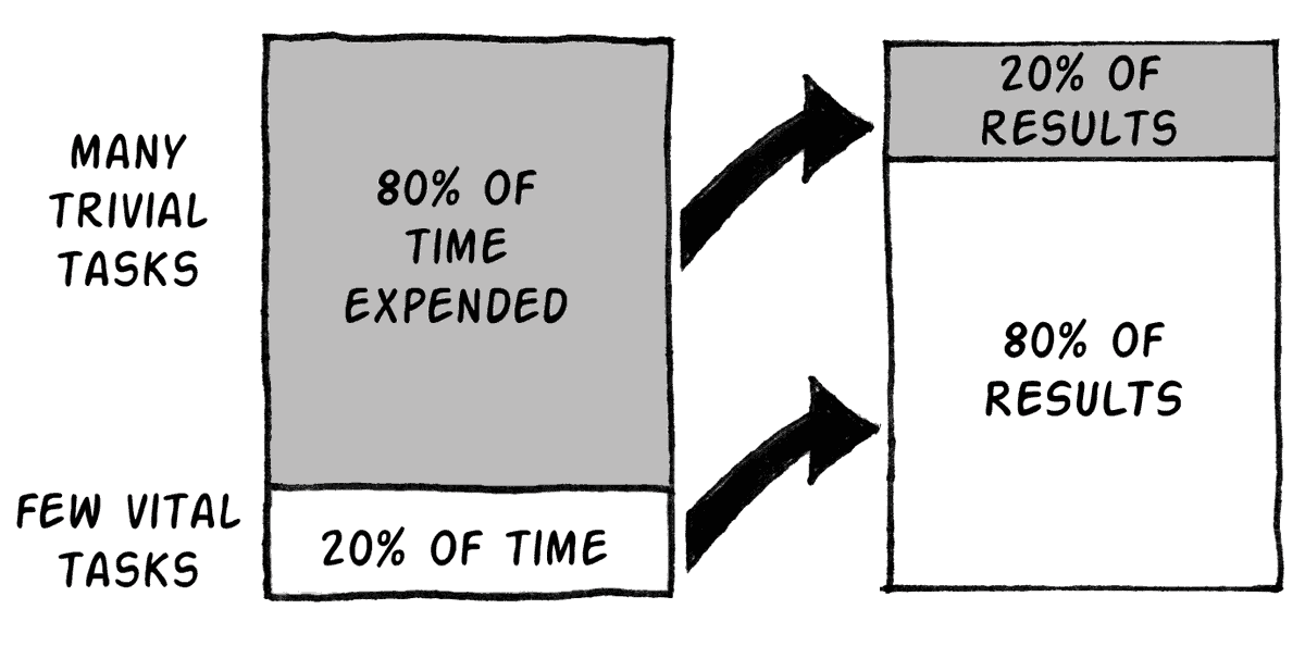
In web design, there is a principle referred to as the 80-20 Rule.
This principle means that when designing a website, you should consider that 80% of the effects of the website come from 20% of the page.
You should focus on the 20% of your website that will generate 80% of the results you want from your website. Your website goals will determine what you choose to focus on.
For one business, that might be an increase in website sales. For another business, that goal might be more registered users.
Whatever your business goals are, make those goals the focus of your website, and don’t clutter it up with unneeded information.
By the same token, get rid of any unnecessary elements.
Your website may not need social media sharing widgets or blog post meta details. If it doesn’t serve a purpose, get rid of it.
If you’re new to the Pareto Principle and still not convinced, Neil Patel has published an excellent case study which will change your mind.
Reduce the Number of Pages
You might think you’re doing a good thing by offering a large number of pages within your website, but the reality is that too much information overwhelms the site visitor.
Providing fewer places for website visitors to explore and click around actually makes it more likely that visitors will get the information they’re seeking.
The ‘shiny object syndrome’ is a real thing, and if you create too many distractions on your website, it’s likely that some of your readers will get distracted and you will end up with a much lower conversion rate than you’d want.
Another thing to consider is the “weight of the page.” Reducing the number of HTTP requests as much as possible is essential because it can slow down the page load time.
Encumbered pages take forever to load, and no user will have the patience to wait for it.
You can do the following to make your website load faster:
· Reduce the number of images
· Reduce the file size of the images
· Use a CDN
· Activate GZIP compression
· Encourage browser caching.
Check out this excellent guide from Hubspot on how to give your pages the weight-loss treatment.
Again, go back to your goals of having a company website, and let those goals determine the most important things a visitor can see on your site. Simplify your navigation menu to reflect the fewer number of pages.
Important Information Above the Fold
The fold is the section of your website page that a visitor sees on the screen without having to scroll down the page, and website design experts agree this should be the focus of your site.
You should always assume that a website visitor won’t go any further into your site, and so, put your most valuable contents of your website above the fold.
Going back to the goals of your site, use this area for the one thing you want visitors to do, whether that one thing is making a sale or signing up for your company email list.
According to an article published by Nielsen Norman Group, “What appears at the top of the page vs. what’s hidden will always influence the user experience — regardless of screen size. The average difference in how users treat info above vs. below the fold is 84%.”
Keep this in mind – the design of your fold should be made as such to encourage scrolling down the page to uncover the hidden content, so make sure to create engaging imagery, offer a glimpse of something interesting and compel the user to look for more information below.
Images
Images are good for every business website, but they must be used carefully.
Many internet users prefer pictures and videos to text, but you must optimise the images for your site. High-resolution, compressed images are the best choices to prevent your site from being bogged down.
An optimised picture consists of:
· Image relevant to the text
· Proper file name
· Image description
· Alt tags
· Caption
· Correct dimensions
· Correct file size (aim for KBS instead of MBS)
· Added to XML sitemap
If you don’t own the photos being used, make sure you are using images with permission or the ones that are free for public use.
The last thing you want to do is to incur a copyright infringement while using somebody else’s copyrighted photos.
Some of the sites you can get great quality copyright-free pictures include Pixabay, Flickr, Pexels and Image source.
When searching the sites, make sure you select the proper filter to display only copyright-free photos (Creative Commons, labelled for reuse).
Choose Your Colours Carefully
Any good website designer will tell you about the importance of using the right colours for your site and your brand. At first glance, it might seem like a minor issue, but just think, what’s the first colour that automatically comes to your mind when you think of Coca-Cola? That’s right – red.
Consumers tend to associate a brand with its dominant colour, so it does play a significant role in overall attractiveness of your brand.
Limit the colour scheme of your website to colours in the same family or complementary colours. In most cases, you should avoid using bright or loud colours as your primary colours, as those may end up competing for attention with your actual website content.
Choose a dominant colour that represents your brand, and go from there, with one or two accent colours that complement it, along with a background colour that makes your content easy to read. Check out some of the beautiful examples of colour scheme simplicity here.
Avoid Drop Down Menus
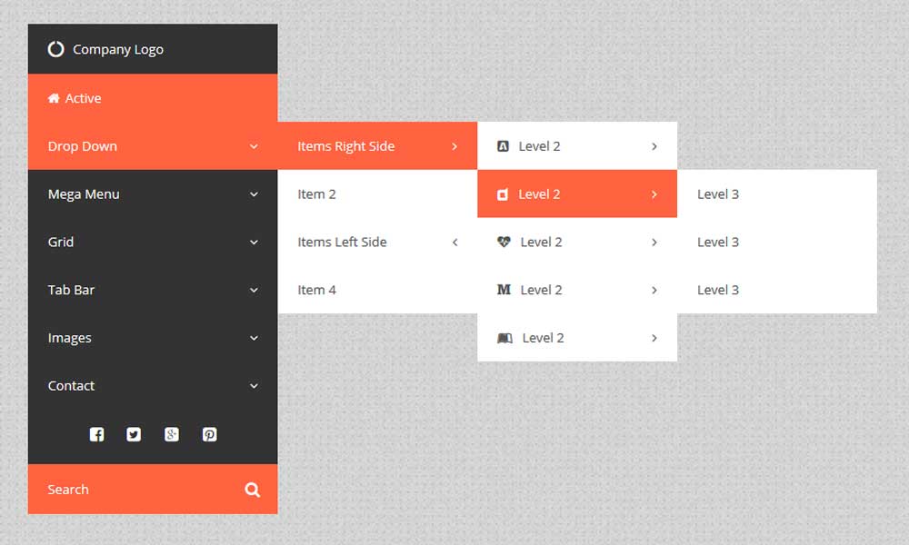
Drop down menus can be wonderful when used correctly, but it seems that many websites don’t use them properly.
Dropdown menus can add too much complexity to your site, and if you have too many options, they can quickly take over your entire web page. However, if you feel confident enough to create a user-friendly interface with drop-down menus, you can check out this great guide on how to do it.
In either case, try not to go overboard with the number of drop downs.
A good practice for drop down menus:
· Don’t add more than two levels
· Use clear headings
· Use columns
· Avoid clutter
· Add borders to help it stand out
· Test it out
Delete the Unnecessary Stuff
Pay attention to what website visitors do on your site. If there are certain areas of your site that they never go to, get rid of those. They’re obviously unnecessary. Remove redundant and unnecessary links. If there are individual pages of your website that don’t increase conversion rates, you can safely delete those.
You can increase your conversion rate by:
· Using tangible action verbs
· Using testimonials
· Crafting your headlines carefully
· Keeping conversion elements above the fold
· Including a clear value proposition
· Using CTA buttons instead of links
· Getting your visitors excited
You should also reconsider your sidebar menu. It’s easy for a sidebar to detract from the website. Unless your business is advertisements, get rid of the ads. Site visitors are easily annoyed by them.
Everything Else
There are several other details that can help in having a clean and simple website. If your web design has a lot of content, consider the use of infinite scrolling.
This will allow content to load as the visitor scrolls down the page continually. Use universal icons for social sharing and traditional symbols for navigation buttons.
Your professional website is not the place to try out trending icons and buttons.
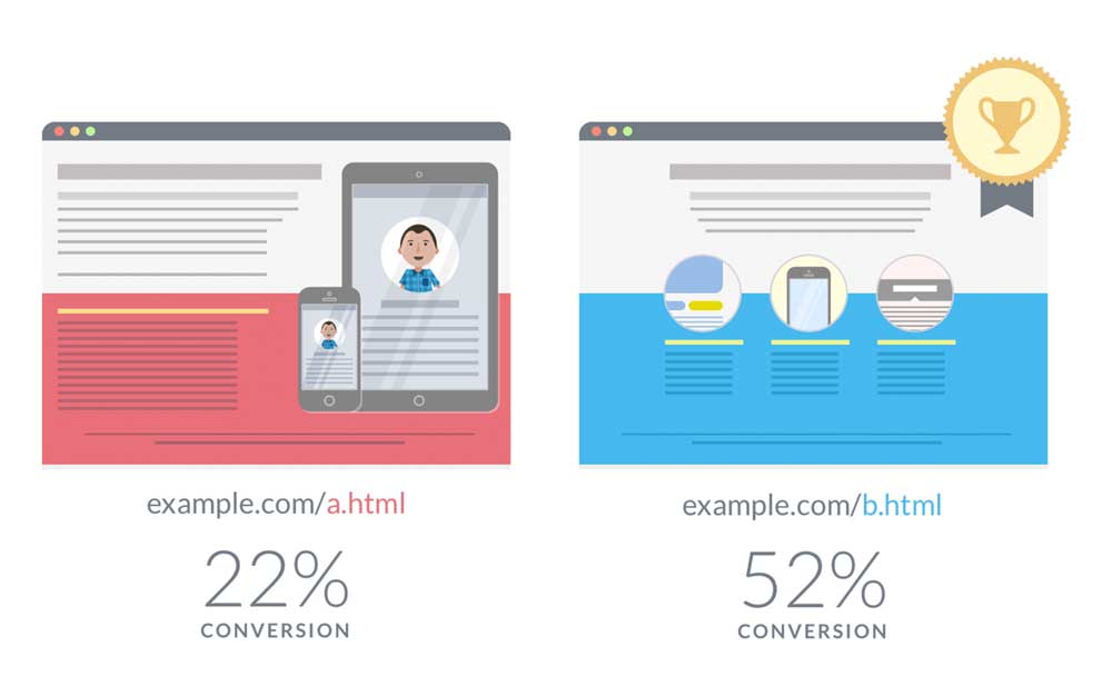
Lastly, do user testing, or A/B testing, on a regular basis. This is when you create two, slightly different, versions of your website and direct half of your website visitors to one version and half to the other version.
You can then analyse the results to see which version will produce the higher conversion rates. After all, that’s the goal of your website.
Many people are tempted to incorporate a great variety of designs into their websites needlessly, but this goes against what most internet users prefer.
Not only does an average user prefer simpler website design with clean lines and information that is neatly organised and easy to read, but minimalist web design also comes with the extra benefit of improving your SEO (reduced page load time, first and foremost).
If your website happens to suffer from some of the elements we’ve discussed within this article, make sure to implement the necessary changes, and you will most certainly improve your user experience and overall design.
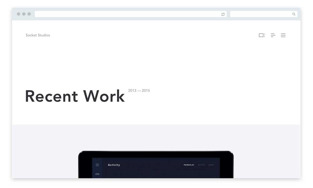
What Minimal Web Design looks like
It is not hard to see how people might wrongly assume that minimal website design requires less time or effort to create.
Conveying the feeling of simplicity and primary focus is, after all, the true purpose of minimal design.
However, to say that minimal web design does not involve much work is just not right.
A minimalistic design has been strategically stripped of excessive gimmicks and features to end up with a concise and clear message to the targeted audience.
A minimal mindset
If you wish to execute minimalism correctly in your web design project, you need to establish a focus.
The ability to present a clear message to visitors is the primary role of minimalistic web design.
Attempting to execute a broad scope of information while still maintaining a minimalistic style usually ends with unsatisfactory results.
Therefore, it is essential to have a narrow scope and project plan before you get to the process of designing.
If your website’s focus is clear, the next important step is considering what information is critical to the design, and the structure regarding significance.
You might be surprised at how little information you need to present to your users to get your point across.
The art of taking away
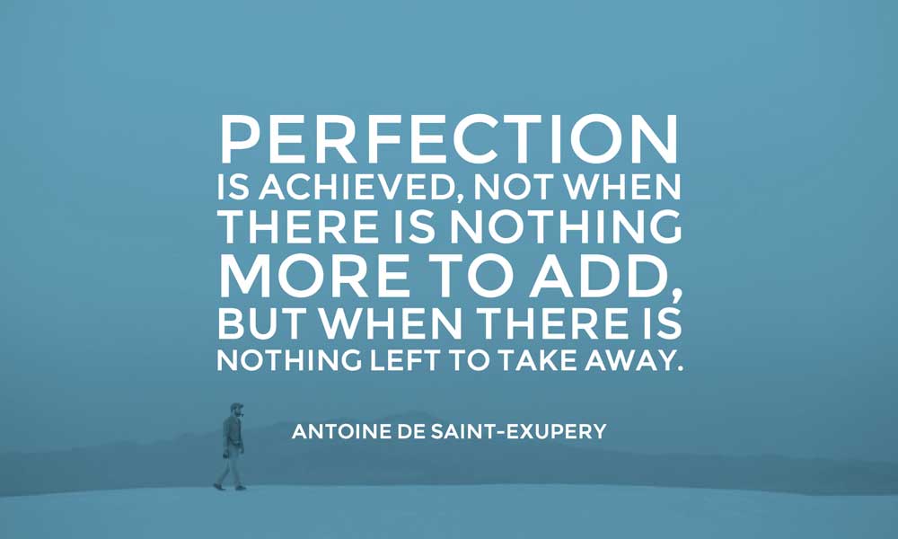
To paraphrase French writer Antoine de Saint-Exupery, you can only achieve perfection when nothing is left to take away and not when you have nothing more to add.
Designers regularly receive praise for their creative abilities.
Beginning with a blank canvas or screen, designers sculpt lovely artworks usually from scratch.
Due to such trained skills, the art of taking away objects from designs can be challenging to master the first time around.
Designers usually love invoking visual stimulation whenever and wherever possible, and this does not fulfil the minimalistic design.
The best practice to implement when working on a minimalistic design is to design a full website.
Once the design feels complete, you may start removing objects or visuals that do not fulfil any function or purpose on your website.
The reality is the process might be time-consuming and painful, but if you do it right, you can end up with fantastic results.
The best way to master the art of reductionism is to keep practising.
Reductionism in web design
Defining reductionism in the context of web design is of great importance.
Reductionism is all about boiling down complicated things into much simpler ones, which may include modularisation of the system into easily digestible components, all while ensuring that you do not lose usefulness and value (fidelity).
Simply put, it means that if you have something complicated or cumbersome, you can improve your work by removing some bulk.
Reductionism vs minimalism
Reductionism is not the same as minimalism, but they can work together.
If you understand the complexity of things by reducing them into smaller components, it will allow you as a “web scientist” to organise and maintain what you produce better.
Reductionism might allow you to strip the complexity away from an objective viewpoint to see the fundamental principles guiding your work.
It also highlights explicitly what the benefit is to the end user, and to you, the creator of the final product.
In practice, you can save some money and time by freeing your visitors from distractions, and eliminate any unnecessary design work.
Content reductionism

You can approach content reductionism in several different ways.
The easiest way is to take your copy, read through it, and identify where you can lower the word count.
This includes simplifying the structure, getting rid of jargon, redundancy, and just about anything that doesn’t add any value to it.
Apparently, content is much more than text.
Visual or image sensory reductionism can be done by taking out complimentary graphics that just act as page bloat and eye-candy, but doesn’t help you drive your point across to the reader.
Keep in mind that pictures are worth a thousand words.
Using an image should ideally lower the amount of content you have to write; otherwise, it should not be part of your copy.
Code reductionism
It is all about the simplification of code and ensuring that it cannot be written any better.
However, code reductionism is not such as simple process, and you also need to make micro-decisions in particular instances and go with lengthier code that’s semantic and web-accessible.
Code reductionism lies in the number of web technologies you use.
If you can produce a satisfactory effect using CSS, you do not need to over-engineer the effect by making it Flash or JavaScript dependent.
Smarter colours
Minimal web designs tend always to be black and white, but it is not a rule of thumb that should be strictly adhered to.
Black and white are usually the most popular because it allows designers to use any accenting colour while matching existing brands.
Minimalistic web design does not mean a lack of colour but instead calls for using well-planned colour palettes intelligently.
Unique colour options can be equally effective.
The important thing is not only to use colour rather than know how to use it.
A continuous background colour can be used in minimalistic design to set the emotion and tone of a website, while accent colours capture a website visitor’s attention and highlight the most critical features of the site.
Typography
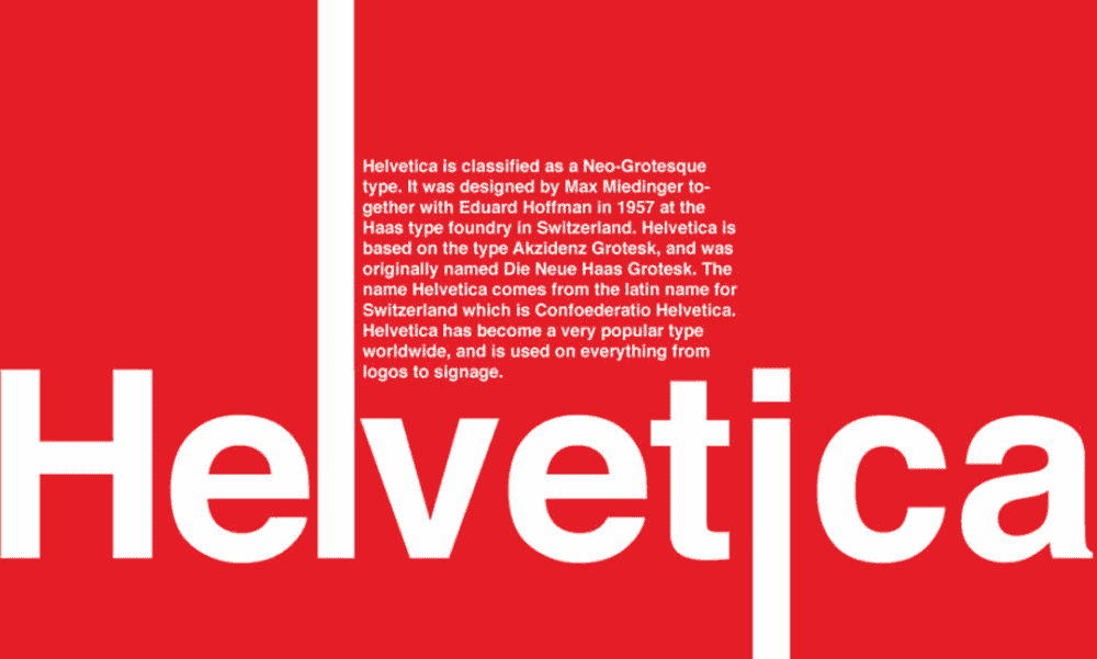
Designs stripped of the unnecessary bells and whistles usually put greater emphasis on content.
This naturally magnifies the importance of typography in web design.
With fewer distractions, it is up to the textual content to capture attention and develop the website’s flow.
The web is embracing more flexible typeface options, and the art of typography is finding a significant foothold in the minds and hearts of web designers.
Minimalistic design is one of the best ways to showcase what can be achieved with proper typography.
The typefaces you choose and where they are implemented on the page can leave a lasting impression.
Embrace different styles and text available to you.
Move beyond size and colour changes and focus on kerning, leading, style and weight to see the possibilities.
Layout structure
Having a minimalistic web design does not always translate to a simple site structure.
In many cases, toning down the visual overload of a website translates to making an effort to implement an intelligent layout.
A poorly planned website structure is one of the few things that can ruin the effectiveness of a minimalistic web design.
Is the logo in the appropriate location?
Is your website navigation convenient to use and easy to find?
These are essential questions that can either make or break your website’s functionality, even without excessive graphics backing up these critical elements.
Negative space
Proper spacing when it comes to content and images is an art form in web design.
The focus is for less is more, and negative space is a powerful tool at a designer’s disposal.
In varying amounts, negative space can act as a subconscious visual guide that provides valuable feedback on which items on the screen are of highest importance.
Simply put, the more a particular item stands by itself, the more the attention it is likely to receive.
Negative space is also used for grouping together similar bits of information, which helps solidify the structure of a minimalistic design.
The void between these groups of information gives the brain and eyes a needed break from the content.
As a designer, you might be tempted to fill the space with lovely graphics to look at, but acting on such temptations usually results in disorganised and cluttered design.
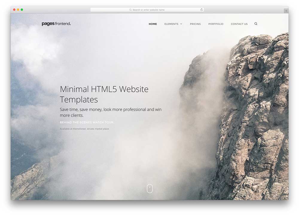
It is all about finding a balance
Having talked a lot about avoiding the use of graphics, it might appear as though images are the enemy.
However, the minimalistic design allows images to hold even more meaning.
The use of simple colour palettes and the increase in negative space in minimal web design provides the perfect platform for images to shine as the screen’s actual focal point.
One important concept to bear in mind when placing images or graphics is the need to strike a balance.
Does the image being used support the content?
Avoid using images for the sake of taking up space or displaying colour, and ensure that they are relevant to the blog content that users are reading.
When you set out to create a minimal web design, be clear on what you want your website to achieve.
When your site has a clear goal, you can design it around that goal.
Otherwise, your website design will not meet the needs of the website’s purpose.
Contributor: John Stone is a business consultant at Algorithm Seo Sydney. Through years of experience, he became a devout believer in the notion that form should always follow function and that developing the ability to think outside of the box is a prerequisite of being a successful entrepreneur. You can get in touch with him on Twitter.