

07 Apr The Ultimate Guide to Using Colors and Typography Effectively
The Ultimate Guide to Using Colors and Typography Effectively
The aesthetics of your brand is an integral part of your business image. It is, after all, what people see when looking at your website, social media, and anything else associated with your business.
Your audience can judge your company, product, or service in just a few seconds. Most of that judgment is based on color alone.
You can influence what your audience feels and sees with the typography and different colors you use. Colors are essential in marketing, and it’s about color palettes, emotions, complementary colors, and more.
Any good color palette you incorporate into your aesthetics will change how your audience feels about you.
Nailing the color and typography you use is essential, and we’ll look at how you can do that in this article.
Put on your best artsy cap because things are about to get creative!
Colors and Typography: Why They Matter
Your website’s typography (and any other online content) can affect user experience and your brand identity.
It gives your branding a specific style that can be recognized by your audience no matter where it’s used. It should complement your company emblem and the structure of your website.
It would be best to create websites and designs tailored to your audience type, so don’t forget to put yourself in their shoes.
If you use it right, your website and business can stand out from the competition and gain better brand recognition.
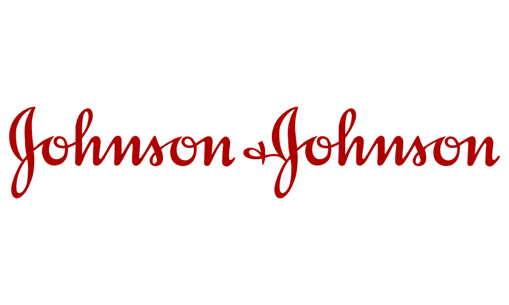
Fonts and typefaces are part of typography, and they can affect people’s moods. Some fonts are whimsical and fun, while others are more serious or sophisticated.
Look at how the following fonts create different emotions and set starkly different moods, and examine the color palette each uses:
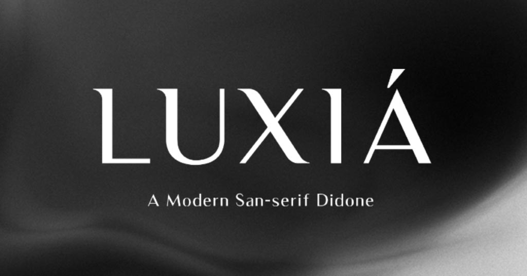
Source: Visme
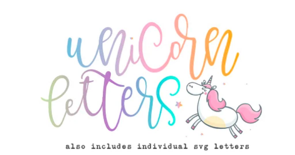
Source: Creative Market
These examples show just how vital color palettes and font are.
Additionally, good typography makes it easier for your website visitors to scan through your content.
Every font and color on your site can help you control what your audience sees. In marketing, this is an invaluable ability.
Key Terminology
Before we dive into the finer details of typography and color, we’ll briefly look at the terminology we’ll be using.
Typography Terminology
Typography
This is the technique (some would say art) of making written language visually attractive and appealing. Typography can refer to the letters’ size, the way they’re displayed, letter-spacing, and line-spacing.
Typeface
Typeface is sometimes used interchangeably with font, but doing so is incorrect. This term refers to a group of characters with the same design, such as Calibri, Helvetica, Georgia, and Arial.
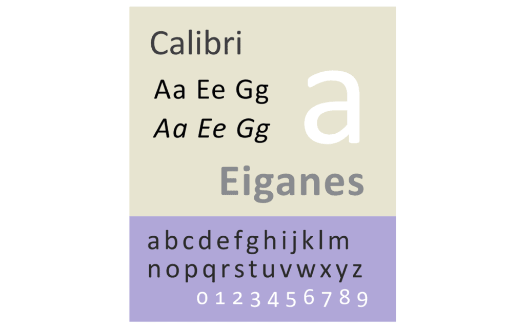
Source: Wikipedia/Blythwood
Font
A font is a part of the typeface you’re using and is in a specific style. For example, Calibri Bold and Helvetica Bold are fonts. Fonts have specific styling elements like width, height, and point size.
Font Family
A font family is a group of fonts that have been designed to be used together. Arial is an example of a font family – it has Arial Regular, Arial Bold, Arial Narrow, Arial Italic, and more to choose from.
Kerning
The horizontal space between two characters is known as the kerning. It is helpful because it lets you set different spaces between the letters of a word if you need to.
Weight
Font weight refers to the thickness of a character’s strokes. Typically, weights are variants of thin, bold, black, or regular.
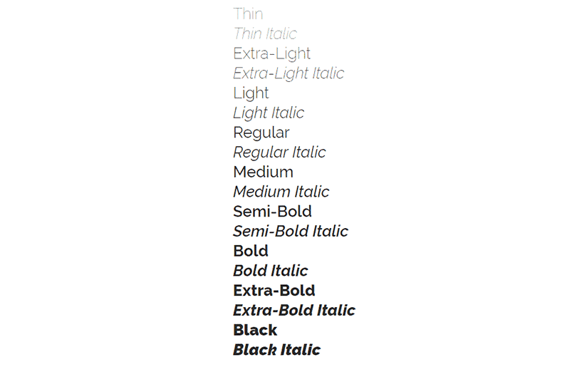
Source: A Smarter Way to Learn
Point
Point refers to a font’s size and the vertical distance from the top to the letter’s bottom. Note that it’s the size of the whole font and not just one letter.
Tracking
This is also known as letter-spacing. Tracking will adjust spaces for a whole block of text. If you need to change only the spaces between two characters, you’ll adjust the kerning.
Leading
Leading refers to the spacing between lines of type. It affects the readability and visual appeal.
Serif
This is a styling element and refers to a small line added to printed letters’ tops and bottoms in certain typefaces.
Sans Serif
Sans Serif is the opposite of Serif; Sans is French and means ‘without,’ so the typeface doesn’t have the small lines added.
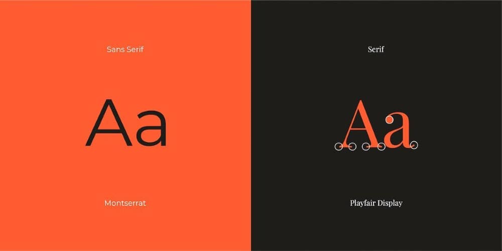
Source: Canva
Slab Serif
Related to the already mentioned Serif fonts, this one is thick and more block-like than Serif and Sans Serif.
Script Typeface
These are supposed to look like actual handwriting and add a touch of authenticity to writing.
Blackletter
Also known as Gothic minuscule, Old English, and Gothic script, an ornamental appearance can identify this typeface.

Source: WordPress/dijames2016
Color terminology
Now that we’ve covered typography, let’s take a look at popular color terminology real quick. Knowing these terms will help you when you’re working on the design of your website, logo, etc.
The Color Wheel
This is a visual representation of color hues arranged by the chromatic relationship between them. You’ll find that a good color wheel always shows 12 hues.
Warm and Cool Colors
The color wheel is divided into warm and cool colors. Red, yellow, and orange are warm colors because we associate them with warmth.
Green, blue, and purple are cooler because we associate these colors with things like water and grass.
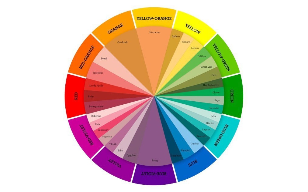
Source: Close To My Heart
Hue
Hue is often used in color to mean the same thing, but it’s more specific than that. Color can refer to tint, shade, hue, or tone. Hue refers to the pure primary colors on the color wheel, the ‘dominant color family,’ and is particular.
Red, blue, yellow, etc., are all hues. Note that we don’t refer to white, grey, or black as hues.
Value
The value of a color is how light (tint) or dark (shade) it is.
Chroma
Chroma, also known as saturation, is how intense a color is.
Tint, Shade, Tone
These three are all part of how we can change and adjust the appearance of colors. You can make them darker or more intense by adding white or black to the primary color.
Choosing the Right Font
You’ve got the relevant terminology out of the way, so let’s jump into action. We’ll start by discussing how you can choose the right font for your goals and purposes.
1 – Understand Font Psychology
Good marketers know the value of using a good font. Much thought goes into fonts and the emotions they can make people feel.
If you use a font like Times New Roman, different feelings and associations are present than if you use Comic Sans.
Examine the fonts you like and try to determine what exactly they make you feel and think. Use your reactions to determine the best font for your business.
Here are a few fantastic examples:

2 – Considering Headings
Not many people realize, but their fonts look different when used in headings. When you’re working on your website content, your headings might look different than the font you chose for your overall written content.
As your headings get smaller, so do your letters, and the words may become difficult to read. Headings play an essential role in your website’s SEO, so you can’t just make your words bigger; they need heading tags.
As such, you can’t always get the same effect with your fonts that you would have without the headings. Always consider how your font will look in the various heading sizes.
3 – Understanding Typeface
Choosing your typeface might be the most complicated or time-consuming decision you make. There are so many to choose from that deciding on one can seem impossible.
Fortunately, you can narrow down your options by remembering our discussion on font psychology. What emotions do you want your typeface to evoke?
Do you want your font to have a happy, mirthful vibe or one that’s more somber and classier?
Your business industry and target audience will play a role in the font you end up choosing. It would help if you considered what will be most appropriate. However, you know the basic rules now, so you can play around and bend them a little.
4 – Free and Safe Fonts
You can use many free and safe fonts if you’re not too sure how to proceed. Google Fonts has a library with more than 1,000 free fonts to choose from.
If you want something bespoke and unique, you may find that you’ll have to buy a font or get someone to design it for you.
In most cases, however, you should be able to find a nice free font that you can use.
You should consider using a safe font, even if it means a little less creativity.
Most devices your audience uses to visit your website come with fonts pre-installed. If you use a unique font, it might not be compatible with all devices.
Fonts that are considered safe include Times New Roman, Georgia, Courier, Arial, Times, Verdana, and Helvetica.
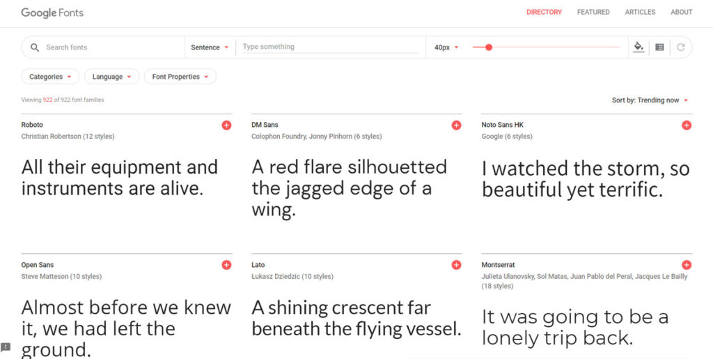
Source: Google Fonts
Choosing the Right Color
Once you’ve decided on your favorite font, it’s time to give it some color. Remember that colors are all about the emotions and associations they awaken in your audience.
What do you want people to feel and think when they visit your website or think about your company? Are you a reliable and trustworthy business or a business that knows how to have fun and let loose?
The kind of industry you’re in will significantly influence the colors you use. Remember, your site has a purpose: guiding customers through the sales funnel. Make it fun with the right colors.
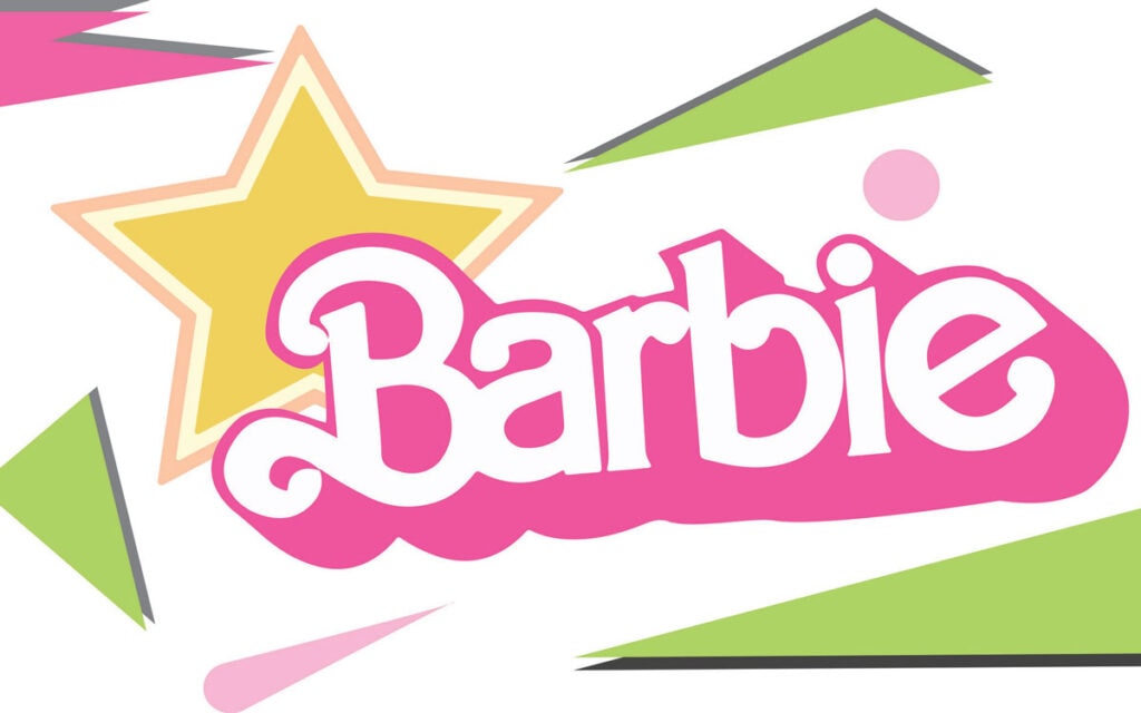
Take, for example, Barbie. They make dolls for little girls. The font and color chosen by the company (bright pink and fun) suit their audience perfectly.
1 – Understanding Color Schemes
Color schemes are the colors that you use in your designs. They are also called color palettes and will be made up of all the colors used to make your website and any relevant content.
Your color scheme must take into consideration your font and font colors, so they don’t clash.
Typically, you will have one or two (or even three) dominant colors in your chosen scheme.
They are the colors chosen to attract the most attention. You create your moods and bring forth emotions with them.
You may decide to use color schemes that are built around your website’s user interface as well. For example, you can dedicate specific colors to particular tasks, such as ‘Add to Cart’ or ‘Search.’
You might even consider using two or three complementary colors as a combined, visually appealing website background color instead of having a plain white background.
2 – Choosing a Color Palette Generator
If you don’t have the time or energy to choose your own color scheme or color palette, you can consider using a color palette generator.
You will still get a beautiful and pleasing color scheme without doing too much thinking. There is awesome graphic design software out there, like color palette generators to choose from, all with great features.
Adobe Color is an excellent choice and will come up with a complementary color scheme for you.
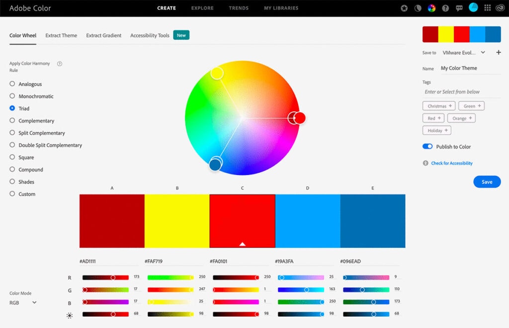
On the other hand, if you want to reduce your digital dependence and minimize the time you spend on such tools yourself, you can hire a trained graphic designer to do this for you.
3 – Using the Right Palette for the Right Purpose
Color palettes are often used for specific purposes, and complementary colors are put together to get a particular effect.
For example, wedding-related websites will have different color palettes than technology sites.
Similarly, business websites and sites dedicated to food won’t use the same color palettes because they don’t require the same emotions and associations.
Think carefully about what your site and business are all about and build a few color palettes around that. It’s good to have a few options to choose from.
If you get stuck, why not look at other smartly designed websites to get inspiration for your own? You might get inspired and come up with a few great ideas.
Make it Mobile-Friendly
We touched on this earlier, and it’s important enough to get into it again.
When it comes to web design, you must remember to make your content mobile-friendly. That means your fonts must be compatible with mobile viewing as well.
It is vital that you use web design methods to ensure that your audience can enjoy all the hard work you put into your fonts and color choices.
No matter what website you have, you must make it friendly for viewing on all devices. Even better, if you can, rope in a designer to help you get the best results.
Color Your Way
You’ve learned about the importance of a good color palette, the psychology behind colors, how to choose the best fonts, and more. The rest is up to you.
You have the tools necessary for brilliant web design and other elements related to your business, now use them.
Author Bio: Mark Quadros is a SaaS content marketer that helps brands create and distribute rad content. On a similar note, Mark loves content and contributes to several authoritative blogs like HubSpot, CoSchedule, Foundr, etc. Connect with him via LinkedIn or Twitter.