

01 Feb Top 10 Band & Music Logos For Graphic Design Inspiration
Top 10 Band & Music Logos For Graphic Design Inspiration
If you want to increase your passion for music and make a living from it, you need a brand image. Whatever music industry area you work in, it’s vital that you promote yourself the right way.
And perhaps, a logo is one of the best ways to show that to your customers. A logo works as a powerful sales weapon. It helps you give your fans a graphic representation of who you are.
You must create a good logo design for a band to stand the test of time.
You may find tons of expertly designed band or music logos out there, designed by skilled and creative graphic designers.
However, some of the most recognisable and iconic logos in the music industry are the ones that are easy to understand and simple in execution.
So what makes a logo design tremendous and inspiring? A good concept is as iconic as the music is a good start.
But originality is just as important as any other aspect to design a music or band logo. Below you’ll find some inspiring logo designs and quick tips to create engaging yet exciting music logos.
Without any further ado, let’s jump right into the most inspiring band and music logos!
1 – Nirvana
One of the most recognisable music logos in history is the Nirvana design that has been on thousands of clothing items for nearly two decades.
Featuring an Onyx font and a smiley face, apparently inspired by a strip club in Seattle. This is one of the best designs to get inspiration from because of its simplicity and minimalism.
2 – Rolling Stones
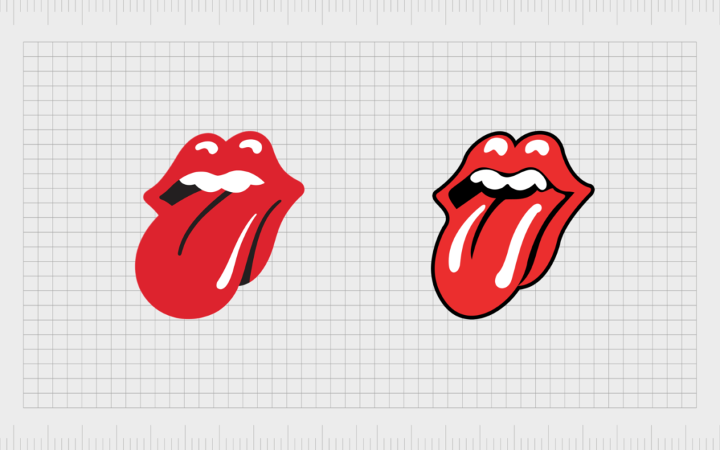
The Rolling Stones logo design is one of the rock legends. Created by John Pasche in 1971, the designer is said to have been inspired by the look of Mick Jagger, and his huge lips were the first thing he noticed on him.
This logo continues to work well for the band, which has just celebrated its 50th anniversary in music.
When designing a logo like Rolling Stores, creating an image that can be used in its entirety and simplified without losing meaning makes much sense.
3 – The Doors
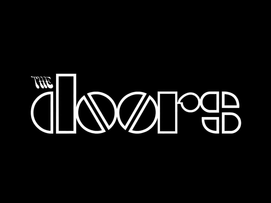
This band shows us a simple and iconic logo with a bold and geometric design with the small and psychedelic “The”, which is perhaps one of the most recognised band logos in the world.
Perfectly summarising the hippie and psychedelic culture of the late ’60s, The Doors didn’t need a symbol or an image. His typographic design is still as fresh today as in the 1960s.
The American rock band’s logo features a bold, geometric typeface with mirrored double o’s. The O’s is the logo is split down the middle, like pills.
4 – Guns N’ Roses
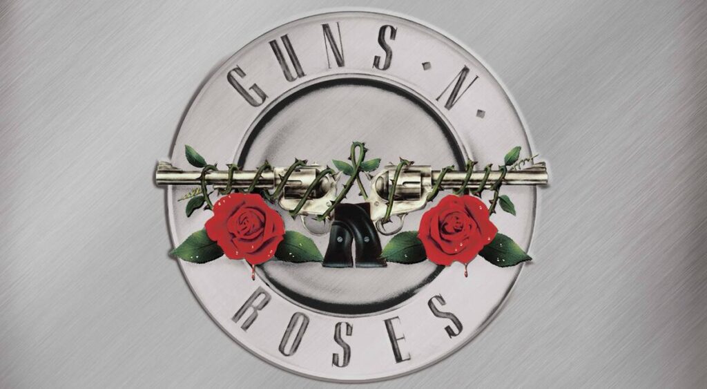
It is composed of two revolvers and two roses and references the duality between violence and passion. Flowers are a counterpoint to gun violence and a classic and ubiquitous symbol in old-school tattoos.
The band’s name combines the founders’ surnames, Tracii Guns and Axl Rose. Another interesting fact is that the silver centre with a gold outline is a revolver bullet shell.
The author of this version of the logo is Steven Adler, one of the band members.
5 – AC/DC
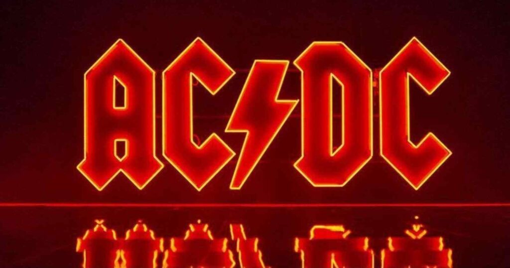
As the band’s logo reflects current or thunder effects, the alternative is just the same: current/direct current electricity.
The angular typeface and the lightning bolt style show the energy of the music and the band’s performance.
6 – Metallica
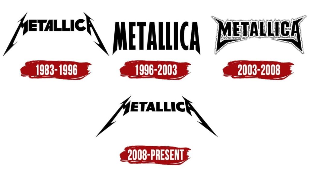
The iconic Metallica logo, designed by Turner Duckworth, was redesigned in 2008. Based on the band’s original version, Duckworth also designed the identity and packaging for the Death Magnetic album.
Like thousands of other metal bands, Metallica’s take on the metal aesthetic is something that its fans appreciate and cherish, whether it’s tattooed or scribbled in books.
The creator of this logo is guitarist James Hetfield, who designed it during the 1980s when the band was founded.
Throughout the group’s history, other versions have been adopted on their albums, but since 2008 the original logo has been used again as a way to return to its origins.
The logo is made up of an extra bold sans serif typeface with straight lines, contrasted by the stylised letters M and A to convey the band’s heavy metal energy.
7 – Gorillaz
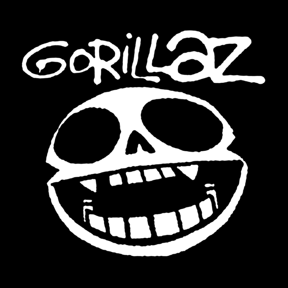
It may seem like an image, but the band is arguably a logo and undoubtedly a remarkable achievement in design.
However, the graffiti-like font is a recognisable testament to how you can sum up a brand just by choosing the correct font.
This typographical post-apocalyptic street art respect summarises the political, aesthetic Damon Albarn and Jamie Hewlett wanted to capture. It is one of the most iconic music logos many music or bands are keen to create.
8 – Queen
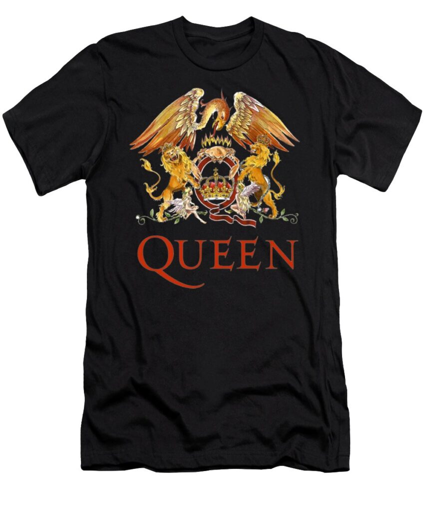
This is undoubtedly one of the most recognisable music logos globally, created by vocalist Freddie Mercury in 1972, illustrating all of Queen’s albums.
Freddie graduated in Graphic Design from Ealing Art College. He was inspired by the official coat of arms of the British royal family to compose the animals in the illustration, which refer to the zodiac signs of the band members.
These are two lions representing Leo (Roger Taylor and John Deacon), a Cancer crab (Brian May) and Virgo fairies (Freddie Mercury).
The phoenix in the band logo design represents immortality. Perhaps a great logo to get inspiration from.
9 – The Beatles
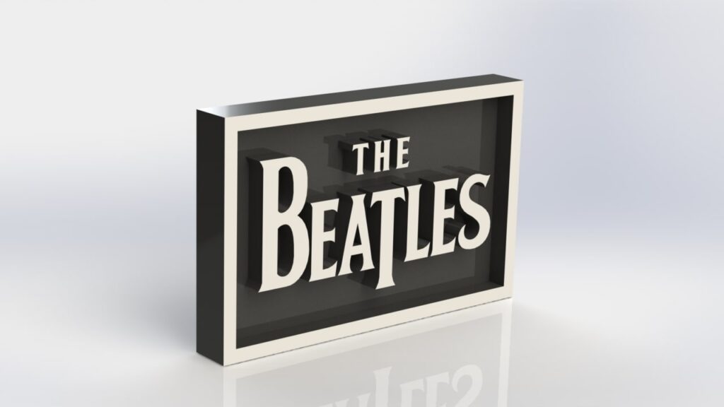
Minimalism is not only a classic and gorgeous design style; it also ensures the longevity of the design throughout your career.
For example, take a look at the classic Beatles logo. It’s just black text on white (or sometimes white text on black), but that typeface is immediately recognisable, and it worked well both in its early days and in its more experimental days.
Many artists want to pack a lot of colours, patterns, shapes, and other figures. However, one must be careful. Being classic and straightforward is effective but minimally.
10 – Wu-Tang-Clan
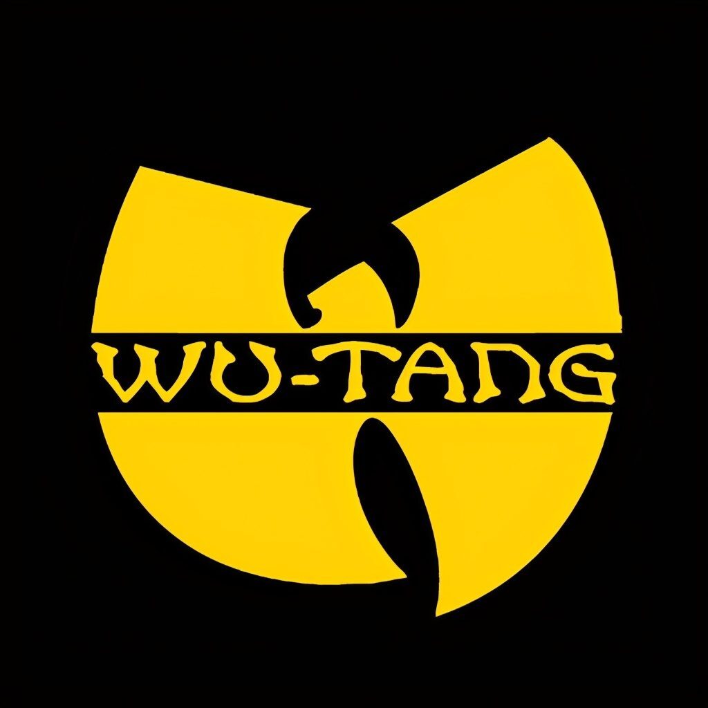
The “W” for Wu-Tang is one of the most recognisable logo designs in hip-hop culture because members of the band adorn the “W” on everything from clothing to chains, but it’s most prominent on dozens of covers of albums.
Created by the DJ and producer, the band has stayed with this design throughout its musical career.
And How to Create an Appealing Logo Design for Musicians or Bands?
The history of creating a band or music logos is full of paradoxes. Some did not emphasise the use of the logo in the design of album sleeves and advertising posters.
A connoisseur of musical symbols at a glance at an album will be able to determine what style the band’s performance belongs to because hard and heavy typography will never make it to a disco band’s album.
The logo affects the recognition of the group increases loyalty and trust. This is an integral part of the image of any artist or band owner.
After all, a visual image is often the first thing people pay attention to when they get acquainted with a personal brand.
Your design must be elegant and delicate, and at the same time, it should also be structured, alive and always relevant.
The following are quick tips to help you create an engaging yet exciting logo for your band or music company.
Use of Correct Fonts
Until the beginning of the 80s, individuality was more manifested in graphics elements, but a desire for simplicity later appeared.
Famous artists have used – and continue to use – minimalist logos. They are readable and have good scalability. The right fonts are as essential as any other aspect to bear in mind.
Make sure that the font you use is legible and contains all the numbers and letters because you may want to use the typographic style for other promotions, and you find that it does not have numbers.
Understand the Psychology & Use of Colours
Various shades of grey, blue, and black and white are popular in the metal camp. There is often a red colour – a favourite of representatives of aggressive directions, less often – orange.
Green and yellow are extremely rare. In light genres of pop music, silver and gold logos are appreciated. Black and white remain universal; they emphasise the minimalism of the design of the brand name.
Opt for the right colour so your fans would know what type of music you produce.
The essence of a Music Icon
If you’re creating a logo based on name or initial, you won’t have to worry about choosing an icon. However, an abstract shape may require a bit more of your thoughts.
If you have a specific music genre in mind, you can see many inspiring music logos, including discreet designs and multi-coloured icons.
Decide on the Elements Suitable for Your Logo
Some bands use their name in an exciting font as their logo. Other bands abbreviate their name, and some use an image for their logo.
You must decide what elements you would like to add to your logo. The most effective way that makes your logo engaging yet describing is to include your band’s name. This would leave a lasting impression on your fans.
Consider the Current State of Your Band
A band logo can be a great marketing tool for musicians that haven’t reached a broader audience. Design a logo that appeals to your potential fan base, and the logo could help you reach those fans.
Consistency
The more consistent you are with the logo design, the faster people identify it with the band. It is not recommended that you change the logo unless you opt for an experimental approach.
It is preferable to keep the same art and impregnate it in the fans’ minds.
Elements to Include in a Band or Music Logo
- Musical symbols work better than large-scale images with lots of detail.
- Monochrome colour palettes are the most common logos for the band.
- Keep the fonts to a minimum and let the logo make its music.
- The more universal your music logos are, the better it will attract diverse artists.
Professional Assistance is the Key for Perfect Logo

Designing a logo sometimes becomes a hectic or frustrating task as it takes time and requires creative skills.
Seeking professional help to design a logo is worth considering. An expert graphic design artist or professional company knows how to design a logo and works alongside you to meet your needs.
Undoubtedly, it is a fantastic way to get unique concepts you can use for your band.
Moreover, the cost to hire a professional logo design depends on the experience of the expert and the clientele they have.
Bottom Line
Now that you know how to design a remarkable yet engaging logo for your band, are you ready to bring your music logos to life?
Don’t be daunted by the task of designing a perfect on the first attempt. Designing a logo is perhaps a tedious task and requires a professional and artistic approach.
It may irritate you. After all, it is a logo with what you will stand out from others. Keep looking for music brand logos that inspire you and capture a unique nature.
Author Bio: Mirza Ali Raza is an industry-leading digital marketer and has fruitful experience in Search Engine Optimisation. Working alongside Brand Reshape, he assists brands to generate revenue and strives to propel their business to new heights. Ali Raza has secured a remarkable position in the digital marketing industry by having a diverse skillset.
The post Top 10 Band & Music Logos For Graphic Design Inspiration is by Stuart and appeared first on Inkbot Design.