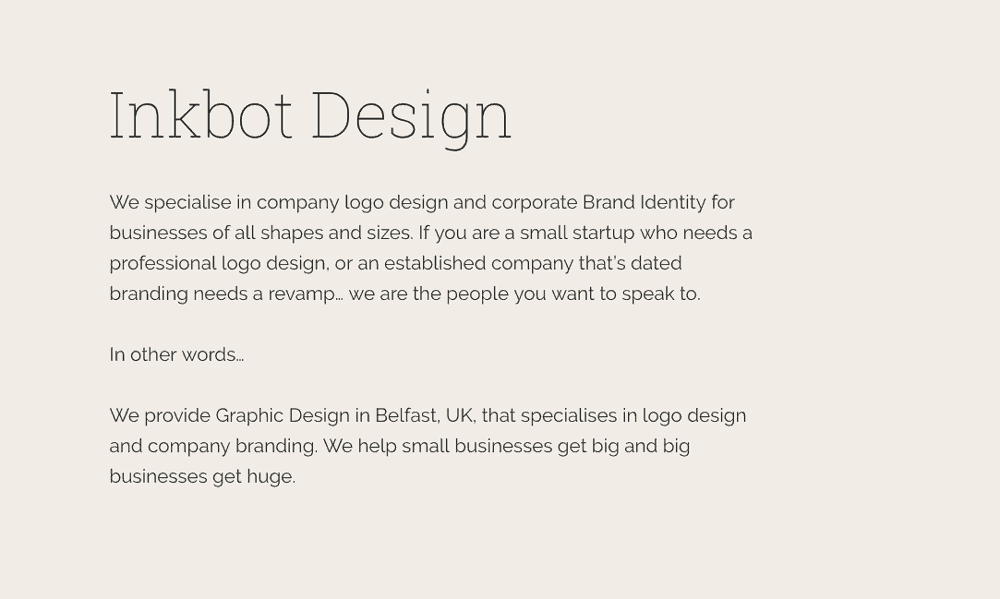
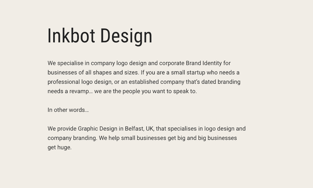
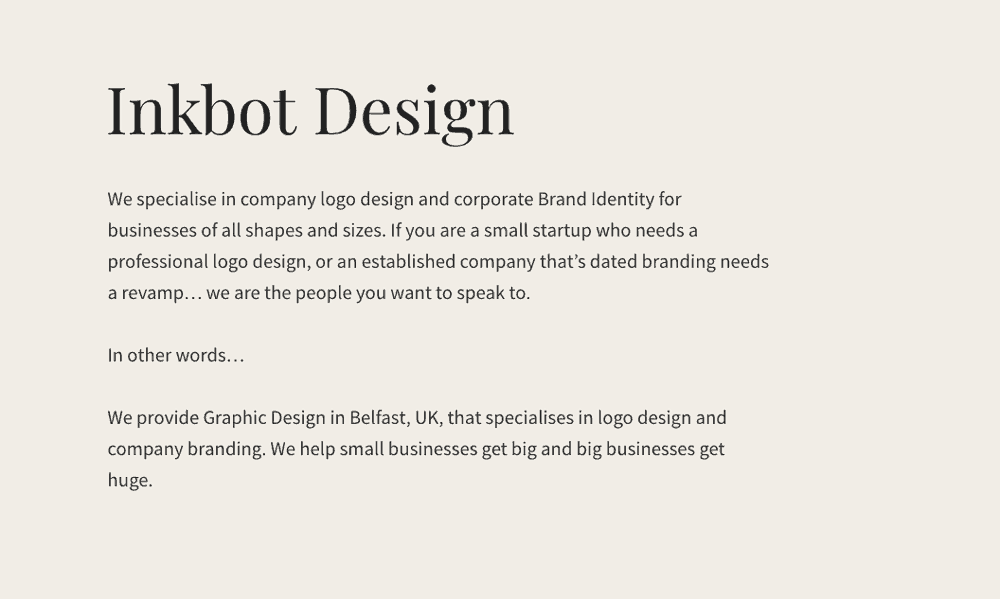
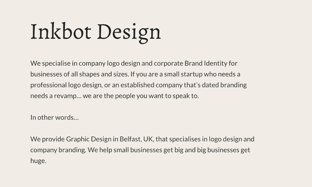
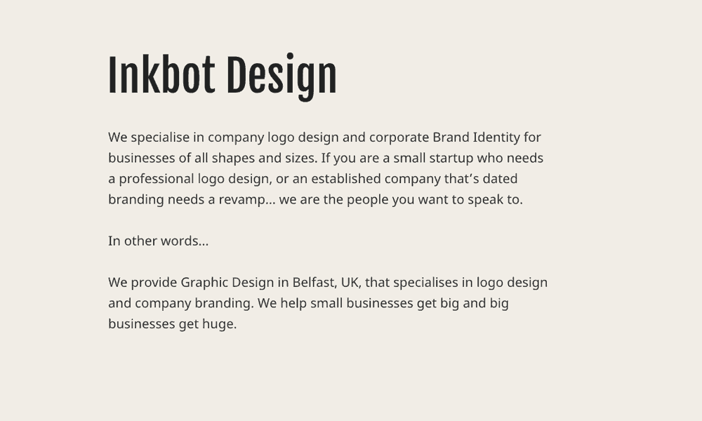
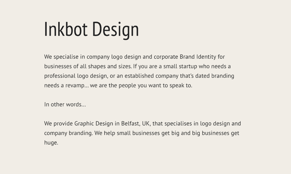
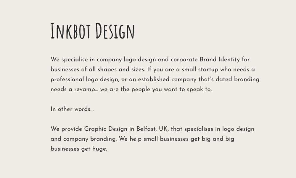
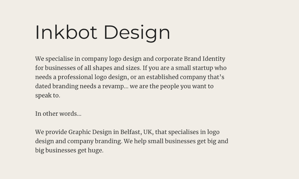
22 Mar Top 10 Beautiful Google Font Combinations in 2020
Top 10 Beautiful Google Font Combinations in 2020
There was a time when almost every website content appeared to be similar.
This was because the knowledge about typography beyond the standard fonts was not known to many.
Furthermore, the availability of different font styles was also limited.
We all depended on the typically same layout, web fonts.
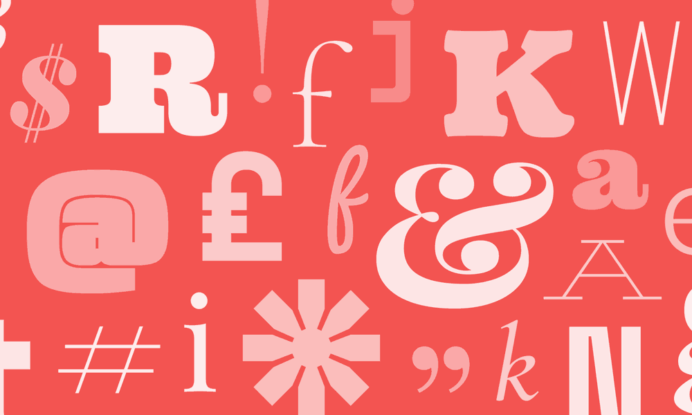
The release of Google Fonts changed every aspect
Things started changing in 2010 when Google Fonts was released.
Being open-source, it allowed the more straightforward and hassle-free execution of customised fonts on web pages and websites.
The process of installation of the Google Fonts is, without doubt, easy and straightforward.
However, you need to aware that every combination of the fonts might not be the right choice.
The right pairing of the fonts is essential
Once you go for the right pairing of the fonts, your business web page will be the optimal example displaying beauty, reader-friendliness and professionalism.
You do not have to burn holes in your pocket with the expensive tailor-made fonts for your website.
Let us have a look at the top 10 Google Font combinations that are trending in 2020.
10 – Oswald and EB Garamond
If you want the headline in your web content to be outstanding irrespective of the weight of the font, Oswald makes an excellent choice.
It can instantly grab the eyeballs.
Moreover, the font also makes a unique appearance while using the body font.
EB Garamond can deliver a unique professional character to your typography.
It is elegant and an updated version of Garamond font.
Main features:
- The combination of Oswald and EB Garamond fonts are best suited for web pages dealing with real estate agencies, elite boutiques, attorneys etc.
- The combo also works great for product description content.
- It is helpful in highlighting the superior quality of the products.
9 – Open Sans and Open Sans Condensed
Open Sans is considered as one of the most versatile Google Fonts.
The combination of both Open Sans and Open Sans Condensed creates magic together for any web page use.
Both the fonts are large blocks of texts, making it easy to read, and an apt choice for the headlines.
You cannot go wrong with the combination that is so simple, yet classy in their ways.
Moreover, the combo is considered as one of the popular and most admired font combinations of the year.
Striking aspects:
- There is perhaps nothing that could go wrong with the combination.
- The combination of the fonts is apt for any blog site, the landing page of a website, business web page, web app and so on.
8 – Raleway and Roboto Slab
Are you looking for a classic, versatile combined with clean and bold typography for your web page?
Well, there is a combo of Google Fonts that gels well.
Roboto Slab is the most versatile and classical font style, that is compatible with the bold and unique Raleway font.
When they both are combined, you get refined typography.
Unless and until you give a try to the combo, you will not be able to realise the magic they both can create together and provide a next-level appeal to the typography.
Some striking aspects:
- The sophistication of Raleway and the simple text style of Roboto Slab together makes it perfect for elite e-commerce sites like designer clothing, upscale jewellery and similar products.
- Both the fonts can be used interchangeably as headlines and body texts.
- You have to find out what works best for your branding.
7 – Roboto and Roboto Condensed
The combo of Roboto and Roboto Condensed is a favourite among web designers, and why not?
The versatility and the extensive range of font weights make the fonts the preferred choice.
Furthermore, the user-friendly and the modernity of the fonts make it dependable for website content usage on several occasions.
Several start-up companies are favouring the use of the pairing.
Striking features:
- You simply cannot go wrong with the combination of both the Google Fonts.
- The fonts work great for any tech start-up company, a contemporary small-scale business venture.
- They will work great with any brand identity with a massive value in the future.
6 – Playfair Display and Source Sans Pro
Playfair Display is believed to have its inspiration from the 18th-century letterforms.
The font no doubt displays an old charm, but with a modern touch to it.
When this old charm font is combined with the futuristic, Source Sans Pro font, there is a creation of engaging typography that is creative, but still practical.
Some points about the combination:
- The combo gives a personal touch to taglines and product descriptions.
- It is apt for web pages that deal with products and graphic design services.
- There is a clean and modern appearance.
5 – Alegreya and Lato
If you look at both the fonts independently, you will find that they both have their unique attributes.
Despite being so different from each other, their combination is just killer.
Alegreya offers a friendly and natural feel.
On the other hand, Lato is considered as one of the best all-purpose Google Fonts.
Some highlighting aspects:
- The combination of Alegreya and Lato gives a practical approach for the web page contents.
- There is a fun element found in the combination.
- They are easy to read and understand, which is very important for web page contents to gain as much as traffic as possible.
4 – Fjalla One and Noto Sans
You may not find Fjalla One as one of the versatile fonts.
However, one of the attractive features of the Google Font is the appeal it can create with the headlines and grabs the headlines instantly.
Whether you write the headlines in all caps, lowercase, small or large, it is bang on.
On the other hand, Noto Sans is an aesthetic and versatile font listed in the Google library.
Despite the language you use in the typography, Noto Sans is one such font that doesn’t demand any formatting for the errors displayed.
It is a universal font.
Highlighting features:
- When you pair both the fonts, it is considered best for landing pages of websites and even for blogs.
- It is also great for long texts that need to be broken down into subheadings.
- The universal character of Nato Sans makes it the right choice for reaching quickly to the international audience.
3 – PT Sans and PT Sans Narrow
PT Sans is yet another traditional font that delivers the old charm at its best, especially when paired with PT Sans Narrow.
The pairing of PT Sans and PT Sans Narrow is without any doubt one of the best Google Font Combinations.
In fact, the pair is in trend this year as well across the globe.
There seems to be no mistake when they are combined.
In fact, they draw immediate attention.
Striking features:
- In either way, the combo works great as body text or a headline.
- Depending on the requirements and the brand value, you can choose between the two.
- The combination is more preferred for contents for software applications, digital business, tech start-ups.
- The font styles are not limited to the few mentioned web pages.
- You can use them in the majority of modern digital communication contents.
2 – Josefin Sans and Amatic SC
The unpredictable nature of both Josefin Sans and Amatic SC makes it essential to implement the combination very carefully and cautiously.
They will surely grab the attention and stand out when you use them.
However, you have to understand that this combo is not for everyone.
It is more on the light-hearted aspect.
It is suggested that you should never use Amatic SC as your web page’s main body text.
Believe it or not, the readers will simply go crazy and will not attract readers.
The highlighting attributes:
- The combination of the unique and light-hearted fonts are best suited for an entertainer, musician or a fun-filled artist.
- The combo works well for niche blogs because of the dominant tone of the fonts.
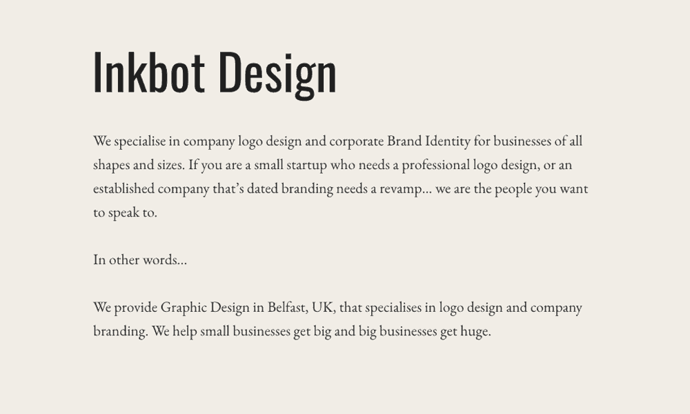
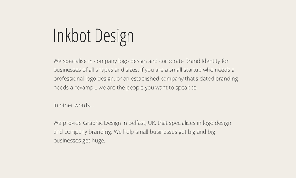
1 – Merriweather and Montserrat
The Montserrat font is the preferred choice among many web designers.
It is for the fact that the font is straightforward, yet highly versatile in nature.
For compatible readability and style, Merriweather pairs well.
The best part is that you use both the fonts interchangeably as headlines or texts for the paragraph.
In either way, they work amazingly well.
The highlighting features:
- The combination of Montserrat and Merriweather fonts does well for online news or any publishing agency.
- Apt for business web pages.
- The combination reflects the right chord between the classic traditional and modern designs.
The above mentioned are the top 10 Google Font combinations that are appealing and beautiful when paired together.
Moreover, they are trending currently in the market.
You can choose any for your web contents and stand out from the rest of the crowd.
Also, see – Top 10 fonts used by professional designers.
Author Bio: Phrona Brown is the author of this article, and she is quite experienced in writing different social media platforms for marketing. She guides about promoting your business on social platforms. For more details you can visit here worldtopthing.com