03 Apr Top 10 Fonts Used by Professional Graphic Designers
Top 10 Fonts Used by Professional Graphic Designers
Graphic design was once limited to beautifying a document, a website, or an object for promotion and marketing.
However, the advancement in web and mobile technology has created a useful tool for communicating messages productively to an audience.
It can include a banner, logo design, slogans, front end of an online store, flyer, brochure, or anything that starts with an idea and extends to the artwork, geometrical shapes, signs, symbols, and fonts.
Among various factors, the font has got a significant role in graphic design as it speaks on behalf of the entire composition.
Professionals have an eye for detail; that is why they know the importance of using a perfect type of font with a suitable size and formatting style.
Designers have individually defined a set of typography rules for utilising certain font types after thoroughly reviewing the project and planning the first draft.
In this post, I have tried to elaborate on various factors to consider while selecting a font and discuss the top 10 fonts used by professional Graphic Designers.
How to select a font type for your project?
A designer combines multiple objects to come up with a highly communicative end product.
With the help of colours, images, and other visual objects, he or she can brilliantly design a copy that communicates the purpose and meaning. Still, the text proves to be a nail in the coffin for a refined design.
One can create a visual context with the graphics, but missing out on fonts can be the most significant sin in communicating precisely what you intend to portray.
The selection of the perfect font types is as significant as adding text or a character intelligently to a design.
To help you quickly select the right type of font for your upcoming project, we are including some valuable tips below.
1 – Make sure the font is legible
Legible here means clean, clear, and readable.
You need to select the type of font that is well developed, and each character is recognisable in small sizes, bold, or italic.
Avoid text that goes blurry, or the characters combine too closely.
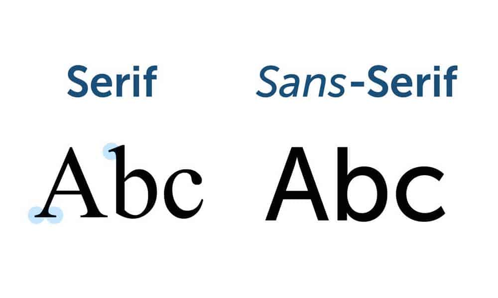
2 – Serif or Sans-serif?
Get to know the kind of font that better use for a specific design.
Serif fonts are the one that have lines at the end of each character.
They are best suitable for traditional or serious purposes.
On the other hand, a sans-serif font type is without the additional lines.
So, it is considered ideal for modern designs. Explore more types to choose wisely.
3 – Take into account the context and audience
Consider the context and audience of your projected design.
Get to know how and where the client is going to display the graphic.
It will give you a good idea to understand how a typical user may look into the design and read the text.
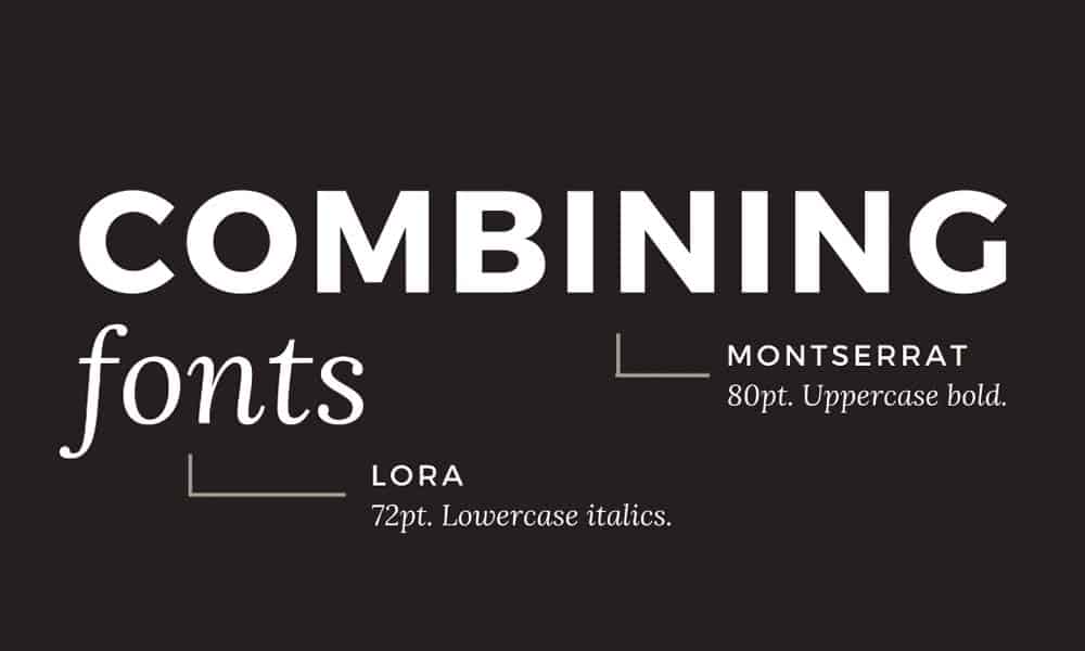
4 – Combine and compare multiple fonts
Shortlisting various font types is difficult, that is why it is always recommended to combine a set of fonts, put them on your design, and compare them at a glance.
The one that is more appealing and attractive gets selected.
Top 10 Fonts Used by Professional Graphic Designers
Professional graphic designers have an industry rich experience of designing for a variety of organisations, both business and not-for-profit.
Over time, they secure expertise in using a variety of fonts.
Their choice of font summarises their expertise in the market that has a lot for the beginners to learn.
Following are the top fonts professional use, and you can use too for excelling in the career of graphic design.
1. Helvetica
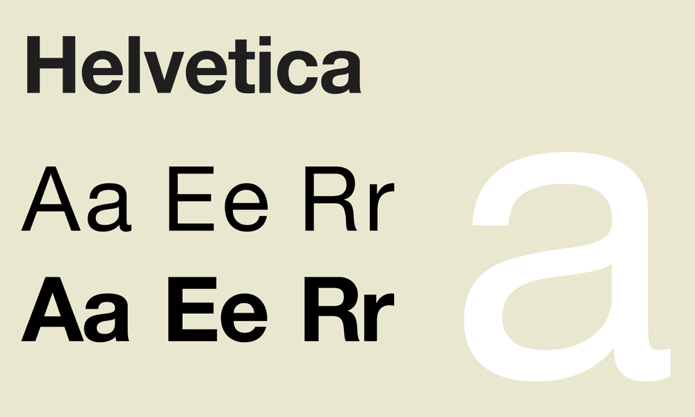
Helvetica is among the widely used fonts by graphic designers, either professionals or working as a mid-to-senior resource.
The likeness of this font varies between professionals as some of them praise it for its unique and simple display, whereas others argue that the spacing between characters is a bit tight.
“You can say, “I love you,” in Helvetica. And you can say it with Helvetica Extra Light if you want to be fancy. Or you can say it with the Extra Bold if it’s intensive and passionate, you know, and it might work.”
― Massimo Vignelli
This may be because of the characteristic differences among designers. In contrast, professional typographers have an eye to every detail; that’s why they classify and use fonts according to the scope and purpose of a project.
2. Garamond
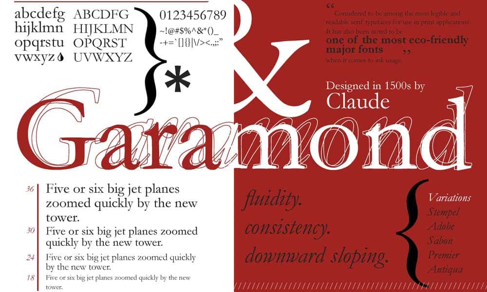
Garamond offers a variety of versions to the community of graphic designers.
Professionals equally like the versions with exception to the Adobe Garamond modification.
It was released in 1989 and has been in practice since then.
It’s bold and subtle style makes it a suitable match for designing websites, textbooks, magazines, and other mediums used for educational purposes.
Its popularity in the design industry has helped it secure the title of the second-best font by a publication agency of Germany. At the same time, Helvetica remains the first on the list.
3. Trajan
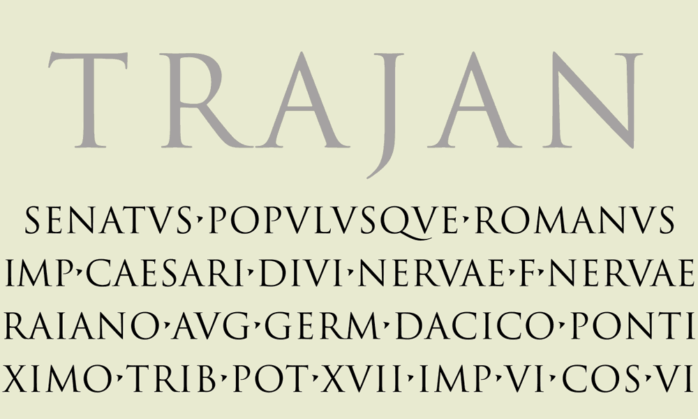
Trajan represents an authoritarian figure among the great variety of fonts because it is the beauty of many Hollywood movie posters.
Take a look at the font, and you will feel familiar as it may remind you of one of your favourite movies of the past.
The extensive use of Trajan exemplifies that it is recommended by the top professionals who are playing a vital in the film-making industry.
Additionally, this font has a symbolic existence that relates to law, religion, marriage, or society.
Whenever professionals have to convey such an aspect, the use of this font seems to be compulsory.
“While designing Trajan, Carol Twombly was influenced by the style of carved letters produced by the Romans during the first century AD. Twombly completed the design, adding numerals and punctuation, as well as a bolder version to allow for text emphasis. Most importantly, her interpretation of the ancient style resulted in a font family whose clarity and beauty come across in modern printed materials.”
4. Futura
Futura suffices the needs of a designer when he or she intends to achieve the maximum in a limited space.
This font type is a perfect match for designing logos, adding slogans to products, typing books, or creating corporate typefaces.
The font has a geometric foundation that’s why you can experience how brilliantly the text makes geometric shapes like square, triangle, or circle.
Like any other font, some people are not happy with the Futura typeface.
However, due to the clean and clear design, most of the designers regard it as a font for forwardness and efficiency.
5. Bickham Script Pro
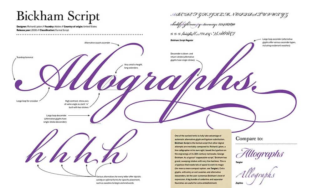
Bickham Script Pro was created with the urge to exemplify the writing as a master’s art.
It was programmed by Adobe in 1989 to be used in-house, but the attractive styles spread soon to the fellow designers in the industry.
This unique and matchless typeface is used for producing visuals or Printables for formal occasions.
It does the task perfectly well in creatively designing readable text.
The simplicity and appeal of Bickham Script Pro have earned a praising mention by Cameroon Moll, an authority in creating a niche, in one of his articles.
Also, see – the Top 6 Cursive Fonts for Logo Design.
6. Bodoni
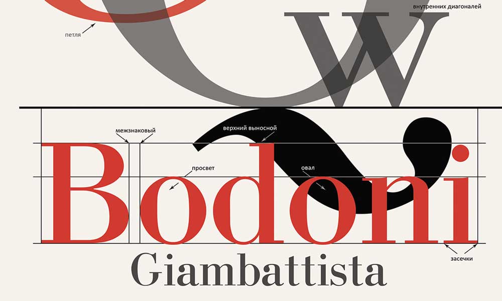
Bodoni has a rich history of serving the designers and artists in pouring their creativity into masterpieces.
The font is famous for its easily recognisable typeface that works best for creating logos, decorative text, and headlines, and specially used by designers in the fashion industry.
“The letters don’t get their pure delight when done in haste and discomfort, nor merely done with diligence or pain, but first, when they are created with love and passion.”
― Giambattista Bodoni
The brilliant combination of thick and thin strokes makes the font aesthetically attractive and mesmerising.
Additionally, a touch of geometrical shapes adds charm to the font.
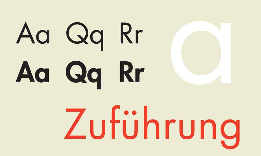
7. Frutiger
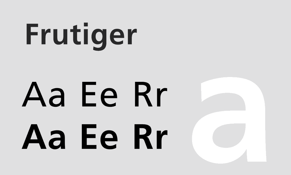
Frutiger is an entire font family that is created by Adrian Frutiger, who is a famous designer from Switzerland.
This typeface is categorised as ‘humanist’ as every character of the font is developed with a focus on clarity and readability.
The designers find it attractive as all the characters are recognisable either typed in small size or looked at from a distance, which is added advantage for any font type to be used by professionals.
Specifically speaking, the font proves to be useful in designing display work and signage, and quite popular in logo making for the web 2.0 platforms.
8. Gotham
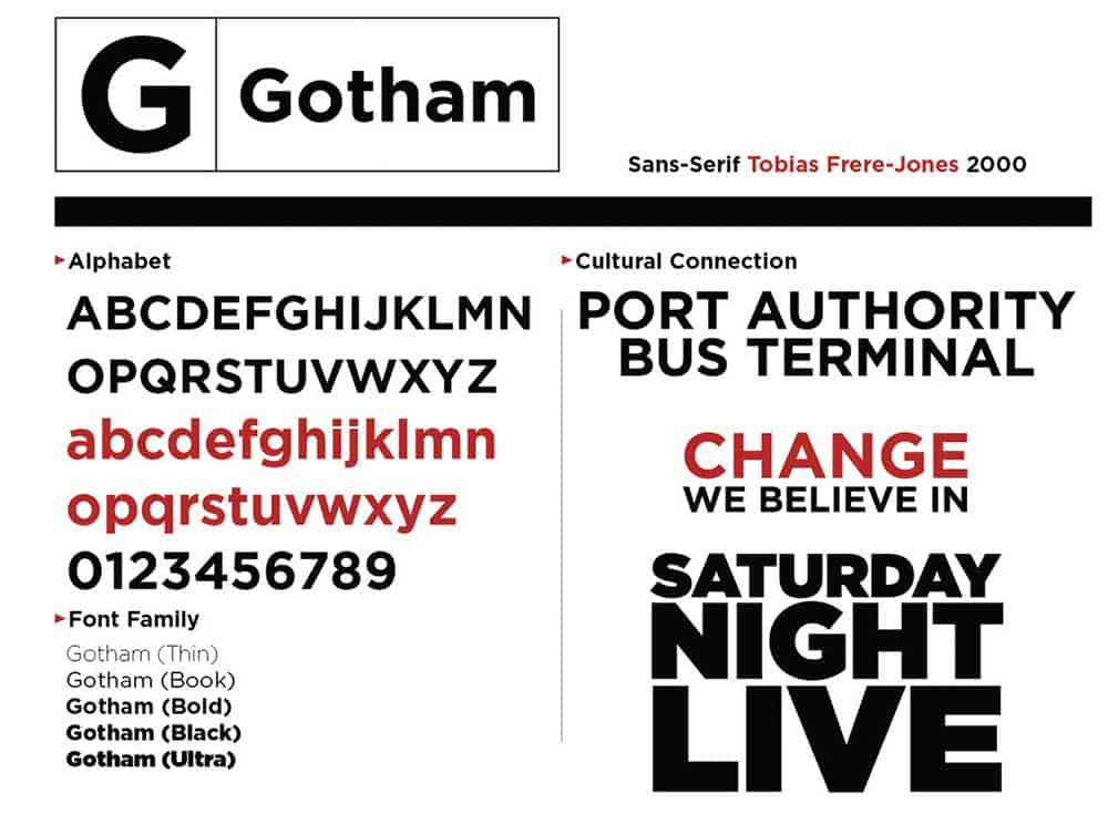
Gotham was introduced in 2000 by professional designers Frere-Jones and Hoefler.
They pursued a type design that is clean, modern, and professional.
Moreover, they have successfully delivered their mastery in the shape of the Gotham font.
That is why it ruled the industry as a favourite typeface for more than thirteen years.
It was also rumoured that Gotham has been a favourite font of President Obama and that he has exclusively used it for posters and flyers in the election held in 2008.
The rumour can be true or false, but the fame of Gotham is real and bold.
9. Caslon
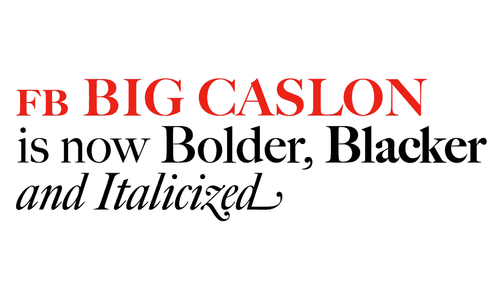
Caslon is named after an eminent designer William Caslon, who has created several serif typefaces and extended it to form a complete family of fonts.
It is the reason that the Caslon font itself is available in multiple versions.
It is the continuing efforts of the design community that today we have a set of beautiful fonts like Caslon that are deemed fit for designing the body content.
Besides being a corporate typeface, we can see the practical implications of Caslon in lots of books, journals, and magazines both online as well as offline.
Among the different revived versions, the Adobe Caslon and Adobe Caslon Pro have got a considerable amount of fame and limelight.
10. Rockwell
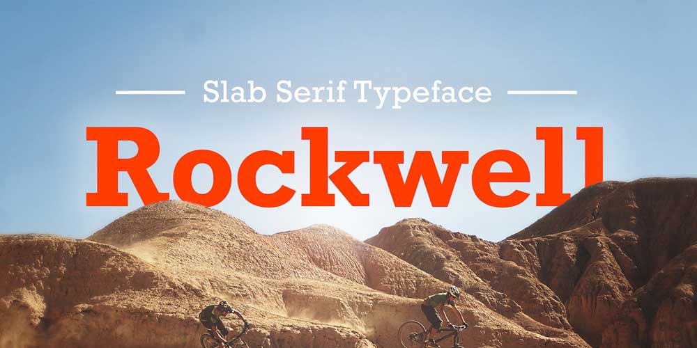
Rockwell is a product of Monotype Corporation and was released back in 1934.
The font is known to be easily recognisable if used for small size or display designs.
Being categorised in the slab serif, the mono-weight design feature makes it similar to the horizontal strokes.
The distinct design of this font is derived from geometric shapes.
It is used for adding value and charm to the end product.
Rockwell has a luxurious design that can suffice most of the needs of a designer while keeping the quality intact.
Final thoughts
Designers have a varied list of their favourite top 10 fonts.
They have kept all of them in a queue to quickly refer to the one that offers a distinct design and meet the business needs.
The above-discussed top 10 fonts are the popular ones, through the selection may differ between professionals and niche experts.
Author Bio: Asad Ali is a digital marketing expert having more than eight years of experience in the web design industry. He is currently working at GO-Gulf – a Dubai based custom web development company where he is working on SEO projects, design optimisation, conversion optimisation, and targeting relevant audience for the clients. You can reach him on LinkedIn.