
06 Jan Top 10 Superhero Logos & Symbols
Top 10 Superhero Logos & Symbols
In today’s world, we tend to be bombarded by logos on a daily basis; this can typically be found on our clothes, phones, cars, streets, and just about everywhere we look.
For starters, a logo is a trademark or symbol a company uses to differentiate itself from others.
In other words, they represent a clear image of the company.
As we all know, a picture can tell a thousand words, and most people find it way easier to remember a simple image as compared to words alone.
This is exactly why companies should try their best to get the perfect logo for their brand.
For the most part, logo design is one of the most challenging aspects of graphic design.
The primary challenge of logo design is to take an idea and compress it down into a symbol that’ll stick to the mind of the public.
To be successful with this endeavour, the public has to see your company as a superhero.
Unlike many companies, these defenders of humanity cannot publish press releases or carry out marketing campaigns.
In essence, they express just about every relevant facts about themselves via their wordless cartoon character logo.
The bottom line is, there’s a lot you can learn about logo design from these simple yet engaging superhero logos.
You may also find the top 10 alchohol and beer logos interesting – take a look!
Here are the top ten superhero logos to consider.
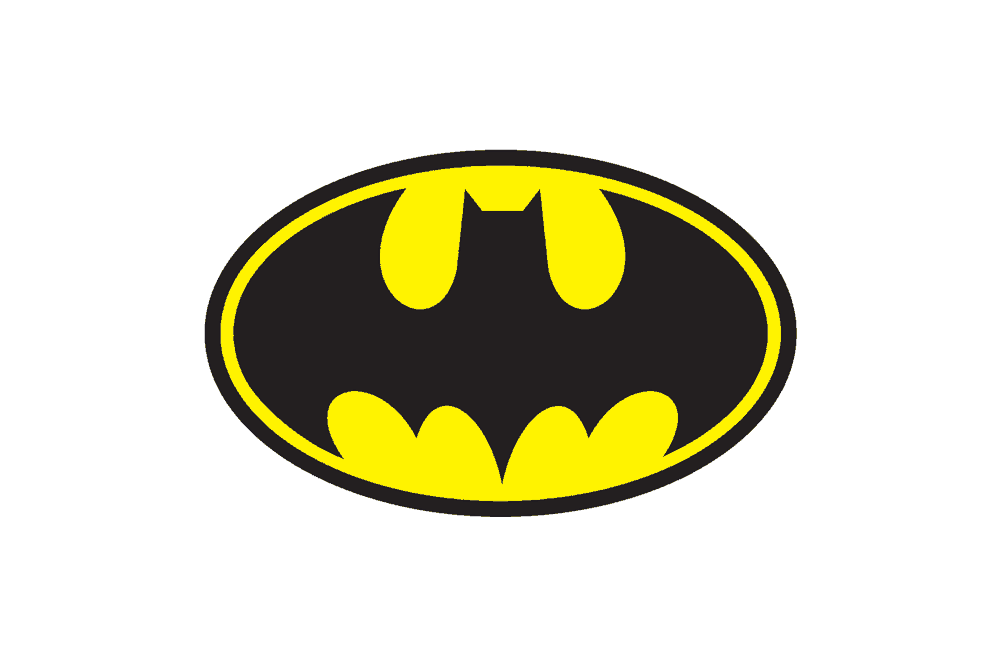
1. Batman Logo Design
First on the list of superhero logos is the Batman logo.
This mysterious superhero has a dark logo coupled with an attention-grabbing yellow accent.
For the most part, the bat depicts the name of this dark hero of Gotham.
As we know, Batman does not possess any superpower like Superman, and that is exactly why the inclusive oval shape works best for this logo rather than a form that portrays any supernatural abilities.
2. Superman Logo Design
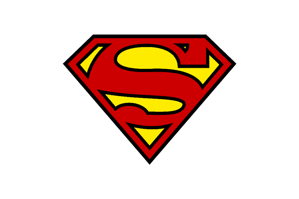
Everyone knows the Superman logo.
Even a ten-year-old can easily draw it thanks to its simple and colourful design.
Now, the simplicity of this design does not mean there was no attention to detail; in fact, there’s a lot to learn from this logo!
For starters, it features an upside-down triangular shape which represents strength, and it is also the form of the world’s strongest mineral, the diamond.
Moreover, the design of this logo can be linked to a strong male torso; in essence, placing it on the hero’s shirt puts more emphasis on the muscular physique.
To sum it up, the red and yellow are bold and super attractive enough to capture people’s attention.
3. Captain America Logo Design
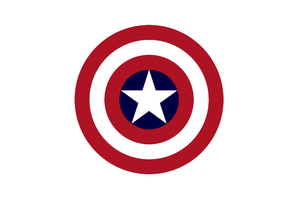
The Captain’s shield is entirely decked out in the recognise of Old Glory; the red, white and blue.
This is the perfect colour design for these superhero logos.
Why? Well, it is because his origin is his creation by the U.S. government in their Super Soldier project meant to develop the perfect soldier to fight the Nazis.
We also appreciate his patriotic origins by looking at his badge.
The white star located in the centre of his shield is a clear reference to the American flag.
Also, the alternating circles of red, white and blue refer to the traditional meaning of the circle shape which portrays infinity, power, and energy.
If you consider the Captain’s Super-Soldier origin, you will find that the use of businesses in this logo is excellent.
All in all, the Cap’s shield is a fantastic example of the simplicity of great design when it is conceived and executed intelligently.
4. The Flash Logo Design
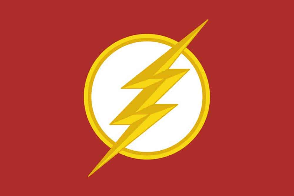
Just like Superman, we get to see another combination of red and yellow that makes a significant impact.
The Flash’s personality is excellently represented by these bold colours choices, and the lightning streak portrays his unmatched speed.
Moreover, the circular shape of the logo is very friendly, and it is just perfect for the community-friendly goals of this super-fast superhero.
5. Green Lantern Logo Design
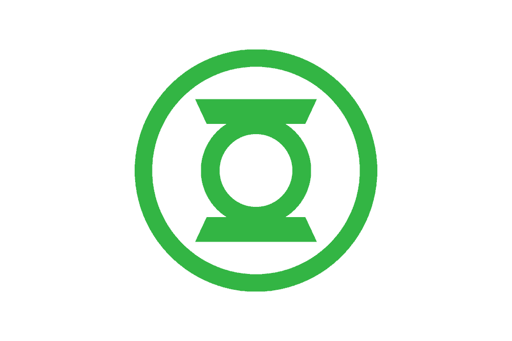
For starters, the logo of this superhero comes in a predictable colour, which is green.
The primary shape is a unique looking lantern.
If you take a closer look, you’ll find that the lantern inside the outer white circle looks more like a bulls-eye.
One other thing is that the several rings present in this logo are a common theme in superhero logos, but they are more appropriate for the Green Lantern since he has a ‘power ring’ which happens to be his main tool.
The good thing is that everyone will be able to recognise this logo thanks to its simplicity and unique attention to detail.
6. Punisher Logo Design
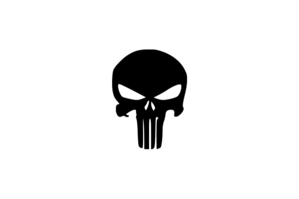
The Punisher is not looking to portray a friendly image; his purpose of being a hero is to avenge the death of his family by punishing villains as well as other organised criminals.
In essence, his logo is anything but friendly.
The central image is a uniquely designed skull coupled with elongated teeth which add to the frightening impression.
Well, we can see that this particular superhero is scarier than the others on this list and the logo says it all.
7. Spiderman Logo Design
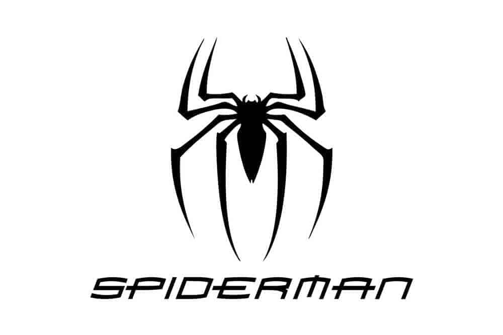
For Spiderman, we get to look at an exclusively symbol-based superhero logos.
Regardless of the illustration and shape, it takes, Spidey’s logo is the spider – black with eight legs, ring a bell?
We all know that Spiderman was bitten by a radioactive spider which gave him all his superpowers – spider senses, increased strength and so on.
As I mentioned earlier, the spider is black, and it is featured on a red background.
It’s also important to note that the design uses a strong contrast with a neutral colour.
You’ll also find that Spiderman’s logo is more of a silhouette devoid of any features.
The great thing is that this lack of detail allows the design to be universally valid; in essence, people can focus their attention on the spider theme instead of being distracted by unnecessary details of the design.
8. Catwoman Logo Design
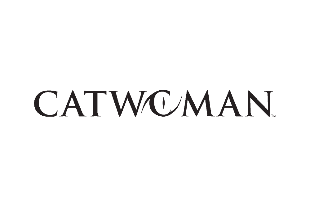
This logo adds the gracefulness of a cat to the best principles of a logo.
The Catwoman logo features the circle which is cool for the concept.
The colour palette is primarily stark black and silver. If you take a closer look, you’ll find that the logo takes the shape of a cat’s eye but its visual interest springs from its off-centre position.
What’s more? The edges are sharp, and the 3-D appearance adds more life to the unusual nature of the logo.
The combination of these elements is the perfect depiction of this super-heroine.
9. Wonder Woman Logo Design
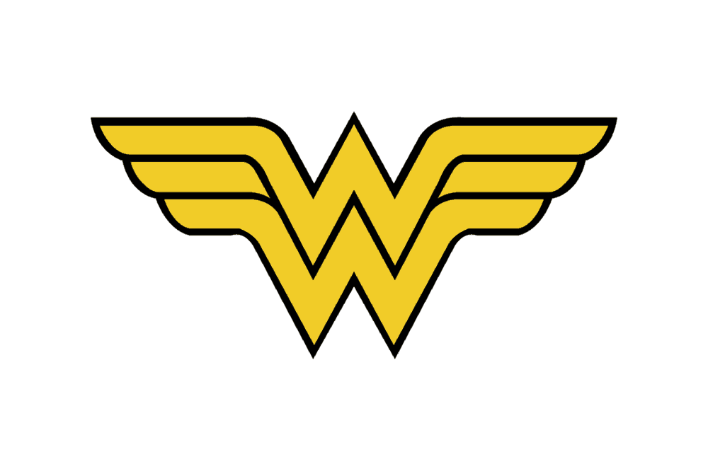
The cleverly entwined double ‘W’ depicts the superwoman’s name.
However, they also the shape of a bold bird with spread wings.
Why is this relevant? Well, it’s only because her most used superpower is the ability to fly.
Moreover, the motif which features red, white and blue colours coupled with the stars is very patriotic and also has a perfect link to the superheroine’s costume.
10. X-men Logo Design
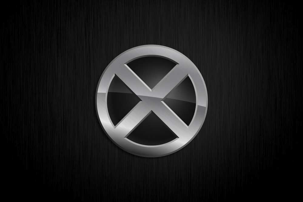
Last but not least is the X-Men logo.
Everyone knows that X-Men is a crime-fighting group that can be recognised by ‘X.’
We can conclude that the light in the centre represents knowledge since the group operates an Institute for mutants like themselves.
The great thing about this logo is the grayscale colour palette coupled with the relative lack of images; this excellent combination makes for a simple yet memorable logo, and that is exactly what your company needs!
So there you have it!
Well, it is pretty obvious that every company would love their customers to view them as a superhero; a benevolent presence that brings a solution to their problems instead of complicating them.
If you find this to be a significant value to your company, then be sure to try out some super logos yourself!
The bottom line is, there are quite a lot of things to learn from these superhero logos that are sure to help you communicate a message that catches on and sticks to the mind of your customers.
The post Top 10 Superhero Logos & Symbols is by Stuart and appeared first on Inkbot Design.