
07 Jan Top 5 Graphic Design Tips to Boost Your Brand
Top 5 Graphic Design Tips to Boost Your Brand and Raise your Conversions
Graphic Design will forever be a core part of any marketing initiative and brand development.
After all, the best way to attract people’s attention is through visual elements that evoke emotions, trigger actions, and promote brands.
If you’re publishing a blog post, adding stunning graphics will make your articles look more punchy and enticing.
If you’re sending emails, using the signature generator by Wisestamp enables you to add amazing graphics to your email signature (among other functionalities) to make you look more professional and trustworthy.
If you’re publishing social media posts, adding crisp and interesting-looking graphics will make your posts more captivating and click-worthy.
That is why graphic design is essential, especially in boosting conversions and raising brand awareness.
Apply these graphic design tips to take your marketing and sales campaign to the next level.
1 – Start With a Design Objective
Whether you are starting from scratch or revamping your company’s brand, it is crucial, to begin with a graphic design objective.
It provides a structure for a complex project.
A well-defined objective will also help you validate the success of your campaign.
Before you even start designing, consider these questions:
- What do you want to achieve with this graphic design project?
- Do you want to increase lead conversion by triggering action?
- Do you want to boost brand awareness?
- What kind of image do you want to portray?
- What assets are you designing? Your website? Printed ads? Corporate assets?
While you are at it, create a visual style guide for your business and brand.
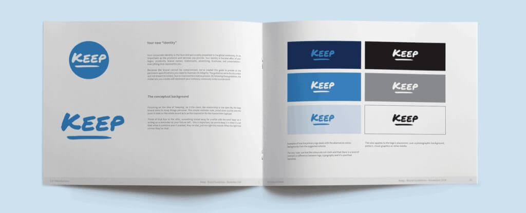
It is one of the essential business documents, and yet many organisations don’t have one.
Style guides, or brand guidelines, include all the necessary visual and design information applied to every aspect of your business assets, from product designs to marketing materials.
While developing such a document takes time, it will make your life a breeze when designing your website, letter headers, posters, video promos, and every single visual asset of your brand.
So, what should you include in your style guide? Start with these elements:
- Define the logo design, its size, and its proper placement in a design.
- Set the colour palette, including the dominant and accent colours.
- Choose fonts that reflect your brand identity.
- Select icons to give your brand an edge.
- Define the image and photographic styles for your brand.
These are just the beginning of your style guide. Add as many, or as little, details as you deem necessary.
As your business grows, designers will refer to this document without your intervention for a more efficient workflow.
It also ensures consistency, which is a critical element of brand recognition.
2 – Use the Right Colours
Colours trigger emotions and feelings on sight. That means that picking the right colour palette is crucial when developing a brand image.
About 85% of consumers claim that colours significantly affect what they buy.
As such, it is also essential if you want to convert leads into customers.
Colours impact practically all parts of your business.
There’s a reason why large companies experiment with something as small as button colours.
Primary Colours Define Your Brand Image
The dominant colour in your website or your product design sets the vibe of your overall brand image.
Think of popular fast-food restaurants and the colours that they use.
Do you wonder why red is such a popular colour in this industry?

Here are some basic colours and the vibe that they portray:
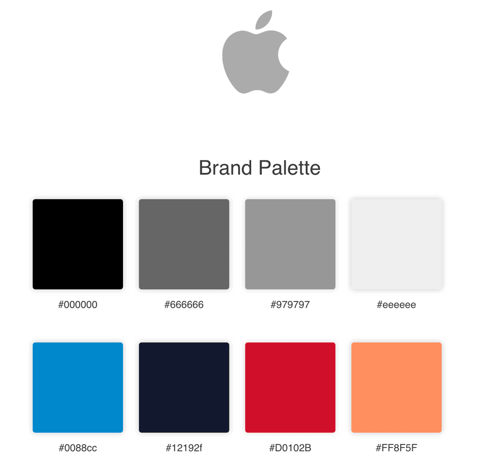
- White – User-friendly, sleek, minimalist, and sophisticated. For example, Apple.
- Black – Luxurious and elegant. For example, Chanel.
- Brown – Mass appeal or a product that fits anyone. For example, UPS.
- Blue – Reassurance, dependable, and professional. For example, American Express.
- Green – Nature, organic, and fresh. For example, Whole Foods.
- Purple – Distinguished, royalty, and high-quality. For example, Cadbury.
- Yellow – Happiness, and optimism. For example, Nikon.
- Orange – Fun and friendly. For example, Nickelodeon.
- Red – Excitement, happiness, and intensity. For example, McDonald’s.
If you already have a dominant colour in your logo, it is logical to choose it as your primary colour.
Play with shades and colour intensity depending on the brand images that you want to carry.
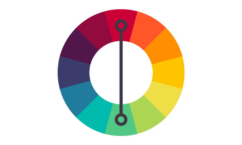
Secondary Colors Add Personality
Secondary colours include accents, background colours, font colours, and colours of other elements in your visual assets.
While a primary colour sets your brand image, secondary colours highlight essential details, underscore call-to-actions, or guide leads towards products and services.
It is also important to play around with the proportions of your color palette and how much of each color is applied to the design. – Shillington Education
An excellent starting point for secondary colours is to explore your primary colour’s complements in the colour wheel.
Experiment with different shades, tints, hues, and various characteristics of colours that will make your product, website, or printed media visually appealing.
However, be careful in choosing too many secondary colours.
Potential customers may end up confused if you inundate them with a barrage of colours.
A good rule of thumb is to choose one or two secondary colours on top of your primary colours.
3 – Take Advantage of Space
Spending time on the strategic use of spaces is as important as developing your design’s visual elements.
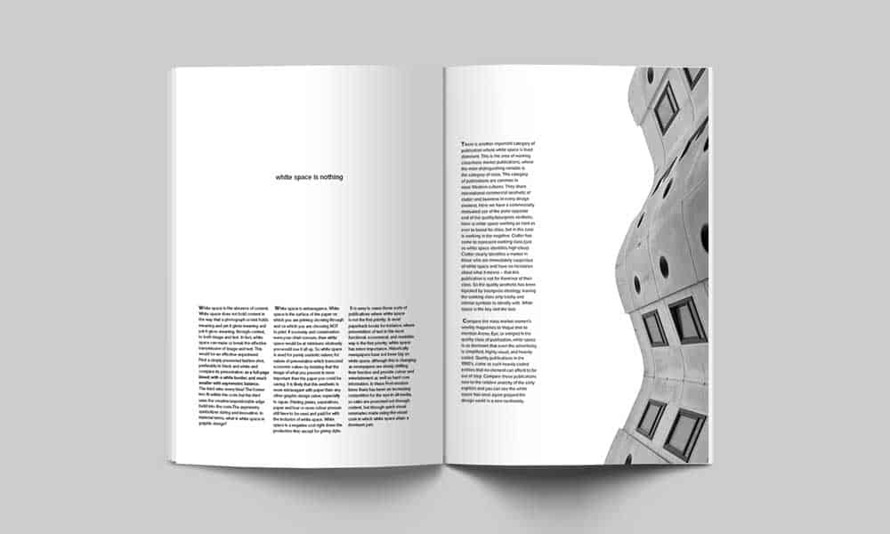
White space is an essential part of all graphic design tips that holds all of your design elements together.
Using space correctly may give your brand an edge over your competition.
Don’t be afraid of white space Integrating space between the elements of your design is called ‘white’ or ‘negative’ space. – Shillington Education
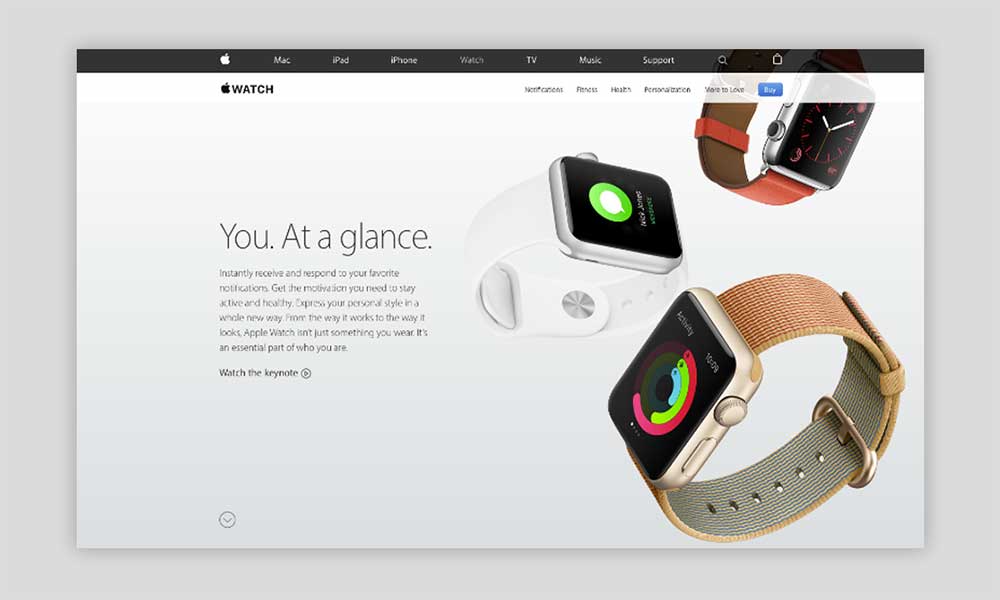
Observe the recent trends in product and web design where simplicity, and even minimalism, is becoming more popular.
For instance, the Apple website effectively uses large empty spaces to direct the visitors’ eyes towards its products.
Here are some of the ways that you can use spaces in your design:
- Improve comprehension – Proper use of spaces between lines of paragraphs and margins dramatically increases the reader’s understanding. Furthermore, it makes content more scannable, which is critical, especially on websites.
- Enhance focus – Like the example above, spaces guide users to the most critical part of the page. It immediately directs the visitors towards elements that you want to highlight.
- Group elements together – The brain automatically groups things that are close together. Spaces provide organisation to your visual design, which helps customers make sense of your message and brand.
- Boost interaction rate – The sooner leads know what you want them to do, the better the chance of converting them into customers. Placing call-to-actions in a field of space increases that likelihood of interaction.
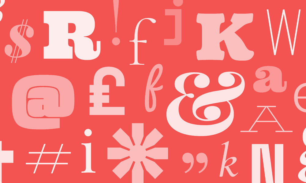
4 – Add Personality Using Fonts
With millions of styles available, it isn’t easy to choose the right font that will perfectly fit your brand image.
Just like colours, font evokes emotions, feelings, and vibes that affect your overall brand identity—as such, experimenting with different font styles should be a part of your style guide development.
Knowing your brand personality is an excellent start when choosing fonts.
It should be legible while communicating your brand personality.
- Hyndman, Sarah (Author)
- English (Publication Language)
- 144 Pages – 05/01/2016 (Publication Date) – Gingko Press (Publisher)
There are six font classifications where you can start your experimentation.
Here are the primary “font personalities”:
- Serif fonts – Traditional, trustworthy, and classic. Established brands such as Vogue and Time Magazine use Times New Roman, Baskerville, Lora, EB Garamond, and similar fonts.
- Sans-Serif fonts – Cleanliness, simplicity, modern, and minimal. It is popular among modern companies such as Netflix, Facebook, and Youtube. Some examples are Open Sans, Roboto, Arial, and Helvetica.
- Slab Serif fonts – Confident, bold, rugged, and quirky. It evokes tradition with a modern touch, such as in Sony, Honda, and Volvo. Roboto Slab, Courier New, and Rockwell are some examples.
- Script fonts – Elegance, uniqueness, and distinct. These are designed to mimic cursive handwriting, albeit with cleaner lines. Companies such as Ford, Johnson & Johnson, and Cadillac use fonts such as Allura, Pacifico, Lucida Script, or something similar.
- Handwritten fonts – Artistic, fun, and informal. It is popular among smaller companies that want to portray an approachable brand. Some of the most popular fonts in this category are Permanent Market, Knewave, Amatic SC, and Patrick Hand.
- Decorative fonts – Dramatic, distinctive, and stylish. It includes some of the most diverse font styles around. IBM, Lego, and Disney are excellent examples.
Stick to one or two brand fonts to represent your image. More than two will result in a confusing and cluttered design.
For longer content, such as in your website, it is possible to add a third one that does not clash with the other two.
After narrowing down your choices, there are a few considerations before finalising your options:
- Fonts must be flexible – Your chosen fonts should be suitable for all types of mediums such as web, mobile, and print. This allows consistency, which increases brand recognition among potential customers.
- Define multiple font weights – Font weights such as regular, light, bold, and semibold adds diversity to your design without cluttering it with different font styles. In your style guide, define which font-weight is appropriate for a particular medium. For instance, website headers usually require bold fonts for emphasis.
- Fonts must be clear and legible – Your chosen fonts should be easy to understand and read. Examine its clarity in different forms such as the alphabet, numbers, lowercase, uppercase, symbols, and more.
5 – Use Icons Strategically
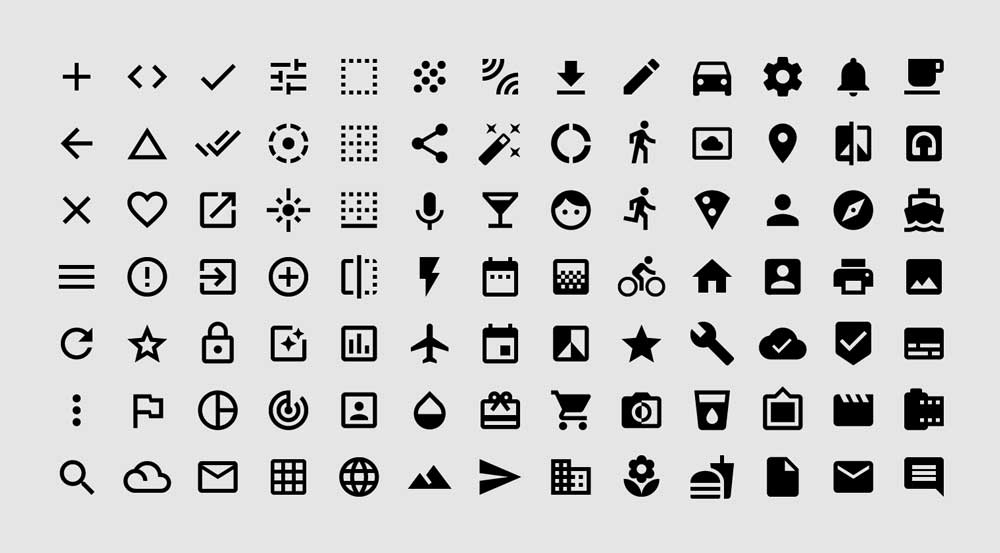
Iconography has been part of the human experience since the dawn of time.
They are used as cues to trigger memory, action, and even convey information.
In modern graphics, icons are used to fill the gap between photos and words. They provide essential benefits, such as:
- Easy and quick to recognise. Popular icons such as “home,” “play,” “pause,” and “like” are so ingrained in modern living that anyone can recognise their meaning. The familiarity of these icons helps convey meaning quickly.
- Save space. The compact form of icons means they can be used even on displays with limited spaces without losing the meaning or the overall visual impact of the design.
- Excellent touch targets. In mobile design, icons are excellent touch targets as they do not occupy much space. Standard icons are around 48px by 48px or 1cm by 1cm. Their size is easy enough to hit with a finger or a cursor in a computer.
- Transcend language barriers. Icons serve as a bridge that words sometimes cannot do. For instance, an envelope icon is easily recognised as “message” whether you are in the United States or Japan.
Just like any graphic design elements, you need to be strategic in using icons.
Overusing them will make your design cluttered.
On the other hand, if you are not using enough, you are missing key design opportunities.
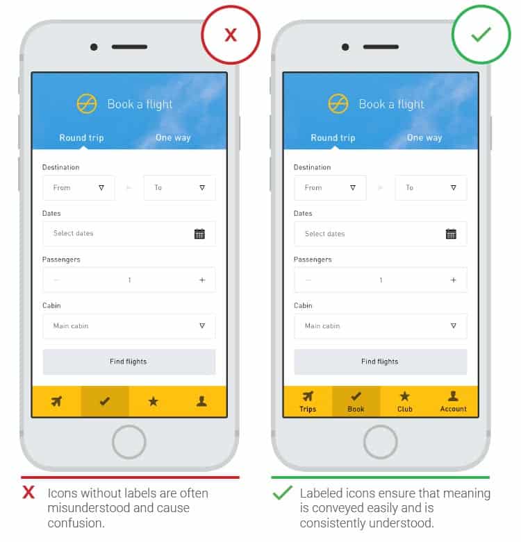
So, when do you use icons?
Here are three critical graphic design tips on scenarios:
- Serve as a common visual language – As mentioned above, some icons are easily recognised by users from different backgrounds, nationalities, and languages. Use familiar icons to drive your message to a larger audience. For instance, a lightbulb icon is excellent if you want to convey an idea or a concept.
- Grab the user’s attention – Icons are flexible as you can modify their design and still carry the same message. Use contrasting colours on icons to make them pop even further. For example, you can use a stop icon to make a reader pause and focus on a block of information on your website.
- Show functionality and feedback – If you observe product designs, icons are crucial elements used to communicate an idea quickly and provide feedback. Imagine how a video player uses the play and pause icon to signify what users can do and its associated actions.
According to the book Universal Principles of Design by William Lidwell, icons fall into four categories.
These types will help you choose the right icon to use in a design.
- Similar icons – Excellent in showing simple concepts and actions using simple design elements such as shapes and lines. In video players, arrows or triangles pointing to opposite directions indicates the rewind or fast forward functionalities.
- Example icons – Use of images of objects that are commonly associated with a concept, thing, or action. The picture directly exemplifies the message that it wants to convey. For example, an aeroplane icon on road signs indicates airports.
- Symbolic icons – Use images to represent an object, action, or concept at a higher level of abstractions. Typically, established and well-recognised items carry complex information or ideas. For instance, unlocking functionalities or elements in Adobe Photoshop uses a padlock icon even though there is no interaction with an actual padlock.
- Arbitrary icons – Images in these icons bear no resemblance or connection to the target concept. That means the relationship between the icon and its meaning needs to be learned using repeated exposure. These are often used to introduce new icons or associate an icon with a brand. An excellent example is the 3-line “hamburger” icon, which is on its way to becoming recognised as the menu icon.
Conclusion
You lose big time if you don’t incorporate stunning graphics in your marketing and branding initiatives.
On the other hand, when you do the opposite, you drastically increase your chances of generating audience engagement, sales, and even establishing your brand authority/image.
The best part is, with the myriad of free tools available, you don’t have to break the bank to get your hands on stunning graphics.
What graphic design tips have we missed? Let us know in the comments below.
Last update on 2021-01-07 / Affiliate links / Images from Amazon Product Advertising API