15 Apr Top 6 Tips for Pricing Page Design with Examples that Convert
Top 6 Tips for Pricing Page Design with Examples that Convert
Creating an effective pricing page is essential to your business; after all, it is your biggest sales pitch. It’s arguably the most important page on your website.
That said, you have to apply some tact to appeal to potential customers. You want customers and potential customers to complete a transaction before leaving your site. To have a well-converting pricing page, you should start by following the design tips in this article.
To show how you can implement these recommendations, we’ve also included some helpful examples from Trust & Will’s pricing page — which does an excellent job of creating a compelling and effective presentation of their pricing options and benefits of their services.
Let’s dive into some proven pricing page principles you can apply to your design.
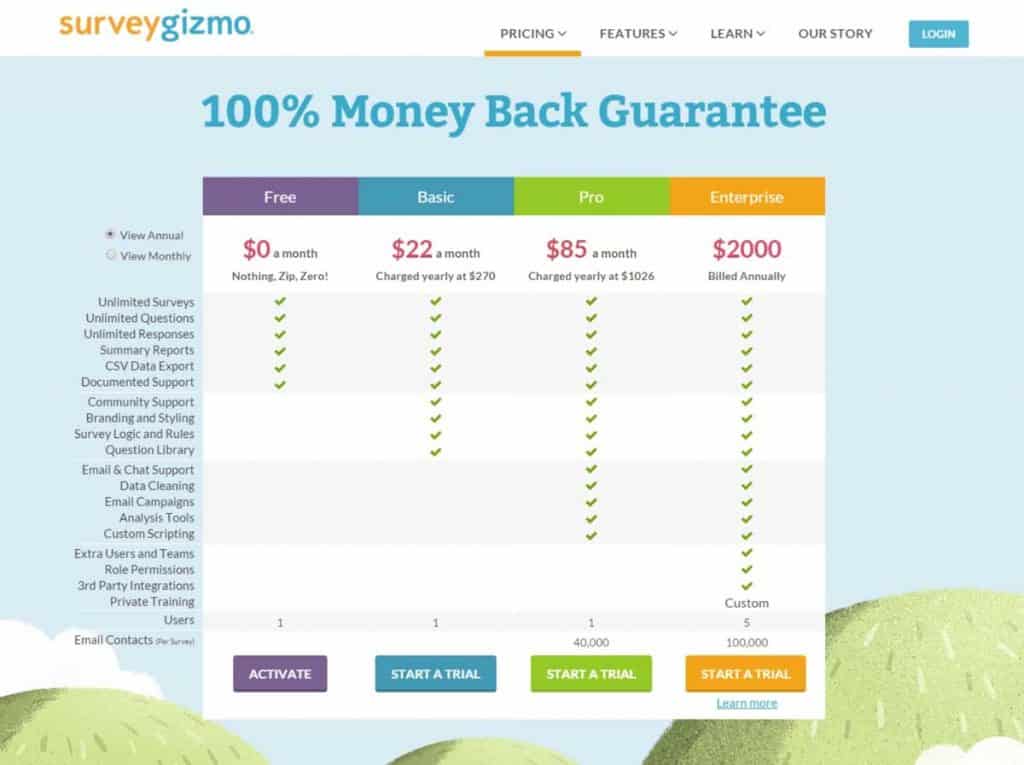
1 – User-Friendly Formatting
You want your pricing page to be easy for the user to navigate. User experience is essential on any business website, but even more crucial on a page that converts into money earned.
This page mustn’t be a source of frustration. Keep the design simple, drawing focus to the critical components of your pricing.
For example, you want to make a section for your pricing tiers (if applicable), what’s included in your prices, details about the difference between the levels, and any specials you might be offering at the time.
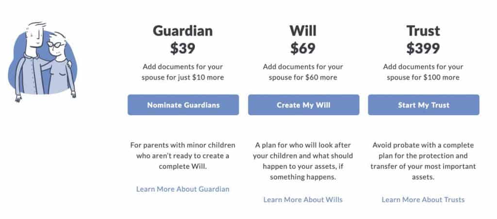
You should put the information about each tier in the same order, in a table-like layout. Avoid distracting colours, design elements, and heavy copy to keep users focused on the most critical information.
Example of direct and easy-to-read pricing page
Image Source: Trust & Will
2 – Clear, Concise Language
You don’t want to conceal how your pricing works in verbose or confusing language. Instead, you want to convey how much your goods or services cost with the persuasive and straightforward copy.
You also need to include your pricing. Just don’t give them too many pricing options, which can be overwhelming and confusing.
Stick to around three price points if possible. If it’s difficult for users to find accurate prices and descriptions, they’re likely to become frustrated and move on in their search.
Many businesses are worried about scaring potential customers away by putting costs on their site. However, not doing so can do the same thing.
People like transparency when they’re shopping, and if they can’t get that from you, they might just go to a competitor.
Giving different pricing tiers is a great way to not only be transparent about your prices but also attract customers at multiple price points.
If you’re worried about how high your prices are, there are tactics you can use (more on that later).
The most important thing is to provide the user with all the information they might need to make an informed purchase decision that way you give them all the tools necessary for them to complete a transaction on your site.
3 – Benefit-Driven Copy
Highlighting the benefits of your services is an integral part of moving a prospective customer to conversion. Users want to know exactly how your service works for them to make an informed decision.
Being too broad in your copy might turn off a potential customer. This is because the biggest challenge you need to overcome to make a sale is to convince shoppers that your product or service is worth the investment.
Make sure your copy is data-driven, informative, and well-written to entice users to want to try out your service.
That said, you don’t want to ignore the doubts or concerns that may be running through your customers’ heads.
Instead, provide answers and address these issues by showing them how your offering is a solution, and the best one at that.
Think about any question that could potentially be asked by a first-time user to your site. You want to make sure you answer all of these questions so that there isn’t a single question they need to inquire about before making their decision.
For example, if you offer a money-back guarantee or other risk-mitigating policies, this will likely be something you want to highlight in your copy.
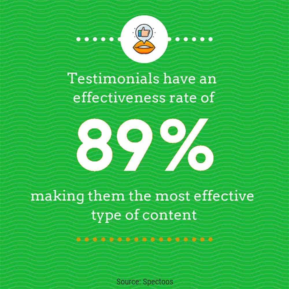
Featuring testimonials through the page can also help address fears while letting others do the talking for you. Testimonials are considered the most effective type of content. With a content effectiveness rating of 89%, you want to make good use of these essential conversion tools.
Testimonials are a great way of having a third party highlight why your company is the best choice for the job!
You can easily feature testimonials from your social media accounts, ask well-known publications to try out your service and give you a review on what they think, or showcase long-standing customers on your pricing page.
Using testimonials not only shows the areas where your company exceeds expectations but also indicates that there are people out there willing to recommend you.
These days, reviews are one of the most utilised tools for customers to consider before deciding on an online purchase.
Example of how to highlight testimonials on your pricing page
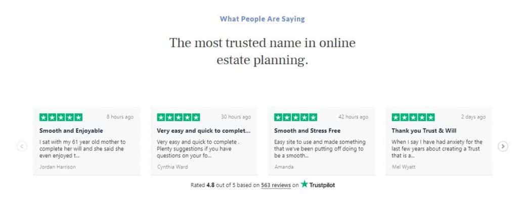
Image Source: Trust & Will
4 – Use CTAs
Calls to action, or CTAs, are a valuable tool for any page of your site, but especially the pricing page.
The purpose of a CTA is to persuade the shopper to take action, whether that’s contacting you for a quote, making a purchase, or signing up for a free trial.
If you offer a free trial or discount for new customers, this is where you want to highlight that information.
Example of a noticeable, actionable CTA

Image Source: Trust & Will
While it’s essential to have CTA’s throughout the page, not all CTA’s are created equal. Think about the best way to convey what you want your users to do. To have an effective CTA, you need to:
- Use a compelling message
- Use contrasting colours that make them stand out
- Strategically place them
- Diversify your CTAs to accommodate users at different parts of the customer journey
Keep in mind that less is more when it comes to CTAs. You don’t need to give heaps of information about what your user should do.
Make an easy to read call to action with a simple, easy to find button for your users to click on to send them in the right direction.
Use them sporadically in places that make sense instead of having them everywhere on the page.
5 – Decoy Pricing Model
As we mentioned earlier, there are pricing strategies you can use to make your offers more appealing.
One of those strategies is a decoy pricing model.
This strategy helps you shift how shoppers perceive your pricing by using a decoy pricing tier.
This price strategy helps skew customers toward your highest offer because of the perceived value it has over the middle option.
It’s essential to give customers options on your pricing page. Some customers are only willing to pay so much for a service, making a budget option a great thing to include.
Additionally, some customers want the best value for their money, therefore adding tiers with more offerings will entice some customers to purchase more.
This is especially effective when it’s laid out in a table that lays out what each provides (with an emphasis on the highest tier).
Usually, with this tactic, three pricing options works best. To further draw the user to the highest price offering, you can also highlight that part of the pricing table, unconsciously drawing them to that option.
6 – Keep Branding Consistent
While you might be tempted to venture into an exciting new colour scheme, it’s essential to keep your branding consistent across all of the pages on-site, especially the pricing page.
If you use a white background with blue accents on your homepage, use this same colour scheme on your pricing page. You also want to make sure the copy across your site is consistent in wording.
Customers want to trust sites that are well-designed in terms of branding and copy.
Keeping your branding consistent helps avoid confusion and ensures that users associate your pricing with your brand. And, if they don’t decide to make a purchase or sign up today, they will be able to keep your business (and prices) in mind for the future.
Final Notes: Tracking Performance of your Pricing Pages
Just like the rest of your website, you shouldn’t set it and forget it.
To ensure that your pricing page is working, you should review metrics like time on page, bounce rate, and conversion rates.
You could even use heat maps to see which aspects of your pricing page are being engaged with most.
As with any marketing tactic, you may also need to test different elements to see how they resonate with your users.
If you do not see the response you had hoped for, make some tactful changes to see if you can
improve the above metrics.
While every business has their unique needs and customer idiosyncrasies, these web design tips are a great starting point for creating a pricing page that is both useful to shoppers and an effective sales tool for you to grow your business.
Author Bio: Alexis Maness has a Bachelor of Science in Integrated Marketing Communications and is a contributing editor for 365businesstips.com. As a professional content writer, she has over five years of experience and is a contributing writer for several San Diego magazines. Alexis specialises in topics related to business, marketing, finance, and hospitality and tourism.
Top 10 Books on Landing and Pricing Page Optimisation

- Amazon Kindle Edition
- Fonseca, Gleison (Author)
- English (Publication Language)
- 121 Pages – 03/28/2020 (Publication Date)