18 Aug What Do Most Successful Logo Designs Have In Common?
What Do Most Successful Logo Designs Have In Common?
Everyone knows how vital logos are.
They’re the foremost example of your brand, no matter what market you operate in or who your audience is.
Those small, often simple pieces of graphic design are usually the first method of contact with your customers.
Clearly, the better your logo design is, the more successful it will be at helping to brand and grow your company.
What makes a successful logo design?
Is there any way to break down the common denominators and find a surefire way to create the best logo ever?
Let’s take a look at what research tells us about common factors in successful logo design, and analyse what that means for you.
Importance Of Adaptability
This is a hugely important factor in a successful logo, but it often gets pushed to the back of the list of essential elements.
A good logo needs to be adaptable:
Scalability. The logo you design should be a vector, allowing for expanding or shrinking as need be without losing the integrity of the details. Logos are used on a variety of marketing and branding, so this is important to ensure that your logo looks good everywhere it is used.

Colour variety. Logos should be tested to see how they show up in black and white, in grayscale, or with a severely limited colour palette, such as only black, white, and one pop of colour. If the logo doesn’t stand out against every background, it definitely won’t be as effective.
Memorability. Successful logos are memorable and relate to their audience in some way or the other. Whether they connected through colours, a quirky custom font, or sheer minimalism in their design – they must appeal to the audience and make them remember the brand.

As an example, think about the size difference of a brand logo on a small product, versus the same brand logo on a billboard.
Regardless of what set of famous logos you take a look at, all successful logo designs will showcase their adaptability.
There’s just no real way to make sure that the logo will even work unless it can be used in a variety of places.
Scalability, adaptability, or versatility — all referring to the same quality — are often quoted among the basic principles of good logo design.
Adaptability means that there will be several versions of your logo in use at any one time — and that’s common for successful logos, too.
For example, according to an analysis of Udemy’s top 50 most popular brands, 36 out of the 50 commonly use several variations on their primary logo.
Use Of Colour Psychology
Since we mentioned the colour in the last section, it’s a good time to bring up the colour aspect of the most successful logo designs.
Colour is a hugely important part in the design, whether it’s a question of which extensive palette to use or whether you’ll use simple black and white for an effective, stripped-down, and straightforward logo.
According to Lizzy Hillier at Econsultancy Marketing, the choice of colour “is a fundamental element that reinforces both [the brand] personality and the qualities of the products and services it offers.”
In other words, successful logo designs use colours that fit with the brand.
The main point behind proper colour usage in logo design is that designers should take the psychology of colour into account when choosing their palettes.
Colour psychology tells us that we tend to have certain reactions or feel certain emotions when we view specific colours.
This varies depending on gender, age, background, culture, and individual experience, but it’s compelling enough that there are plenty of studies on how colour use affects consumers and marketing.
And an analysis of Interbrand’s top 100 brands in the world — obviously, the most successful logo designs out there — shows some statistics about colour use that illustrates how the top designers are also heeding colour psychology.
The most popular logo colours in use are blue and red — 33% of those top 100 brands use blue, and 29% use red, with 28% using black and white or grayscale palettes.
This also fits into the apparent reality that there are more red, blue, or black/white letter mark and wordmark logos — logos that use a typeface instead of an image — than any other colour.
Blue and red, as well as being popular colours in general, are also quite dynamic in terms of the psychology of colour.
Blue is a soothing, traditional, cerebral colour that evokes trust.
Red is an active, motivational, passionate colour that can encourage the viewer to make a connection with the brand.
It’s obvious why this energetic colour is an excellent source of inspiration for red logos.
On top of those specifics, a whopping 95% of those top 100 brands use only one or two colours in their logos, rather than more.
So a limited colour palette would be counted as one of the commonalities that most, and almost all, successful logo designs have.
Use Of Typefaces And Fonts
Depending on the type of logo you design, there may or may not be a typeface involved.
If you use a wordmark, lettermark, or combination mark logo, you’ll have to choose which font to incorporate — and you won’t be alone, either.
Going back to Udemy’s list, 42 of the 50 famous logos they analysed had the full name of the brand written out in the logo, which meant that they were either using a wordmark or a combination mark.
And according to Interbrand’s list of 100 top logos, 41% of brands only use a wordmark or letter mark, and only 9% don’t include the name of the company at all.
So a typeface is likely to be included in your successful logo design. But what sort of font should you look at?
Well, there’s also much research into the psychology of fonts, and it does depend somewhat on your market.
The most common font type by far was sans-serif.
For this internet-based day and age, that’s not exactly surprising — sans-serif fonts are generally seen as being sleek and modern and work well for tech-based companies.
Another common theme was bespoke fonts or fonts which aren’t just picked from a resource and which are designed specifically for the brand.
And out of those companies which used fonts, which was most of them, 21 used uppercase lettering, which was more than any other type of lettering.
And out of those companies which used fonts, which was most of them, 21 used uppercase lettering, which was more than any other type of lettering.
In short, uppercase sans-serif lettering is a common trait among successful logo designs.
Shape And Depth
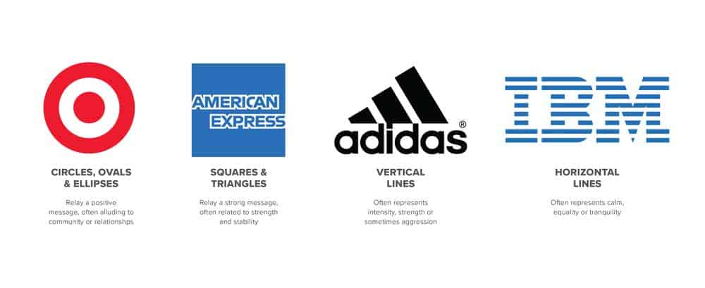
A final aspect that we can analyse to seek out familiar trends in successful logos has to do with the overall layout, or the shape of the design as a whole.
Udemy’s list of 50 popular logos found that the most common shapes are rectangles (25 out of 50), squares (11 out of 50), and circles (10 out of 50).
This may be a surprise to a lot of us, as we tend to associate a “common” logo with a circle or square.
But a rectangle can allow for a more considerable impact, more detail, and covering more real estate when it comes to marketing efforts, which can enhance the effectiveness.
Along with that, the vast majority of those 50 successful logos featured a flat design, rather than one that included any depth to the images or beveling to the words.
Creating Your Own Successful Logo Designs
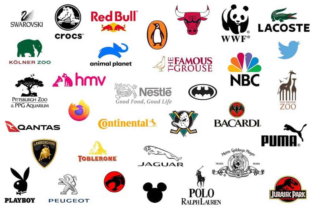
So — what have we learned so far?
Basically, if you were to take an average out of all the features we mentioned here, you would end up with a rectangular, flat-design vector wordmark in all-caps bespoke sans-serif, using two colours.
Does that mean that that’s the key to success?
No, of course not!
The key to a successful logo design is creating one that fits your company, one that is based on the brand personality, and that successfully acts as an ambassador for who you are and what you do.
Those are the main elements that require attention from a smart designer.
That being said, it never hurts to be aware of what popular trends are ongoing in the design world.
Some of the most popular trends in current times include flat logo designs, funky neon colours like the 80s, thin line art, vintage and gradient logos.
And some of these choices may just be perfect for your logo design.
Following trends will make your brand be “current”, but not all directions sustain the passage of time.
That’s why successful logo designs like Coca-Cola, KFC, McDonald’s, Mercedes, etc. stick to their own plan regardless of the trends.
Just remember that the specifics are up to you!
Author Bio: Alicia Rother is a freelance content strategist who works with small businesses and startups to boost their brand reach through creative content design and write-ups. Her area of expertise includes digital marketing, infographics, branding, and graphic design. You can connect with her here.
The 12 Do’s And Don’ts For A Successful Logo Design
1 – Remember K.I.S.S.
Do – Most of the best iconic brand logos in the market are very simple, straightforward, and clear.
Your logo design should embody your business philosophy without the wordiness.
These kinds of logos stand the test of time.
Let your image do the talking.
Don’t – Too much detail in the logo cramps and muddles the message you wish to put across.
Using too many words in the logo defeats its purpose.
It is a logo. It is not an essay.

2 – Be Unique
Do – You want your logo to stand out? Then be different.
The first impression lasts and a successful logo that stands out for its uniqueness will click and will always be remembered.
Make your logo significant.
Don’t – Tie a logo to a particular trend, fad, or movement.
In time your design becomes outdated, and your business will be outdated too.
Ask yourself the question: will my successful logo still standout many years from now without looking ancient?
If the answer is no, then do not use it!
3 – Colour, Colour, Colour
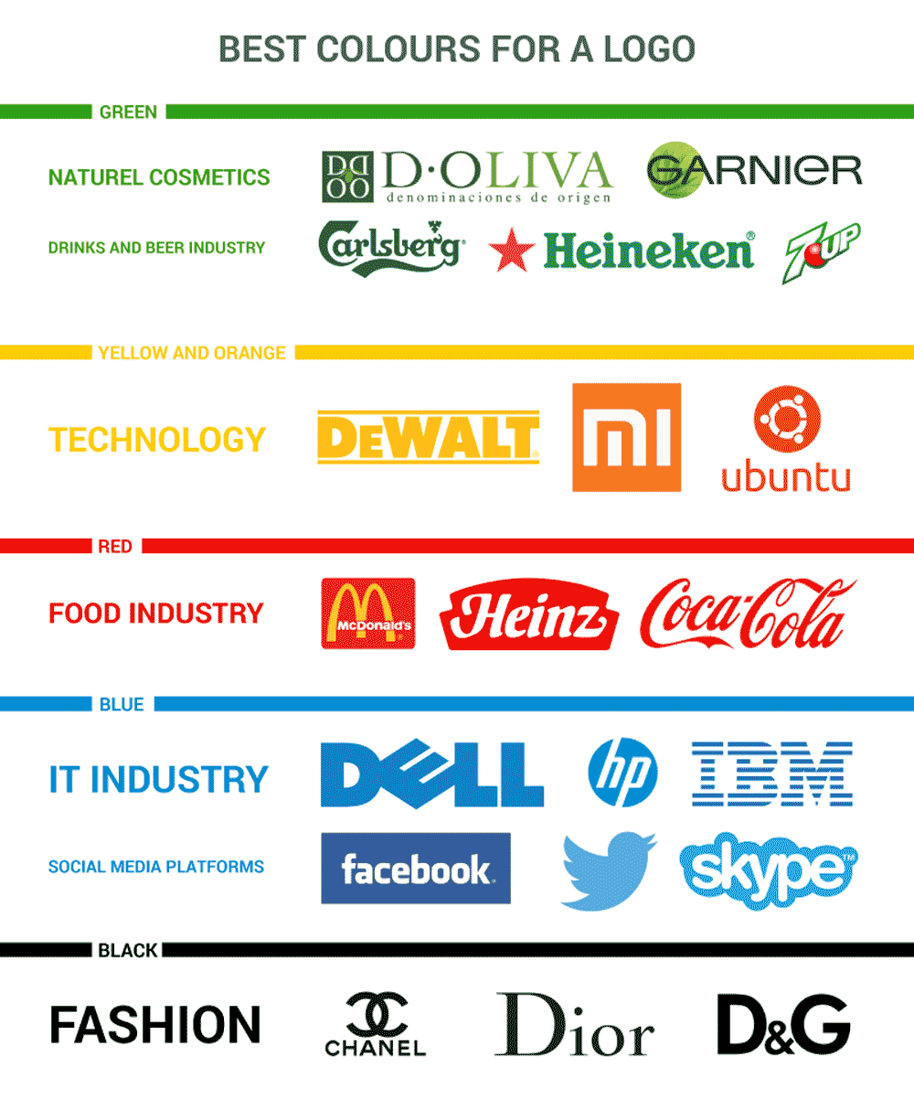
Do – Colours do matter in your design.
Combining different hues is an art form.
Each colour scheme conveys and stimulates emotions so research the meaning of every colour.
It will not hurt to ask the suggestion of an artist or a professional designer.
It will be your business that will benefit from the feedback, so you had better make it right the first time you come up with a logo.
A word of wisdom: add colour towards the end of your design.
Don’t – Mess up your logo.
Using 4 or more different colours is not good.
Although some brands were able to pull it through like the NBC logo, you had better stick to your guns.
Colours that do not convey meaning to your audience is not the right colour.
4 – Versatility
Do – You will want your business seen in every possible media available.
Design your logo in such a way that it can be used in a variety of platforms.
This way whenever you need to post or print your logo, it would be easier and faster.
The variations that you have will reach a wider audience.
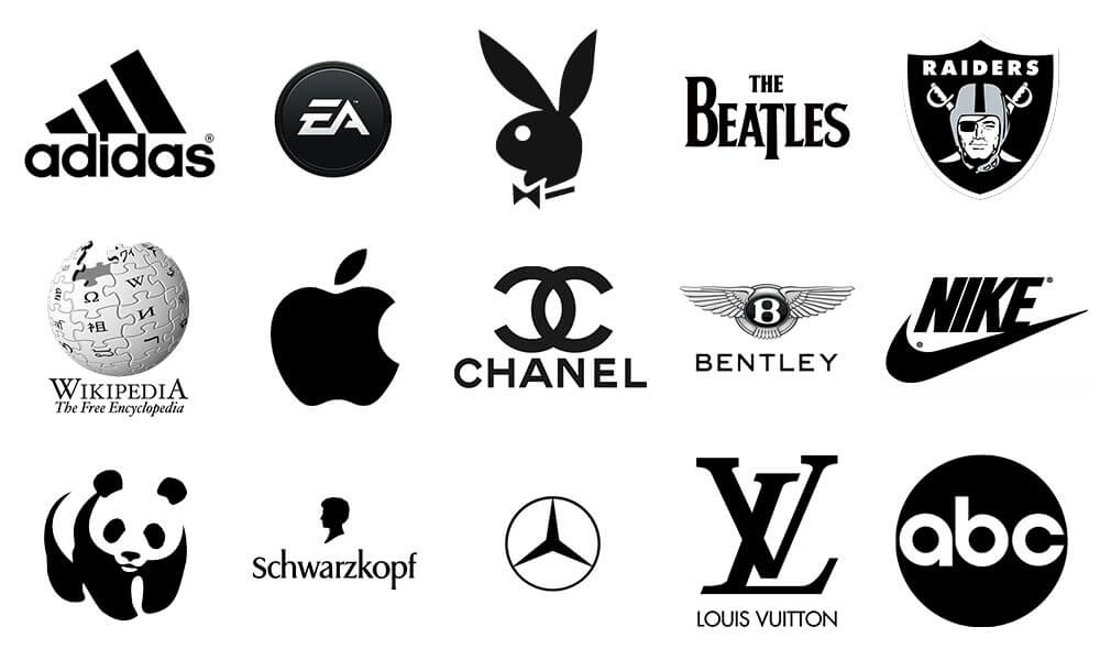
To see if your design is versatile, print it first in black and white.
If it stands out that way, then your design is on the right track.
Don’t – Stick to one version of your design.
If you do, you will have difficulty sharing it with others and thus limit your post exposure.
Have an assortment of formats available.
5 – Typography
Do – Choose a typeface that is easy to read and utilise a maximum of two fonts in your logo.
This way, your audience will not be confused or be at a loss.
When you are done with your prototype, save your design in vector format for easy resizing.
Another reason is that vectors avoid pixelation.
An effective way to come up with a unique typeface is a bespoke font.
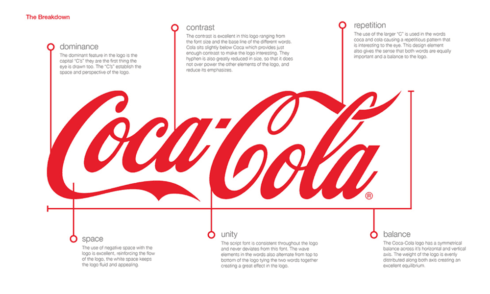
Coca-Cola is a classic example of a bespoke font.
It will amplify your logo.
Don’t – Overuse fonts.
Comic sans and papyrus are out and not recommended fonts.
There are many typefaces to choose from.
You can experiment and try them before you come up with your final copy.
Never use shadows on your fonts. It will create a mixed-up visual.
The key to good typography is the balance.

6 – Your Audience
Do – Nothing beats a well-researched design with your audience in mind.
Employ the psychology of colour, shape, and typeface when you conceptualise your successful logo.
There are many available scientific studies and data about designs and logos. Refer to them.
It pays to know more about designs that your intended audience will understand and come to love.
Don’t – Impose your branding as if it is the be all and end all.
Do not ignore feedback, comments, and suggestions from people.
They usually tell you the truth.
Do you want to know an honest opinion?
Ask a child how your design looks like and take to heart what that child says.
7 – Inspiration
Do – Draw out your design.
Moodboards will be much help when you begin your design concept.
They will help you combine your brand values and that of your audience who’s ever mindful of your competitor.
Your concept will matter a lot and take to heed your thoughts.
Better yet, seek the golden ratio and sketch it out.
Keep thinking and innovating in your design.
Symmetry and proportion should be considered in the plan.
One idea is not enough. Generate more.
To come up with the best model, you must use available vector design graphics software that you are comfortable with.
Don’t – Copy from other designs.
Don’t use clipart and downloadable designs on the web.
Moreover, most of all do not plagiarise!
Quick fixes are often disastrous so better take the long and arduous task of conceptualising rather than the easy way out.
Also, please, do not put photographs in your logo.
Remember photoshop is for photos, logo design is not a photo.
Raster-made images, popularly known as bitmap images, are also a mistake that you want to avoid altogether.

8 – Consistency
Do – When you have decided on a logo, stick to it.
Visual consistency is necessary for any successful logo.
This is the start of brand recognition.
When every time they see colour, shape, or typeface, and they can relate it to your brand, you have achieved consistency.
Don’t – Change your logo ever too often. Changing it will confuse your audience and customers.
They may end up not remembering your business or your company.
9 – Mind your Space
Do – Space in your design can be a boon or a bane.
Use it to your advantage by incorporating meaning into that space you left out.
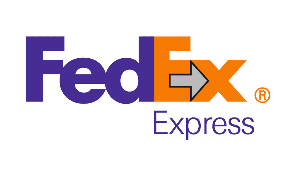
The most famous and effective use of space is that of FedEx.
Their use of space was able to incorporate in business signs the FedEx’s philosophy of moving forward.
Don’t – Use space in your logo without putting any meaning into it.
Although white space serves as a break from the design, it need not be empty.
If you will leave a space empty and not put any imaginable thought into it, better not add space.

10 – Know your design
Do – You thought of it. You designed it. You must know it by heart.
The key to a successful logo is if you can explain the meaning of it to your customers and employees.
That is what is meant by taking it to heart.
Don’t – Study your design.
Your logo will fail you. Don’t be detached from your logo.
Since it represents your company, you should know it thoroughly.
11 – Lines Matter
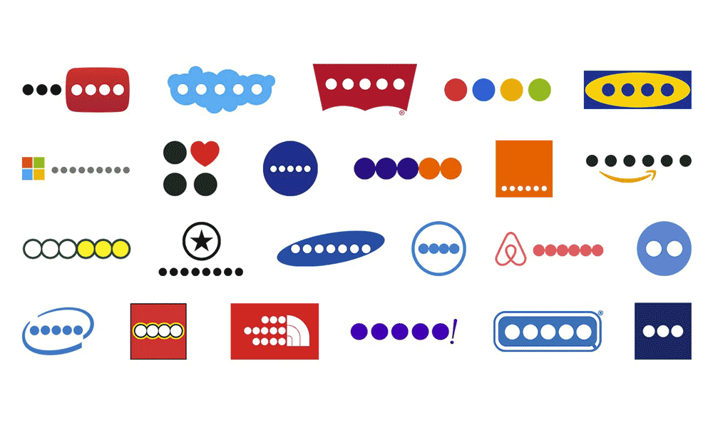
Do – Simple lines and bold shapes.
These will make your design easily recognisable and uncluttered.
Besides, it will make your logo distinguishable from afar and even on a smaller scale.
Don’t – Use sunbursts and swirls.
It will make your logo appear nonsense and be one of those ill-conceived designs.
Do not use pre-made logos.
Chances are, you will have an identical plan and if the logo design is rare, you will have to pay for its copyright.
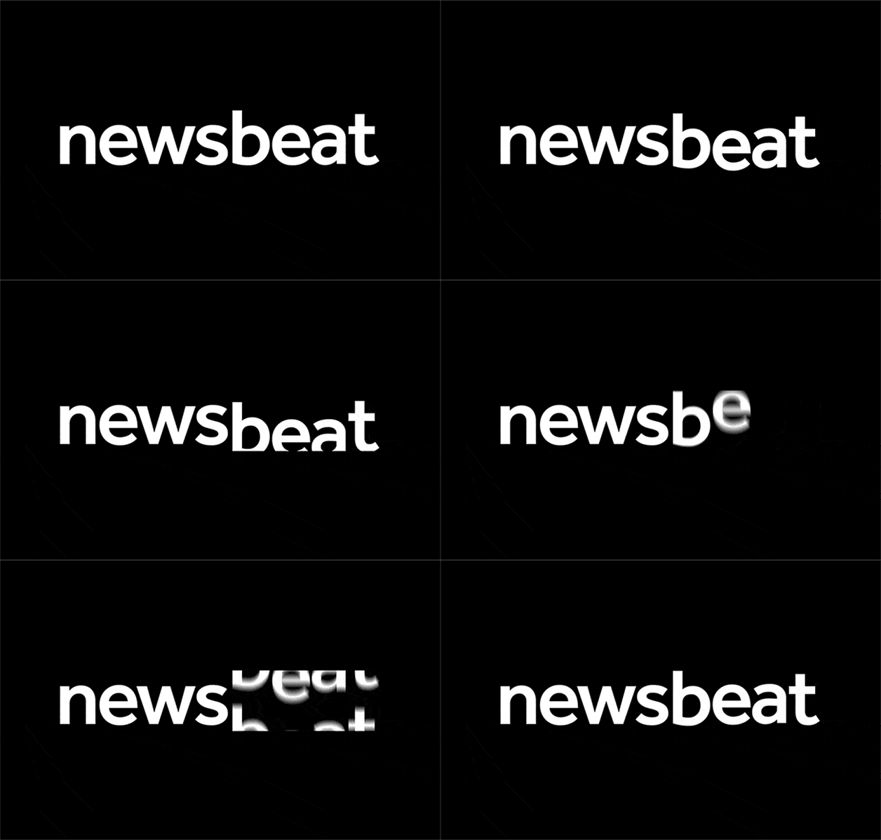
12 – In Motion
Do – Make a moving version of your logo.
Your static designs should have an animated version for digital use.
In this day and age, static just is not just the design, but it is bringing to life.
Imagine your design when it moves and how it looks.
Don’t – Stick to a passive design.
Passive designs are acceptable in itself if the logo is well conceived and used when appropriate.
Apple is one example.
Nevertheless, ushering your design forward towards the aim of making it available to many people is the goal.
Will these tips help create a successful logo?
When your budget permits, it is advisable to hire a professional logo designer to ensure the quality of your logo.
Request your designer to create a favicon logo for your website.
After all, it is your business, and you want to project an air of professionalism.
Still, keep in mind these 12 tips so you and your designer can see eye-to-eye.
If you want to know more about successful logo design, there’s a bevvy of resources available on the Internet.
If the resources on the web are not enough, books about logo design are available on sale in online shops.
Moreover, if you are a professional designer looking for possible clients and want to submit some sample materials, there are blog sites that allow you to do that.
