

02 Jul What Makes a Good Mobile-Friendly Website?
What Makes a Good Mobile-Friendly Website?
We are already living in the digital world. Everything is related to the internet of things (IoT).
And as we walk through this digital world, there is one thing that has remained constant for every individual.
Yes, you guessed it correctly, it is the Smartphones.
Smartphones have become one of the necessary things that we need in our daily life.
Without a smartphone, we cannot imagine doing half of our daily things.
Smartphones are digital hands that we use to complete all our digital work.
Smartphones have influenced our life to the point that it has even started changing our personality.
With time, smartphone users have become goal-oriented.
Every user wants to get access to every possible service from their smartphone.
Whether contacting your friends and relatives, doing shopping, paying utility bills, etc.
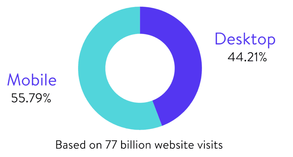
Today, more than 45% of the total population of the world uses smartphones. The sheer number of smartphone users has made the companies to attract audiences with the help of a mobile-friendly website.
The primary objective of this article is to highlight some of the basic principles that you must follow while building up a good mobile-friendly website.
What does a good Mobile-friendly website need to have?
In recent studies, it has been found that a website optimised for mobile phones gets more revisited than the desktop-based site.
But what makes the mobile-friendly website different from a regular website?
Well, the fundamental differences between the two sites are their usability.
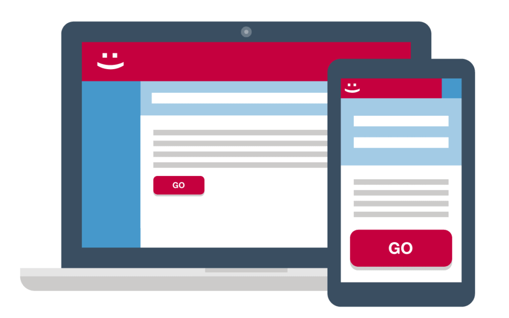
With a regular website, the user will only be able to access the site with the help of a desktop, but with a mobile-friendly website, a user can access that website with both a smartphone and desktop.
In the midst of all this, a question arises. How can a website be mobile-friendly?
Well, several processes help the website owner to optimise their website for mobiles and smartphones.

Let’s have a look at the methods that we can implement to make a good mobile website.
1 – Optimise Your Website
Have you ever seen the same website on desktop as well as on a smartphone?
If you have ever seen something like that, then you would have noticed that when a desktop-based website is opened on a smartphone, all the content overlaps each other.
To make sure this never happens, here are the following tips that you consider.
- To make sure that your website can efficiently work on mobile-based platforms, you need to optimise your website in such a way that it can be navigated vertically on the smartphone.
- While uploading your content on a mobile-friendly website, you need to prioritise your content. Remove the excess element that might distract your audiences.
- Make sure that you have the least number of columns. If possible, keep the number of columns to one.
While your users are using their mobile phones to visit your website, you would not like them to miss out on essential user interface elements.
To make sure that this never happens, you can put those elements in the Call to action buttons. This will surely help you to attract the audience’s attention.
The success of your mobile-based website will depend on how well you will be able to use the call to action button on the handheld devices.
So try to place the call to action on the most prominent places where your users will be able to see it clearly.
3 – Keep your Menus short and simple
Optimising the website means that you also need to optimise the content of the website.
Keep only the necessary content on the mobile-based website, so that your audience can get all the information in the shortest time frame.

You have to make sure that your menus are concise and to the point.
This way, you will be able to showcase the most prominent things that your audience may like.
While optimising your website for mobile users, you must go with the least number of menus that will be able to show all of your products and services.
This will improve your conversion rate.
4 – Keep the website Search bar visible
For the mobile-optimised website, a search bar is an essential element.
With the mobile-based website, you can show your audience every service of your website.
But with a search bar, you might convince the audiences to search for the things they are looking for.
A search bar lets the audience search thing they desire without going through the hassle of going through every menus and category.
The best place to allocate your search bar is at the top of the home page of the mobile-based website.
This way, you will be able to hold them on your website for a bit longer.
5 – Design your site clear enough that user don’t need to zoom in

The common problem with the website that has recently optimised their site for handheld devices is that they forget to update their design according to the mobile.
This makes all content look smaller in mobile devices. For the audiences to have a clear look, they need to do zoom in.
Zooming in is not the problem, but the audiences might miss out on some essential things while zoomed in scrolling.
So to make sure this does not happen, you can design your website in such a way that the content remains visible while opening the site on a smartphone by keeping all the content concise in a single column.
6 – Use high-quality images
The next important thing is to use high-quality images.
While converting regular websites to mobile-friendly websites, most website owners forget about using high-quality images.
This mistake will not affect the mobile-based user. Instead, the desktop users will not be able to see the images clearly.
All the images will be blurred due to low-quality visual content.
So to make sure this never happens, you need to use high-quality images that work both on desktop and mobile-based websites.
7 – Design finger-friendly touch targets
When you are designing a website for mobiles, it becomes essential to utilise the small space to its best potential.
Not only that but also you need to be efficient with the use of the spaces.
This is where finger-friendly touch targets come into action.
Finger friendly touch targets mean, creating a call to action buttons big enough to fit your fingertips.
This way, you will be able to use the working space efficiently. You must also emphasise the margins between two successive elements.
The marginal differences should be enough so that the users can easily click the right call to action buttons.
Usually, the marginal difference between two successive elements is 10pixel.
8 – Lets user decide for themselves
Some websites force their users and audiences to subscribe to their website the moment they enter their site.
This makes the audience create a bad image of the website. This can undoubtedly reduce traffic to your site.
You should never force your audiences for anything.
You can just give them access to the content you want to and can provide them with excellent user experiences.

This way, you will be able to convince them to subscribe to your website.
You should allow your audiences to explore your website more, this way you will be able to have a good session time, and if the viewers feel that you are worth enough for the subscription, they will undoubtedly do so.
And believe me, gaining audiences this way is more effective than forcing them to take action.
No products found.
9 – Suggest user screen orientation for better user experience
There are two modes in which a website can be optimised for mobile phones.
The first one is the landscape mode, and the other one is Portrait mode.
Every mobile website is designed following this model. And if the site is viewed in that particular model, the user experience will improve its quality.
To make sure you can give the best user experience to your audiences, you can just ask them which model will suit them better while navigating the website.
This way, you will be able to guide them to the best user experience.
10 – Use the right design for a mobile website
Remember, the screen of smartphones is around 6 inches. Your design needs to be flexible enough to fit inside a 6 inch.
Not only that, but you also need to place all the relevant elements that you have used on your desktop website. Your design should also need to be clean and straightforward.
Conclusion
With more than 4 billion smartphone users, it has become mandatory for businesses to have a mobile-friendly website.
In this article, we have talked about the tips that you can use to correctly optimised your website.
Let me remind you that website designs are not for the designer, but for the audience you are targeting.
So, design every element of your website, keeping that in mind.
Last update on 2020-07-02 / Affiliate links / Images from Amazon Product Advertising API