06 Jan What makes a Logo Design Successful? – 8 Top Tips
What makes a Logo Design Successful? – 8 Top Tips
Deciding on a logo is one of the first significant steps for a new business.
It must come before giving out business cards, designing letterhead and in many cases a company website, as many business’ sites are developed with the logo’s design and colour scheme in mind.
While a logo is relatively straightforward in explanation — it features your company name with some colour and graphical touches — it has a profound impact on potential, new and longtime customers.
Essentially, your business’ logo is the most critical design aspect of your brand.
It appears on marketing, stationery and packaging material, hopefully reflecting the image the business would like to convey.
A great logo gives a particularly enticing feeling among those who are seeing it for the first time while validating the positives for new and pre-existing customers.
So, what exactly makes a logo design successful?
It varies depending on the business and the image they’d like to convey.
Still, there are several universal factors that all business can consult when deliberating as to their logo’s general design and colour scheme.
1 – Colour and Graphical Relevance

It’s typically impossible to capture every facet of the business from a logo alone.
However, your role is to capture as much as possible while making the logo accessible and immediately enticing.
For instance, if your products are organic vegetables, opting for earthy green tones and using a small graphical touch is a right direction.
Regarding the graphical touch, perhaps consider adorning an ‘i’ or a similar letter to make it look somewhat like a beanstalk or vegetable.
2 – Simplicity and Accessibility
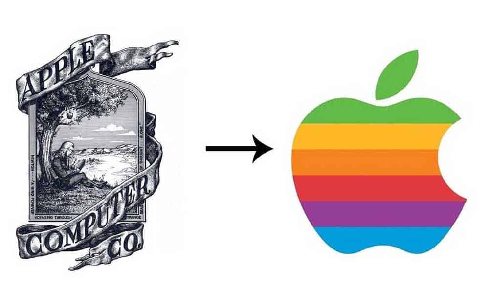
The logo should be simple and to-the-point, exemplified well by Apple’s logo journey.
The computer giant’s initial logo featured a rainbow-coloured design that many of us now associate with the early computer age.
If they stuck with that, it wouldn’t precisely coincide with the reality that they remain, active innovators, today.
So instead, they now feature a solid black or grayscale logo, which is much easier to look at and seems to suggest experience in its directness.
As a brand, it’s critical to present an accessible aesthetic that consumers will easily remember.
3 – Evolving Consistency
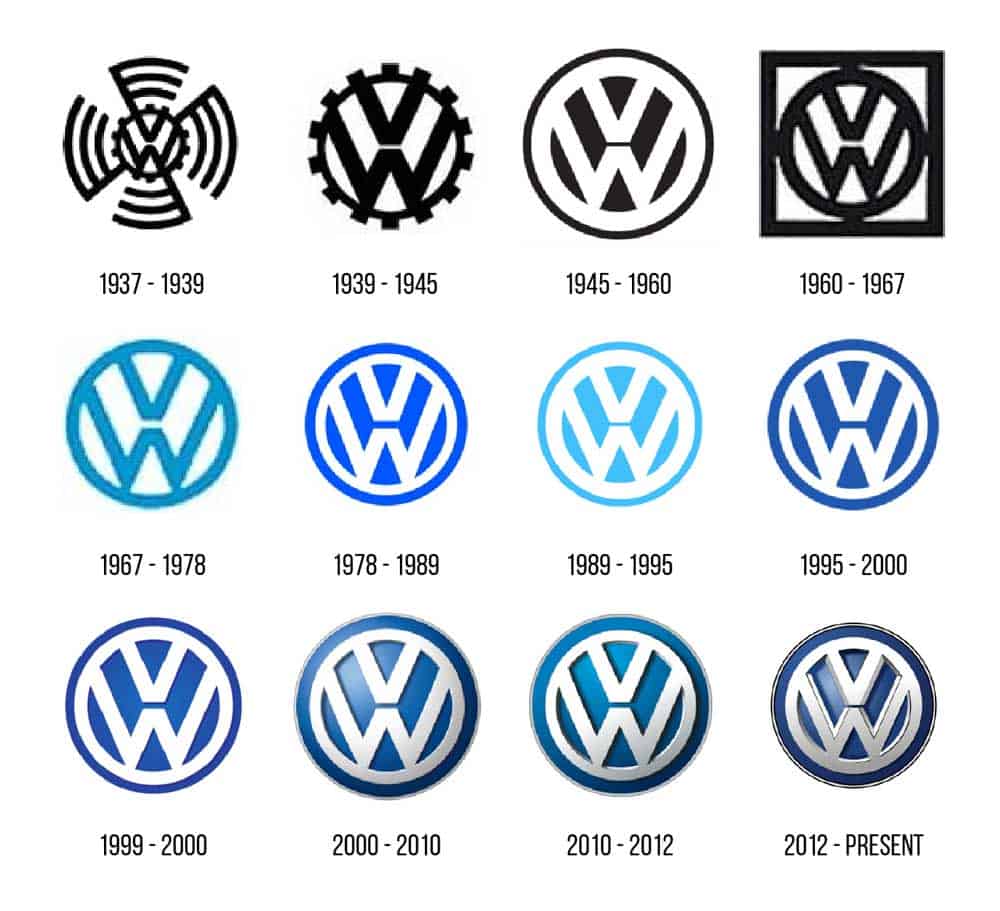
Perhaps a company specialising in laser light shows may benefit from an ever-evolving cast of colours encompassing their logo.
Still, most businesses should strive for something that’s enjoyable, consistent in both colour and general theme.
Going back to the evolution of Apple’s logo as an example, their rainbow-themed initial logo that was revealed in 1976 represented the freedom of an upstart, with the various colours outwardly opposing the generic grey-tinted business logos familiar in the late ’70s and throughout the ’80s.
Now that Apple stands as one of the most successful companies of all time, it makes sense that they’d evolve into a logo more indicative of the future.
Some may suggest that starting with a rainbow-focused logo and then arriving at a more future-thinking corporate feeling in the future is not consistent at all, but it is in regards to the logo’s relevance.
Being consistent with a logo means being consistent with where your company is, status-wise.
If you’re an upstart, then it may be prudent to embrace that mindset, while a more experienced company would go with a logo that exudes experience, like Apple’s current approach.
Apple may have a very different logo in 2020 than in 1976. Still, the logo’s evolution has been consistent with the business’ development regarding both products and public perception, exemplifying the actual value of evolving consistency for a logo.
4 – Memorable Quirks or Approaches
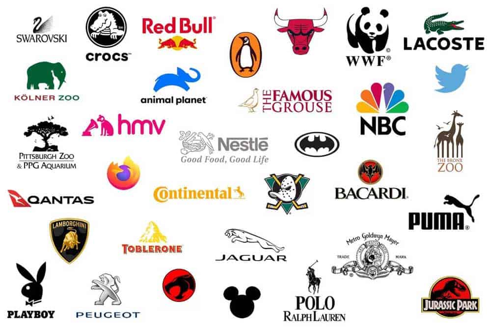
With so many businesses and the ability to create a logo or hire a logo designer being more accessible than ever, companies are competing with a ton of others when putting their logo out there.
As a result, making the logo as memorable as possible is a no-brainer pursuit.
Whether it’s turning a letter into a beanstalk for an organic vegetable company, incorporating a cute yet relevant panda (World Wildlife Fund), or incorporating distinctive wagon-type wheels in the letter ‘O’ for an animation studio, brainstorming fun and relevant graphical quirks is a significant step in designing an appropriate and wildly memorable logo.
5 – Word-of-Mouth Potential
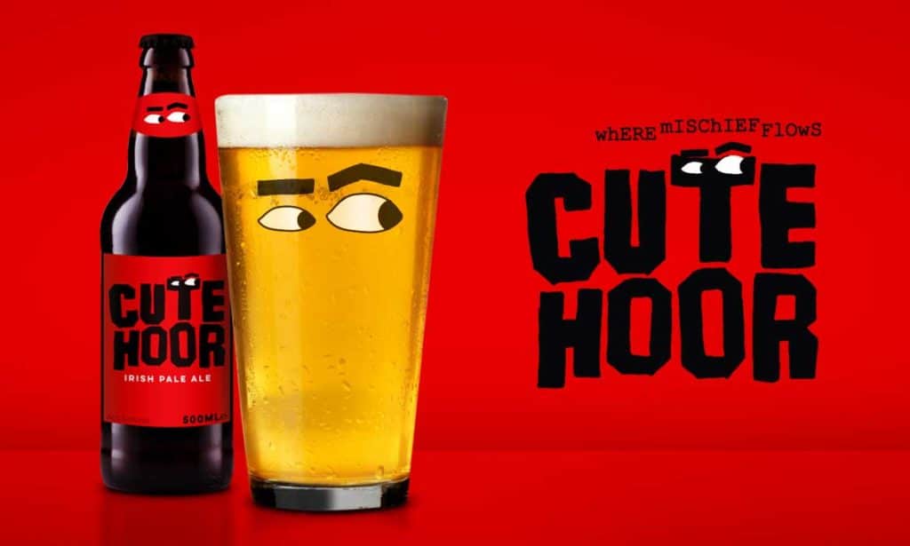
Business logo design isn’t exactly among the most discussed topics within the general public, but people are certainly open to chatting about something that’s memorable and cute.
A great logo is in that realm and provides an excellent source for getting leads.
Having a remarkable logo, in being worthy of remark, is a great goal.
Jonah Berger, author of Contagious: Why Things Catch On, uses search engine TalentBin as an excellent example of this.
Their logo features a cute purple squirrel riding a unicorn.
While that may initially seem irrelevant to a search engine, the more profound meaning (that “purple squirrel” is a term for an individual who’s difficult to find) shows relevance and wit.
According to Berger, this smart and semi-inside joke approach emphasises that they’re insiders and are very familiar with their niche’s culture.
Startup business’ logos should take more risk, with the chance of either falling flat or become buzzed-about, with TalentBin being an excellent example of the latter.
6 – Thorough Market Testing
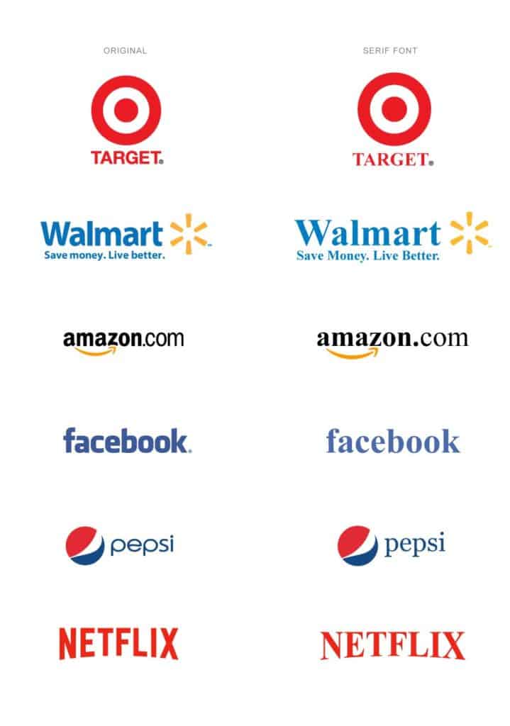
Even if you feel like your logo idea is fantastic and utterly flawless, it’s essential to keep this in mind: The logo isn’t for you — it’s for your customers.
You may enjoy the colour scheme and find the design excellent, but if the majority of other people don’t, then it’s going to be an imminent failure.
The most recommended method to ensure the logo’s success is not limited exclusively to your business’ echo chamber is to conduct market testing.
Market research is crucial in the post-development stage of the logo.
Even after following every bit of advice and consulting a logo expert, there’s no telling how it will react with a broad audience until it’s exposed.
Amazon’s Mechanical Turk is an excellent way for businesses to conduct market research, with the ability to gain independent feedback from several individuals for $10-20.
While they may lack the expertise of a logo expert, that’s not what matters — what matters is that they represent the general public.
If you poll 50 or so individuals, and 40 or so of them suggest an improvement, then it’s very likely around 80% of people in more significant numbers would feel the same way.
7 – Avoidance of Abstract Symbols
Even for the most relevant of businesses, like one that deciphers messages, abstract symbols are a big no-no.
If someone has to squint to view a logo or ponder significantly to understand what it even says, the logo isn’t doing its job.
This sentiment is similarly important during market testing.
While abstract symbols — like Apple’s apple — are okay with very established businesses, upstarts should avoid them.
Opting for a logotype, which is a stylised version of your business’ name, is much preferred for accessibility and memorability.
Alan Siegel of design firm Siegel+Gale suggests that small businesses on a budget avoid abstract symbols altogether, noting that a logotype or wordmark is more natural to recall.
If you’re intent on using an abstract symbol, make sure the business’ name is apparent somewhere else in the logo.
However, this also risks over-stuffing the available space, which is another thing to avoid.
8 – Independent Design Consultation

It’s recommended to consult an independent designer no matter the stage, whether you’re starting to brainstorm for ideas or want a consultation for a nearly finished product.
These days, services like Fluence provide quick and easy consultation often for a flat fee, where you can select designers and artists for discussion on a logo.
Some will be receptive to chatting in person or on the phone for further consultation as well.
Whether you plan to involve a design professional significantly or just as a consultant, it’s recommended to use them in some capacity, especially with services like Fluence making their input more accessible than ever.
A standard rule of thumb in the logo industry is that a good logo should last a decade.
Keeping that in mind for an independent designer budget, having a great consultant who contributes will pay their weight in gold if the logo works great for a decade.
Even if you have an artistic tendency and have designed well in the past, consulting with another experienced designer and embracing market research will ensure your time spent on the logo is not in vain.
Once a logo is released, it’s tough to retract it without looking bad, so market research and consultants can go a long way in making sure the finished product will be one with longevity and success.
Topical relevance and colours, simplicity, accessibility, evolving consistency and memorable quirks are typical elements of a great logo.
Most great logos also undergo thorough market testing and additional consultation to obtain word-of-mouth potential and ultimately bring in new customers while retaining current ones.
It may often be overlooked, but a logo is a hugely important factor in a business that plays a substantial role in moulding public perception.
Author Bio: Lexie Lu is a designer and writer. She loves learning about the trends in web and graphic design industry. She writes weekly on Design Roast and can be followed on Twitter @lexieludesigner.
The post What makes a Logo Design Successful? – 8 Top Tips is by Stuart and appeared first on Inkbot Design.


