25 Feb Why Visual Hierarchy Matters in Web Design

Why Visual Hierarchy Matters in Web Design
Visual hierarchy is how you arrange design elements on a page will show viewers their order of importance.
In other words, visual hierarchy is the strategy that will help you show people where to find what they need on a page.
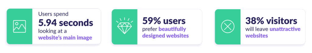
Since the average online reader has an attention span of 15 seconds, it’s crucial first to emphasise the essential information.
Menu navigation bars, larger text for more critical information, and contrasting colours on important call-to-action buttons are all examples of using visual hierarchy to rank different page elements in order of importance.
How Does Visual Hierarchy Work?
Visual cues like loud colours and large headings play a huge role in deciding what the eye is drawn to first – and second, and third.
But it’s not as simple as making every vital bit of info a flashy red colour – if you try to emphasise too many elements, nothing will end up standing out, and viewers will click out of your page for fear of developing a migraine.
The key to effective visual hierarchy is in that second word: hierarchy.
If you know how to identify which page elements are the most – and the least – significant, you can begin the design process with a ranking order in mind that you want your viewers to be able to recognise.
Visual hierarchy is ultimately a user-focused design technique – you want to give your viewers the most intuitive experience possible.
After all, 38% of visitors will leave a page if they find content or layout unattractive.
Why Does Visual Hierarchy Work?
The short answer is: because our brains usually scan content in a few distinct patterns.
This means that designers can position important content in a way that ensures it will likely be the first thing that meets the eye.
The F-Pattern
One of the most striking patterns is the F-shaped reading pattern, which eye-tracking technology has shown to be a widely popular pattern for both desktop and mobile viewing.
In this pattern, users first read in a horizontal movement across the upper part of the page.
They then move down the page a little and read in a second, shorter horizontal pattern that forms the F’s lower bar.
Finally, users will scan the page’s left side in a vertical movement, forming the F’s stem.
It pays to make sure your website design plays to these predicted behaviours, at least on some level: 95% of users in one survey agreed with the statement that “good user experience just makes sense,” and intentional user experience has the potential to raise conversion rates by up to 400%!
Feeling Boxed In?
Don’t worry – eye-tracking software and letter-shaped patterns can serve as helpful guides in website design, but ultimately, it’s up to the designer to call the shots.
Like F and others, patterns are where the eye goes when designers have made no effort to direct the eye.
But we can use this knowledge to our advantage without letting predetermined patterns make all of the creative decisions!
The F pattern is a product of most web users scan pages instead of thoroughly reading them. And there are plenty of less rigid ways to use this knowledge to your advantage, such as:
Larger or bolded introductory paragraphs
This is an excellent tool if you want users to read more than just the headlines.
In one test, when users encountered a story with a boldface introductory paragraph, 95% viewed all or part of it.
Bolded paragraph copy
By similar logic, if there are small pieces of body copy that you feel are particularly important, then don’t be afraid to bold them for scanners!
Just make sure to be really selective about your bolding – remember that nothing will actually stand out if you try to emphasise everything.
Selective images
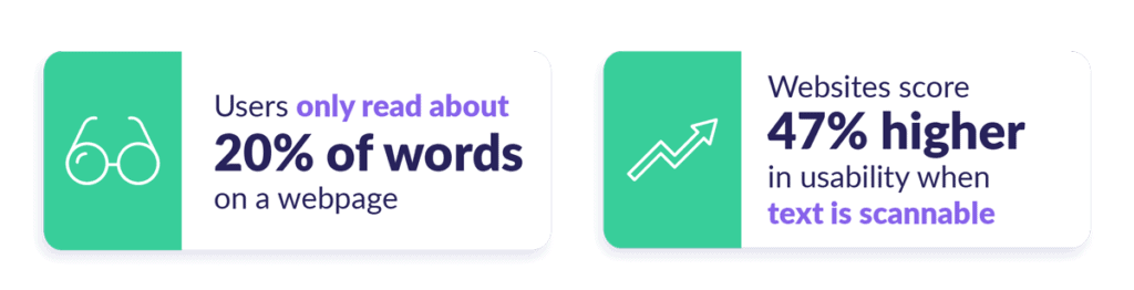
An estimated 86% of consumers experience banner blindness (in other words, they either consciously or subconsciously ignore anything resembling a banner ad).
If a web page is littered with generic images that aren’t contributing to your message, then you run the risk of viewers ignoring those, too.
It’s always better to put effort into creating relatable imagery than going with an over-polished stock photo – for example; one debt company saw a 35% increase in online sign-ups after replacing a top-performing stock photo with a picture of the real-life founder.
How Can I Use Visual Hierarchy to My Advantage?
Now we know some of the theories behind visual hierarchy. But how can you put this strategy into practice?
Implementing visual hierarchy on a web page can be as simple as creating a left-hand sidebar menu or upping the font size on text headers – but it pays to have a few wider-reaching plans in place.
UX design is all about removing friction and enhancing usability for a product, and paying attention to visual hierarchy is a key way to do this. (xd.adobe.com)
With this in mind, we’ve identified a few methods you can try out for yourself.
Think About Space
Crowded design is the most common mistake small businesses make when designing a website – this is another example of the dangers of emphasising too many elements at once, to the point where nothing stands out.
Instead, you can utilise negative space or the blank areas between different elements on a page.
Negative space is an excellent, less-is-more tool to help viewers quickly identify a web page’s focal point.
Squarespace always uses negative space well:
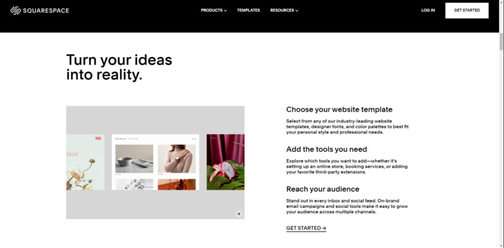
Notice how there’s plenty of white space in this layout, making the heading and image stand out so much more.
The overall effect is a clean page that doesn’t overwhelm the reader and makes it obvious which elements are supposed to capture your attention.
Think About Placement
It’s natural to put the most critical design elements at the top of a page – and this is even more important on the web, where more than half of users’ viewing time is spent “above the fold,” or on the part of the screen that’s visible without scrolling.
This means you’ll want to be intentional with the headlines and images you place above the fold – make sure they tell users exactly what the page is about.
You’ll also want to keep any body copy above the fold as spare as you can.
The good news is, the website content doesn’t get ignored just because it’s below the fold – in total, 74% of viewing time is spent in the first two screenfuls of content (up to 2160px).
So your below-the-fold designs aren’t a lost cause – still, of that 74%, just 17% of it is spent looking at the second screenful of content. So above the fold still reigns supreme!
Be Intentional with Colours
It’s no secret that bright, upbeat colours help positively catch a reader’s eye.
85% of people claim that colour has a significant influence on what they buy – even just disrupting your typical colour scheme can have a massive impact on performance.
For example, when the ketchup company Heinz changed its signature product from red to green, it led to $23 million in sales – the highest increase in the brand’s history.
We can’t all be multi-billion-dollar ketchup connoisseurs, but why not start by experimenting with the colours of your CTAs?
One case study has shown a company achieving an 11% increase in clicks to their checkout page just by testing colour variations.
Not sure which colour to start experimenting with? Blue is always a great option since 57% of users see it as the colour of success.
But be selective with your hue: the search engine Bing ended up making an extra $80 million just by changing the shade of its blue (Bing used #0044CC, in case you were wondering)!
It’s fun to switch up colours when you’re first finding your style, but don’t forget that consistency is still vital in the long run.
One study has found that colours boost brand recognition by 80%, so developing a colour scheme you like and sticking to it will pay off in terms of identity and awareness.
Consistent presentation of a brand has also been seen to increase revenue by 33%.
Use Best Practices as a Guide
Just as the F-pattern can be a helpful guide, design trends and best practices are tried-and-tested templates that you can use to ensure good UX (don’t be afraid to colour outside the lines once in a while!).
Here are the most critical elements that you’ll want to get right:
By now, we know that people expect to see a navigation bar towards the top left of a page.
We also know that if possible, it’s good practice to keep the entire navigation bar above the fold so that the majority of visitors will know what’s on your website.
But the actual contents of the menu are also important.
You’ll want to stay away from long page titles that don’t fit the navigation bar’s width – if a page title is very long, try to abbreviate it when it goes on the menu.
You’ll want the menu text to be clear and concise.
Phrases like “About Us” and “Shop” are good examples.
Logos
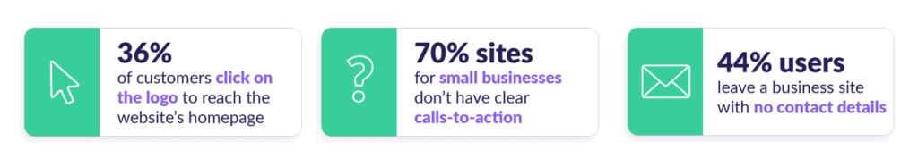
When it comes to logo placement, the F-pattern wins out again: users are 89% more likely to remember logos shown in the top-left position than logos placed on the right.
You can even try placing your logo in your navigation bar instead of a bare site title.
When it comes to logo design, it’s best to keep things simple – 95% of top brands only use one or two colours in their logo designs.
Having a simple logo colour scheme can lead to excellent brand awareness.
When arranging the elements of a composition, designers can use the space around the content to draw attention to particular elements think of a single element on a blank page or to send an entirely separate visual message, such as the hidden “arrow” found within the famous FedEx logo.
Visme
For example, over 90% of the global population recognise Coca-Cola’s clean, red logo!
CTAs
Calls to action are a crucial part of digital marketing, but not every CTA is the same.
In one test, a company found that turning its CTAs into buttons created a 45% increase in clicks, while another company saw a 26% increase in clicks by adding an arrow icon to its CTA buttons.
You can make your CTAs stand out on a page by positioning it far apart from the other copy on the page so that the CTA doesn’t get grouped with other visual elements.
Nice contrasting colours are also a big help, and when in doubt, buttons are usually the way to go – in one study, button CTAs drew a clicks-to-open rate that was 33.29% higher than the rate for in-text CTAs.
Anticipate What Users Want to See
Lastly, it always helps to think about what information the user wants to see and make sure that it is easy to find.
Some of this information is general – for example, 51% of users think “thorough contact information” is the most crucial element missing from many company websites, so it’d be a real win if you can make sure the “Contact” section of your navigation bar appears above the fold.
Or better yet, place contact information on the homepage with plenty of white space to offset the text.
Some of this information can even get specific to each user…
Utilise Personalisation
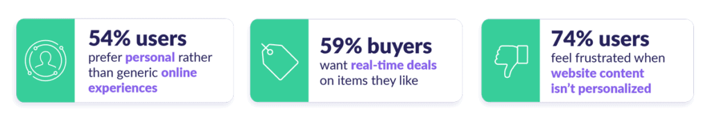
54% of global users prefer personal experiences over generic ones, and these days, we have the technology to provide that for website visitors.
Of course, what benefits the users also helps the business owner: 93% of companies have seen a boost in conversions after using personalisation.
Personalisation can involve using geolocation to offer language and currency conversions for foreign customers (also known as localisation) to use cookies to track customers’ personal preferences.
The latter option allows you to offer tailored product recommendations for different customers.
Design is all about giving users what they want – and if you can provide a digital experience that’s more bespoke to each viewer, it’ll pay off!
The Wrap-Up
The visual hierarchy gives us many useful design principles to work from, whether it’s the infamous F-pattern or merely the idea that the most critical elements belong at the top of a page.
That said, you should use visual hierarchy as an informative but flexible guide – don’t let it box you in creatively!
It’s up to the designer to decide what makes sense (and what looks great) at the end of the day.
Think of this as your roadmap to getting started!
Author Bio: Maura Monaghan is a writer at Website Builder Expert, a resource dedicated to helping users get started online no matter their experience level. Her favourite topics to cover include web hosting and content marketing, and she believes that everyone is capable of creating their own stunning website.